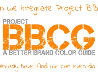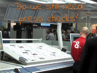
Strategic Insights
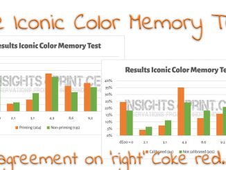
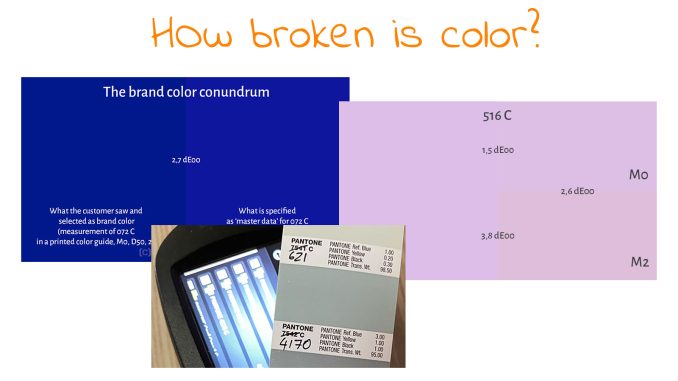
How broken is color?
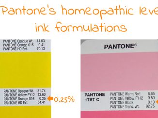
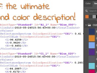
You may have seen some posts on LinkedIn about the latest Pantone guides, about issues with those guides. Many people shared pictures of differences between old and new guides, we discovered homeopathic-level ink formulations (which […]