

With screens all around us, some people also use them for color evaluation. But that’s not always a good idea: there are multiple factors that can influence the color that is displayed. Let’s look at the three main reasons why it can go wrong: the screen as such, the operating system and the app used.
CONTENTS: The screen | The OS | The app | Test ICC support it yourself! | The environment… | Why is this important?
The screen
Not all screens are created equal. And most are just not suitable for color critical work. Not even after calibrating it. For color critical work, you should use a monitor that is capable of reproducing the AdobeRGB gamut. A ‘sRGB’ monitor will not suffice to reproduce all colors that can be printed.
Let’s do a practical test: in the picture at the top of the article and also below you see four screens: two laptops, a tablet and a smart phone. They all show the same picture… but they just don’t match. So what’s happening here?
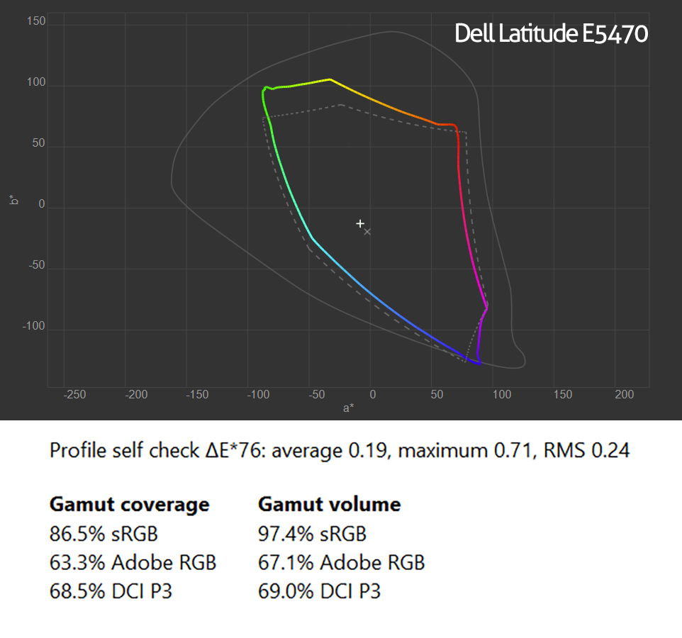
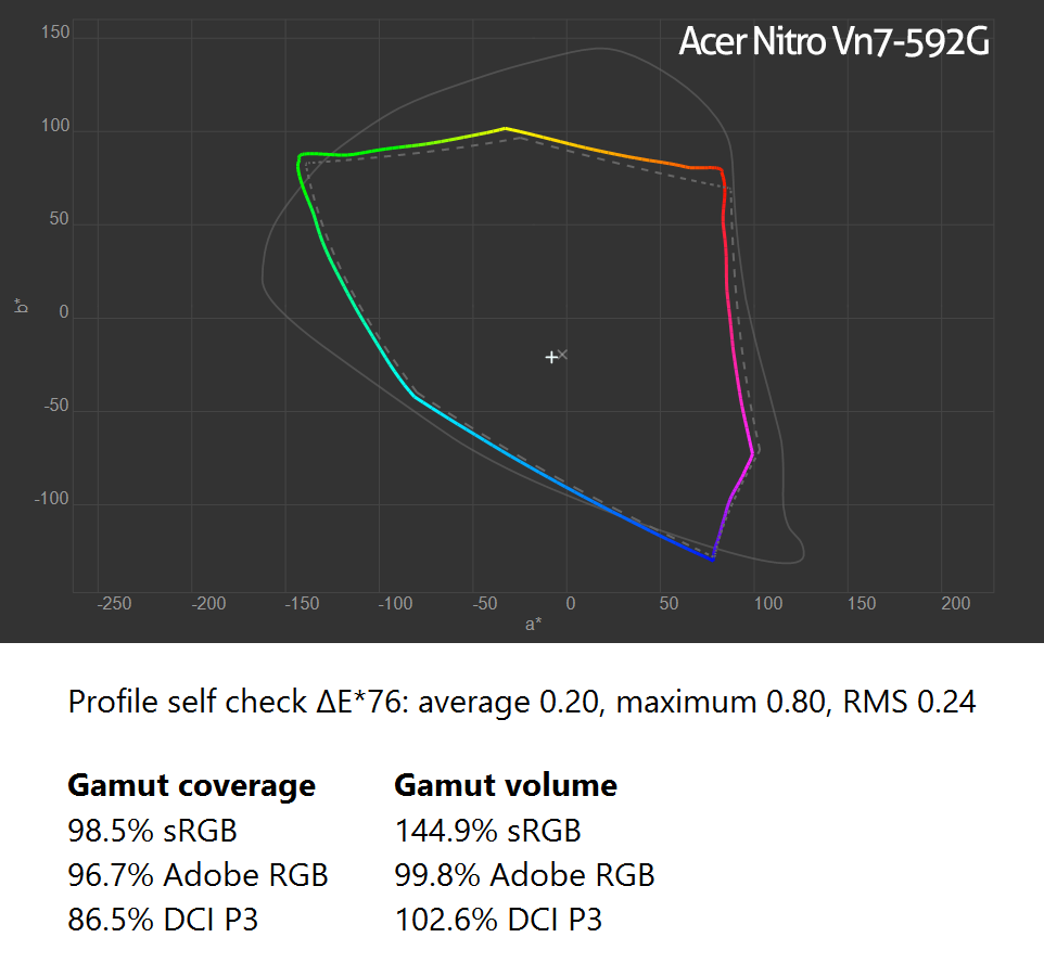
The large laptop on the right has a screen that is capable of reproducing nearly 100% AdobeRGB (Acer Nitro Vn7-592G). The other laptop, on the left, has a smaller gamut, more or less sRGB (Dell Latitude E5470). Both were calibrated before the picture was taken, with DisplayCAL and the X-Rite i1 Display Pro. Please note that laptops with a (nearly) 100% AdobeRGB screen are quite rare… Most laptops have a smaller gamut. You need to check this if you are using a laptop for design, for photography!
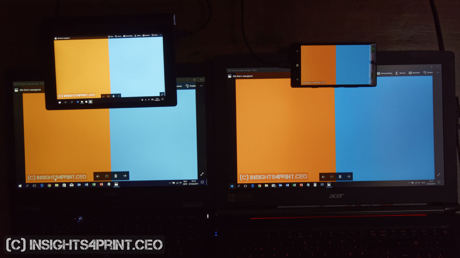
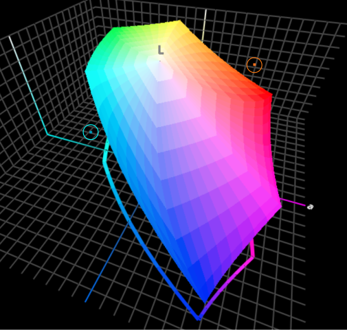
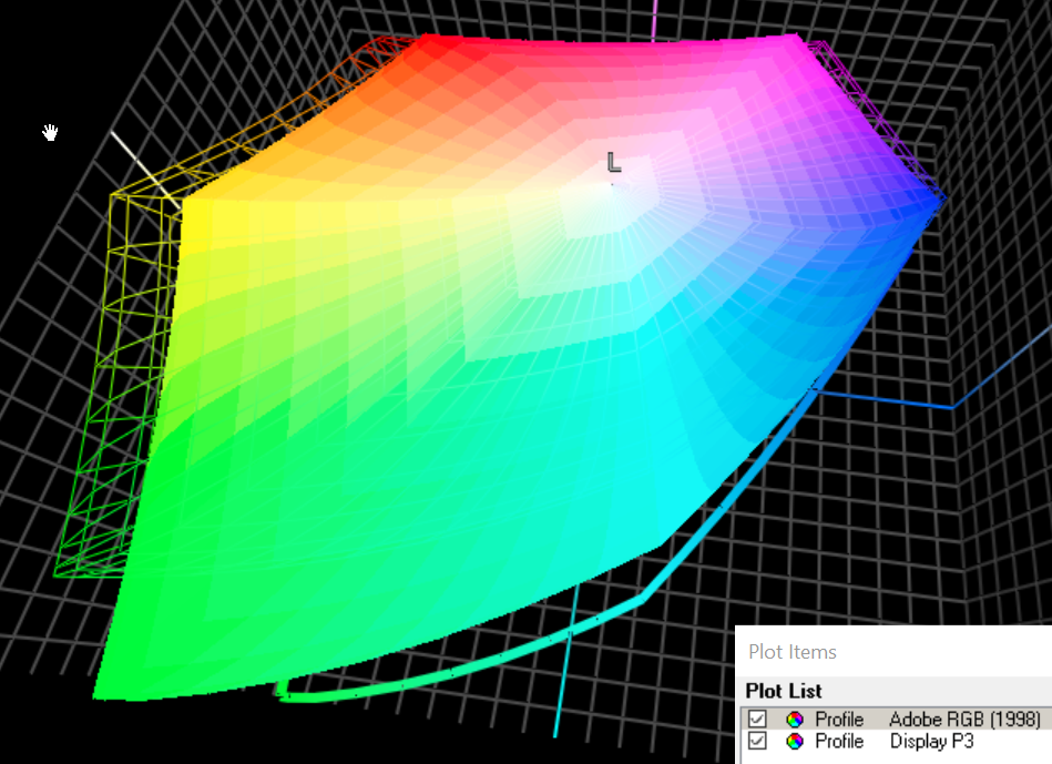
You can download the testfile used in the picture: as a JPEG, or as a PDF. The two colors were carefully chosen for this test. As you can see in the graph below, both colors are located outside the sRGB gamut. The most interesting one is the cyan: that is close to 100% cyan on a coated paper… So you see: you can not reproduce the cyan printing ink correctly on an sRGB monitor.
The graphs below show the profile information from both laptops. The calibration was done with the DisplayCal software, the screenshots are from the profile information shown by DisplayCal right after the calibration.
When looking at tablets and smartphones, differences in capabilities of the displays can even be bigger. And calibration can be hard. For more info about those, I recommend the website of DisplayMate, they do shootouts on a regular basis.
Over the last years, wide color gamut monitors have become more common and cheaper. But now a new problem has surfaced: Apple has embraced DCI-P3 as the gamut for their monitors, not AdobeRGB… DCI-P3 is a wide color gamut RGB color space that is used by the digital movie industry. DCI is the Digital Cinema Initiatives. The blue primary is the same as AdobeRGB and sRGB, the other two (red and green) are however different… Which makes it even more difficult.
Here is an interesting article about the differences between DCI-P3 and AdobeRGB.
And then there are also the settings of the monitor, e.g. the white point, the gamma curve. Even the viewing angle can make a difference. For more information about monitors, I can recommend a number of articles by Eizo, a manufacturer of high quality monitors: bit level and LUT (look up tables), LCD displays and differences in image quality, color gamut and LCD displays.
The OS
The capabilities of the screen are very important, as we have seen above. But it doesn’t stop there… Especially when you’re looking at tablets and smart phones. On the desktop (Windows, Mac OS) the color management is done by the operating system. But that’s not necessarily true for a mobile OS…
Windows tablets support ICC color management, even my Windows Phone 8.1 supports it. Apple’s iOS and Android: it depends…
At first iOS did not support color management. The first apps that claimed to manage colors on iOS (and also Android), did this ‘in app’. Which means that only within that specific app color management was applied. And not for other apps.
But that has changed for iOS. With the launch of the 9.7 iPad Pro about a year ago, iOS got an update that does support ICC color management (iOS 9.3). There aren’t that much articles on that, but it is a significant step forward. The website ipadforphotographers.com was probably the first to note it. AppleInsider had a brief article on the subject. AnandTech covered it quite extensively. Now that iOS does support ColorSync and therefor ICC color management, apps can start using it. But you will need to check whether your tools support it or not…
If you looked at the reports on the iPad Pro, you will have noticed that the color gamut is… DCI-P3. Which is different from AdobeRGB, as I showed above.
Android only recently started supporting color management, after the initial publication of this blog post. In August 2017 Android Oreo (v8.0) was released, which is the first to support color management.
The app
There can also be differences between apps: some support color management, others don’t support it at all or some only partially implemented it (meaning: only support for version 2 ICC profiles, not for v4).
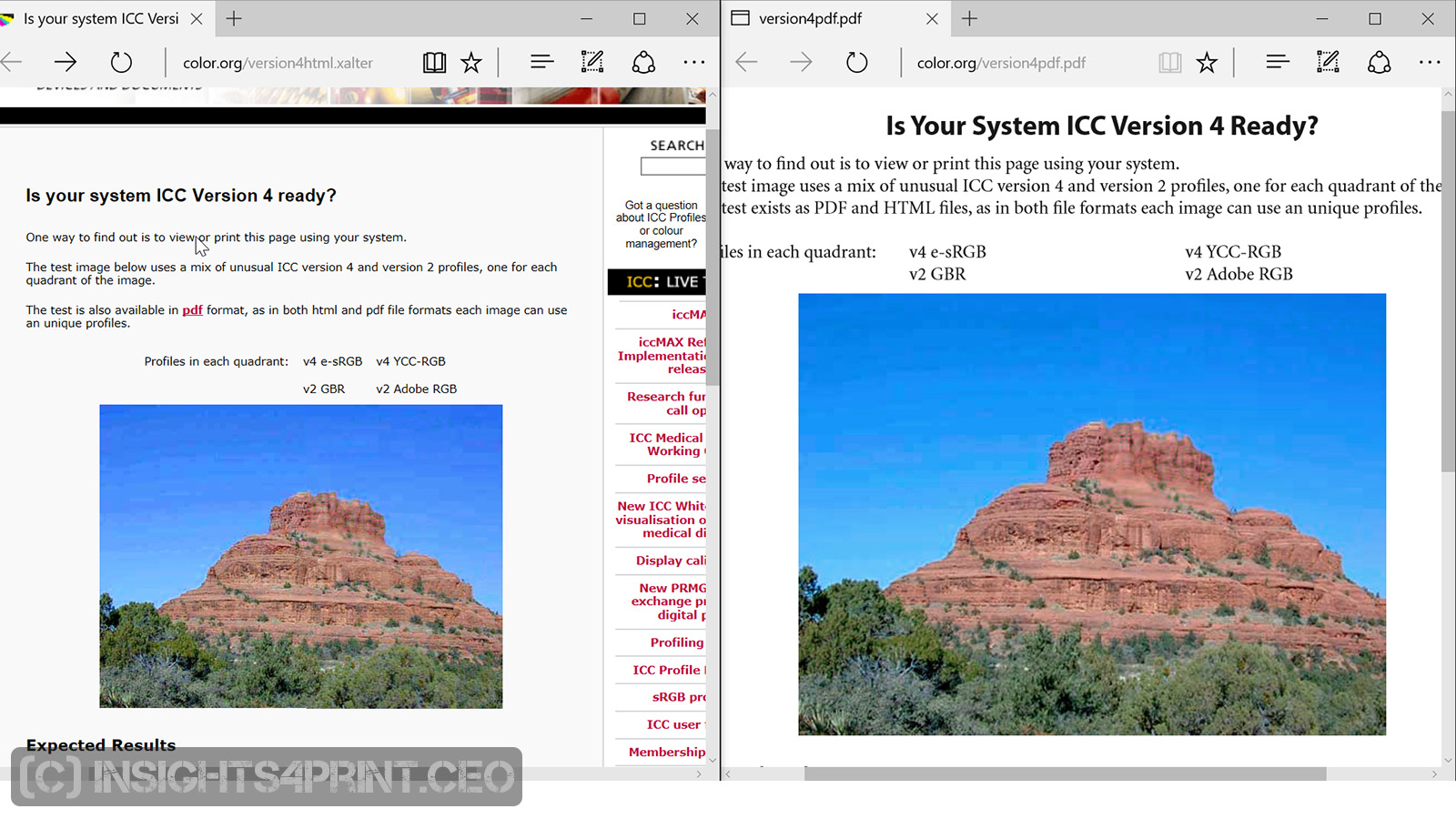
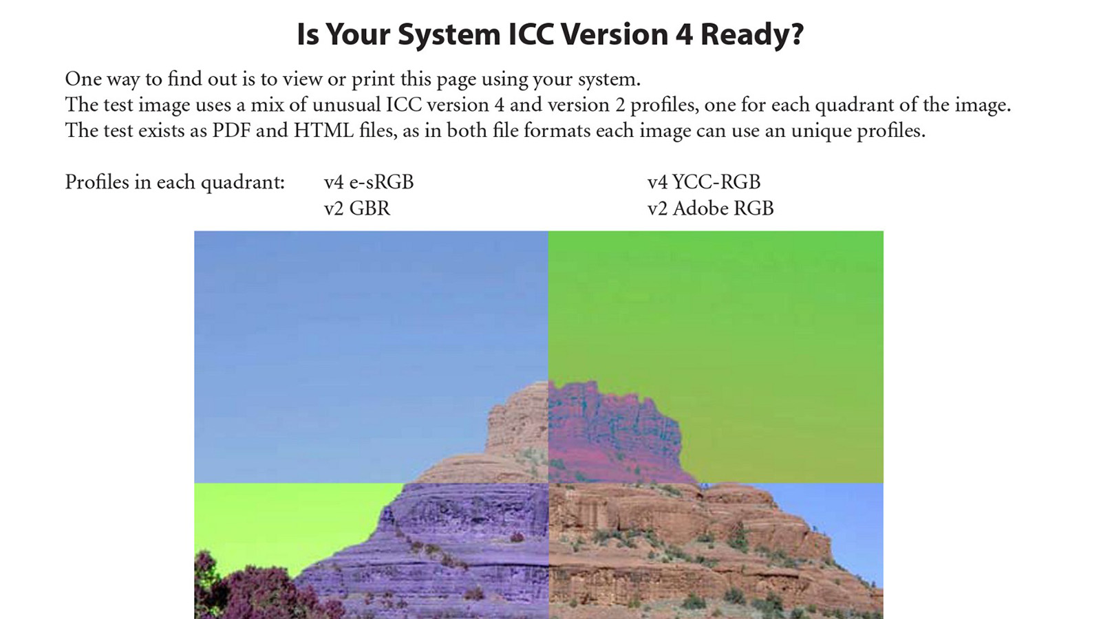
Let’s take a look at browsers and the default PDF viewers in those browsers. The ICC has two test files to check color management support. One is a HTML file, the other one a PDF file. If both v2 and v4 ICC profiles are supported, the image looks ok. If one or both are not supported, a part of the image will have completely wrong colors.
Below are screenshots of both (HTML left, PDF right) in resp. Edge, Chrome and Firefox, all on the same Windows 10 system.
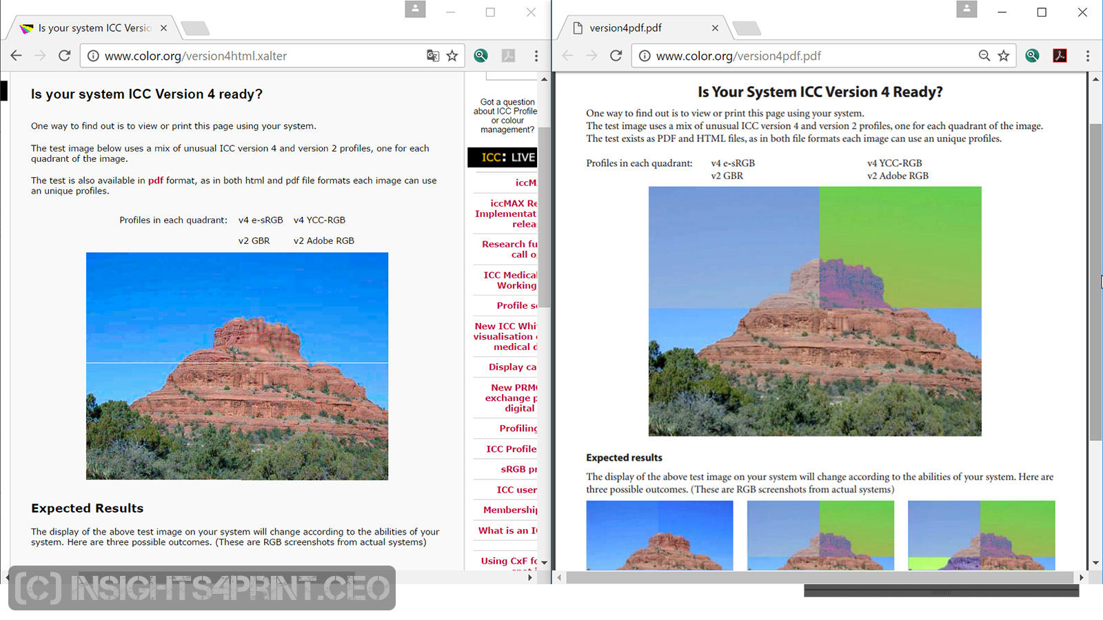
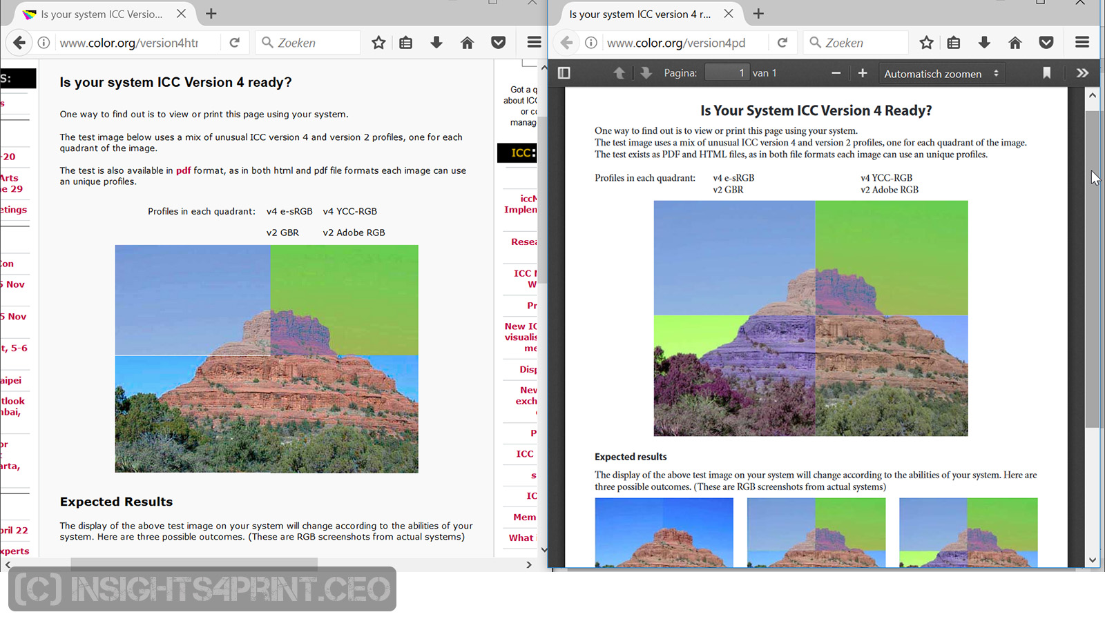
So that doesn’t look good…
If you don’t work on Windows, or use another browser, do this test yourself! It is mandatory if you are viewing color critical work in a browser, in the default PDF viewer in that browser.
(for your convenience, here are the links again: HTML version, PDF version)
And at this level it can become very confusing, or interesting, depending on your point of view. Take my smart phone, which runs Windows Phone 8.1. The OS does support ICC color management, if I open the HTML version of the test file, it is shown correctly. If I open the PDF version with Adobe Reader, it is not shown correctly. If I save the two ‘test images’ from the HTML version and open them in the image viewer, it seems that also the image viewer does not support ICC color management. So it really is complicated…


Test ICC support it yourself!
If you want to know if your favorite app supports ICC color management, go to the test page of the ICC and do test it yourself! And that PDF can also be used to check if your printer support ICC color management…
The environment…
And then there is one more thing… the environment, the viewing conditions. There are a number of ISO standards that are relevant to judging color on a monitor. The most important facts about them can be found in the Mediastandard Print 2016, which is published by BVDM, the German printing industries association. See chapter A.3.1 ‘Monitor proof’ (page 17) .
Color is important in the printing industry. But the tools to view that color are not created equal. If a designer views his beautiful design on a monitor that is not capable of reproducing the ‘real’ colors in his design, the print job will look different. And that will lead to a lot of discussions and extra costs. Using a smart phone or tablet as a color reference is a dangerous thing. Unless you are really 100% sure that it does cover a wide gamut (AdobeRGB) AND it is calibrated AND the app that you use supports ICC color management AND the brightness is at the right level. So: it’s complicated.
PS: if you are not that familiar with ICC color management, you might want to read my tutorial on color management.
Good stuff !
Amazing to me folks go cheap in displays for color critical applications
Thanks! 🙂