

When designing a brand logo, you want it to reflect the brand, its values. And you want it to reflect these values every time the brand logo is reproduced. So you think about form and color. And maybe, at the end, about printing that logo. Which is not ideal: you should think print from the start! I’ll explain why and how.
CONTENTS: First the why | Different ICC profiles = different conversions | Designing for stability and predictability | Small % = ‘dirty’ color | Unconditional faith in algorithms or ‘seeing is believing’ | Fewer channels = higher consistency | Get candidate colors printed | Design in CMYK! Exchange those ASE files! | Why is this important? | Disclaimer
IMPORTANT UPDATE (03/11/2022): if you care about brand colors, check the new Project BBCG – a Better Brand Color Guide!
First the why
If you are designing a brand logo, you should take into account ALL the possible uses for that brand. If the brand is a FMCG (fast moving consumer goods), it will probably be used on packages, in advertising. And that’s where it becomes interesting (or complicated, whichever you prefer). Not all substrates are equal, not all printing technologies are equal. A brown cardboard box is not the same as a glossy foil. A rather rough newspaper is not the same as a glossy coated magazine. And technology wise: a flexo press (e.g. cardboard packaging) is not the same as an offset press (e.g. brochures).
In some cases you probably want to print the brand color(s) as a specific ink, a ‘spot color ink’. This is very common in packaging printing. You can even see it on the package: you will see to small squares or rectangles (‘control strips’) somewhere on the package that will show you the different inks used.
In other cases, however, you don’t have a choice: you will need to print it with the 4 colors that are available on that press: CMYK (cyan, magenta, yellow and black). With advertising in magazines e.g. you won’t have a choice: it will be in CMYK. When printing brochures you might get a choice: either CMYK or CMYK + your brand colors, but that comes at a higher price…
Some ‘spot colors’ are very hard to reproduce in CMYK, they will look quite different in that magazine ad. That is the reason why some colors are not used as brand colors.
Different ICC profiles = different conversions
If you want to convert something (a photo, artwork in RGB, spot colors) to CMYK, we are talking about color management (in case you are not familiar with color management, please check this tutorial I wrote, specifically for brand owners and designers).
As you probably know, you can use different ICC profiles for converting to the same destination, e.g. a coated paper. From a conceptual and mathematical perspective, they will all give you a ‘perfect’ conversion. In reality however, these can be slightly different and might behave different when being printed.
The most pronounced example is a gray in RGB, e.g. R100 B100 G100. With one ICC profile (Coated FOGRA39) this will be converted into C 56%, M 46%, Y 45% and K 34%. With another ICC profile for the same type of paper (Coated FOGRA39L VIGC 260), this will be: C 35%, M 29%, Y 28% and K 57%. But, since it is a pure black, I could also – manually – choose to only use the K-channel in my artwork. A 75% K is the same color. And that will be much easier to print: you won’t get color shifts, which will be a risk with the other two conversions, since they use 4 channels (C, M, Y and K).
So if you want to convert a spot color to CMYK, for that magazine ad, you can get different values with these different profiles. And now I hear you: “But there are CMYK values in the Pantone guide!” Yes, there are. But I would be cautious with a number of them… Remember the different substrates, the different printing techniques? Well, there are some things you shouldn’t do: e.g. printing a 1% of a color in flexo, directly on a cardboard box. Both substrates and printing techniques can have their limitations. You should take that into account.
Designing for stability and predictability (aka: better safe than sorry)
Printing is not a lab environment. It is not even an exact science, it’s not only pure math and algorithms. Print works with natural products, print depends on multiple variables, even including temperature of the print shop, the printing press.
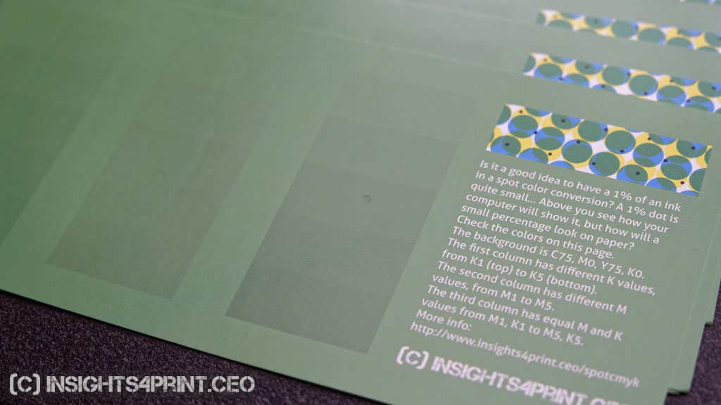
One of the properties of a print job that can change during printing, is ‘dot gain’. Which literally means that a printed dot becomes larger than the ‘ideal’, which you might have seen on computer screens. Or smaller, as dot gain can also be negative (dot loss). Let’s suppose you have a 1% of black in the CMYK version of your brand color, because it gives that little bit of extra twist on your screen compared to the 0% black. Well, chances are that the 1% will become darker than the 1%, even when printed on a coated paper with offset. And when it’s printed in flexo, on a cardboard box, it will probably disappear.
Not only the small percentages are delicate, also the high percentages are: a 99% will probably become 100%.
To be safe, you better avoid small and high percentages in a brand color conversion to CMYK. You better choose 0% for the ‘light’ colors and 100% for the dark colors. That 1 or 2% in offset, customers will barely notice the difference with 0% (ok, you and I, being experienced color viewers, we might see it, but the average shopper will not).
When your brand colors will also be printed in flexo, you should check it with your print suppliers what the lowest safe percentage is. Not the best they can do in optimal conditions, but what the safe choice is. And stay above this (in highlights) / below this (dark areas) when designing your art work. And yes: these percentages are also relevant for spot colors, not only converted colors!
Another property that can change during printing, is the ‘density’ of the inks, which relates to a thicker or thinner layer of ink. This will mainly result in changes in chroma and/or lightness, to a lesser extent in hue.
Small % = ‘dirty’ color
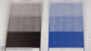
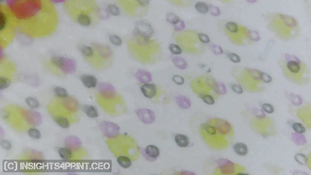
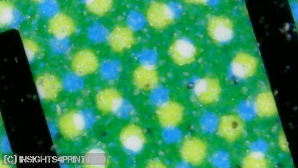
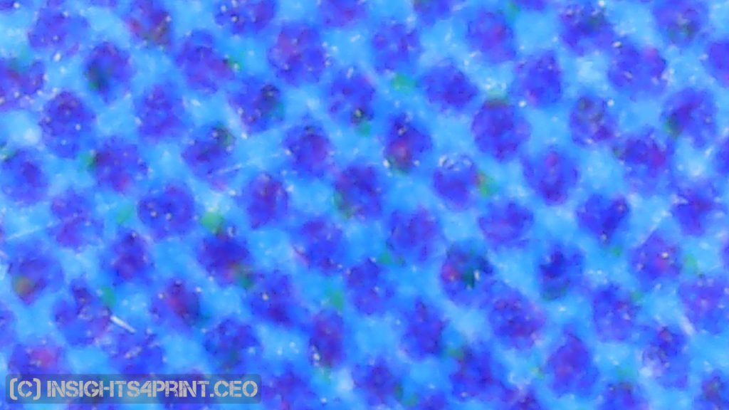
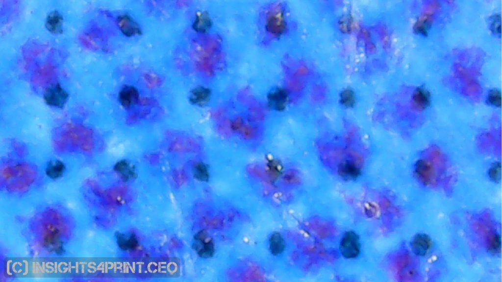
I admit, the following might be a personal thing… To me, a converted color with a small % in some of the channels, always looks ‘dirty’ to me… It seems there is something wrong. An office supplies company that sends me a folder on a regular basis, is a champion in that… Just last week I got a folder promoting their ink and toner deals, with large areas of C, M and Y. But they didn’t look ‘clean’ to me, so I checked it with a loupe and yes, the Y also had really small dots of C, M and K… And it was the same for C and M. Here there might be an ICC-based color conversion in play.
Below are two more pictures from real print jobs. The first is from a large sporting goods retailer, which has the following blue as brand color: C95, M45, Y5, K0. The second is from an online retailer, also with a kind of blue as brand color: C100, M30, Y0, K6. You can see what these look like in real life.
Unconditional faith in algorithms or ‘seeing is believing’
So here is the choice you have to make: do you want to have the closest colorimetric match to the ideal color, a color where machines tells you which is the best match? Or do you want a ‘clean’ color (no small percentages), which might have a larger color differences when measured, but which is more pleasing?
To me it is clear: I want a pleasing color for my brand! Not a dirty one, which would reflect on my brand image. But there are people who have an unconditional faith in algorithms. Just as a comparison: if your GPS/navigation system tells you to make a U-turn in the middle of the highway, do you obey without thinking? Or do you trust your eyes and wait to make the U-turn until the next exit? Seeing is believing. A pleasing color is better than a ‘correct’ color.
Now I have to admit: I used to have that unconditional faith… But over the years I saw examples and situations where it did not work properly. Which changed my view: in some situations, you need to take another road to get the best, most consistent results.
Fewer channels = higher consistency
If you can limit the number of channels used in the CMYK conversion, e.g. 3 instead of 4, this will make print production in real life easier and more consistent. With 4 channels (C, M, Y and K), small differences in the 4 different channels can get amplified, showing an undesired color shift. Therefor: 3 is better than 4, 2 is better than 3. If possible of course.
In a number of cases when you see a spot color conversion with 4 channels, it will have a small percentage in one of them. Is that really necessary? Can’t you get (more or less) the same color with 3 channels? When the small percentage is C, or M or Y, eliminate it and deduct that number from the other two and add it to K, you will end up pretty close. A little more tweaking might do the work. If the small percentage is K, then add that number to C and M and Y and you will again be pretty close. Once again some tweaking and you will get a color that will be easier to reproduce.
Get candidate colors printed
When you are evaluating multiple candidates for the brand colors, get them printed. Not a proof, a real print. In both offset and digital. This isn’t that expensive anymore: go to one of the online print shops and check the prizes for e.g. flyers. Make multiple variations of the ‘optimized’ spot color conversions on one page and get that overview printed. Use the same file for both digital and offset. Then you can check the colors ‘in real life’, the way they will be printed, not just on your screen.
In preparation for this article, I designed a test file and got it printed. 100 copies on a digital press, 1000 copies printed in offset (the minimum). This cost me less than a pizza for two, with a bottle of wine, in a decent Italian restaurant…
Design in CMYK! Exchange those ASE files!
Now that you have found the best CMYK conversion for your brand color, you’re almost ready for real production. But first a really important point that will make your life a lot easier: create custom swatches for use in the Adobe Creative Cloud applications (do this in CMYK Color Mode, not RGB Color Mode!). And save these, as an ASE file, so that you can exchange them with others. And do exchange them, with everybody who is designing for that brand. It will improve consistency in design, and therefore in production. And, if necessary, instruct others how to use these swatches, how to design for the brand.
The video below, from Lynda.com, shows how you can create those ASE files. Please note that they are creating the colors in RGB Color Mode, for our purposes, you need to use the CMYK Color Mode! Otherwise the colors will be converted with color management and you might get those low percentages we are trying to avoid… If necessary, make two different color swatches, one for web use, one for print use.
And when you start designing: design the artwork in CMYK and ‘preserve numbers’ when exporting the work to PDF, this will keep the CMYK percentages the way you designed them. If you apply color management to it, the colors will be converted and you might again get small percentages. So the whole exercise we just did will be in vain…
Why is this important?
When you are designing a logo, when you are picking the corporate colors, you have an idea what the brand value should look like. But you are working in kind of a lab environment. And the colors you choose, may not be that easy to reproduce in a newspaper ad, or a magazine ad. When taking into account a few limitations of print, when giving the necessary tools for designers (the ASE file), you can limit the deviations in the reproduction of the brand colors. And safe a lot of irritations. And reprints, which is beneficial to the environment…
BTW: if you need help with this kind of issues, you can contact me via the contact form.
Disclaimer: some people might not agree with the contents of this post. But be sure: it is based on real life experience, it is based on the print jobs I see around me. And the differences in opinion come down to these two points:
- do you have an unconditional faith in algorithms and technology? Or do you trust your eyes?
- do you design for the best print shops in town, with state of the art equipment (e.g. HD Flexo) and excellent standardized procedures? Or do you play it safe and make sure your design can be printed by print shops that do not offer that kind of quality level, consistency and standardization?
If you want to play it safe, my approach probably will deliver less issues with color consistency, so less arguments, less irritation and less reprints (which is also a plus from an ecological point of view). But again: some people might disagree. And for the record: I can’t be held responsible for any deviations in print jobs which are executed to the tips in this article.


Really helpful article! Thanks!
Hi Fero, happy you like the article!
This article was a great help to get clear some concepts of printing.
I am new to printing world, before that i used to make graphics for web only.
But had started learning and experimenting on printing colours since last 6 months.
Working in illustrator it is very difficult to find difference in spot colours and process colours.
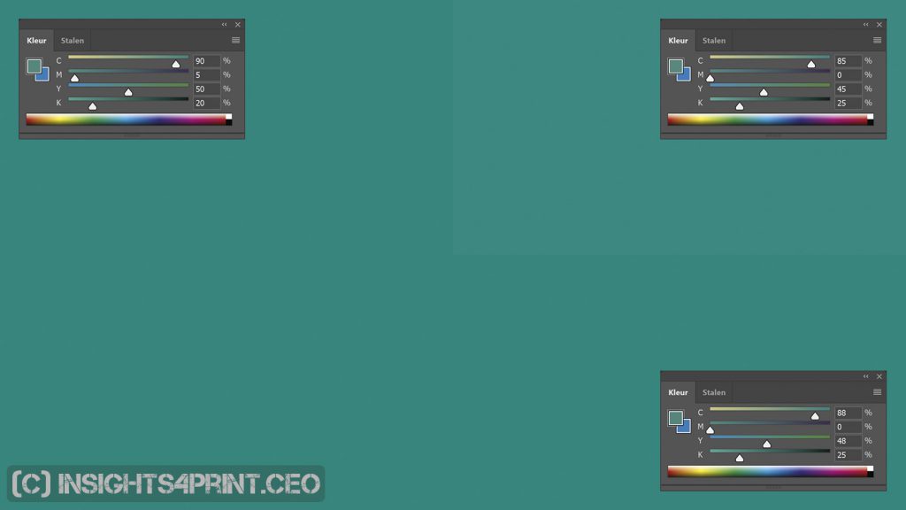
My brand colour has only 2 channels : C99, M0, Y70, K0. but to get the printed colour nearer to Pantone 334C have to use C86, M16, Y64, K02 which works quite well.
This made me think about adding little percentages to all clean channel would give better result then using lesser channels, but i am not sure of it though.
Thanks for your comment Angira!
In Adobe Illustrator (and Photoshop, InDesign, …) you won’t see any difference between spot colors and the simulation of that spot color in cmyk (on condition that it can be reproduced in cmyk).
The two cmyk values you mention, they look rather different (also the visual appearance when I check them in Photoshop). The one with only two channels looks very ‘pure’ and vibrant, the other looks darker and dirtier.
The Pantone 334C reference: is this an official Pantone guide? And if it is: how old is it? And even if it is rather new: there can be differences between different guides. I recently did a study on this: https://www.insights4print.ceo/2018/11/your-color-guide-and-you-first-results/
And how did you compare these values with the Pantone 334C reference color? Was this on your screen? Was this printed on an small printer? Or was this printed in offset? And was this just one print job or multiple print jobs? Because that is the idea behind this article: with those ‘simple’ simulations (using as few channels as possible), different print jobs (e.g. a few dozen) will be much more consistent. Depending on your budget, you could check this by ordering a small print job with both colors (e.g. a postcard in the smallest amount possible for offset printing) at five or ten different online print shops. You will probably see that the simple one looks rather consistent, the one with the four channels might look very different.
Adding small percentages to clean channels is not a good idea in my opinion: it will make the color less stable in printing. When comparing different print jobs with that color, you will get different colors.
Hello,
This was indeed a great topic. Sometimes we have things in practice but we do not know it.
Now i feel i was doing the right thing.
I have a question about getting good result in offset of Skins. i mean printing fashion mags and anything that include Faces or any skin in the image. Skin get grainy printing. Please refer me some learning materiel specific to skin tones printing.
I will be very very grateful.
Thanks Hasan!
And interesting question. Although I don’t know your complete workflow and how I should interpret the ‘grainy printing’, a few ideas. It could be the screening, it could be the RGB/CMYK conversion. From a project with the goal of producing ICC-profiles with a lower TAC (total area coverage), long time ago, I can remember that we first made both ‘large’ and ‘regular’ sized ICC-profiles (this was one of the option the profile creation software we used at the time) and when converting a large amount of images, including a lot of them with different skin tones. The ‘large’ files (about 5 or 6 MB, compared to 1 or 2 MB) contained a much more detailed conversion, which showed, e.g. in the skin tones. That’s the reason why we opted for the large sized ICC-profiles. So you might want to how your profiles profile, how different color conversion tools, color servers work.
And you also might want to post your question in a specialized forum, like PrintPlanet (https://printplanet.com/). There are a lot of very skilled people on that forum.
O wow, Thanks for your reply.
Sorry if i couldn’t make my point clear technically. Actually i have been a Web Graphic designer for 15 years and now i am new to PRint Media… just couple of years… not technically that strong yet… I do the prepress.
I want to Learn Printing….Do u think Forums is a better choice than book?
Please guide.
Ok, what you might want to check, is the online learning channel of PIA: https://www.printing.org/ilearning or the ‘print production training & tutorials’ from Lynda.com/LinkedIn Learning: https://www.lynda.com/Print-Prepress-training-tutorials/45-0.html Both might be a good starter.
A wonderful explanation — I shared it with a color-sensitive client for whom I’m designing a logo. Thanks!
Thanks Maria! Glad I could help! 🙂
Nice one Eddy. A concise explanation of a complex subject. Thank you for sharing.
Thanks for your nice comment Tim!