Brand color guides are flawed, ambiguous, and incomplete; studies have shown that. But what are we going to do about that? Well, here is the answer: Project BBCG, a Better Brand Color Guide. With the help of a few old and new friends, I’ve created a free framework for everyone to improve brand color guides. One that is rock-solid and will result in faithful and easy reproduction in print. A comprehensive tutorial shows the way, including how to share brand color definitions efficiently with ASE files and become completely independent of, e.g., Pantone libraries in Adobe CC. You can even try it yourself, with an example file! But first, many thanks to dr. Kai Lankinen for triggering me on this. And thanks to Henk W. Gianotten, Paul Sherfield, Hauke Liefferink, and Gary Courtney for the input and verification of the proposed method!
CONTENTS: #1: The very basic color definition | #2: Undefined RGB, CMYK | #3: Risks of automatic conversions | #4: Sharing brand colors | Why is this important?
When there are discussions between a print buyer and a printer, it’s usually, if not always, about the reproduction of a color. And this often leads to extra work, even reprints and waste. But very often, the root cause is the brand color definition itself. When checking brand color guides, these are very, very often flawed, ambiguous, or incomplete. And this is also the case with brand color guides from large corporations, with brand color guides created by large agencies. Studies in the past have shown this.
#1: The very basic color definition
The first point where it goes wrong is the very basic brand color definition. In most cases, a Pantone color is used. This is, however, NOT a good idea, you need an better alternative to Pantone colors. As I’ve shown before: the color you see in your printed copy of the brand color guide is probably not exactly the same as the one from your prepress house, your printer. And it’s probably not exactly the same color as specified in the Pantone ‘master’ database. Printed color guides are print products and have deviations compared to the original digital values.
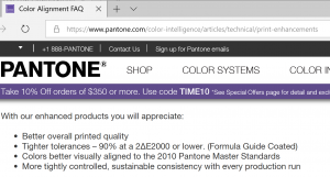
Pantone claims that about 90% of the swatches in their printed color guides (Formula Guide Coated) are within 2 dE00 from the master data. Which means 10% is outside that 2 dE00. Which ones? I don’t know, do you? That’s why I set up a test, with companies measuring 4 patches in their copy of the Pantone color guides. Here are the results of those measurements.
Recently, Gary Courtney told me he always has 10 current copies of Pantone guides in his shop. He was so kind to measure 7 of them. Please note: these were all purchased at the same time, and the measurements were made by the same person, at the same moment, with the same device. So, the only variable in this test is the Pantone guides themselves!
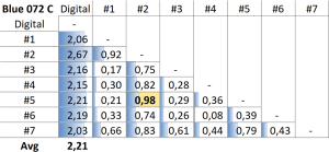
This clearly shows why you should never refer to a Pantone number as your primary brand color definition. The only alternative and rock-solid way to approach this is by measuring the color you saw, the color you picked! And when you include how you measured it, that is rock-solid. That is the way to go.
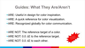
UPDATE 13/11/2022: I just retrieved this presentation from January 2020 by someone from Pantone, with the slide below on what Pantone color guides are, and what they are NOT… I wonder how many designers, brand owners, print buyers know this…
#2: Undefined RGB, CMYK
The next point where it goes wrong is ‘undefined’ RGB and CMYK values. RGB values don’t mean a thing, unless you mention which RGB: sRGB, AdobeRGB, or another RGB. And yes, that does make a difference. Just look at the image below! This is a screenshot of two documents in Adobe Photoshop, with the same RGB values, but the left one with an AdobeRGB profile attached, the right other with sRGB.

The same accounts for CMYK: unless you mention the ICC profile, the ‘print condition’, this doesn’t mean a thing.
#3: Risks of automatic conversions
A lesser know aspect where things go wrong, is the conversion from Lab or RGB to CMYK. Many people, if not most, rely on automatic conversions, e.g., in Adobe Photoshop. This is NOT a good idea for your brand colors. Contrary to Lab and RGB, there are many ways to reproduce the same color in CMYK. This depends on how ‘grey’ is created: you can either use a specific amount of Cyan, Magenta and Yellow, or you could use only black (K), or a combination of all four. And in most colors, there is a portion of ‘grey’.
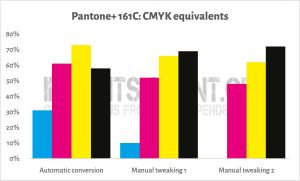
To give a visual example, look at the image below. This shows the conversion of Pantone 161 C to CMYK (PSO coated v3, relative colorimetric rendering intent). The left part is the automatic conversion. A printer will not be happy with that, nor will a print buyer: very hard to keep this consistent, since you have to control four inks (C, M, Y, and K) within very tiny margins. If even one of the colors (CMY) deviates a little, you will notice a color shift. In the middle part, I tweaked the color a bit, by lowering CMY and raising K. But I can go even further, as shown in the right part: I eliminated Cyan completely! This is a conversion that printers like! And print buyers will also like it since it’s much more stable in print. But it’s not a conversion you will get automatically, you will need some manual tweaking to get to that color. Don’t worry! It cost me about one minute to find the combination at the right! And in case you wonder, this is an old trick called ‘Grey Component Replacement’.

#4: Sharing brand colors
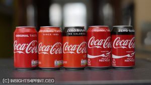
And then there is that last aspect: sharing the brand color definitions. In many cases, this will be done in a pretty ‘Brand Guide’, that most people probably won’t read… Unfortunately. Some companies even keep it a secret: Coca-Cola claims their red is their second secret… That’s not a good idea if you want a consistent brand color reproduction… (the original article on this was removed from the Coca-Cola website, this is an archived version of that page)
However, there is an extremely easy and powerful way to share brand colors with designers, creatives, … There is a little gem in the Adobe Creative Cloud applications: ASE files (Adobe Swatch Exchange). This makes it so much easier to pick the right color, to exchange colors. It is only a minor time investment (a few minutes!), but it will significantly improve the faithful reproduction of your brand color! In the Project BBCG tutorial, I explain step by step how to create and exchange those files. There is even an ASE file with the insights4print brand colors for download! Check it, and try it yourself! Sharing ASE files is a much better alternative than looking up colors in Pantone libraries in Adobe CC.
BTW: these ASE files can also be used in some other applications, like Affinity Designer, Photo, and Publisher.
Go to ProjectBBCG.guide and check the tutorial, check the example Better Brand Color Guide I created for my insights4print Orange, and check the ASE file. And above all: do share this with brand owners, designers, agencies, prepress houses, printers, educators, …
Why is this important?
Many, if not all, discussions between print buyers and printers relate to color reproduction. And this can often be tracked down to the very basic brand color definition, which is often flawed, ambiguous, or incomplete.
For the record, I’m not pointing fingers: there was no real guide, template, or instructions on creating a rock-solid, unambiguous and extensive brand color guide that also focuses on reproduction in print. But now there is: Project BBCG.
Project BBCG provides all the information and tools to create a Better Brand Color Guide, to exchange that Better Brand Color definition with all people involved. The time is now to adopt this approach! It will improve brand color reproduction, and, eventually, your bottom line. And you don’t have to believe me; check what the experts that provided input have to say about Project BBCG!
PS: this is the press release announcing the launch of Project BBCG.
UPDATE 16/04/2023: the Project BBCG tutorial is available in the following languages (in alfabetical order of the language codes):
- Deutsch (German) – translation by Claas Bickeböller (MYIRO – Konica Minolta Sensing Europe)
- English
- Español (Spanish) – translation by Ferran Peñalver (Litografía Rosés)
- Français (French) – translation by Anthony Martin (MYIRO – Konica Minolta Sensing Europe)
- Bahasa Indonesia (Indonesian) – translation by Clara Averina (Mega Putra)
- Italiano (Italian) – translation by Denis Salicetti and Manuel Trevisan, in collaboration with COMUNICO ITALIANO.
- Nederlands (Dutch)
- Português – Portugal (Portuguese – Portugal) – translation by Vítor Pedro
- Português – Brasil (Portuguese – Brazil) – adaptation by Bruno Mortara
- Svensk (Swedish) – translation by Lukas Engqvist (Brobygrafiska)
- Türkçe versiyon (Turkish) – translation by prof. dr. Bilge Altay (RIT)
- 中文 (Chinese – Simplified) – translation by Petros from WeChat channel ‘Printingnews’
- Chinese – Traditional – translation by Fred Hsu (Idealliance Taiwan)
Is your native language not listed yet and do you want to volunteer for the translation? Please get in touch!


Be the first to comment