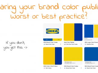
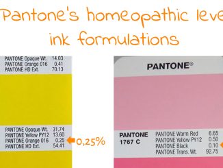
Brand colors are extremely important for companies. They represent the companies identity. Faithful reproduction is mandatory. However, there is more to it than most people are aware off…

Best Practices
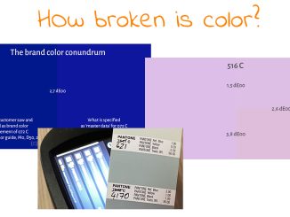
Monitors: is sRGB still standard?
Last year, I got a new monitor at work, a 4K monitor, nice! My regular job (the one that pays the bills) is not in the printing industry, so ‘color’ is not at the top […]