

In a recent discussion on LinkedIn, someone said that Project BBCG is a good system, but only for tech-savvy designers. While I agree with the first part, I strongly disagree with the second: it’s even the opposite! Plus, the tech-savvy part – which only has to happen once – offers printers and prepress houses opportunities. They have the expertise to make the lives of designers easier and brand color reproduction more predictable, in a straightforward way… Join the growing Project BBCG movement!
Contents: Creating Better Brand Color Guides | Using Better Brand Color Guides | Why is this important?
Creating Better Brand Color Guides
Project BBCG, and every brand color guide BTW, has two parts. The first is building that brand color guide, and the second is using the instructions in the guide to create documents and print jobs containing that brand color. The first part might indeed be a bit tech-savvy. In the case of a Better Brand Color Guide, you need to know how to make a color measurement and how to create a better transformation to a specific CMYK profile. Plus other elements that might have an important influence on color reproduction (e.g., the use of coatings or special paper types).
This is BTW where it often goes wrong: people without sufficient, without the proper knowledge creating brand color guides that are flawed by design. That’s why we created Project BBCG – A Better Brand Color Guide, and the tutorial to explain color, color identification, and color reproduction.
And here are the opportunities for printers and prepress houses: assist designers and brand owners in creating rock-solid brand color guides, in building Better Brand Color Guides! And this is nothing new, some companies have done this already for a long time. E.g. my friend Gary Courtney, Technical GC and Training at DagwoodLinnetts, a company that specializes in quality print, mock-ups and prototypes for the advertising, design and packaging industries: “Project BBCG brings together important technologies and best practices which we have advocated for years, along with some additional rock-solid approaches to brand colour standards all in one clever package.”
Using Better Brand Color Guides
In a perfect world, where all brand owners have created a Better Brand Color Guide and the associated tools (ASE files), a designer’s job will not be very different from their current workflow. It might even be slightly more straightforward, and less error-prone. When brand owners make their brand color definitions available as ASE files, one of the basic components of the Project BBCG approach, designers only need to import those ASE files into their Adobe CC applications, or other applications that support ASE files. When done, the brand colors will show as a new color library, including all colors in the ASE file. Look at the different colors in the ‘insights4print’ library!
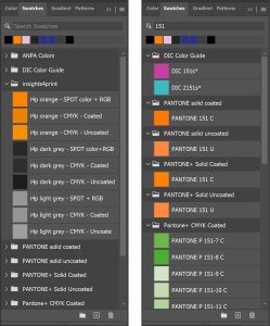
In the old workflow, designers will probably have to search for a specific color in a specific generic color library, e.g., a Pantone number in one of the Pantone libraries. This can be more complicated than it seems: you need to pick the correct library (especially if you still have the old ones in your system…), and search for the right color. In my insights4print library, you only have to pick the right color (e.g., orange), for the proper use (spot color). Easy, isn’t it?
Why is this important?
Every change is difficult, change management is often the reason why innovations fail. But changing from the old, flawed use of brand colors to the Project BBCG approach is not that difficult. Once you have tested it, it will become apparent that it’s an improvement! Import the insights4print ASE file and check it out!
Defining that Better Brand Color Guide might require a bit more attention. But current practices deliver flawed brand color guides, which can lead to a lot of issues later on, even with every print production. Printers and prepress houses should grab this opportunity and help designers and brand owners to create Better Brand Color Guides. It is not only a business opportunity, it will also eliminate issues when reproducing that precious brand color. Talk about Project BBCG to customers! Especially with those customers you had issues with reproducing their brand colors. You can download a presentation for free!
And don’t forget: the Project BBCG framework is based on tools you already have, no extra licenses needed!
PS: the Project BBCG tutorial is available in the following languages (in alfabetical order of the language codes):
- Deutsch (German) – translation by Claas Bickeböller (MYIRO – Konica Minolta Sensing Europe)
- English
- Español (Spanish) – translation by Ferran Peñalver (Litografía Rosés)
- Français (French) – translation by Anthony Martin (MYIRO – Konica Minolta Sensing Europe)
- Bahasa Indonesia (Indonesian) – translation by Clara Averina (Mega Putra)
- Italiano (Italian) – translation by Denis Salicetti and Manuel Trevisan, in collaboration with COMUNICO ITALIANO.
- Nederlands (Dutch)
- Português – Portugal (Portuguese – Portugal) – translation by Vítor Pedro
- Português – Brasil (Portuguese – Brazil) – adaptation by Bruno Mortara
- Svensk (Swedish) – translation by Lukas Engqvist (Brobygrafiska)
- Türkçe versiyon (Turkish) – translation by prof. dr. Bilge Altay (RIT)
- 中文 (Chinese – Simplified) – translation by Petros from WeChat channel ‘Printingnews’
- Chinese – Traditional – translation by Fred Hsu (Idealliance Taiwan)
Is your native language not listed yet and do you want to volunteer for the translation? Please get in touch!

I suspect it might have been me commenting that users need to be technically savvy to use the BBCG system in their work.
However “technically savvy” may be a bit of an overkill. The designer has to be organized and able to follow simple instructions when preparing their job. They need to have basic understanding of icc colour management – i.e. what icc profile to use for each type of job and last but not least, the designer or the design agency has to be willing to take responsiblity for the brand colours of their customers.
If it were up to me I would recommend that all students of Graphic Design and Prepress worldwide should be taught how to use the media neutral SMS colour palettes for starters (icc colour managed colour palettes, ready to use) – and how to convert them from the screen native sRGB colourspace to CMYK as well as the BBCG approach for exchanging colours in .ASE format. Professional designers can easily learn how to use both SMS colours and to use your approach to brand standards in one day, if they are willing to learn new things and take responsibility for their brand colours by the horns.
The purpose in both cases is the same – i.e. to teach basic colour management to designers and prepress people and to improve and simplify brand standards to make clear what version of the colour should be used for each occasion – to prevent mistakes and massive colour fluctuations from one media to the next.
I know we don’t agree on the importance of keeping brand colours absolutely consistent from one media to the next, but I think we agree that the state of brand colour definitions as it has been for the past decades doesn’t cut it and is in fact a recipe to disaster, if colour consistency was ever the plan.
I sometimes wonder if some designers and perhaps also their professors/mentors PREFER a certain level of inconsistency in their brand colour definitions to avoid complaints from customers – strange as that may sound. The idea here would be that if ALL brand colours – even Coca Cola Red are subject to colour variations depending on the media, no one is responsible – it’s just an unavoidable part of the game. Then there are the good old argument s “This is the way we have always done it” and “Don’t fix it if it ain’t broken”. Well… it is broken.
I suggest we leave it up to each user to decide whether he or she wants ABSOLUTE colour consistency – a-la Spot Matching System (www.spotmatchingsystem.com) – or just an improvement to the way they keep track of their brand colours – or a mixture of both – using SMS colours for base design and your approach to keep track of each variant using the .ASE format for exchange of the colours. SMS colours anyway need to be added to colour palettes in Indesign or Illustrator or whatever, before you can start using them – see http://www.spotmatchingsystem.com/gettingstarted, so we are on the same page. The .ASE format works well for exchange and every designer can use it today.
Your BBCG approach on how to write brand manuals is for sure an improvement – and current brand owners (i.e. their design agencies) can start using it today without changing their old brand colours (while in the case of SMS colours the old colours need to be replaced with SMS colours enabling the use of one colour for all media v.s. one colour pr. media).
In any case it is my opinion that your BBCG instructions are a big improvement to current brand specifications and should be added to the curriculum for students of Graphic Design and Prepress worldwide – and Design agencies should use it when setting up brand manuals for their customers to make reproduction of the colours easier and more straight-forward in all industries.