

You may have seen some posts on LinkedIn about the latest Pantone guides, about issues with those guides. Many people shared pictures of differences between old and new guides, we discovered homeopathic-level ink formulations (which ink manufacturers call ‘absurd’). Some colors share the same ink formulation… (yes, really) But it’s not only Pantone: when you look closer, maybe our entire color flow might be broken… Again after discussions with dr. Kai Lankinen and my other friends, I’ve taken a closer look at some aspects.
CONTENTS: Color is critical | Measurement modes | A round trip, that isn’t round | The measurements | And more… | When going to print… | What now? | Why is this important?
As you know, for print buyers, ‘color’ is critical, that’s the characteristic on which they will approve, or reject a print job. Sometimes that rejection is based just on vision, sometimes on a flawed brand color definition, or maybe even just because they can reject it. So ‘color’ requires a solid approach. And that’s much more difficult than you might think. All the discussions on LinkedIn over the last few weeks clearly showed that.
Let’s start the list with the ‘references’ and the primary brand color description. Brand color guides are flawed, I’ve reported on that in previous posts. The printed Pantone color guides of a designer and a printer can be 4 dE00 apart, and both be within the tolerances set by Pantone… Nice start.
“Oh, but the guides are not the reference, the master digital data are the reference!”, that’s the reaction I get a lot when complaining about differences between printed color guides. That’s indeed the official narrative, but all those people seem to forget one thing: the brand owner, the designer who picked the perfect color for his brand, his customer did NOT see that master data. They saw the color in the printed color guide. And he picked that color in the printed guide, not the color from the master digital data.
To make it very concrete, my friend Gary Courtney measured several patches in 7 of his 10 copies of the Pantone color guides last year (v 2022). One of the patches was Blue 072 C. In all cases, the measured values were outside that 2 dE00 tolerance. As he compared the colors to the master digital data (v4) in D50/2°, M0, he noticed that one of his books had the measured value of 14,96 / 37,16 / -70,73. Which is 2,7 dE00 different from the master data. And this might still seem a bit abstract, so let’s look at those two colors…
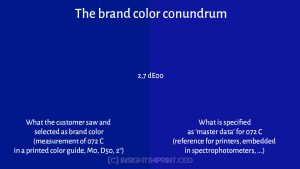
The left blue is the one that the brand owner, the designer saw in a printed color guide and has chosen as the PERFECT brand color. But when using the Pantone-way, the right color is the color that will be communicated as the brand color specification: the Pantone master digital data. This is fundamentally wrong. Brand owners should not be forced to comply with the Pantone definition of their perfect color!
And there is a simple solution: use the measurement of the chosen color as the primary brand color specification. Simple and solid. Check out Project BBCG if you want to know more about it.
BTW: this is not just a Pantone problem. This is a problem with every printed color guide! There will always be deviations between the ‘master data’ (or whatever others will call it) and the printed color guide (which many brand owners, designers will consider as the reference). It’s a print job, which has tolerances.
Measurement modes
Now I do have to admit: the devil is, of course, in the detail. And the little devil in the case of measurements is the chosen measurement mode… There are 4: M0, M1, M2, and M3. M0 is the legacy mode, based on a limited light source: standard illuminant A, with a color temperature of 2856 K (like the old-fashioned light bulb). M1 is the preferred way. This uses a D50 light source, just like you will have in your viewing booth, at the press console. M2 uses the same light source, but cuts the UV part. This will eliminate the effect of Optical Brightener Agents (OBA) in the paper. M3 is similar to M2 but also uses a polarization filter, which will eliminate the gloss of wet ink. This is the ‘offset printers mode’, for measuring wet ink. Unless you really know why you should use another mode, M1 is the preferred way, this is also the way FOGRA advises you to use.
And then it gets confusing… Or interesting, if you like.
So, the way to go is M1. That’s also what is reflected in the latest ICC profiles at the ICC profile registry; If you check the characterization data that the profiles are based on, you will see that data like FOGRA51/52/55 are based on M1 measurements. So, if you define a color in, e.g., Adobe Illustrator (a package design), that will be based on M1 color data.
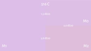
Now, guess what… the Pantone libraries in Adobe CC applications are NOT M1 data, these are M2 data… Which can be slightly different, or even a few dE00… This article by prof. Abhay Sharma from Ryerson University shows which measurement mode is used in these Pantone libaries, plus a nice example of the differences between the measurement modes: 516 C.
Look at the picture below, which visualizes the values of 516 C in the different measurement modes. And pay special attention to M2, the one used by Pantone in Adobe CC applications: it’s 3,8 dE00 off from M1… And keep as I already mentioned above: all recent ICC profiles use M1 values.
To make it even more complex: when checking the manual of the X-Rite ColorCert QA software, it seems that PantoneLIVE libraries used in that tool include M0, M1 and M3, but not M2… While the libraries in Adobe CC applications will only show M2. Confusing, isn’t it?

Added 09/04/2023: And to make it even more confusing: PantoneLIVE is based on M0, You can check all the different PantoneLIVE dependent conditions on this page and check which measurements were used.
The values of the Pantone libraries in Adobe CC applications are M2: UV cut. But guess what: the Pantone color guides (the physical product brand owners, designers use to pick their perfect brand color) are printed on paper WITH optical brighteners… What the brand owner, the designer sees with his own eyes when looking at it in a D50 viewing booth is M1, not M2. [sigh]

And if you think it can’t get any more complex, please check the properties of the paper on which Pantone prints the ‘on demand’ samples: optical brightener-free paper… Put an demand sample next to the same color in a color guide under a light source that has a UV component and you will see something different.

Once again, this shows why we need a different approach: measure the chosen color and use that measurement data (including the measurement mode used) as the primary color definition. The ‘Better Brand Color Guide’ that Project BBCG describes includes the measurement mode used to avoid mistakes.
Added 29/05/2023: With the shift to move away from fluorescent light sources, most light sources don’t emit UV anymore, turning OBA useless. And that makes it more complicated, in that case the M2 measurement would be more appropriate. For that reason, in those cases when all people involved are knowledgeable about M1 and M2, it might be advisable to mention both M1 and M2 measurements in a brand color guide. With M1 as the default (especially when designing in CMYK), and M2 for OBA free applications, and only for those people who know when and where to use it. If you have remarks about this: please leave a comment! It’s a discussion we need to address.
A round trip, that isn’t round
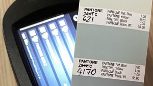
Recently Hauke Liefferink, managing director of Acme Graphics Ltd, posted a small, interesting experiment on LinkedIn: he measured a few patches in a Pantone color guide and asked his spectrophotometer (X-Rite eXact) to find the nearest Pantone color. That should be an easy exercise, isn’t it? Pantone is owned by X-Rite, the X-Rite devices contain the Pantone libraries, this kind of ‘round trip’ should be a piece of cake! What could go wrong?
Well, he got quite different suggestions from the spectrophotometer… See the image from his post.
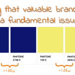
What went wrong? Well, there could be a rather simple explanation for this: the printed color guides have a higher deviation to the master digital data than the different colors are apart. And that’s a fundamental issue. I already discussed this in a previous article, e.g. Pantone 2747 C and 2748 C are only 0,6 dE00 apart, 100 C and 3935 C are even closer: 0,25 dE00… With an official tolerance aim of < 2 dE00, that doesn’t make any sense, don’t you agree?
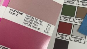
And when you think things can’t get any more complicated, check out this LinkedIn post by James A. Wallace. He made an ”X-Rite SpectroProofer certified proof” of Pantone 7633 C and put it next to his copy of the printed color guide. That’s not even close… That’s a double digit dE00, possible even over 20 dE00… [sigh]
The measurements
If you want to know more about the different measurement modes I discussed above, the major vendors of spectrophotometers all have nice information about them: Myiro, Techkon, and X-Rite.
The measurement mode can be set in most spectrophotometers, the only exception I’m aware of is the cheapest spectrophotometer, the Variable Spectro 1. Based on tests by Chromaxion, we can conclude the light source conforms to M2.
Talking about that Spectro 1, there is another element that is also different from other spectrophotometers used in the printing industry: geometry. This is how the light falls on the sample and how it is measured. The standard way is 45/0 or 0/45. The first number is the starting point of the light (in degrees), and the second is where the light ends up, so where the measurement is taken (more on this). The Spectro 1 uses diffuse lighting. If there is a difference and how big this is, I don’t know. If anyone has tested this, please leave a comment and share your findings!
Next to the measurement mode, there is also an important setting on your spectrophotometer: the delta E calculation… There are different methods to calculate a color difference, delta E 2000 is the formula we use these days, but you might still be able to set a different formula in your spectrophotometer. And I’ve seen issues with that: using the wrong formula without knowing it.
And more…
Spectrophotometers (individual devices) are not perfect. In the past, in certain conditions, you could see repeatability issues. I once did a test, first job on a Monday morning, in winter time: it took about 10 or 15 measurements before the (high-end) spectrophotometer became stable… Repeatability should be OK with recent devices, but you can have differences between two devices of the same type (inter-instrument agreement), between two different types of devices of the same brand, and between devices of different brands…
A long time ago, I had some fun getting this tested. And in one printing company, we found a large deviation, close to 4 dEab, between two high-end devices, the same brand, the same type, purchased at the same moment… The cause: the one with the high deviation was used in the printing department and the optics were dirty… Maintenance can be an issue.
When doing color transformations, there is also a ‘color management module’ (CMM) involved. And different CMMs can give different results. If you compare Adobe Photoshop with GIMP, the first one uses it’s own CMM (or the one from the OS), GIMP uses the Little CMS CMM. There can be differences, but probably not that big, not to the extent that James A. Wallace saw.
When going to print…
When going to print, multiple factors will influence the final color, factors which can break color in this part of the process. I’m not going to go into the tiniest detail, that would make this article way too long. I’ll touch on some points, there are probably many more.
- Deviations in the substrate: an often forgotten factor is the substrate. When looking at the applicable ISO standard, you will see that the substrate can already have a tolerance of a few dE00, without even having ink applied to it.
- Rough substrates don’t treat fine dots very nicely. The dots might get broken or gone.
- The feedback loop while printing: you will always see a slight, or longer, delay between the measurements and the effect of adjustments that have been applied. In the case of a sheetfed inkjet press, that will be a few sheets. In the case of offset printing, that will be much more than a few sheets… Due to the construction of the ink feed, it will take some time before the adjusted amount of ink has reached the substrate. There are ideas for new kinds of ink feed, but press manufacturers seem reluctant to adopt these, despite positive test results.
- When printing in flexo, ink deposits in the anilox rollers might influence color reproduction. When not sufficiently cleaned, some dried ink residue can be built in the cells of the anilox rollers, reducing the amount of ink and influencing the color.
- Coatings and laminates: we see more and more coatings and laminates begin applied. But are these neutral? Or is there a (slight) color shift when applied?
- Ink can shift color during drying, fresh ink can be contaminated due to improper cleaning of the previous inks from the inking unit.
And even after a product has been printed and finished, some factors can influence the appearance of the color: the light in which the print is being ‘consumed’… And no, you cannot make the entire world switch to D50 (or D65). It’s a fact of life, of nature: the sun changes color temperature throughout the day, the year, depending on the weather and the location on earth. Standard light is something artificial (but very useful, even necessary in specific conditions).
BTW, talking about looking at print: how many printers, print buyers take ISO 3664:2009 into account when doing a press check? E.g., article 4.1.5 Ambient conditions: “The visual environment shall be designed to minimize interference with the viewing task. (…) In addition, no strongly coloured surfaces (including clothing) should be present in the immediate environment. (…)” (bold is mine)
What now?
Relax… I know, you might have become stressed with all those issues, but let’s relax. Especially on the idea that color reproduction should always be within a tiny tolerance. (*) I’ve examined many studies and found NO evidence that tiny color deviations matter in FMCG or similar print jobs. The infamous quote “color enhances brand recognition by 80%” is on color versus black/white in newspaper advertising. It is absolutely not on small color differences in print. Also, our color memory is very flawed, check the Coca-Cola red memory test. Also scientific tests have confirmed this, even when comparing two colors that are next to each other, our color memory is flawed! (yes, really) Plus: our brain plays tricks on us, e.g., in the 3-dimensional setting of the real world, and with colored backgrounds. And a final one: the amount of time consumers spend on judging a packaging in a supermarket is, on average, less than a second. Coca-Cola red? One-tenth of a second. Try doing a press check in one-tenth of a second…
What we should do, is eliminate the variables that we can easily control. And let’s start with that brand color definition: measure the original color patch that was chosen as the brand color and use that measurement as the primary brand color definition. Measure once, and communicate this measurement. Via ASE files, for instance, for all involved in design. And via CxF files for demanding print production.
What we should also do, is educate all involved. In a way they understand the issues and possible solutions. This doesn’t mean you have to give all the scientific details, that will confuse many. It can be done in an easy-to-understand way, with lots of visual examples. That’s what we have done with Project BBCG – A Better Brand Color Guide. The tutorial, which is available in many different languages, offers a very solid, but accessible introduction to color and color reproduction. And the feedback from designers shows that: “Love it – very informative!”, “It’s a wonderful project, I really like the book, very simple to read and understand.”
Why is this important?
There is a strong tendency to control ‘color’ up to the smallest detail. But there are just too many variables that make this mission impossible.
So, let’s relax and get realistic.
Some researchers might freak out when I say this, but start by looking at the big picture: you cannot control many variables, including how people ‘consume’ print. Some tiny tweaks you are working at might be from a different order of magnitude than standard deviations in print (e.g., the plea to Adobe for two decimal places to define colors in Lab in Adobe CC applications… please, don’t…)
Focus on the fields where you can still make a lot of progress in predictable color reproduction with a minimal amount of energy. Don’t focus on areas that need a lot of energy for minimal progress, progress that will get lost in the rest of the process. This could mean: accepting a level of ‘uncertainty’, ‘uncontrollability’, and compromising on this.
Plus: we need to educate everyone involved, in a way that they get the message and can easily implement it. A printing factory is not a lab environment. The goal of a printing company is to output saleable print products in the most efficient way, with as little waste as possible. Some tricks that might work in a lab environment, will not be practical in a production environment.
(*) There are a few exceptions where tiny tolerances can matter. A typical example is wall- and floorcovering. Since, in that case, you will put different parts of the production run next to each other, tiny differences can be noticeable.
But even then, we should not forget the big picture: I once got a tour of a printing company that produces floor covering. During the tour, we visited the color lab. There were three samples next to each other: the original/reference, the first attempt, and the second attempt. The quality control manager said: “They still have a lot of work to mix the inks! This isn’t right!” But when I asked a bit later, when we passed a few barrels of varnish, how they check the color quality of that varnish: is it neutral, or will it provide a color shift, and will this be the same color shift as in previous runs? The answer? “We don’t check that.” [sigh]


try to use spectral curves and metameric indices, as a complementary resource in the validation of color correspondence. The use of Lab and dE values as the only measurement method is insufficient, from any point of view.
Thanks for your comment Carlos!
Spectral curves (wrapped in a CxF file) would be better, but then CxF should also be supported in design applications, like Adobe CC…
Given the breakup between Adobe and Pantone, here is a huge opportunity for Adobe. I’ve been suggesting that at least for over a year, in multiple articles.
Great article again. It’s important to mention the findigs of Abhay Sharma (Ryerson University Canada). Adobe using M2 data instead of M1 is dangerous in a workflow. Designers (and printers) should be aware of this.
Thx Henk!
It is indeed dangerous to mix the different measurement modes for brand colors.
But now the big question is: is this Adobe demanding M2 data, or is it Pantone pushing M2 data? I’ve asked Pantone this in a LinkedIn discussion, will update this comment if / when they answer.
But maybe this Pantone presentation from 2020 holds the key (slide 19, 20):
FAQ: Design Apps vs Guide Values
* Data for design applications: M2
* Data for production applications: M0
Hi Eddy, great article indeed, but let me say that the problem posted by James A. Wallace related to a “certified proof” that does not match at all the printed color guide, IMHO this must be something else. There is not enough information to know what the problem is. The color difference is too high. From the picture I can see that the color in the Pantone book should be OK, and the color in the proof is not OK, that’s for sure. First, we should examine the real data in the file that has been printed on that inkjet proofer, because maybe that color patch is not PANTONE 7633 C, and the real problem is just a typo on the text that reads PANTONE 7633 C.
We do a lot of proofing, and we have never seen something like that. But there are some things important to know that are related to your article, and the truth is that some people ignore. For instance, if we look at the GMGColorproof (no Opencolor profiles here), the Pantone libraries included use M2 values (by default). Maybe other vendors are in the same situation. The funny thing is that when the proof is verified with the ILS, the measurement mode is M0/M1. I have been told that the reason for M2 values in the database is simply because historically Pantone first delivered M2 values only, and these values are the ones used in Photoshop, so when prepress talks about Pantone they talk about these M2 values. In many cases the difference between M2, M1 and M0 is comparably small for the underlying material contains a very small amount of OBAs, so a verification using the “wrong” measurement mode nonetheless works.
But the truth is that using M2 Lab values as a reference is not a good start. We have found significant improvements when using M0 and M1 values. Luckily, GMG also offer the M0 and M1 values, and/or you can modify the Lab values manually, and/or use the GMG Spot Color Editor and/or use the integrated Spot Color Optimization wizard. Using this tools make a real change, all for good, and you can get very accurate proofs containing Pantone colors that will match your jobs on press. And when measuring using a spectro, and comparing the proofing samples with the Pantone Master data you realize that you are getting very low delta E, and it is not hard to understand that in many many cases you are beating the Pantone books !!
So, for me the Pantone guides/books are just a starting point to communicate a color, but has limitations and it is no precise. And it is a must that professionals like us need the knowledge of the processes and techniques in order to help our customers… let’s do not forget we have amazing tools available in order to make this happen.
Thanks for your comment and sharing your experience Ferran!