

Color is probably the main quality criterium when dealing with print. And lower deviations are better, leading to some people demanding, defending a delta E 2000 of 2 for brand colors. But this raises a few questions, among which what the reference is and how reliable that reference is. And how reliable are measurement devices? Which leads to what I like to call the chain of tool tolerances, or also the additionality of tool tolerances. Let me explain this, it’s rather important when dealing with high-quality demands for your brand colors.
CONTENTS: Delta What??? | What’s your reference? | The measurement device | Adding things up | Your Rules of Engagement | Enter CxF (and PDF v2) | One more thing… | Why is this important? | Updates
Delta what???
Before digging into the tools, I first need to explain something about how we identify, how we measure colors. Basically, most scientific systems identify color with three dimensions, so you can literally look at it as a 3-dimensional space. There are a few possibilities how to put numbers in that 3D-space, the most common is called CIELAB, or just ‘Lab’ for friends. The dimensions used in CIELAB are L for lightness, a for colors ranging from green to red and b for yellow to blue. The L, a and b axis look similar to the x, y and z-axis in a 3D model, with the L-axis being the vertical one.
CIELAB is the most often used color model in print. But there is also one alternative that has interesting benefits: CIELCh. The L-axis shows the lightness, just like in CIELAB, but C and h are quite different. The h represents the ‘hue angle’: a degree on a color circle, with 0° for red and 180° for green. The C represents the chroma: how intense the color is. A low number is relatively ‘dull’, a high number is a very vibrant color. And this shows the interesting property of CIELCh: you immediately see the kind of deviation: on the L-axis it is lighter or darker, if the C differs it’s duller or more vibrant and if the h differs, you have a different hue. And as you might have guessed: yes, there is a difference in how we perceive color differences between these three properties.
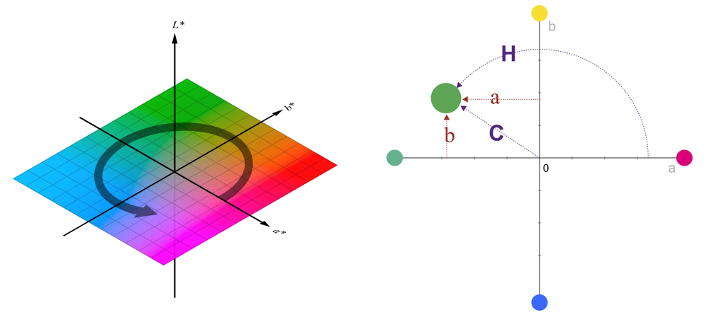
Now that we know how we can describe color, we can also measure color differences: delta E (or ΔE). That used to be a simple ‘Euclidian’ measurement in that 3D-space: take a ruler and measure the distance between the two colors. That’s dE76 or dEab. But depending on the direction of the color deviation, the same ‘number’ could be more, or less disturbing: our eye is more sensitive to deviations in hue than deviations in lightness. So clever people came up with newer ways to calculate that dE, which are more consistent with how we as humans perceive color differences. The method that is used the most in print is delta E 2000, or dE00 in short. It’s a complicated formula, so I won’t bother you with that. (I get nightmares when looking at this kind of formulas)
So: when talking about print specifications and tolerances it is of the utmost importance to specify which delta E formula is going to be used. You could compare it with the use of ‘dollar’. A US dollar is not the same as a Canadian dollar and certainly not comparable to a dollar from Zimbabwe. As an anecdote: I have a 20 billion dollar bill on my mantelpiece, which I bought it for 5 euro. It’s – unfortunately – Zimbabwe dollars.
What’s your reference?
Now that we know how we can define colors and measure colors, let’s go to the next step: the reference. That could be a print product from the past, a digital value or – very common – a number or name from a color guide like the Pantone color guides.
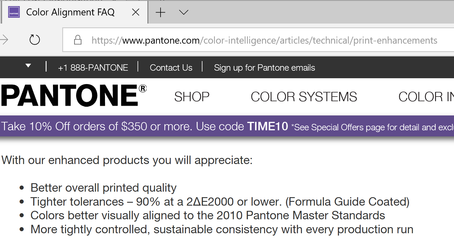
And now it starts to get interesting… If you have and use a color guide, you probably consider this as THE Reference, telling you THE Truth about a color. Well, that’s not entirely true. The ‘true’ Pantone colors, the ‘master standard data’, are digital values, which are at the center of their Pantone LIVE system. The colors that are printed in the color guides are implementations of these master colors. And as with all printing: there can (or better: will) be deviations. In the product description, which is more marketing than technical information, the tolerances aim is ‘less than 2 dE for 98% of the colors’. Now, this doesn’t include the type of dE, so let’s put this aside as just marketing talk.
More detailed information can be found in a blog post from May 2018 about the newest edition of the color guides. And, as the blog post states: “we are pleased to release our most color-critical Formula Guide ever!” Nice! It’s more color-critical than before. But how color-critical is that new edition? Well:
- “Tighter tolerances ~ 90% at a 2ΔE2000 or lower. (Formula Guide Coated)
- Colors better visually aligned to the 2010 Pantone Master Standards
- More tightly controlled, sustainable consistency with every production run”
In case this page is changed in the future, below is a screenshot.
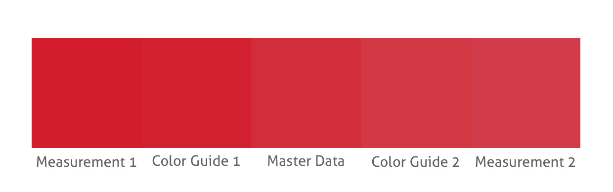
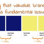
What does this mean in practice? That any color guide can differ 2 dE00 from the Pantone master standard, for about 90% of the Pantone colors. And here comes the tricky part: dE doesn’t show a direction, so the color guide of the print buyer could be 2 dE00 off in one direction and the color guide from the printer 2 dE00 in the opposite direction. Which adds up to a 4 dE00 between the two guides! So two guides could already have a 4 dE00 difference, but be in line with the tight tolerances that Pantone specifies.
And there is one aspect of printed color guides that is often forgotten: their lifetime. Depending on where you look, Pantone recommends to replace them annually or every 12 to 18 months. Some people think this is just a sales pitch, but it isn’t: paper turns more yellow, ink colors can change, color guides can get dirty. At this moment, I’m also conducting a small research on the use of Pantone color guides, which includes measurements of four colors. Please participate! The first results already look very promising…
The measurement device
We’ve already established that a color guide does not tell THE Truth, but how about measurement devices? Well, it’s complicated. First, not every color measurement device is created equal. There are colorimeters and there are spectrophotometers (here is a blog post that explains the most basic differences). For color quality in print, you should only use spectrophotometers. And not every spectrophotometer is the same: there are e.g. differences in how the light falls on the sample and the measurement is taken, how big the aperture is. So, you need to use the right tool for the right job.
And even two devices of the same brand, the same type can differ. Device manufacturers normally mention the ‘inter-instrument agreement’ of these devices in their product specifications. Let’s take a look at four common devices in the printing industry:
- X-Rite i1 Pro v2: an average of 0,4 dE94 and a maximum of 1,0 dE94
- X-Rite eXact: an average of 0,25 dEab and maximum of 0,45 dEab
- Techkon Spectrodens: 0,3 dEab
- Konica-Minolta FD-7: an average of 0,3 dE00
It’s, of course, unfortunate that these numbers are in different versions of dE, making it hard to compare them…
In the past, there have been a number of studies on this inter-instrument agreement. John ‘The Math Guy’ Seymour presented a paper at TAGA 2013 about these. One of the studies he reports on, is one that I set up six years ago, the execution was done by a student and one of my former colleagues. It was the first large-scale field test of spectrophotometers, other comparison tests were always with brand new devices. Over 20 devices were checked with the X-Rite Netprofiler chart. And it showed interesting stuff. The most significant: two identical devices in a printing company had a deviation up to dEab of nearly 4… The reason: maintenance. The one with the high deviation was the one used in the press room and it had dirty optics… And that’s the reason why maintenance and calibration are so important.
Here is another interesting one, a test by Techkon where they compared four different devices. Especially interesting is that they included the measurement data from 16 different colors.
Some people also state that you should take three measurements and average them, to have a correct measurement. In some situations even those three are no guarantee: a long time ago, in wintertime, we tested how long it would take on a cold Monday morning before measurements would be more or less stable. Guess what: it took about 10 measurements. It took that long before the device, and it’s light source, were warmed up…
To sum this part up: also measurement device have tolerances. They can be off up to 1 dE94 (for simplicities sake, let’s assume that this is more or less equal to 1 dE00). And once again this can go in two directions: so let’s suppose both the brand owner and the printer use an X-Rite i1 Pro v2, their measurements of the same physical sample could be about 2 dE00 apart.
Adding things up
One and one makes two and in this case: 2 dE00 deviation between ‘Pantone Master Data’ and the printed guide, plus 1 dE00 deviation between the ‘real’ color and the measurements (the inter-instrument agreement of an i1 Pro v2), adds up to 3 dE00 between the ‘perfect’ color and the measurement data. And since Murphy’s law always is around the corner, this could go in the opposite direction for the other partner in the production process. A simple calculation would add this up to a 6 dE00 between the readings of the brand owner and the readings of the printer, without any one of them making a mistake!
So this raises an important question: how can you demand a 2 dE00 if your references and measurement devices combined can be 6 dE00 apart?
(please note that the real calculations might be a bit more complicated than my simple addition)
Your Rules of Engagement
If you want small tolerances, you need to respect a few rules:
- Don’t rely on giving just a number or name from a color guide as a reference. Nor a digitally printed proof, which can also show deviations. You reference needs to be exact. Either a physical sample that is shared with the printer, or a digital (spectral) reference, which I will discuss later. The best physical sample is one that uses the real ink on the real substrate, but it should be created with care: manual ink drawdowns can be dependent on the operator and can be inconsistent… So using a more standardized printability tester is recommended. And it should have the right amount of ink, over the whole sample.
- Use only one (decent) measurement device, that is well maintained and frequently calibrated. If you use two or more devices (brand owner, printer), you need to add the double of the inter-instrument agreement to the required tolerances. When using two (or more) different measurement devices, you need to communicate how everything needs to be measurement: illuminant and illumination mode, geometry, aperture, filters used, backing. You can’t compare apples with oranges.
- Use the right dE formula: dE00. Other industries might prefer other calculations, but this is the one that’s used for printing. And it’s better than older versions (being: dEab and dE94).
Enter CxF (and PDF v2)
The most exact way to communicate a color at this moment, is by its spectral reflectance: how much energy is there in every wavelength. This is also the format that the master data of Pantone LIVE uses. And the nice thing is that this information can be included in a specific type of file: CxF, the Color eXchange Format. CxF can also carry a lot more information, which can be essential for the reproduction of brand colors. This presentation gives a good overview.
And with CxF, I should also mention version 2 of the PDF standard. Why? Because this one can include that CxF information. But be careful: PDF v2 is rather new and not everybody will support this, so you need to check this upfront with print providers! CxF has been around longer, but not every print provider knows about it, supports it. So once again, you need to communicate with the print provider upfront!
One more thing…
Well, two more things to be correct. First: paper also varies. When looking at the ISO standard for sheetfed offset printing (ISO 12647-2:2013), there’s a 4 dE00 between the upper and lower limits of the paper color. And that’s just the paper, without any ink on it. Also other kinds of substrate can vary.
Second: wet ink looks different from dry ink. Now, this might sound silly, but it isn’t. I know somebody who had a customer coming to a press check, signing off the sheet, but refusing it a few days later when it was delivered. Because it was looking different from what she saw, and liked, during the press check: the glossy wet ink.
Inks can also change color during drying. A former colleague once did a test with different magenta inks, printed on an IGT printability tester. He measured them right after printing and 24 hours later. One of the inks had shifted no less than 6 dEab.
Also in real life we once noticed this shift during drying. For a large print run the conformance to ISO 12647-2 needed to be checked. A few samples were shipped from the South of Europe by plane, these samples were (just) within the tolerances. When the rest of the job arrived, a few days later, the samples from that part of the print run were (just) outside the tolerances: it had shifted during the transport, during drying.
Why is this important?
Brand color quality is very important. And it’s probably the number one reason of disputes between print buyers and printers. But you need to take into account a series of rules when setting up tolerances when evaluating color quality. If you want low tolerances, it’s mandatory to follow very strict rules in this process!
PS: you might also like following, related articles:
Groundbreaking color study: 2 out of 3 see differences between identical packages, dE 6 won’t influence buying
Brand colors in real life: the Milka case
You can’t correctly remember an iconic color, not even Coca-Cola red
The uncertainty principle of visual color evaluations
UPDATE 14/11/2018: I got contacted by Danny Rich, who co-authored following paper: The Effect of Spectrocolorimeter Reproducibility on a Fully Color-managed Print Production Workflow, which was presented at the IS&T conference CGIV 2008. And he also saw a significant chain of tool tolerances.
UPDATE 22/11/2018: I just published the first results of the Color Guide tests. On average the deviation between the 15 measured guides and the ideal value was 4,5 dE00, with a maximum of 11,9 dE00. Which are well above the values that Pantone specifies in its documentation.
UPDATE 06/12/2018: earlier today Techkon USA published an interesting guide on device agreement and consistent color. It’s really worth downloading! It describes in a simple way a lot of relevant subjects: device accuracy, device repeatability, inter-instrument agreement, intra-instrument agreement and inter-modal agreement.
UPDATE 13/07/2022: Hauke Liefferink, managing director at Acme Graphics, shared something interesting on LinkedIn: when measuring the same patch on a white BOPP (‘wraparound foil’), but turning the device 180 degrees, you can get a 5 dE00 difference! The same patch, but a 5 dE00 difference… X-Rite has published a white paper on this subject, but claim the difference can only be about 2,5 dE00.
UPDATE 20/09/2023: When looking at the promo video for the new Nix Spectro L, I noticed they mention it has ‘𝗮𝘂𝘁𝗼𝗺𝗮𝘁𝗶𝗰 𝘁𝗲𝗺𝗽𝗲𝗿𝗮𝘁𝘂𝗿𝗲 𝗰𝗼𝗺𝗽𝗲𝗻𝘀𝗮𝘁𝗶𝗼𝗻’. So, I contacted my friends at Nix Sensor to ask for more information. It seems that inaccuracies due to temperatur changes can be up to 0,75 dE00, in extreme temperature ranges… That’s a lot… That’s why they added that automatic temperature compensation.
And it – again – shows that if you want tiny tolerances, your tools need to be up to the task! Mixing brands and types of spectrophotometers is a not a good idea, but also moving from a very hot to a cold room could influence your readings!
BTW: the Nix Spectr L is probably the cheapest spectrophotometer that offers also M0, M1 and M2 readings (about 450 euro). Check it out here!


Nice summary of a complicated problem Eddy! Stresses the need for tight procedures (at each juncture in the workflow), single instrumentation, and of course, spectral values are king!
Thanks Chris! Appreciate your comment! And there’s still a lot of work to do, e.g. on the education front. Including spreading the word on CxF.