

The publication of the groundbreaking color study did generate some attention. Especially my plea for a more realistic, less fanatic approach to color tolerances in real life seemed provocative to some. I e.g. got a mail from somebody who is quite familiar with Milka, stating they would never tolerate a dE of 3. Not having Milka candy at home, I headed for the supermarket. Here’s what I found.
In the picture below you can see the aisle in the supermarket. Specifically looking for color deviations, I first picked the one with the most vibrant purple (the large Milka Oreo, the far left in the bottom row) and looked for the one that seemed to have the highest deviation compared to the vibrant one. At first, I thought the one at the far right had the highest deviation. But when picking one up and comparing it to both the Milka Oreo and the one next to it, it became clear that the placement and lighting conditions were deceiving me (and all other shoppers): the second from the left (Milka Peanut Caramel) had a higher deviation! This already shows the most tricky part of the color evaluation in a supermarket: placement and light/shadow have a huge impact on the color perception. This environment is absolutely not comparable to the conditions of a light booth, of a press room.
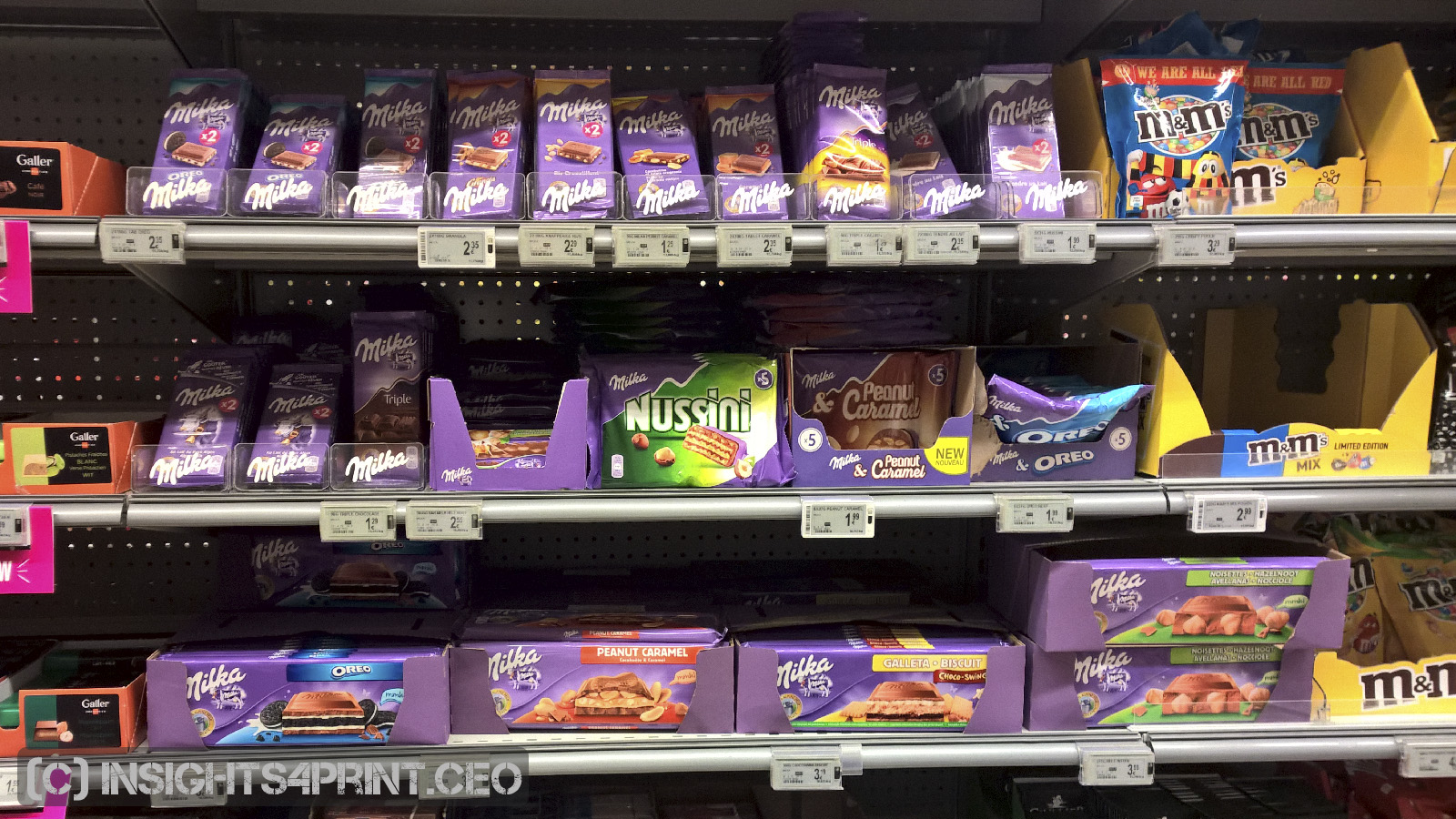
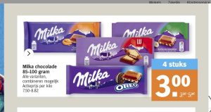
Eventually, I ended up with five packages of Milka products. Two large packages (Milka Oreo and Milka Peanut Caramel), a small package (Milka Oreo) and two very different ones (Milka Hazelnuts and Milka Mouelleux Choc & Choc). And the colors: not within that tight deviation that some people are demanding…
When taking the small Milka Oreo as the reference, I got following deviations:
- Large Milka Oreo: dE76 2,9 / dE00 2,4
- Large Milka Peanut Caramel: dE76 6,4 / dE00 3,4
- Milka Hazelnuts: dE76 4,6 / dE00 3,9
- Milka Moelleux Choc & Choc: dE76 14,1 / dE00 7,9

And now the 100 million dollar (or euro) question: did this color difference influence buying behavior? I guess not. As I told you, I specifically looked for packages with color deviations, spending significantly more time than the average user looking at the packages. And even then my first assessment was wrong, due to the placement and light/shadow. Customers only interact a few seconds with packages, they probably don’t even notice the differences. Or if they do: they care more about getting their preferred product and getting out of the supermarket as fast as possible than a color deviation.
For the record: the package with the highest deviation wasn’t placed in the same aisle. So there was no reference to compare it too, expect color memory. But that is, as I mentioned before and also showed in this test, our color memory is very poor.
And also for the record: the color deviations did not influence the taste, the quality of the Milka products.
Why is this important?
Some brands, some print buyers are too demanding when it comes color deviations. In real life, consumers are much more tolerant to color deviations than many assume. The brand color is used to recognize a brand, a package, but it’s only one aspect. And our color memory is not accurate enough to distinguish small deviations. As I showed in a previous test: you could easily swap Coca-Cola red by Adobe red.
And don’t forget: rejecting print jobs purely based on the color deviation also has an ecological impact, next to the financial impact for the printer.
PS: in case you feel the urge to respond to this article, please do. But: if you reference that infamous Loyola University study about the importance of color in interactions with products, please do send me a copy of that study. My friend John ‘The Math Guy’ Seymour recently went on a quest to find that study, but despite millions of citations, the study itself couldn’t be retrieved. (UPDATE 27/02/2019: after a long search I got a copy of that famous study, and it’s not about print quality!)
UPDATE 21/04/2022: I recently saw the following picture in a digital (!) brochure. All of these packages have a different kind of purple. If the brand color is sooooo important, this should not happen. There is only one variable here: the original images.
When I published this on LinkedIn, I got a reply that these images come from a variety of sources (packshots, digital renderings, …). But that should not be a reason to have no quality control at all! These should either have exactly the same brand color, or the brand owner should admit it doesn’t matter that much, that also print jobs can have this kind of deviations.

Hi Eddy I enjoyed the read. The truth is that these DeltaE tolerances come from the Brand discussions with the Graphics Service providers discussing their Ink Jet contract proofs. Everything focuses on the proof being the centre of the universe instead of a solid focus on mechanical print standards, process control and actual press fingerprints. I regularly see print businesses sharing proof targets (datasets) as a way of defining their colour management policies where the printers themselves tell me they might as well throw the proof in the bin as it will never in a month of Sunday’s match what comes off of the press. I could go on for hours but I think most of the experienced readers will know where I am going with this.
Thanks for your comment Niall!
I am sorry to hear / read that Milka chocolade packaging is not being kept at the tolerance of dE00 2-2.5 at the most, which I would assume was the contract. It is of course almost impossible to measure how consumer loyalty goes up or down with shifts in colour of “their brand”. However with the technology we have today, I simply don’t think there is any reason for a brand owner to accept more than an average of dE00 2 when it comes to shift in colour in production. If a printer/manufacturer cannot sign up for this, the manufacturer can always find another printer/manufacturer who can and is willing to oblige to this tolerance. If you take your car to the autoshop to have it repainted and you give them a colour that you want. If it doesn’t look exactly like what you asked for, would you accept it and pay, ask for a discount because they missed the visual target or would you ask them to do it over, this time with your requested colour? Perhaps you would let it slide for a small discount but if you had asked them to paint 50.000 of you cars in this shade, would you accept it and go back to them with the next batch? I remember being a young apprentice at a printshop in Reykjavik back in 1988 when we would just use the blue ink we were running that day on my single colour press, – if it was process blue, all jobs that were blue were printed in process blue on that day (even if it was printed in Reflex Blue the last time it was printed). This was a really comfy time but times, they are a changin’ 😉
Hi Ingi, thanks for you comment!
But I disagree. The comparison you use is unfair imo. You can’t compare a supercheap, disposable piece of plastic foil who’s main goal is to protect the product to a 15.000 to over 100.000 EUR/USD investment good that will last for at least 5 to 10 years. That’s not even comparing apples to oranges, it’s comparing oranges to bowling bowls.
Tight tolerances are possible, but they come at a price: the right equipment (both prepress and press), the right people (trained and objective) and the right consumables. And those all come at a price. If a brand owner wants tight tolerances, he must be willing to pay the price. You can’t get the supercheapest price AND a supertight tolerance.
Regarding substrates: I didn’t mention it in the article, but the Hazelnutts substrate was rather different from the first three, the Moelleux substrate was completely different: a metalized foil versus opaque white foils in varying thicknesses. Making tight tolerances much more difficult.
And regarding the people: there you also need people that know how to objectively handle a press check. And that means: using, trusting your (calibrated) measurement devices. Not relying on your eyes. The moment a human, with all his emotions and pyschology, enters the equation, the color control system is broken. Check the results of this study: one out of 3 ‘professionals’ claimed they saw a color difference between two identical (!) samples… This was a study with over 100 people, judging offset printed samples, under standard conditions. And when comparing the folded packages: 8 out of 10 (overall) claimed to see a color difference between identical packages… You can’t visually correctly asses color differences when you know that you’re looking for color differences: the uncertainty principle of visual color evaluations.
When refering to the ’80s: those were also the days when a glossy, vibrant Chromalin was used as the contract proof for advertising in a (coldset printed) newspaper… Fortunately times have changed…
Hello Eddy,
doesn’t your example show, how important those narrow tolerances seem to be?
Even with strict rules we seem to end up with significant tolerances on the final product. So there are obviously tools and processes in our actual prepress/print/ink-kitchen procedures that are maybe summing up?!
If this brand/print buyer would release his tolerances from e.g. 2 to 4 (whatever Delta), we could imagine how big the variation would then be.
… and at a certain point, color inconsistency of some products make them look cheap and of low quality.
@Niall: most solid spotcolors are controled through ink drawdowns or spectral references for thee ink kitchen.
Juergen
Thanks for your comment Jürgen!
My little experiment shows that those tight rolerances aren’t followed in real life and that probably not one consumer cares.
I’m not convinced that ‘loosening’ the tolerances would result in more variation. I guess it would only result into more conformance between the prints and the specifications.
I wouldn’t be surprised if it had the opposite effect: when confronted with specifications that are more feasible, printers might make an effort to print within them. Not just ignore them, which seems to happen now.
Clients care about color. If colors are off significantly and placed side by side on a shelf it matters. Saying that colors don’t matter because they are not next to each other doesn’t make sense. What if they are next to each other? Color consistency is important. There is a tolerance which clients should understand but to say they shouldn’t care is not the way to solve the color issue. In fact, it is a way to say mediocrity is okay. Clients keep your standards high and hold your packaging manufacturer accountable.
Thanks for your comment Elizabeth!
Can you define what is ‘significantly off’? Which dE00 are we talking about?
I’m not promoting mediocre quality, but I’m against too tight tolerances. What’s the value of demanding a dE00 of 2 between print products when Pantone itself can only guarantee a dE00 of 2 for 90% of the colors in their latest – and improved – swatch books? (see: https://www.pantone.com/color-intelligence/articles/technical/print-enhancements)