

You can find them in attics and basements: unknown treasures. At the campus of the AP university college in Antwerp, there is such a treasure. A groundbreaking study on the perception of color deviations. The results are intriguing: almost 1 out of 3 professionals (and 1 out of 4 in general) claims to see a color difference between two identical flat copies. And even 2 out of 3 (all participants) between two identical folded boxes. When drilling down a little bit, eliminating those who saw differences between identical boxes, it seems that even the highest deviation in the test (dE76 of 6,33; dE00 of 3,44) would not have influenced the buying behavior. That puts press checks and extremely narrow tolerances in a very different perspective, doesn’t it?
CONTENTS: The setup | The results | Disturbing? Influencing buying behavior? | Let’s do an extra check! | What’s missing | The Loyola University study | We need to talk… | Why is this important? | Let’s spread the word! | Full Disclosure | Update
The study is officially called: ‘Color perception: a comparison between color judgement in a print shop and the color experience of the consumer’. It was executed by Jens Adriaensen to get his bachelor’s degree ‘Graphic and Digital Media’ at the AP University College.
The setup
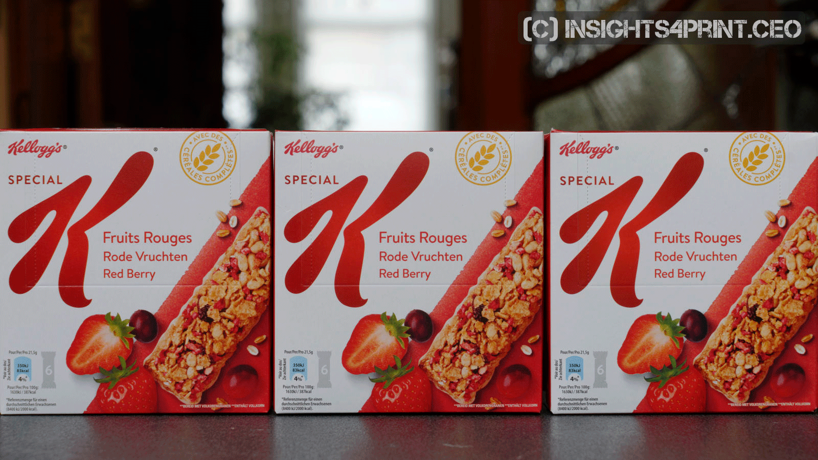
The setup was interesting: he designed a package, similar to the small Special K-packages that you can find in hotels. He made eight variations: the reference had a 100%M 100%Y logo, the others had lower percentages of M and/or Y, resulting in variations up to a dE76 of 6,33 or dE00 of 3,44. One side of the package had a bleeding logo, the other side was not bleeding.
All samples were printed in offset, alongside a real order. They were finished along with the order (varnishing, die-cutting). Part of the samples were folded and glued, the other part were delivered as flat samples.
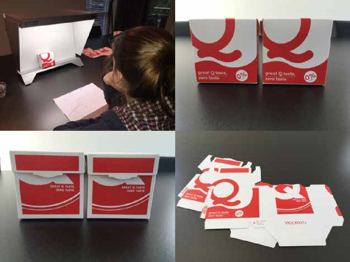
For the test he used a portable light booth, to be sure that all participants looked at the samples under the same conditions. The test procedure was as follows: he showed the reference (100%M 100%Y) and put one of the variations next to it. The participants were asked the following questions:
1) Do you see a difference? On a scale from 0 (no) to 3 (big difference)
2) Do you consider it a disturbing difference? On a scale from 0 (no) to 3 (very disturbing)
3) Will this difference influence your buying behavior? On a scale from 0 (no) to 3 (very likely)
Most studies on the perception of color variations only focus on the first question: do you see a difference? But a small, noticeable difference might not bother you, nor influence your buying behavior. So, including these two extra questions already makes it a valuable study.
But there was another part of the procedure that makes this study so unique, even groundbreaking: during the comparison of the different samples, he also included one identical sample! And that’s what makes this study so unique, so valuable.
He eventually surveyed over 100 people, with a nice mix of gender and age. Both people active in the printing industry and not. Although I don’t have data on it, I guess most people were caucasian (the large majority in Belgium).
The results
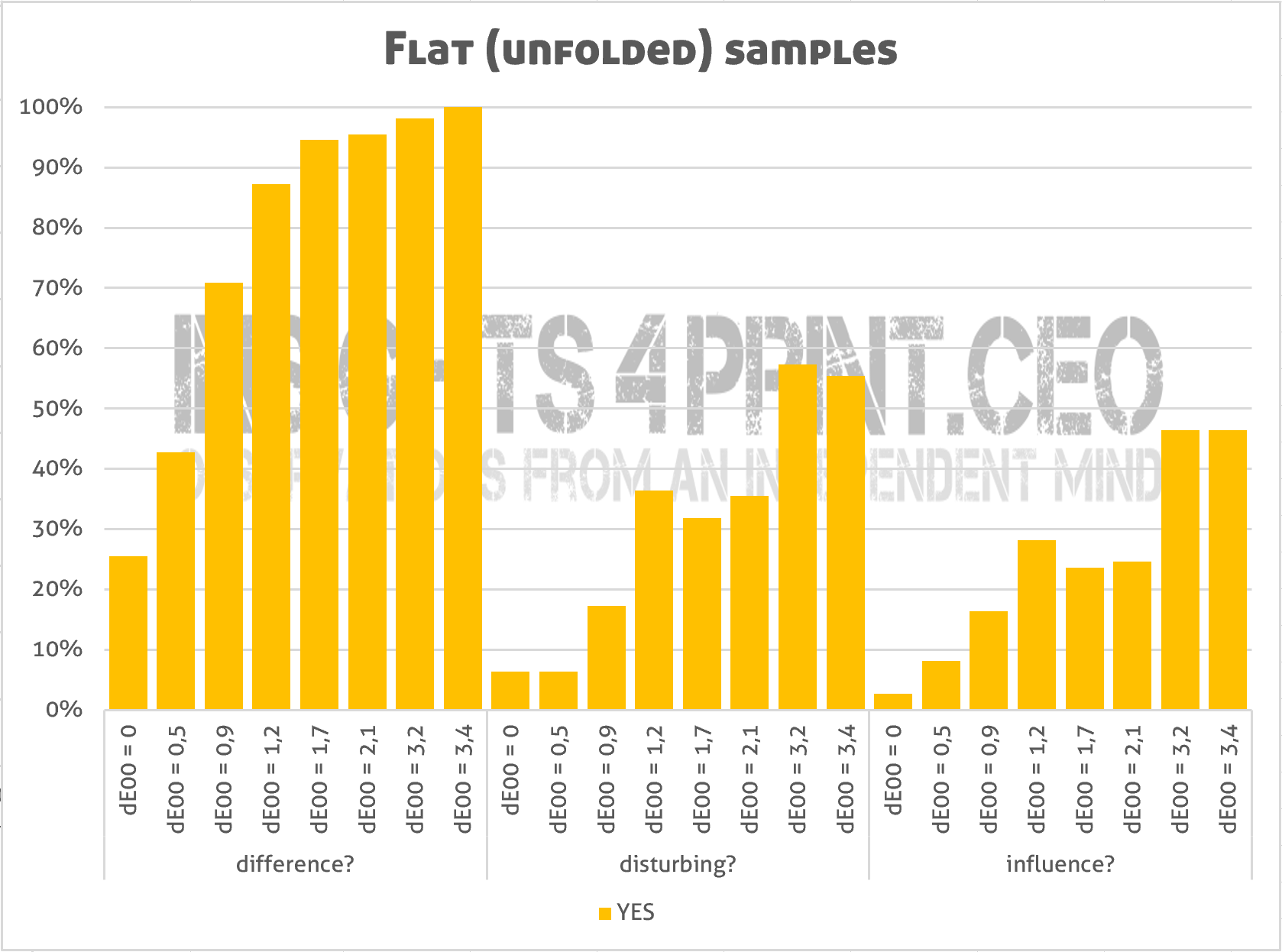
Let’s first take a look at the flat samples, where the setup resembled a press check. In the graph below you can check whether people saw a difference or not (0 = No; choices 1, 2 or 3 = Yes). And here’s the first remarkable result: 1 out of 4 claims to see a color difference between the two identical copies!
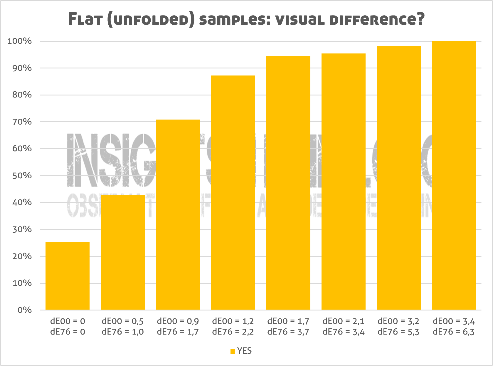
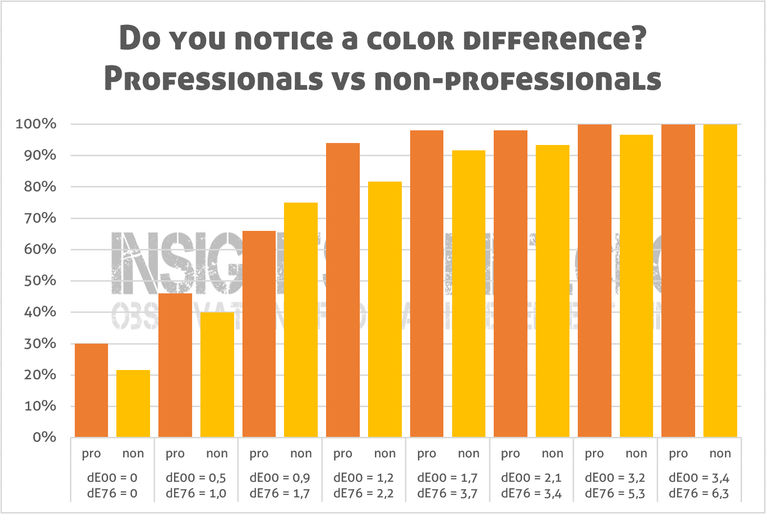
When filtered down to the participants who are active in the printing industry (‘print professionals’), it’s even higher: nearly 1 out of 3! Which means that a visual ‘press check’ is unreliable. It needs to be supported by measurements.
To me, this result was quite shocking: it seems that people active in the printing industry (‘print professionals’) aren’t that objective when judging print quality. But on the other hand: it does make sense. It’s psychology. Jens asked whether people saw a difference, which means that people will start to look for differences, even if there aren’t any. This is a concept in psychology called ‘framing’. And the fact that more people in the printing industry saw a difference? Being in the printing industry means that you know about color, that you can identify color, making them look even harder for a difference. They were just ‘overachieving’.
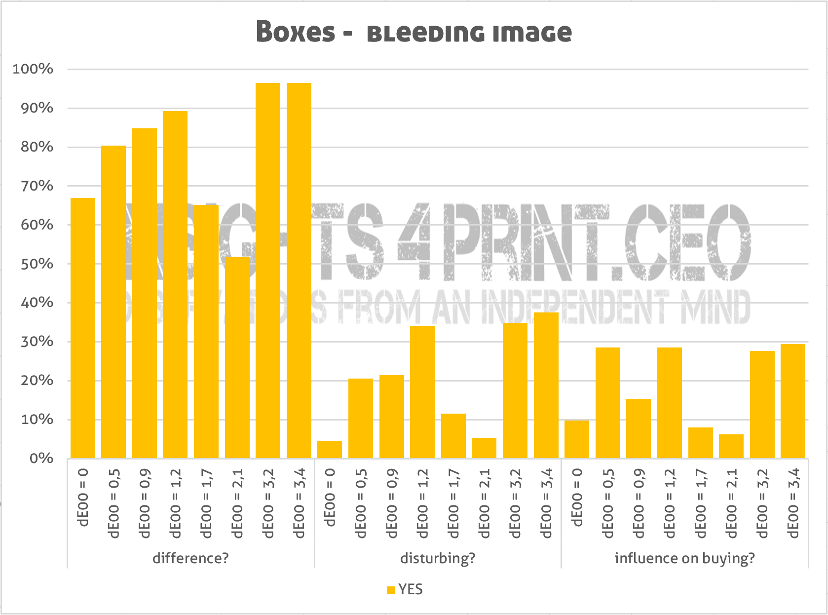
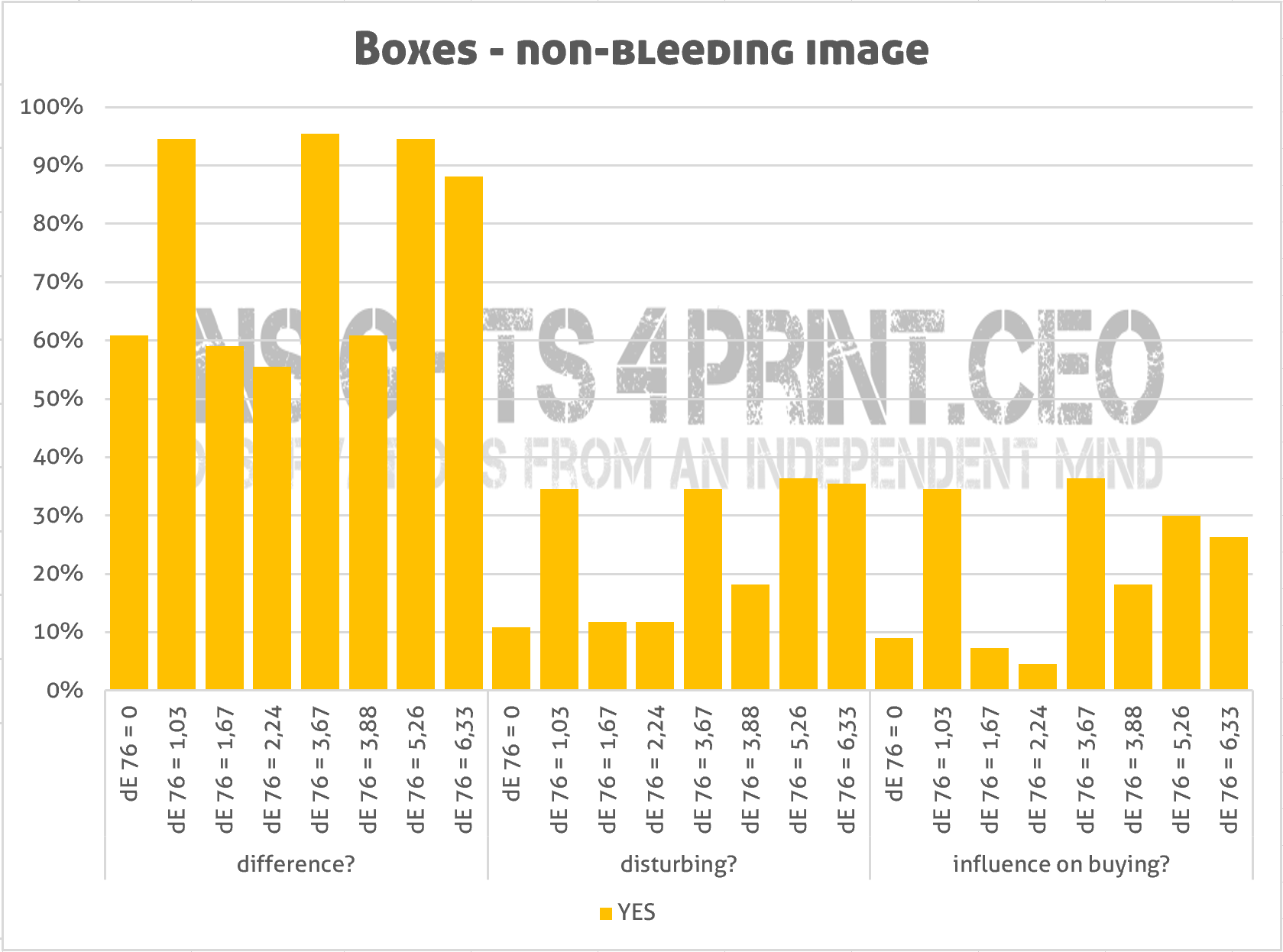
When looking at the results for the folded boxes, which resembled a supermarket experience, it becomes even more interesting: here about 2 out of 3 see a difference between identical copies… That’s amazing! Which means that it is extremely difficult to correctly identify or to judge colors of boxes. And that it is virtually impossible to make a color comparison in a situation like a supermarket shelve. So, all those people arguing that color differences of packages should be less than delta E of 2, because otherwise the consumer won’t buy the package, they might need to rethink their position.
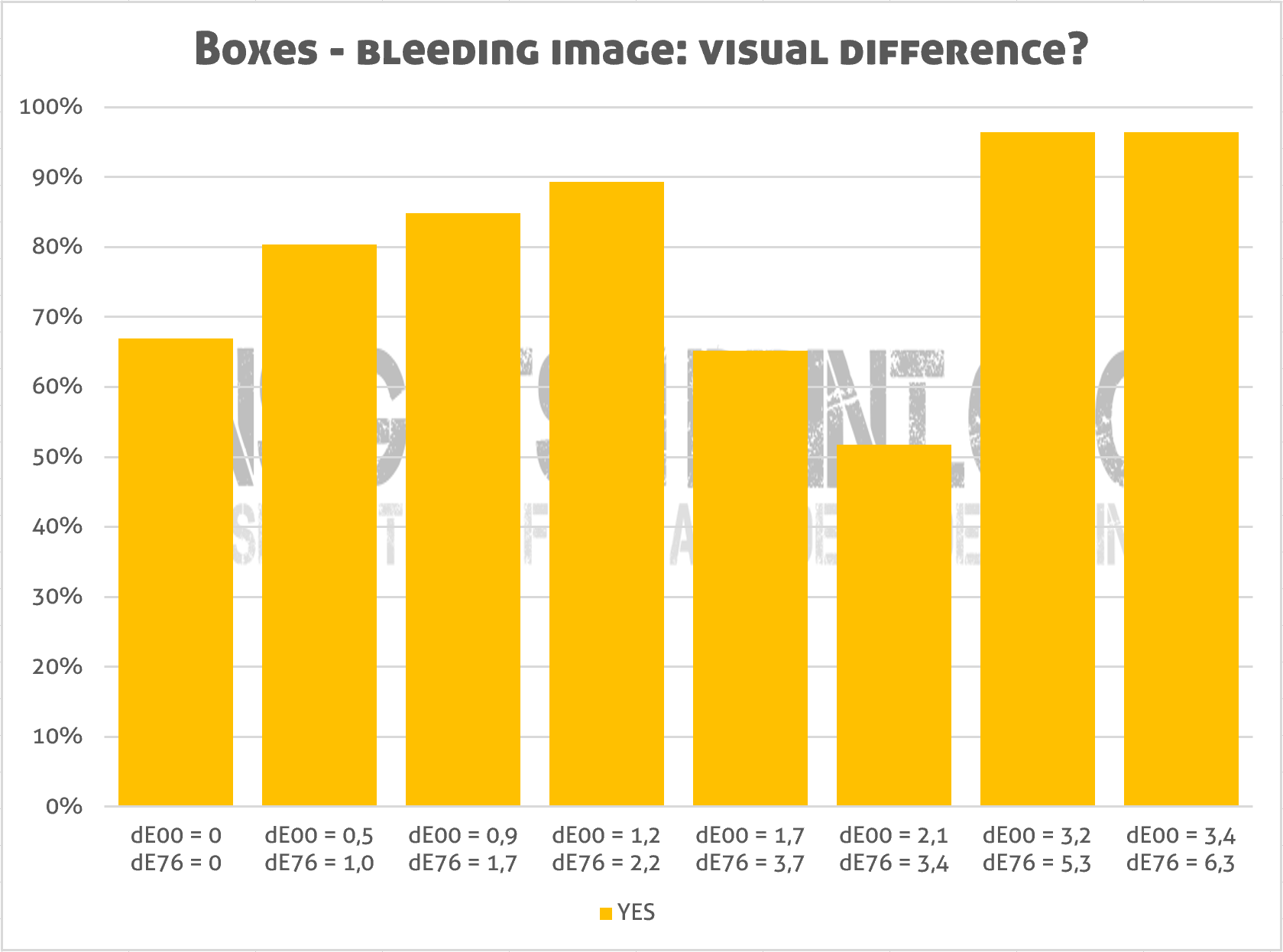
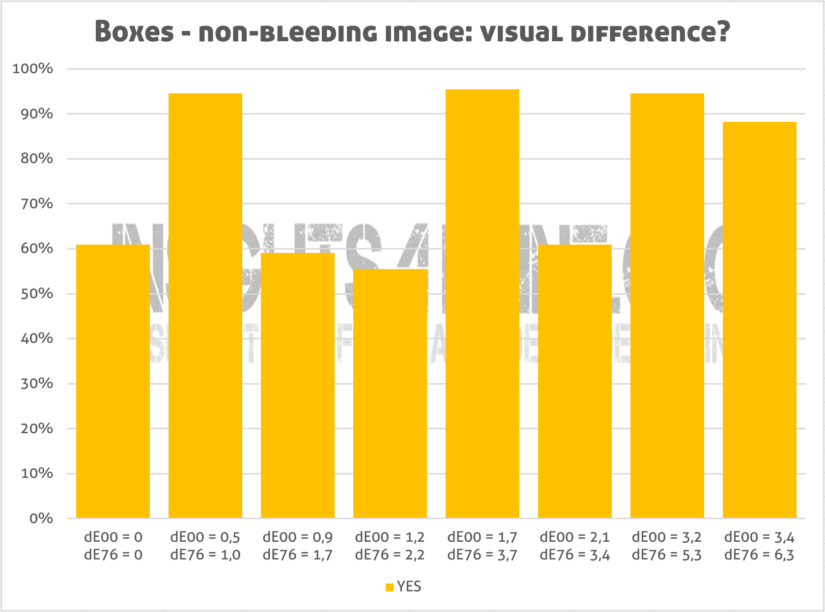
The graphs of the folded boxes also show something weird: the number of people seeing a difference isn’t progressive, there are ‘bumps’ in the graph. In his report, Jens argues that this is due to the type of color deviation (a change in hue and the sensitivity of our eye for some hues). I think he is wrong on this one: if that would be true, wouldn’t we have seen the same bumps in the graph of the flat samples? There is no bump in that one, just a nice progressive line.
In my opinion there is another reason. There are many factors influencing the color appearance when placing packages on a shelve, it is not as straight forward as a press check with flat samples. E.g. boxes don’t touch each other, as often happens with the samples in a press check, and there is also a small shadow at the edges and in between the boxes. And when positioned slightly different, at an angle, the color appearance will change. To illustrate this, let’s take a look at the animated GIF below, which I already shared in this article about real-life factors influencing color appearance in packaging. In this animation, I slightly turned the box on the left between exposures. See how this influences the red of the logo.
And there is one more thing that these graphs show us: the huge importance to include a verification method, to include an identical copy when doing this kind of comparison. Without this basic test, you have no idea whether the results are reliable or not. Don’t forget it if you ever do a similar test!
Disturbing? Influencing buying behavior?
Knowing which color differences can be seen by how many people is already interesting. But there is a difference between seeing a deviation and finding it annoying. And even an annoying deviation might not influence the buying behavior. In the next graphs, you can see all the three aspects at once.
Let’s do an extra check!
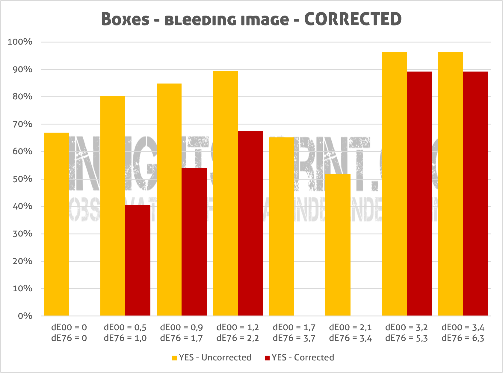
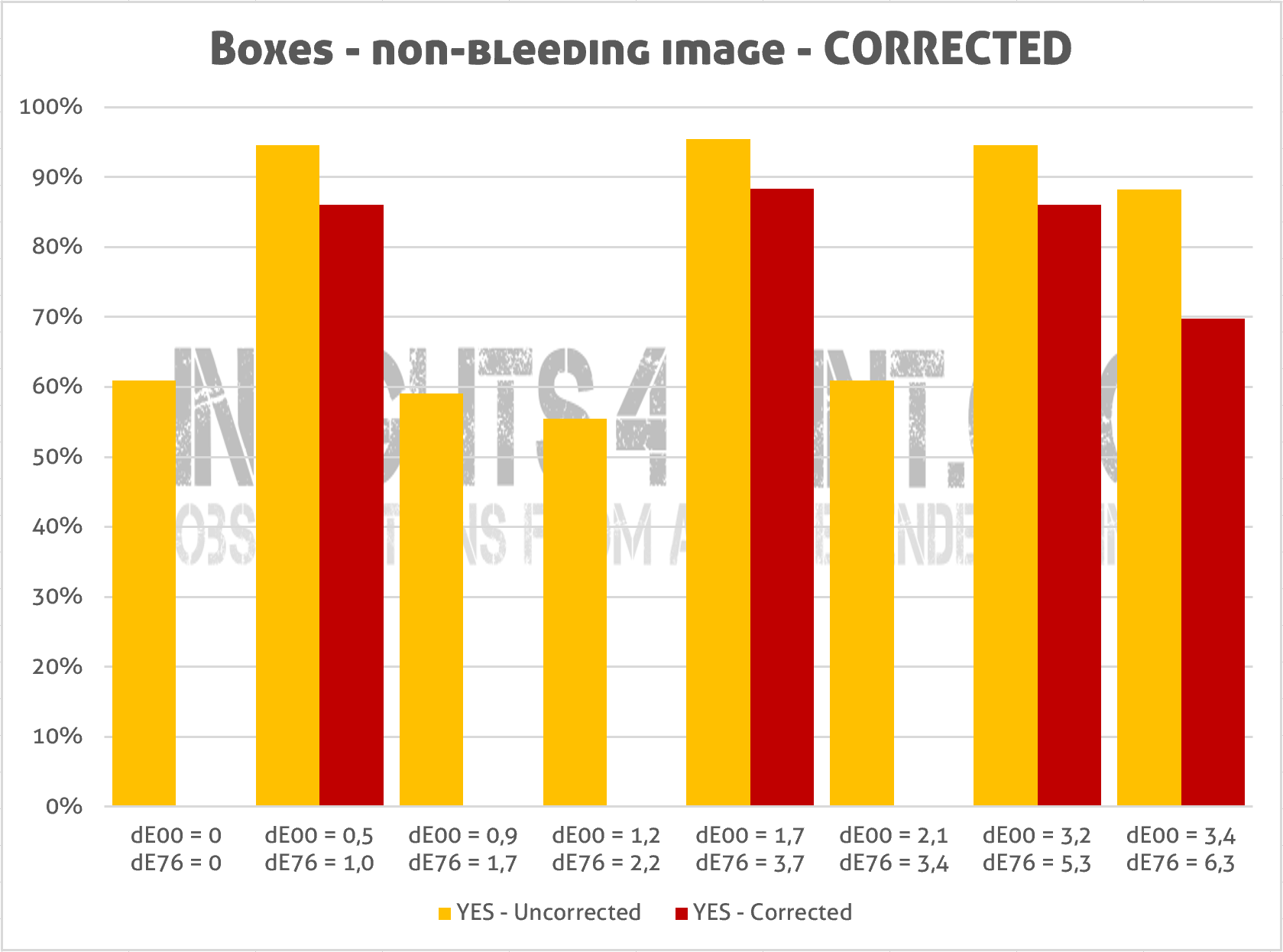
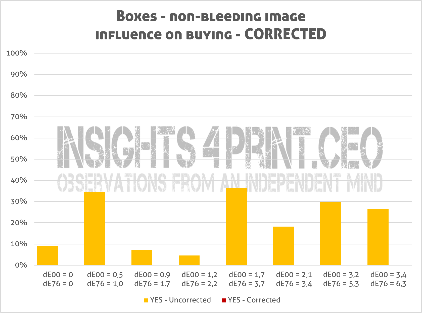
Although these results are already quite interesting, I noticed that we should do one more thing, which wasn’t done in the study: take out the unreliable results. All the people who said that they saw a difference between the identical copies, should be omitted, because they are unreliable. Since I don’t have access to the original data, I did it the ‘quick and dirty’ method: I subtracted the number of people that saw a difference in the identical copies from the rest of the results. I guess that everybody who ‘saw’ a difference between the identical copies, also saw differences in the other sets. [Added 30/05/2018, thanks to John for the input] But please keep in mind that this ‘quick and dirty’ method could have flaws: it is possible that somebody who saw a difference between the identical copies, did not spot a difference between, e.g., the ones with a dE 1. And having said that: it would have been nice to check the results of every single participant, to see if the results are always progressive, or not. Especially since the color difference had to be evaluated on a scale from 0 to 3, this could have been a very interesting check.
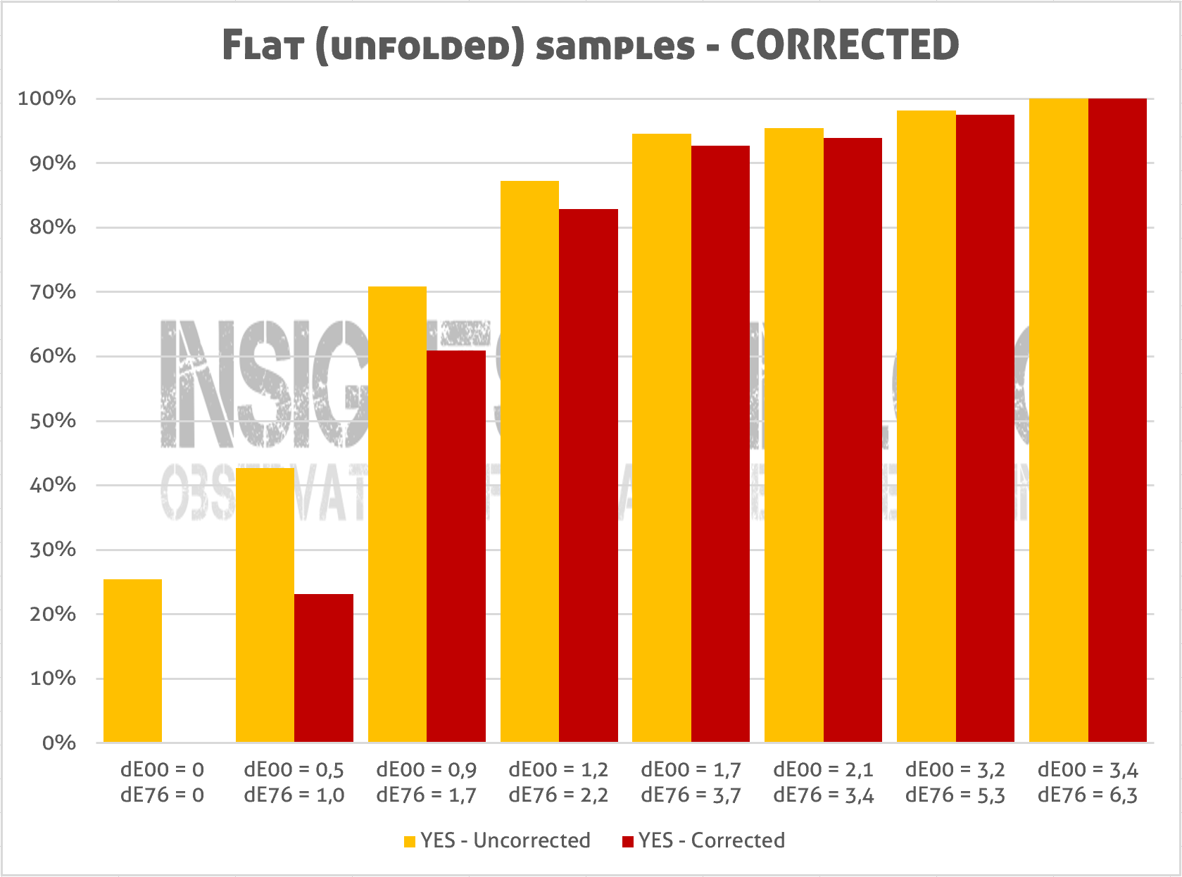
I have done the same exercise with the boxes, and the corrected results show how difficult is to judge the color of boxes on a shelve: the corrected results are all over the place, even more than before…
And when I apply the same correction to the last question (“Will this color deviation influence your buying behavior?”), then the picture is complete: nobody said that the color deviations they had seen would have a negative impact on their buying behavior. Not even the one with the highest deviation in the series… The graph below shows this result for the non-bleeding boxes, the results for the bleeding boxes are similar: no influence on buying behavior.
What’s missing
There are a few things missing in this study: with all the data collected, it would have interesting to check if gender and age make a difference. And since he also asked about the frequency of supermarket visits, that could also have been a nice filter: are regular shoppers more or less tolerant than non-shoppers?
What would have been nice, but it wasn’t a part of the test, is to validate these results in a supermarket, by observing the behavior of real consumers during an actual shopping process. How long does it take to pick a product from the shelve? Will they leave a package with a slightly different color on the shelve? Would they prefer a damaged but color correct box over a non-damaged one with a color that’s slightly off? But I know this will be a very difficult test to set up, to execute.
And maybe one last thing: it would have been nice if the time that it took to evaluate the color and answer the questions was included. Again: this was not part of the setup, this is just an afterthought. And it’s probably difficult to execute, because it should not interfere with the process itself (meaning: participants should not be aware that the time is recorded, making sure that this parameter won’t influence the results). In real life (read: the supermarket), the interaction time with a package is quite short, just check it when you go shopping. So if it takes 60 seconds before someone can identify a small color variation, then this won’t be relevant in a shopping experience. According to this whitepaper, it takes only 12 seconds to ‘search and select’ a product. To put everything in perspective: how long does the average press check take? How much time is taken to compare proof or reference with print samples?
The Loyola University study
This study by Jens from AP University College is of course not the only study on color. Usually, when talking about (brand) color and packaging, people refer to a study by Loyola University. You can find numerous quotes like this: “Color is ubiquitous and is a source of information. People make up their minds within 90 seconds of their initial interactions with either people or products. About 62‐90 percent of the assessment is based on colors alone.”
But did you ever wonder how this was tested? I do. And so does my friend John ‘The Math Guy’ Seymour. He recently went on a quest to find that study. He found more than 2 million references to it, but he was not able to locate the original study. Which makes us both believe this study could be nothing more than an urban legend…
And that’s the big difference between that Loyola University study and this study by Jens from AP University College: this is real. I have seen the report, I even got a digital copy (which is in Dutch, for the record). And being real makes it much more relevant than the 2 million quotes from a probably unexisting study. If you do have a copy of that Loyola study, please send me a copy! I would really appreciate it! (UPDATE 27/02/2019: after a long search I got a copy of that famous study, and it’s not about print quality!)
We need to talk…
With all this new knowledge in mind: we need to talk about tolerances for packages, for ‘single use’ printed materials. A package is not the same as an art reproduction or a wall covering. It’s single use, it’s wasted right after use, sometimes it’s only touched once by the consumer. Its goal is to package, to protect, to transport the product that the consumer wants to buy. And to make it quickly identifiable for the consumer in the supermarket, within a few seconds. As my small test on color memory has shown: our color memory is quite tolerant and also recognizes similar colors as that unique and iconic brand color. Please keep in mind: the (overall) color is only one part of the identification process. It’s also about the shape of the logo, the shape of the package, the overall design of the package. On top of that, there are all kinds of real-life factors that influence color appearance in packaging, in marketing.
Keeping all those things in mind, we do need to talk about tolerances like ‘below dE 2’ for (single use) packages, for marketing materials. Let’s stop the unnecessary wasting of good print products and focus on what matters much more: eliminating print defects and damaged packages. Those will make a bad impression, not the fact that the brand color is a bit different from that theoretical ideal.
Added 09/07/2022: you might also want to check this article, with the results of a test where participants (399!) were asked to pick the ‘right’ Coca-Cola red from six variations. Spoiler alert: there was no agreement. The most popular one was 4 dE00 away from the correct one. Even the one with a 9 dE00 deviation was quite popular…
Why is this important?
Color is extremely important in the printing industry, with jobs being rejected (and wasted) because the color is not close enough, according to the print buyer. But with this groundbreaking study in mind, we need to rethink how we deal with press checks (1/3 print professionals see a difference between identical copies), what acceptable tolerances for brand colors are (dE76 of 6 won’t influence buying behavior).
Press checks often are more about psychology than about print quality. And judging the color of a package on a shelve in the supermarket is much more difficult than assumed, the time frame is very short. This new knowledge makes the old adagio, that consumers will not pick that package with a slightly different color, obsolete.
It is with this knowledge in mind that I introduced ‘the uncertainty principle of visual color evaluations’. You can read more about it in this blog post. And instead of promising customers ultra low tolerances, companies might redirect their focus to something new: color expectations management. What can you in real-life expect in different environments, with different substrates, with different printing processes?
Let’s spread the word!
If you reached this point, you are probably convinced that this is a very valuable study. So, let’s spread the word! Here are a few rules: please always include Jens Adriaensen as the one who executed the study. And always link to this webpage, for the full story. You can use this URL: https://www.insights4print.ceo/colorstudy, which redirects to this blog post. You can also use the graphs, the animated GIF, but you need to mention the copyright: © insights4print.ceo.
Full Disclosure: there is a reason why I know so much about this study: I designed the test and asked Jens to execute it. Unfortunately, I had to stop working before he had ended his project, due to a severe fatigue issue (more on that: http://i4p.ceo/cfs). And as far as I know, the results weren’t shared with the rest of the world when he finished his study, which certainly was my intention from the start.
Since not everyone can go to the AP University Collega campus in Antwerp to consult the work, I’m sharing here the most interesting conclusions. Jens was so kind to share a PDF-version of his study. And I also got some extra data, which allowed me to do some checks, to derive more information from his work. Unfortunately, I don’t have access to the original data set (which was in SurveyMonkey). BTW: these kind of works, to receive a bachelor’s degree, are at AP University College (and probably also at other colleges) by default open for the public to consult, sometimes there are really interesting works to be found.
PS: if you are a researcher, a professor, a student and you would like to replicate this study, please feel free to contact me upfront to take a look at the setup, the protocol. I’ll be happy to assist you! And I would love to see these conclusions confirmed by others.
PS2: you might also want to check brand color quality in print: the chain of tool tolerances.
Update 07/11/2018: it might seem a bit of topic, but here’s an interesting video from Tony Northrup, who did a test with four different digital cameras, to check which brand has the ‘best’ color science. Why this is relevant to this article: he also clearly proves that we are not objective when evaluating color. Only 8% of the 1500 participants picked the same ‘best’ picture from four when they were rearranged in a different order, when they had a different label…
UPDATE 22/11/2018: yesterday I had an interesting conversation with David Hunter, from ChromaChecker.com. And he confirmed the most important finding of this study: people often ‘see’ color differences between identical copies. He has done a lot of background research to establish his ‘Expectation Factor’ (E-factor in short). And in that research he too encountered people claiming there was only a ‘fair’ color resemblance between two identical copies.
UPDATE 13/03/2019: you might want to check the results of a new survey I did, one on the influence of damaged packages and color deviations on brand loyalty and shopping behavior. It is often said that these kind of defects will kill brand loyalty, but the survey results show something different…
UPDATE 01/01/2020: I’ve updated the graphs in this article, after I discovered a minor typo in the dE values (in the decimals).


Very interesting article based on Jens his smart research. It proves (again) that the right spectral sensors combined with clever software outperform our eyes and brains. I hope that marketeers will find the proper answers for this topic.
I totally agree Henk!
Dear Mr. Hagen,
I would question the message “(1/3 print professionals see a difference between identical copies)”. Just ask for the differences (lighter/darker, red/green – yellow/blue and less/more saturated) and then turn the samples and ask again (in a random fashion). I bet a box of Augustiner Helles (great Munich beer) that the results will cancel out.
BTW, providing this dE figures of precision (2 decimals) you need to measure more with some devices and doing only repeatability and reproducability tests to see that in the best case only one decimal is meaningful.
regards
Andy Kraushaar (Fogra)
PS: 90% of German observers answered to buy meat from well treated animals also if it was a bit more expensive. Lidl now introduced three levels and almost no one (more) bought the bio-food (http://www.spiegel.de/wirtschaft/service/lidl-fleisch-kennzeichnung-fuer-tierwohl-a-1211287.html). I do think that something similar applies when colour is influencing buying behaviour …
Hi Andy,
thanks for your comment.
I know that Jens did a repeatability test with some participants and that the second time the results were the same.
And if repeating it would cancel the results out, wouldn’t that confirm my point that our vision and therefore visual press checks are unreliable? And that was the main point of the study.
Regarding the measurements: I need to check this with Jens how he did it. I wasn’t there when did the measurements (somebody else helped him out with this).
Interesting anecdote about the bio-food at Lidl! There is often a difference between what people say and what people do. But I think it would only have applied to this study if it was the other way around: that a small color difference would influence buying behavior. That would involve an action: choosing another option (or the option not to buy the desired product), and inertia is also a known and important topic in ‘behavioral economics’. People don’t want to change behavior, if the incentive is only very small or if there is cost involved. Not buying a product or having to select a different one, involves a cost, there is no incentive. But: I would like to see this confirmed by an observation study in the supermarket, as I already mentioned in the article. And I would also like to see the results confirmed by others. So if Fogra would like to replicate this study, feel free to contact me! I would be happy to help you out with the setup.
BTW: did you also read this article and the conversation I had with my girlfriend? https://www.insights4print.ceo/2017/08/uncertainty-principle-visual-color-evaluations/
Regards,
Eddy