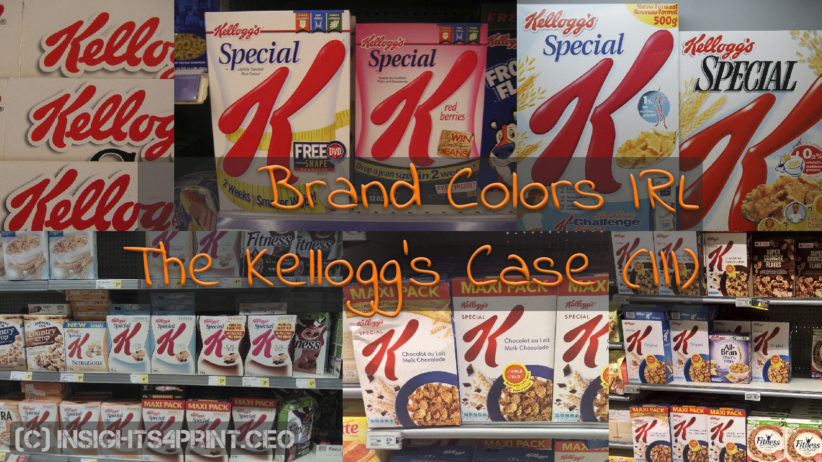
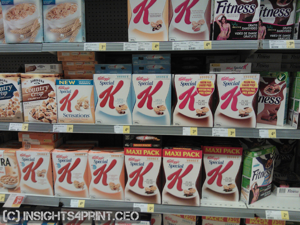
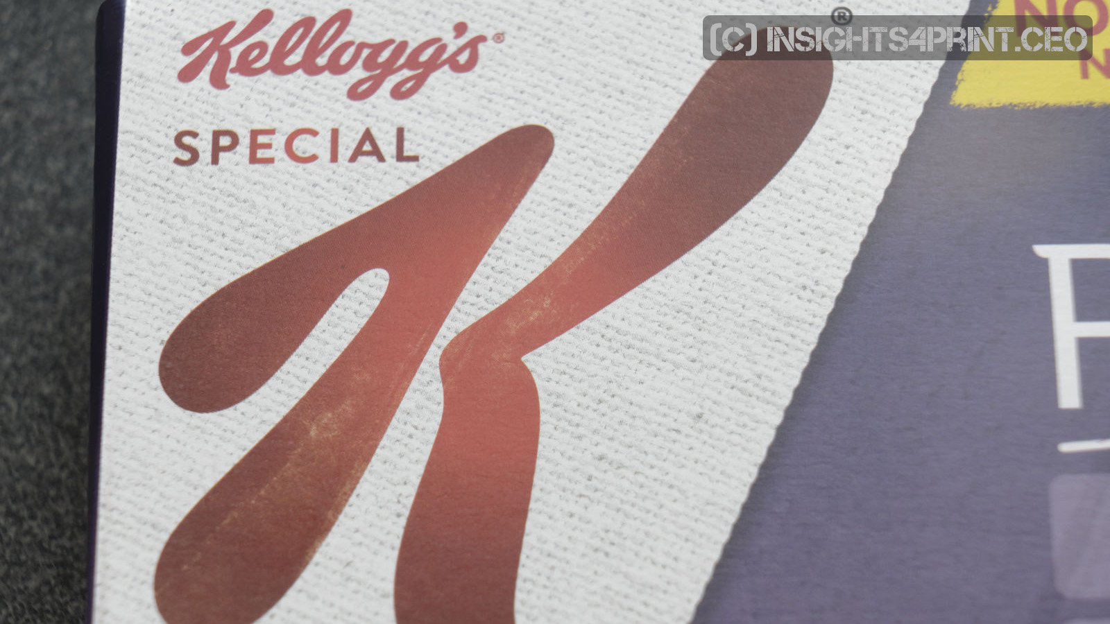
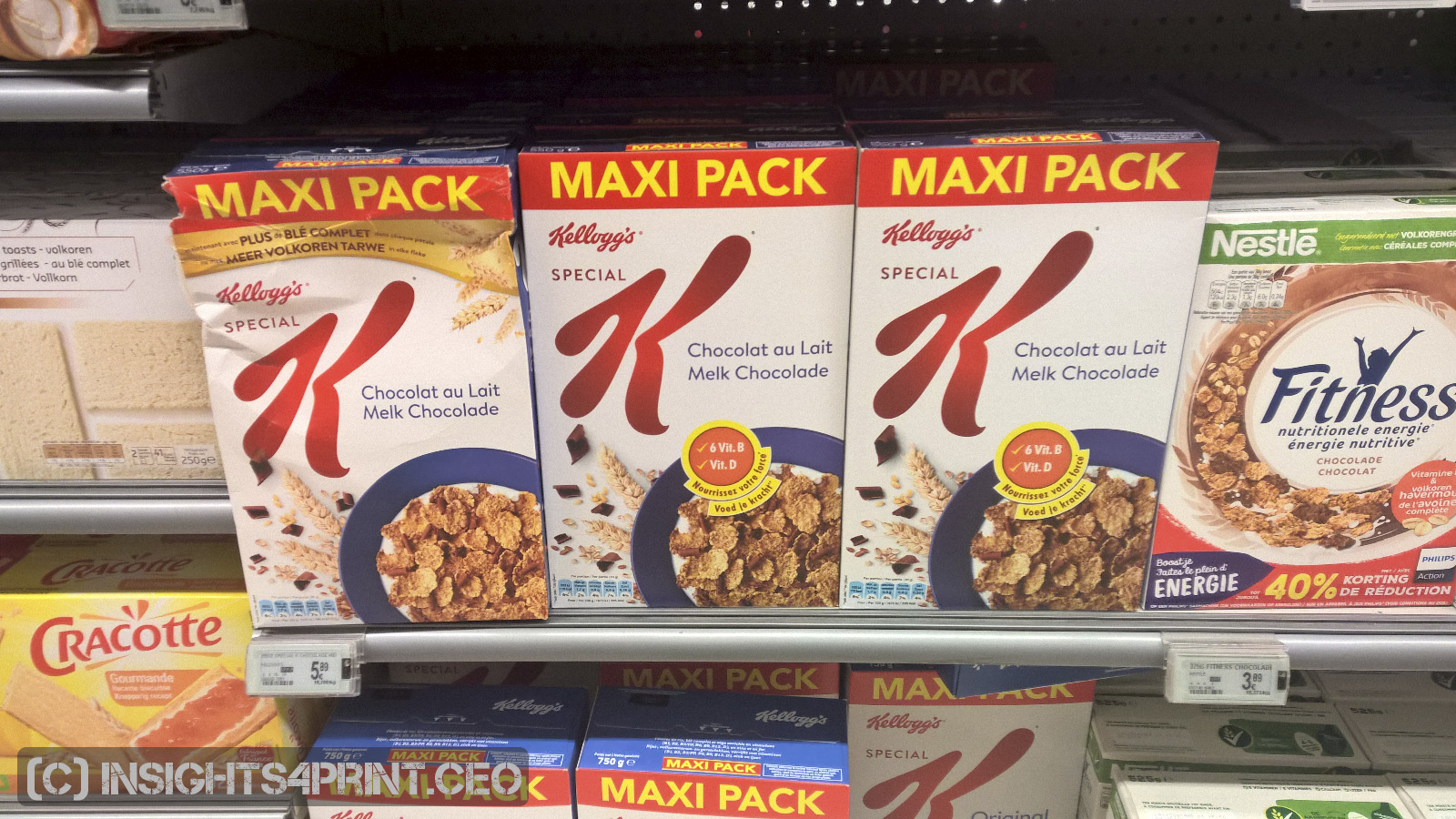
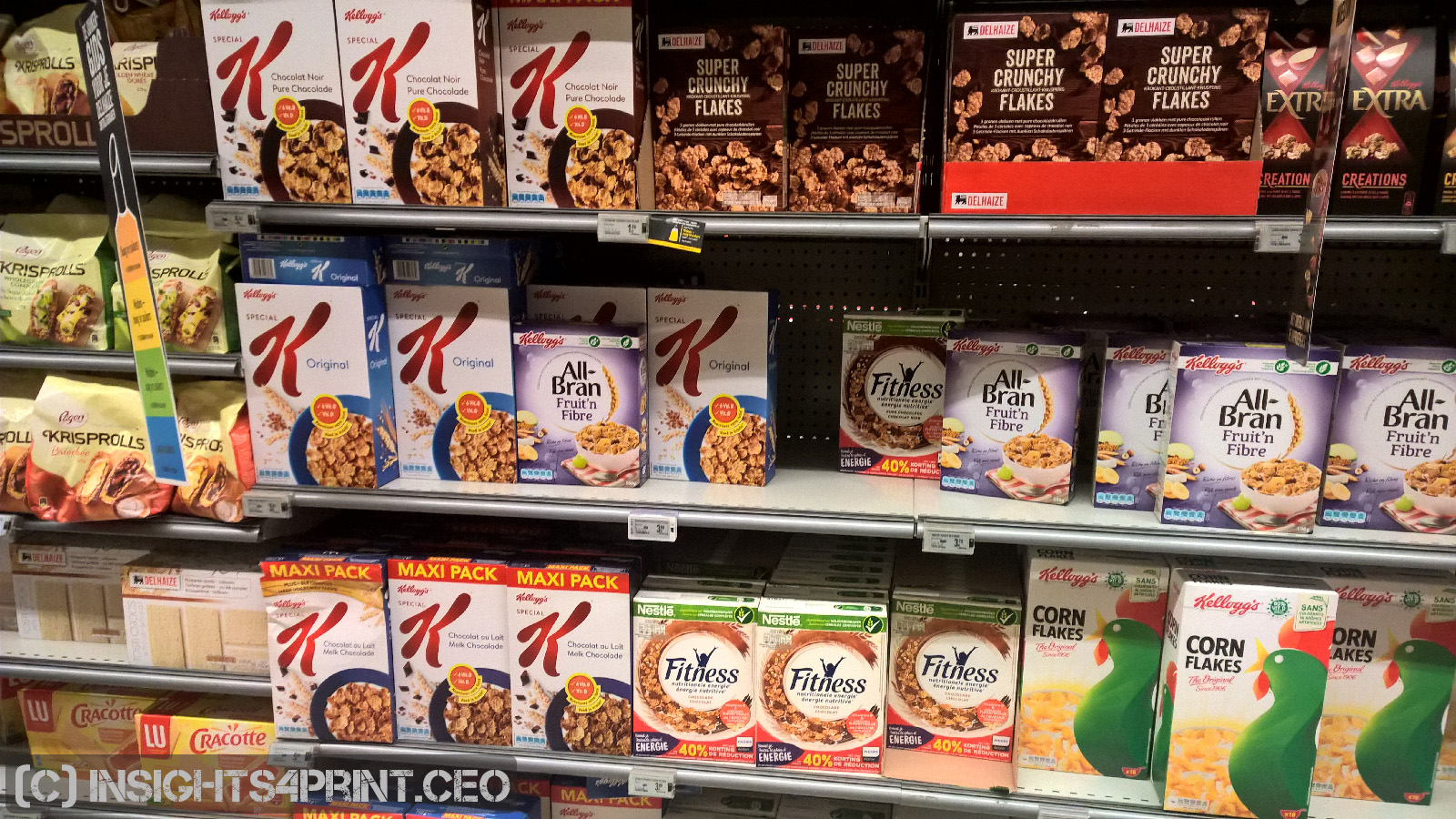
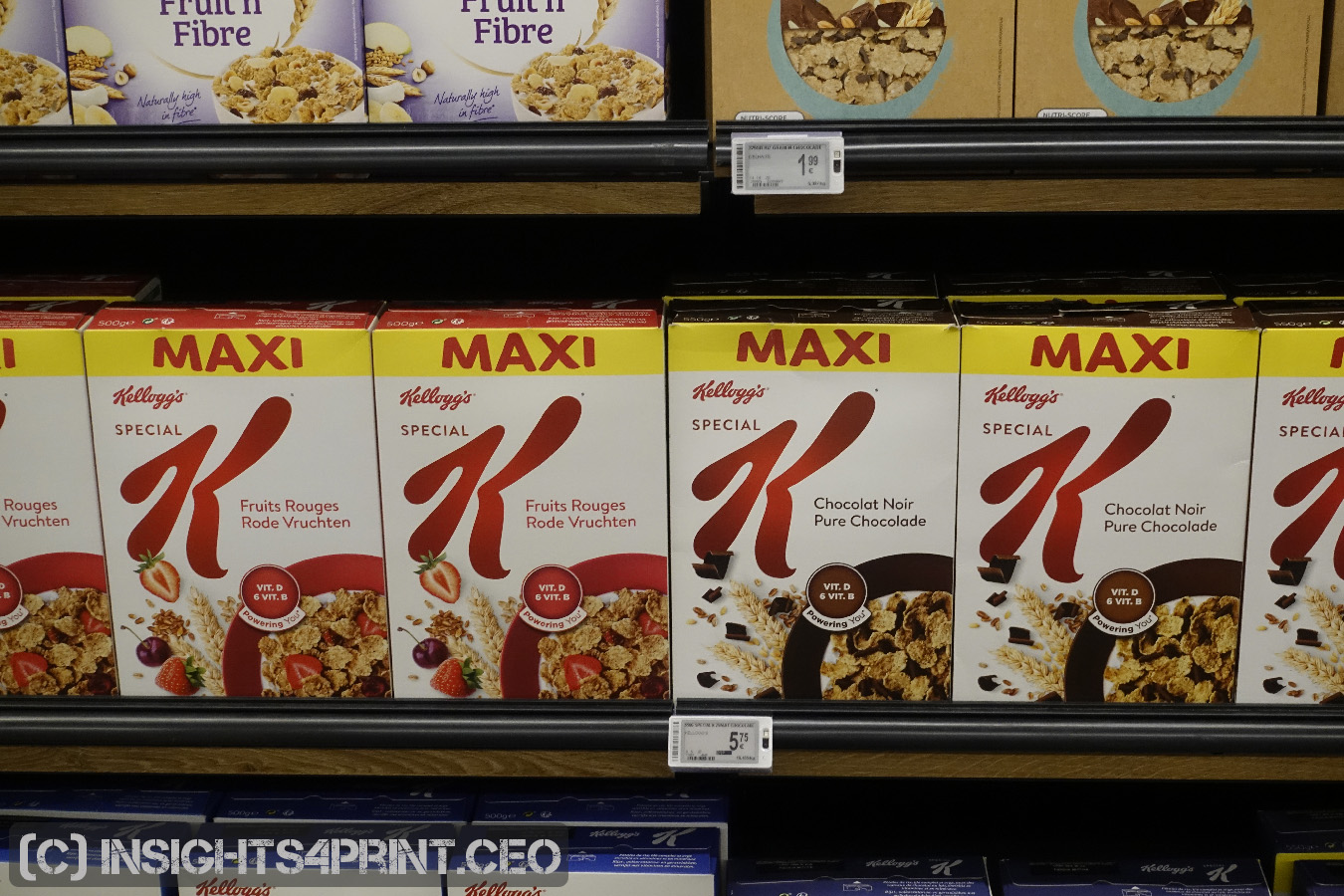
Kellogg’s red has had my attention for almost two decades. I have used examples of Special K boxes in seminars for a very long time. But I have also made pictures during that period and when comparing those, you can see that the Kellogg’s red brand color has had very different implementations. Which challenges the premise of the ‘sacred’ brand color and the absolute need for tiny deviations.
Before showing the pictures, please note that these were taken with different cameras, including smartphones, over a long period and under different lighting conditions. The capabilities of cameras have significantly improved over this period, lighting influences color perception. But even with this taken into account, it still provides a fascinating overview.
Why is this important?
Too many people believe that brand colors are sacred and that products will only sell when the deviations compared to the ultimate reference and differences between packages are minimal. A 2 dE00 is often mentioned as a reference.
Too many people believe that brand colors are sacred and that products will only sell when the deviations compared to the ultimate reference and differences between packages are minimal. A 2 dE00 is often mentioned as a reference.
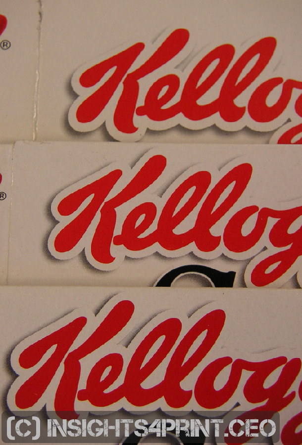
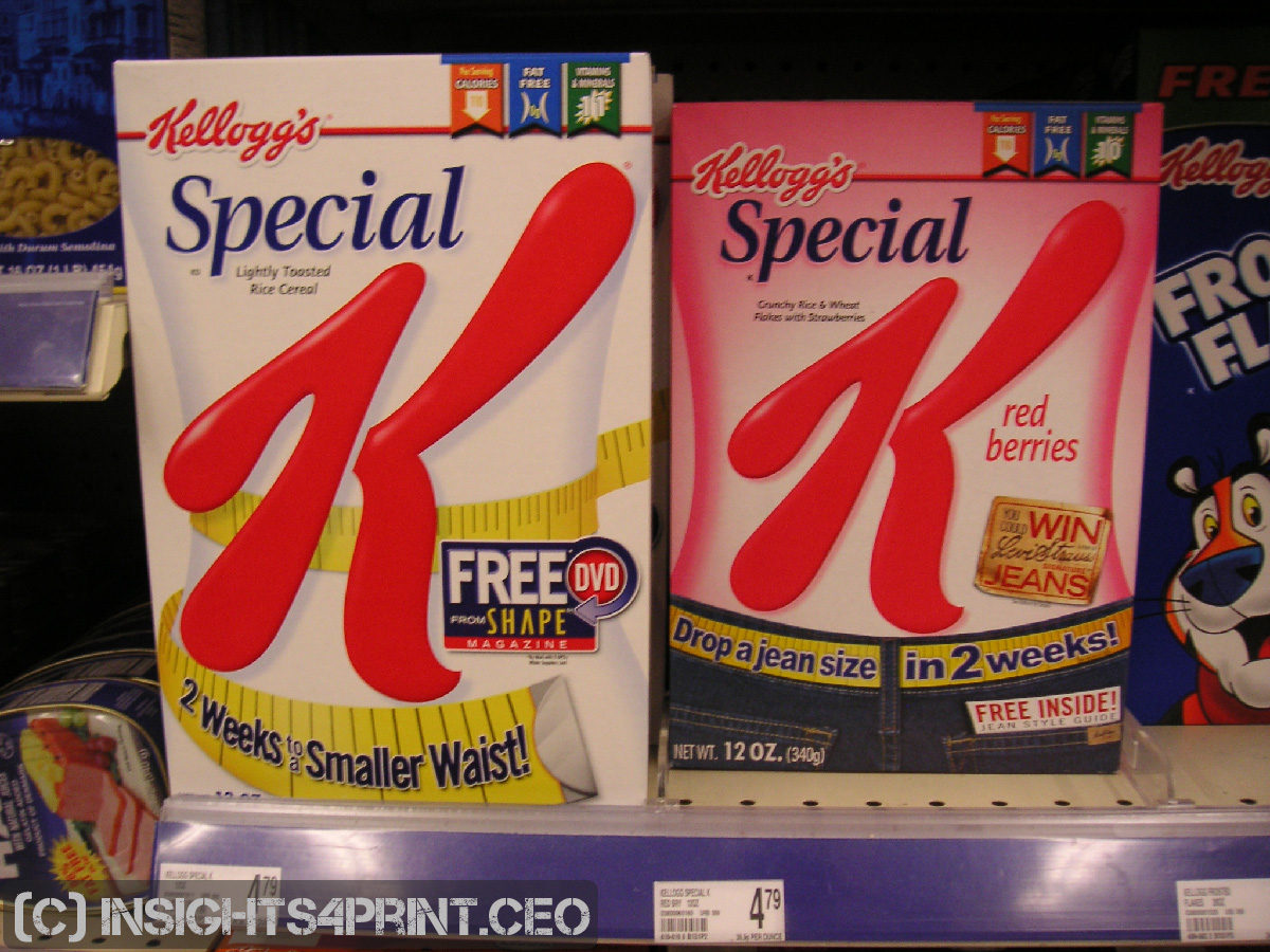
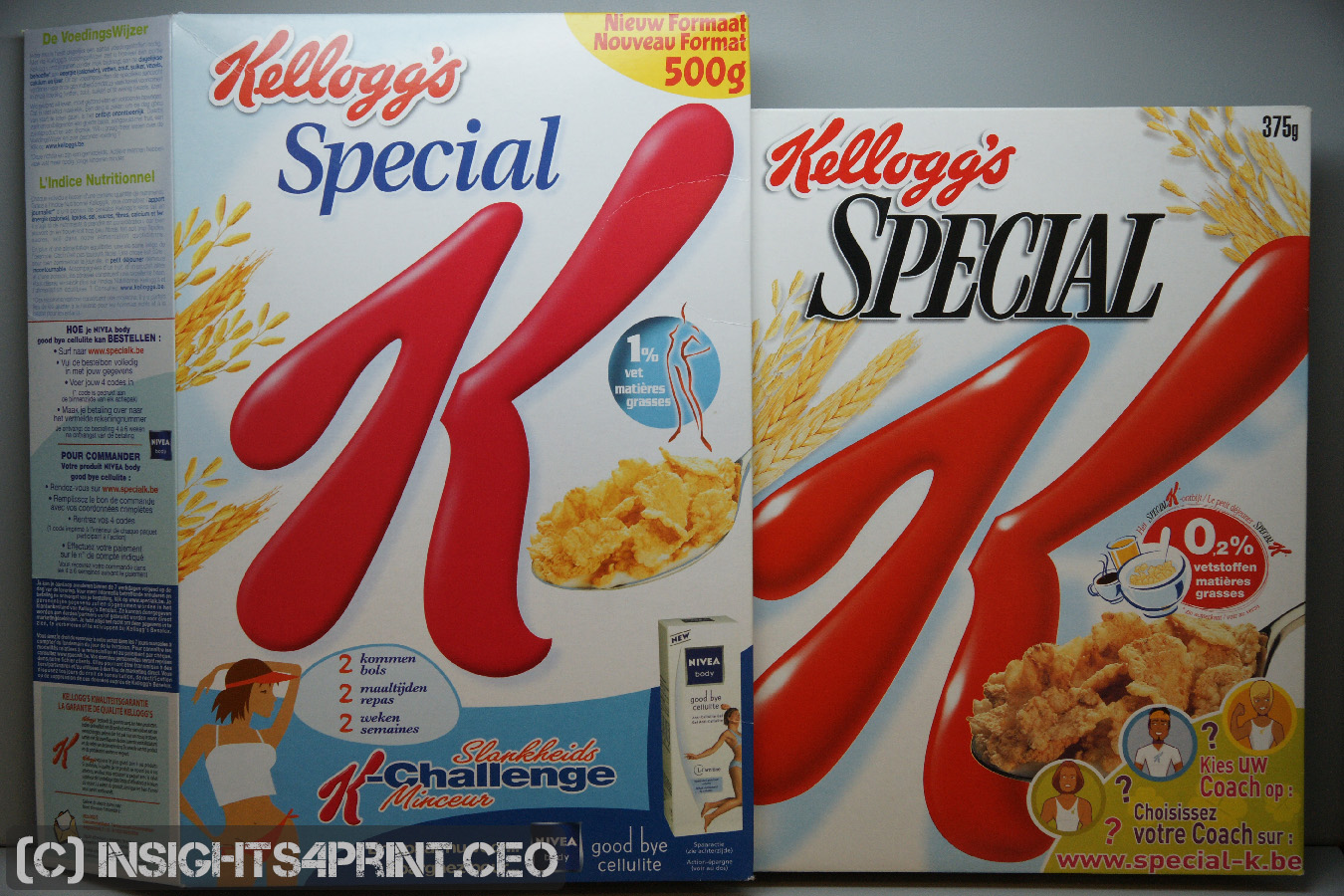
The pictures above show that in real life, deviations can be much higher. And did these higher deviations influence buying behavior? Probably not. If there were a proven correlation between print deviations and sales of a certain product, this would have been reported and acted on by brand owners. But I’ve never seen a study on this. If I missed one, please send me a copy!
What these pictures also show, is several factors influencing color perception, color appearance: the amount of light, the effect of shadows, even the effect of a different angle of view. Taking all of these factors into account, it’s impossible to correctly perceive deviations in print. A folded box on a shelve is very different from a flat sheet in a light booth. But too many people assume it is. This study on the color perception of folded boxes clearly shows this: 2/3th of the people who participated claimed to see a color difference between two identical folded boxes…
(Visited 624 times, 1 visits today)


Color fluctuations in printing are unfortunately quite common and I see this myself when I browse through the shelves of my local supermarkets in Iceland.
The color fluctuations that you point out and that we both see are for sure mostly due to lack of quality control in printing of the product during that print run – and between two print runs – and of course they are not acceptable, since they reflect on the brand owner as if they don’t CARE about their customers, – it’s like finding a hair in your soup at your favorite restaurant.
However the even bigger color fluctuations between printshops in the same print category and the incredible color fluctuations we see between print categories – reaching a maximum difference when you have different printshops in different print categories printing with different print methods on different substrates (say an offset printshop printing on uncoated paper in CMYK v.s. a flexo printer printing spot colors on plastic).
The fact that these incredible color fluctuations are “the standard” today does not mean that it is ok – that we should accept it. It only tells us that the tools we have used until now are not good enough.
Of course all brand owners, regardless of whether they are selling morning cereal or perfume should look for ways to stabilize their brand colors – and they should be as protective of the colors as they are of their corporate logo itself, it’s resolution etc.
If brand owners would like to get a grip of their brand colors, the only way to do this is to start by defining their brand colors properly – to international ISO standards that CAN be achieved in all printshops in all categories and secondly they have to be know what they should order/request – each time a job is ordered, which icc profile their designers should use and which color variation for each brand color should be used for that job – and how and who should evaluate the job, once it has been printed.
The Spot Matching System (www.spotmatchingsystem.com) attempts to take this bull by the horns. SMS is a LAB based palette of 500 media neutral standard colortones based on colors from the ISO 12647 standard (so each SMS color can be ISO certified – and an ISO certified contract color proof can thus always be printed and provided).
Use of SMS colors connects brand owners with printers through the universal ISO 12647 standard which is used and accepted worldwide, to ensure that the correct variation of each brand color is always used – and that the printer knows HOW to print it.
Thanks for you comment Ingi!
I’m all in favor of standardization of processes, of ISO-standards. I have been advocating and promoting them long before this became popular.
But on the other hand, I’m opposed to demanding tighter deviations than the ISO-standards when that just doesn’t make any sense. Tighter deviations do make sense e.g. for wall and floor coverings, but not for consumer good boxes, like Kellogg’s cereal boxes.
As for tolerances, in my opinion the tolerances of the ISO 12647 standard are too big – +-4% TVI means that a 10% halftone that is supposed to measure at – say 13% is within tolerance according to the ISO 12647 standard if it measures at 9% and 17%. Even if you print just one process color the DE2000 between 9% and 17% is pretty high. If you add another process color on top (say 10c10m) you get an even higher DE2000 between 9c9m and 17c17m.
I expect printers to print with an average DE2000 of 2 – proof to print in the case of my SMS colors. That is the target and I believe printshops that are set up to print according to ISO 12647 with up to date equipment and well trained printers can reach this goal – while of course there are other factors that can increase the average DE2000, such as difference in white point between the proof and the print, – which is of course something that can often not be helped and must be taken into account in case of disputes between print buyer and printer.
One point worth mentioning while on the subject of variants that affect overall color is that quite a lot of printers and print buyers have come to a silent agreement on continuing to use the older Fogra 39 and Fogra 47 icc CMYK profiles, even continuing to print proofs to Fogra 39/Fogra 47 but using Fogra 51 and Fogra 52 media (so you don’t get a formal, ISO certified contract proof due to the difference in white point and measurement condition – M0 v.s. M1) and then printing the jobs on substrates that align to Fogra 51 or Fogra 52. This is due to the fact that OBA containing paper has been around much longer than the ISO 12647-2-2013 standard and print buyers and printers are looking for ways to maintain consistency between print jobs that were printed before 2013 and current print jobs – by not changing a thing.
In this case we can of course provide SMS colors that are adapted to the Fogra 39 or Fogra 47 print condition but the Fogra 51/Fogra 52 white point. The layout on your screen will show “warmer” colors than the proof or the print in the case of images but the SMS colors are simply made to match a certified contract proof according to ISO 12647-7-2016 for either Fogra 51 or Fogra 52.
The Spot Matching System will be able to standardize on coated and uncoated paper, Ingi wrote. Does that mean that Uncoated Spot Colors can be matched on coated paper? Some brand owners in my country (Netherlands) specified their spot colors based on a combination of CMYK on uncoated paper. These Lab values were used to specify the coated values. Does SMS follow the same principles?
Hey Henk
I am delighted that at least some brand owners in the Netherlands are opening their eyes to reality, – i.e. picking out colors that can be kept correct cross media instead of colors that are only correct on coated paper – or even only if printed with a proprietary spot color on coated paper.
The ideology behind SMS is basically the same as your described. The system is LAB based and the 500 standard colors of the Spot Matching System are available and achievable for coated and uncoated paper (Fogra 51, Fogra 52, Fogra 39 and Fogra 47 as well as Gracol), sRGB (for web) and Rec. 709 for Television/Cinema.