

In a previous post, I already covered the fact that not all black is designed equal. ‘Black’ can be composed in different ways when going to print. And this is becoming very relevant when designing food packaging. A brand of breakfast cereals I recently discovered shows you why. In a bad way.
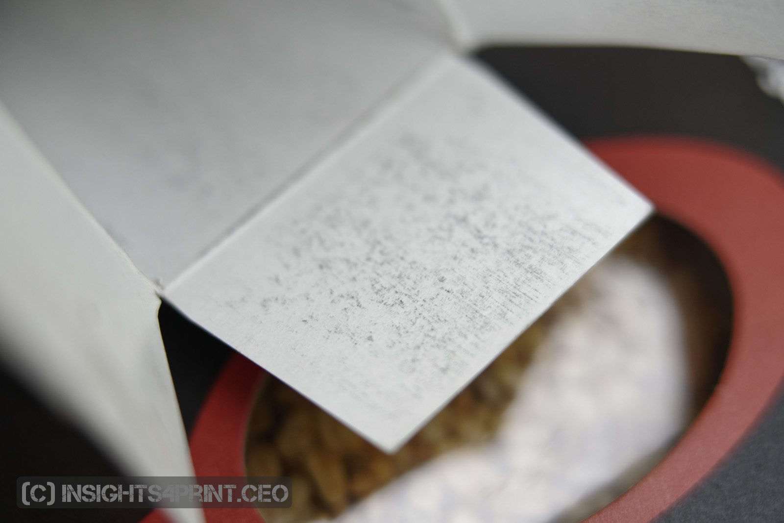
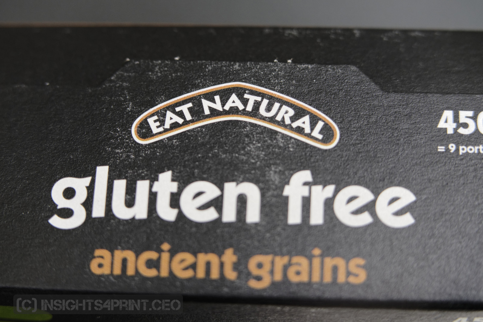
I always like to try new stuff, so when I recently came across a breakfast cereal with ‘ancient grains’ that I hadn’t seen before, I had to buy it. When I opened the box, there was a little surprise, but a bad one: the inside of the box looked ‘dirty’, the black ink had set off, had rubbed of. Which is probably due to the slow drying of the ink used. And this is something that sounded familiar… But before I go into that story, let me first explain the difference between black and black.
Black and black
When designing a package or any other printed piece, you could start from a document in RGB (red, green, blue). Which eventually needs to be converted to CMYK (cyan, magenta, yellow and black). This is done via ‘translations dictionaries’ called ICC-profiles. You will have such profiles for each kind of print: coated paper, uncoated, newspaper, … But: for a specific type of print (e.g. offset on coated paper), you can have different ICC-profiles, which will give slightly different results, if you look at the numbers. You could compare it to the differences between Google Translate and Bing Translator. For a more complete – but still very accessible – overview, please check this article I wrote about color management. When designing in RGB, a pure black (0; 0; 0) will be translated into the highest percentage of ink described in the ICC-profile that you use for the conversion. Also, other ‘pure’ colors might be converted into something that is not ideal. For more on that, check out this article on choosing brand colors.
To have better control over the graphics used, you probably want to design that in CMYK: you will have control over the colors used if you always use ‘preserve numbers’ when doing color conversions. Which is specifically relevant for packaging.
When designing in CMYK and wanting a black background, how will you specify it? It’s not that straightforward as some people might think. Defining it as only 100% K (black) will not provide the best result: a 100% K is not that dark… You could, of course, increase the ink density (the amount of ink that the press puts on the paper), but a higher density means more ink, which could lead to drying problems, with ink setting off, rubbing off on the next sheet. Which is what I saw in the package of cereals I bought: the black was composed of only black ink.
An often-used old trick is to include also another color, next to 100% K. Most often cyan is used, e.g. 60% C. This will give a ‘cool’ black. Adding other colors will influence the appearance of the black, so you need to pick it wisely. You can read more about it in this article.
A story about food packaging
Let’s get back to food packaging. Almost a decade ago, I had a conversation with a food packaging printer. Due to a change in regulations and/or customer’s requirements, he recently had to switch from UV-curing offset inks to ‘ordinary’ food-safe inks, which dry using oxidation. UV-curing is almost instant, but the photo-initiators used, had just been blacklisted. So, the use of UV-curing inks for food packaging was forbidden at that moment. But the oxidative drying inks took a very long time to be fully dry. A very long time means multiple days. Which wasn’t workable: the amount of storage needed to let it dry completely wasn’t available, it would have taken multiple times his normal storage space. So, he asked if I knew inks that would dry faster. Which wasn’t the case. But I did remember something else: a test that one of my colleagues had done a few years before.
Let’s get back to food packaging. Almost a decade ago, I had a conversation with a food packaging printer. Due to a change in regulations and/or customer’s requirements, he recently had to switch from UV-curing offset inks to ‘ordinary’ food-safe inks, which dry using oxidation. UV-curing is almost instant, but the photo-initiators used, had just been blacklisted. So, the use of UV-curing inks for food packaging was forbidden at that moment. But the oxidative drying inks took a very long time to be fully dry. A very long time means multiple days. Which wasn’t workable: the amount of storage needed to let it dry completely wasn’t available, it would have taken multiple times his normal storage space. So, he asked if I knew inks that would dry faster. Which wasn’t the case. But I did remember something else: a test that one of my colleagues had done a few years before.
The test he did was on the composition of black and what was the deepest black. At that time, most ICC-profiles for offset coated paper had a total area coverage (TAC, all the ink channels combined) of 350 to 370 %. Which means a lot of ink. And the black channel always had a maximum below 100% (e.g. 97%). What he found was that if you increase the black to 100%, you get a deeper black and you can lower the other channels (cyan, magenta, yellow). But he never did anything with that knowledge.
So, with both the story of the food packaging printer and the 100% black test in mind, I wanted to test how low you can go in TAC before you will see a visual difference. Let me stress: a visual difference, under standard P2 conditions, not a measured difference. One of my colleagues made a series of ICC-profiles, starting from 320% and going as low as 180%. I selected a number of ‘interesting’ test photos from my photo library and also created an additional one: Belgian chocolates, including many dark chocolates. This kind of deep brown can be challenging to reproduce and this was one of the types of work the printer had. All conversions were printed, in offset, on a coated paper and I showed the results to a number of seasoned printers. And asked what they saw. “The same image, over and over.” When I said it was a test with lower TAC and how low we went, they couldn’t believe their eyes. The 260% TAC looked identical to the 320%, even the 220% image was only slightly less dark. After this first test, I got a new test set printed (320%, 300%, 260% and 220% TAC) and showed it to a few dozen of print professionals during a print show. They were unanimous: they were all acceptable. They had a hard time seeing a difference.
The food packaging printer started using the 260% ICC profile right away and was extremely happy with it: his drying problems had disappeared.
Why is this important?
Food packaging is a very tricky business: if something goes wrong, this can lead to recalls with a huge financial impact. Which means that from start to finish, everyone should be aware of the best practices, of the risks involved. Everyone, including the designer: he/she must create a package that can be printed without problems, such as issues with ink drying.
When designing ‘black’, there is a very simple trick to make it both a pleasing deep black and limit the amount of ink and, therefore, possible issues with ink drying. Try it!
PS: independent consultant Paul Sherfield reviewed the ICC-profiles I talked about above. And he was also impressed by them. “Visually, again the match between the four pages/profiles was perfect. There was little or no loss in gloss for the 220% or 260% TAC profiles when compared with the 300% and 330% TAC profiles. (…) The use of these types of profiles seems extreme but on the evidence of this trail and VIGC’s own tests it is worth testing these profiles in your workflow. The gains in press color stability, ink consumption, ink drying and less marking should be considerable.”
(Visited 674 times, 1 visits today)


Be the first to comment