

Designers know black. Especially when it comes to fashion. When looking at print, it might be a bit more complicated and sometimes strange things can happen to black, unintentionally. Last week I got two different mail pieces that contained a ‘weird’ black. Let’s take a closer look at black and how you can avoid these disturbing issues.
CONTENTS: Postmortem analysis | How to prevent this? | What ‘composite black’ to use? | Why is this important? | Updates
Postmortem analysis
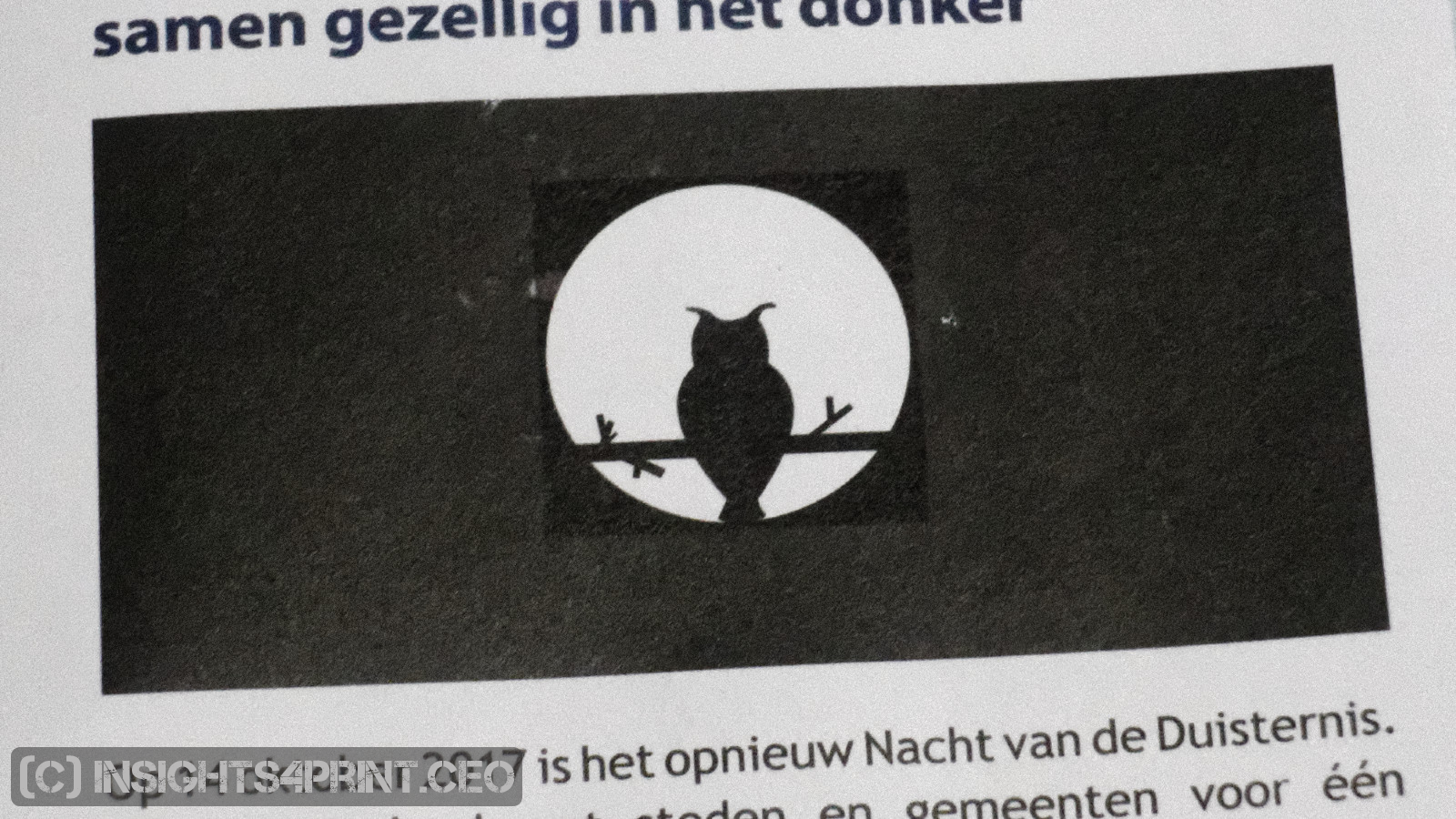
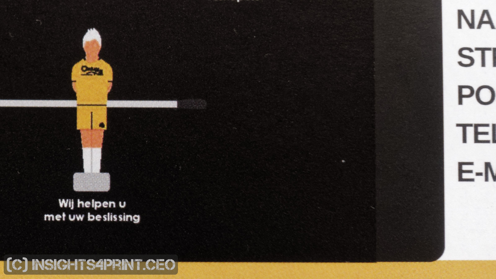
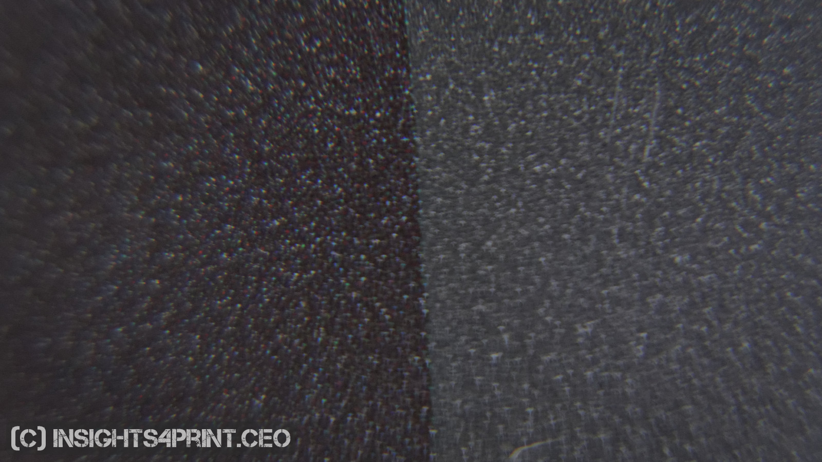
When looking closely at the two mail pieces, it immediately becomes clear why there is a difference in the black: one part is only printed with black ink, the other part also contains other colors (cyan, magenta and/or yellow). Combining black ink with other inks will give a different visual impression.
The big question is of course where that ‘composite black’ came from. In both cases the image seems to consist of different elements: a black background, with a black image on top of it. The black background was in both cases 100% K (black). The image that was placed on top of it (in the first case the owl, in the second case the graphic with the football team), probably had another definition of ‘black’. The images were either in RGB (highest probability) or had a different CMYK mix for black.
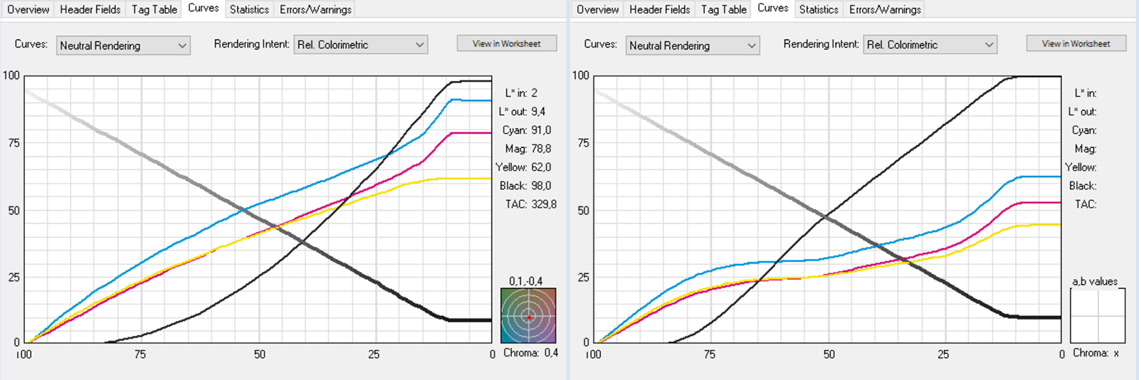
The first case will be very common: RGB images that are placed in a CMYK document. Since we print in CMYK (cyan, magenta, yellow and black), the RGB (red, green and blue) colors need to be converted to CMYK. That is done with a special ‘translation dictionary’, called an ICC profile (you can read much more about ‘color management’ in this blog post: Color management, explained for designers and brand owners). Depending on the dictionary (ICC profile) used, R=G=B=0 (the darkest black in RGB) will be converted into certain values in CMYK. Every ICC profile can have a different mix. Here are two conversions I made, starting with R=G=B=0 in AdobeRGB:
| C | M | Y | K | C+M+Y+K (TAC: total area coverage) | |
| ICC Profile 1 | 91% | 78% | 62% | 97% | 328% |
| ICC Profile 2 | 61% | 52% | 44% | 100% | 260% |
And this table also shows what can go wrong when you mix two CMYK images, made with different profiles: the composite black used is different. And that will show in print. Sometimes only when you look at it under an angle, sometimes it will be very clear.
How to prevent this?
It is rather easy to prevent this kind of artifacts. You just need to make sure that the images you are combining, placing on top of each other, use the same ‘color space’ (e.g. both AdobeRGB or both PSO Coated v3). When you are creating a black rectangle in e.g. Adobe InDesign, you should first check the CMYK value of the black in the image you are going to place on top of it. If this is an RGB image, you should first convert that RGB image to CMYK and check the values of that converted ‘black’. When you know the CMYK-values, you can match the composition of the black rectangle created in Adobe InDesign. When the ‘black’ from both the background rectangle and the image have the same values in CMYK, there should be no difference in print.
Depending on your situation, it might be a good idea to design artwork (e.g. logos) in CMYK from the start and always ‘leave color unchanged’. Which means that a 100% C logo will always be printed as 100% C. If you apply color management, it is possible that the print will also have other colors. (for more on this, please read my blog post: Brand colors and printing in CMYK: better safe than sorry)
What ‘composite black’ to use?
Now that we know that there can be different compositions for black, another question arises: what composition should you use? Well… it depends…
There is a concept called ‘rich black’, which means that you will add another color to the black ink. The reason why we want to add another color, is to make the black look darker. But by choosing the color(s) you add, you can also make the black look slightly different: adding only cyan will make it look colder (think black metal), by adding magenta and maybe also yellow, it will look a bit warmer. A common recipe for ‘rich black’ is 100% K + 60% C. If you have a print job with a very dark black lying around, take a loupe and check it! You will probably notice small cyan dots.

And what about the darkest black? What is the ideal composition of that? There can be discussions on that. But let me share you a story from my previous life. Over a decade ago, when you would ask a printer what the darkest black is, he/she would probably answer something like 330% to 360% ‘total area coverage’ (TAC). Which means that if you would add up all the different colors, you will get 330% or 360% (see also the table a bit higher in this article). And that’s a lot of ink.
A colleague of mine at that time, once noticed in a test that to get a real black in print, you need to use a 100% K. Which was certainly not the case in the familiar ICC profiles at that time. They typically stopped between 95% and 98%. But my colleague didn’t take further actions with that knowledge.
When I had a conversation with a food packaging printer, who was complaining about the very slow drying of ‘low migration’ inks, I remembered that 100% K test. And I challenged my colleagues: how low can you go before you see a clear visual difference?
A number of ICC profiles were created, going from 320% TAC in steps of 20% to 180%, which was considered as ridiculously low. The trick to do this, is to define how ‘grey’ in an image is converted into CMYK, shifting from a combination of cyan, magenta and yellow ink to only black ink (called ‘GCR’ or gray component replacement).
A number of critical images were converted with these new ICC profiles and then printed in offset, all together on one sheet, in a random order. These samples were shown to a number of printers, some with a career of over 40 years. The result was that a 260% TAC could – visually – not be distinguished from a 320% ink… Even a 220% TAC was still very good.
The food packaging printer was very happy with these results and has used the 260% profile since that day. And in some cases even the 220% profile. The profiles were also tested by other people, here is a nice review. In real life, also another advantage of this kind of profiles showed: a much better color stability on press.
These days most ICC profiles in the ICC profile registry have a 100% K, but some organizations still don’t want to go there. E.g. the latest PSO coated v3 ICC profile has a 96% K and 300% TAC.
When doing the tests, years ago, I asked many people why profiles didn’t go up to the 100% K, only one person had a possible answer: when using a bad paper quality, the 100% K might damage the paper coating. But if that is the case, shouldn’t that also be true for a rich black containing 100% K? Or for the much higher TAC?
Why is this important?
Getting your colors right in a design is extremely important. If your blacks are different, it will show in print. But you might also want to check the total amount of ink used (the TAC: total area coverage) and switch to an ICC profile with a lower TAC. Print stability will be better, and the blackest black could even be darker when a mix with 100%K is used.
PS: if you don’t see a difference in the black in the top image, you might want to check the brightness of your monitor and set it to the maximum.
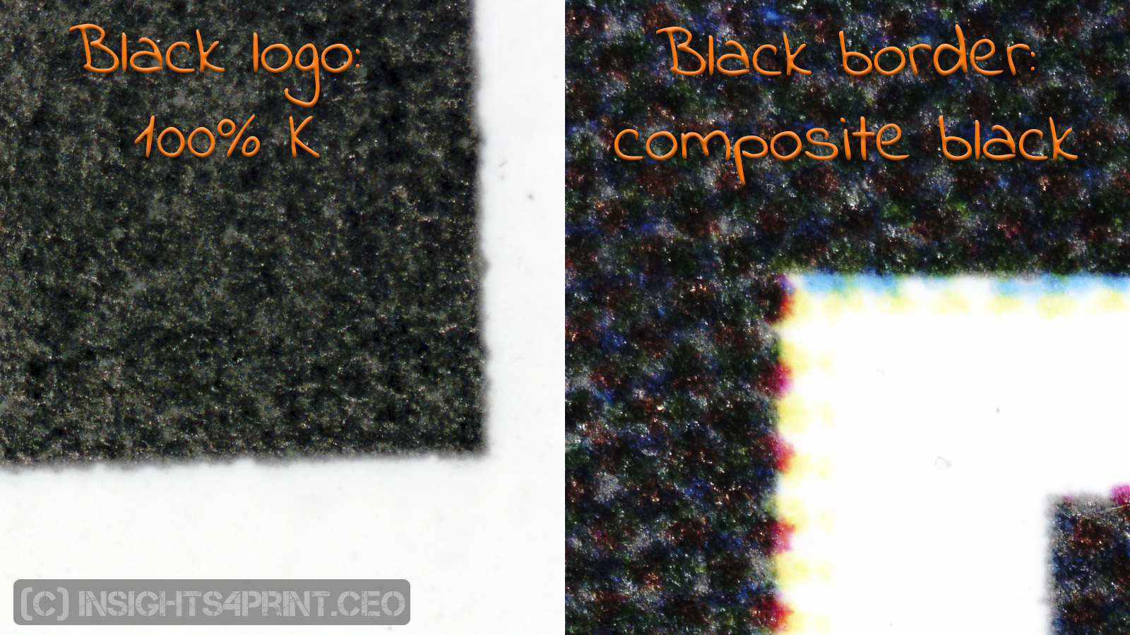
UPDATE 23/11/2017: This morning the mailman brought me another interesting example. It was a leaflet from a fashion shop. The logo is 100% pure black, which is great of course. But at the bottom of the leaflet, there is also a black border, with white text. And you probably can guess it: that black border is composite black… Which gives a different impression compared to the black logo.
UPDATE 16/01/2018: And here is another example, with a huge risk of color shifts: a light grey rectangle containing all four channels… And this on almost every page of a 16 page brochure… A slight deviation in dot gain, density of one of the channels would have caused a nasty, very visible color shift in that grey.


Be the first to comment