

Over the last few decades, print has seen a significant increase in quality. Just go to your bookshelf and take a look at an old book with color pictures to see it with your own eyes. And still today efforts are made to increase quality. One of them is certainly worth a look: XCMYK. Which delivers an expanded gamut with regular CMYK inks, in a four-color process… If that isn’t a nice proposition!
CONTENTS: Background | Gamut comparison | Real life | How to proceed? | Why is this important? | Updates
Background
XCMYK is an initiative from IDEALLIANCE and was released just a year ago. It is the result of a 15 months test period, at 26 international test sites (mainly North America and Asia). And there was a 100-person task force, from 88 companies, behind the project.
The interesting part of XCMYK is that it uses regular CMYK inks that are compliant to ISO 12647-2, but with a higher ink film thickness and by using a non-traditional screening, e.g. FM screening.
Gamut comparison
The big question with this kind of solutions is of course how big the gamut is compared to ‘regular’ printing. Let’s compare it to PSOcoated v3, which is often used in Europe for printing on coated paper. Below you see the gamuts compared, with the XCMYK as the wireframe.
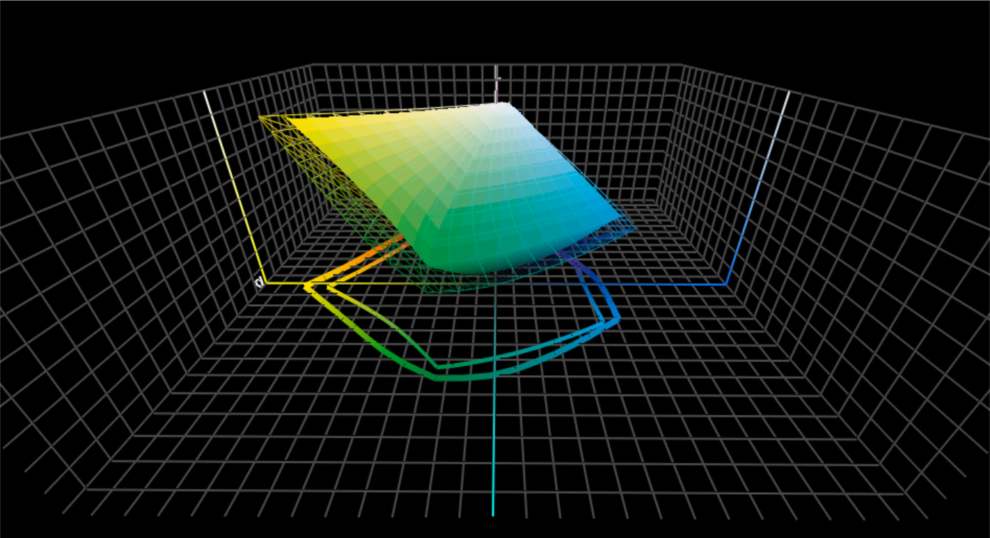
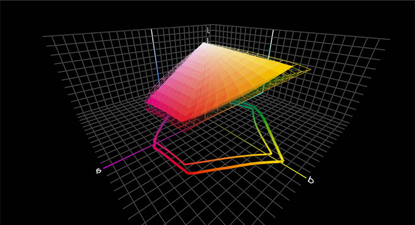
So the gamut comparison shows that XCMYK is bigger than regular CMYK, but what does that mean for print designs? An interesting study was done by Kiran Deshpande, Colour & Print Management Specialist at Multi Packaging Solutions in the UK. He compared the XCMYK gamut with a number of other gamuts. When looking at the volumes, XCMYK is 46% bigger than GRACoL2016 CRPC6, 43% bigger than FOGRA51 (PSOcoated v3 ICC-profile).
Also interesting in his study: a small fraction (2,38% of the XCMYK gamut) could not be reproduced on the proofer he used…
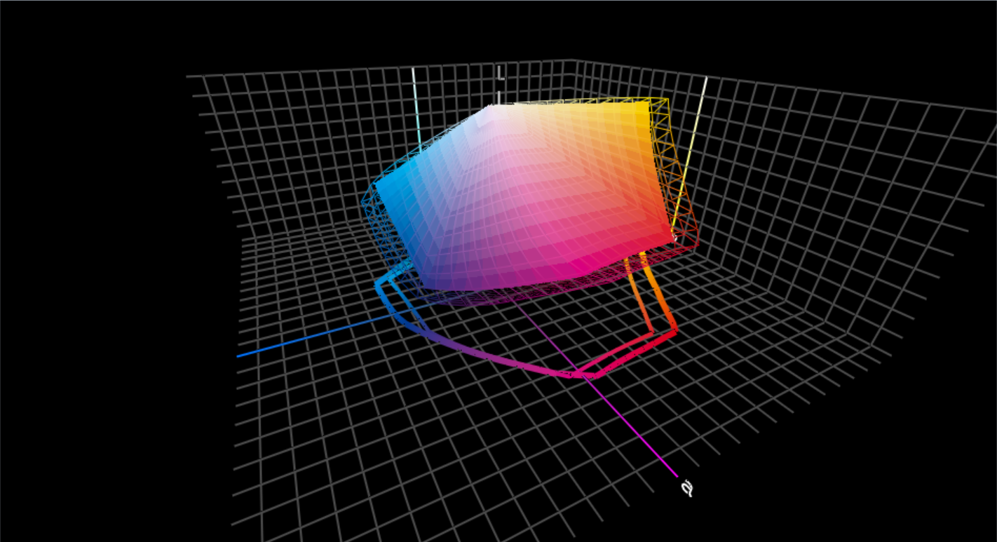
But maybe the most important comparison was with CMYKOGV, which is a 7-color process consisting of CMYK, expanded with Orange, Green and Violet. A process which is used in packaging. While CMYKOGV uses 7 inks instead of 4 with XCMYK, the gamut was only 14% bigger than the XCMYK gamut. If you look at the extra costs, especially the bigger printing press needed, that’s a very interesting finding. And packaging printers should look into this.
Real life
While the test mentioned above clearly shows that the XCMYK is significantly bigger than regular CMYK and therefore it can reproduce more colors, the question is what this means in real life.
More spot colors can be simulated, limiting the need for an extra ink. Artwork designed in CMYK will look more vibrant.
And what about pictures? That’s what I tried to find out in a small test, with a simulation in Adobe Photoshop and a calibrated monitor with a gamut that (nearly) covers the AdobeRGB colorspace. Being a photographer, I took a dozen of colorful images from my archive, most of them of flowers, but also some landscapes. When taking pictures of landscapes, I always use a polarization filter and I also boost the blue in post-processing, to get really blue skies (which I like). Also, the colors of the flowers were ‘boosted’, making both types of pictures interesting for this test.

When converting these images from AdobeRGB to either PSOcoated v3 or XCMYK 2017, there are some minor differences visible between the two profiles. Only in the blue skies, there was a quite noticeable difference, with a much better rendering in the XCMYK profile. When adding the paper white in the proof simulation setup, also differences in the greens and reds become more visible, but they are still limited. So there is a – slight – improvement in pictures.
UPDATE: check out these two articles: on my quest to find a printer for my photobook, and the final result!
How to proceed?
If you have to print a lot of brand logos and artwork, you might want to test XCMYK and see if it has advantages for your typical work. If you have a lot of images with blue skies, my tests revealed that the XCMYK is an improvement. Vibrant reds and greens show a slight improvement. But maybe the biggest advantage of XCMYK is that it is a standardized process, forcing everybody to work according to a certain procedure. And that means a more consistent production, which is already an advantage in itself.
If you have a lot of brand logos and artwork that are still outside the XCMYK gamut, you might want to wait for another project that IDEALLIANCE is working on: a 7-color process, CMYKOGV. If this will also show an increase of color gamut over the existing extended gamut systems, that would be very interesting for the packaging industry.
Why is this important?
If you can enhance your print production with a few simple tricks that don’t require expensive investments (7-color press) or more expensive consumables (special inks), that’s already enough of a motivation to look into it.
PS: you can download the XCMYK ICC-profile from this page.
UPDATE 21/12/2017: I didn’t mention one aspect of XCMYK in the original article: ink consumption. To get to the bigger gamut, XCMYK uses more ink. But it’s a bit more nuanced than you might think: IDEALLIANCE has used some interesting tricks in the XCMYK profile to lower the ink consumption.
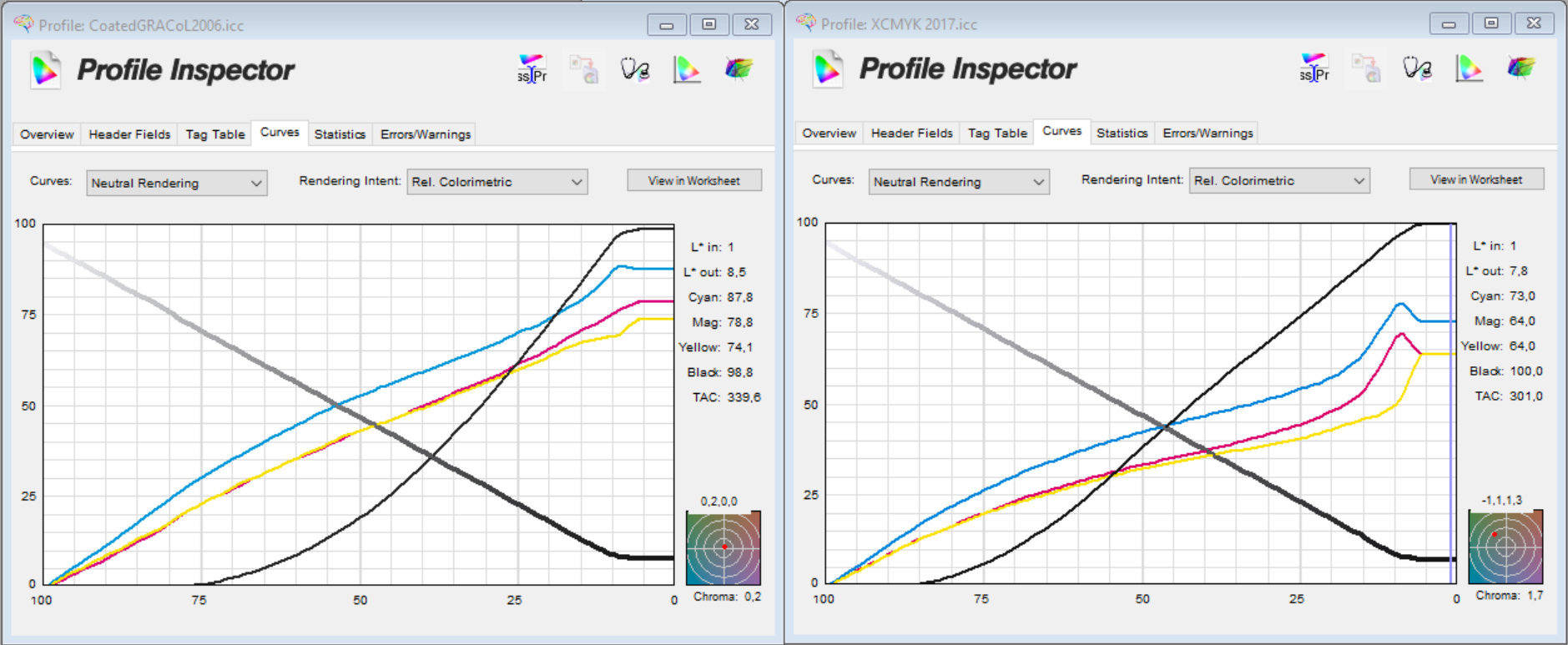
First: the total area coverage (TAC) is lower than e.g. in the GRACOL2006 profile. That TAC is the darkest black you can get, adding up the maximum percentages of all inks used, and this can be very different depending on which ICC-profile you use for converting RGB-images to CMYK (more on that in this blog post, where also the visual impact is discussed: Not all black is designed equally). In the case of GRACOL2006 this is 320%, in XCMYK this is 300%.
Second: XCMYK also applies a more aggressive ‘grey component replacement’ (GCR). This defines how ‘grey’ is reproduced. This can be done with using about the same amount of CMY, or you could only use K (black ink). In the first case you use more or less three times the amount of ink, plus it is less stable on the printing press: small deviations in one or two of the colors will deviate from a neutral grey. In the picture below, you can see the curves of both the GRACOL2006 (left) and the XCMYK profile (right). And you can see that XCMYK replaces CMY by K already with ‘lighter’ colors.
Both the lower TAC and the more aggressive GCR result in lower ink consumption, if you would use the same ink densities. In the case of XCMYK, the higher ink usage due to the higher densities is at least partly compensated with the use of the lower TAC and the more aggressive GCR.
UPDATE 26/04/2020: although XCMYK has an interesting proposition, it’s very difficult to find a printer using it, as I found when looking into publishing a photo book.
UPDATE 26/09/2020: I have hands on experience with XCMYK! Check out this article, covering my ‘corona photobook’ with lots of deep blues, which are impossible to print with regular CMYK.
Interesting article. What is the reason that European packaging printers did not participate? Is this still the old “battle” between the Idealliance experts and the ECI/BVDM/Fogra supporters? I assume that you refer to the ISO 2846-3 standards for CMYK-inks and the Lab-values provided by ISO 12647-3. Did they change the TVI according to Gracol? Is there any indication how the higher ink consumption (thickness) is?
Thanks Henk!
The reason why no European printers were involved: probably because IDEALLIANCE isn’t really known in Europe… Although they are trying to expand their geographical coverage to Europe.
The documentation I have, refers to G7, so I guess the TVI is the same as G7.
I didn’t find a statistic on ink consumption, only following densities as a rough guide: C: 1.85; M: 1.85; Y: 1.20; K: 2.0.
This is certainly nothing new. I actually formally described how do do this in 2009 ( http://the-print-guide.blogspot.ca/2009/01/printing-at-dmaxx-maximizing-cmyk-gamut.html ). What idealliance appears to have done is to create a standard profile – something that I was, and still am, against doing.
Hi Gordon, it has been done before, as you notice correctly. But the fact that IDEALLIANCE now has standardized it, is a step forward in my opinion.
Why don’t you think it’s a good idea to have a standard profile?
Obviously written by a photographer and not a print production professional. Couple of flaws, This cannot be achieved on a web press, and only dreamed on a sheetfed. Increasing ink film thickness on FM work leads to very bad things on the press…hence why FM screening was introduced was for consistency and running a more stable process (at mimumm ink film thickness). Many other issues creep up such as dry time for sheets with heavy coverage, marking, ghosting, chemical ghosting, ink consumption costs, blah blah blah. Want increased gamut? try digital! Cheers Gordo!
Hi Steve, thanks for your comment.
I didn’t claim that you could use XCMYK on a web press. I compared the gamut with the gamut of PSO coated v3, which is the sheetfed offset profile for premium coated papers (http://www.eci.org/en/colorstandards/offset). I did not compare it with a web press profile.
Please read my conclusions carefully: I only saw a small advantage for images, nothing spectacular (although the gamut is in theory more than 40% bigger). And I didn’t say that everyone should go there, I only suggested that people for whom this might be interesting (very colorful photos and some brand colors) that they should look into it, that they might want to test it in their print shop.
Regarding the ink consumption costs: the ink cost is only a few percent of the total print cost. If – and do read that ‘if’ – XCMYK is a real added value for a printing company, they can probably charge a bit more money for the more colorful print jobs, compensating that extra cost. If they can replace extra spot colors by a bit more standard 4-color ink, the cost of the extra ink is compensated by the elimination of the extra spot colors, next to the lower machine cost of a 4-color press instead of a 5+ color press.
Regarding dry time: drying equipment on sheetfed offset presses has also improved over the last decade, e.g. with extended delivery and UV-drying. If drying would be a real issue on a modern press, wouldn’t this have been a major issue at the 20+ test sites? I can’t imagine that if this is a real life issue with a modern press, that IDEALLIANCE would launch such an initiative. But I didn’t test this on a printing press, so this is just an assumption on my side.
And please be careful when making assumptions about people’s background.
I forgot one aspect in my reaction yesterday, and also in the original article, which is relevant to the ink consumption and the drying time. XCMYK uses a lower TAC and a more aggressive GCR than GRACOL2006. Which means that the higher ink consumption due to the higher densities is at least partially compensated by these tricks. I’ve added an update to the article, including a screenshot from the curves of both profiles.
To know the effect of a lower TAC and more aggressive GCR in real life, you might want to check this article by Paul Sherfield, a print consultant from the UK: http://www.missinghorsecons.co.uk/wordpress/2012/02/the-power-of-grey-and-black/ He once told me that he has applied the really low TAC profiles (260%!) at a number of his clients, one of them producing very color critical catalogs. And they were very happy with the result, especially with the higher stability on the printing press and the excellent color quality.
FYI, I am the person who was responsible for the development of the low TAC profiles that Paul reviews in his article. I initiated the project after hearing complaints from a food packaging printer about drying times of ‘low migration inks’. Even the profile with a 220% TAC we developed produced very good results and had only a just noticeable difference with a 320% TAC profile (a few dozen of print professionals participated in that visual test, we used some critical images, all printed in offset on coated stock). The food packaging printer loved them and has used them ever since (usually the 260% profile, but in some occasions also the 220%).
Thanks Eddy for your comments, I worry when print shops who try this forget about clients branding? what happens to logos that no longer match let’s say other printing results (web or standard sheetfed)? Corporate branding is very particular and needs to be consistent. Different gamuts and or profiles will alter. This means most commercial clients wouldn’t want to go this route. That leaves a selected niche market for this technology. As for Ink consumptions costs are very real. Large printer spend millions of dollars a year in ink alone. A 3% increase alone in ink could be as high as $90,000. As for charging more for this technology, not going to happen…clients wouldn’t pay for many new technologies such as CTP, stochastic printing and Press side proofing. Many other technologies have boasted elimination of spot colours and failed. We all know that trying to create spots from process colours creates large issues such as consistencies even if the gamuts were larger. large areas made up of process colours are difficult to control ink film and colour and roller marks and a whole list of other issues that a single pantone colour lays down easier and better than.
As for dry time, We still have issues with heavy coverage with the two sheetfed presses at my location which run daily. Running low TAC profiles with higher GCR helps with consistencies and ink film, but as for my experience in running GCR across pressrooms leads to problems with matching colour and if the press isn’t running exactly 100% (which happens) limits the pressmans ability to push/pull colours when needed. I realize in a small controlled environment, High GCR and matching colour proofs made to a proper specification will work wonderfully, however large pressrooms with various equipment, operators and proofs from all over the country doesn’t always play nice.
Clients branding and more specific simulation of spot colors: that’s a tricky one… This should be handled with care. I’m not an unconditional believer in ‘The Color Algorithm’, converting spot colors automatically to CMYK does have serious risks (you might want to check this blog post: https://www.insights4print.ceo/2017/01/brand-colors-printing-cmyk-better-safe-sorry/ and this follow up post: https://www.insights4print.ceo/2017/10/brand-colors-better-safe-than-sorry-again/). BTW: do your digital presses handle spot color conversions well?
And the offset printing process is a very complex ecosystem. Different presses have different dot gains (needing different compensation curves to get to the desired dot gain). Different consumables like ink, rubber blankets, fountain solutions, … can result in differences in print. Even other factors like the water used for the fountain solution and the climate inside a production facility have their influence. As an example: I know a printing company that had quality problems on a regular basis (getting to the right color and color stability). After a long search it seemed that the tap water they were using for the fountain solution was very unstable: sometimes it was very hard, sometimes very soft, sometimes in between. After installing a water treatment system, the problems disappeared. Immediately. Another issue they also attacked was climate control: “The best investment ever”.
To tell an anecdote about climate control: I knew a large printing company that had reprints on a very regular basis and they had issues with getting the color right. From one of the press operators, I knew that they didn’t have climate control, resulting in temperatures up to 30°C (86° F) in Summer, as low as 14° C (57 °F) in Winter. Imagine how the inks react in those temperatures… I managed to get a temperature / humidity logger into the press room for some time, in October I believe. After a few weeks I looked at the log files and it was amazing how the temperature and relative humidity fluctuated during operating times… And often well outside the recommended parameters. FYI: the company doesn’t exist anymore, they went bankrupt.
When having all these parameters under control and working according to a standard, corrections on the printing press should be very limited, so GCR should be no problem. In case you do need a lot of work to get to the colors of the proof or sample the client provided, you might want to question the quality of the proof… Colors degrade over time, not all proofers are well maintained, some designers like to use the same swatch book their entire career… Some printing companies also produce an internal proof in the case of such difficulties. A wise move.
My main issue with this initiative is that the benefits of standardization of this process go to the standards organizations like Idealliance and not to the printshops. Idealliance earns money through providing training, certifications, recertifications, etc. So, yet another standard promoted by industry pundits creates new revenue opportunities for them. The printshop, on the other hand, sees the loss of a means to differentiate their offerings, a further commoditization of their services, and yet another industry push to compete for business solely on the lowest price.
I’m all for standardized print characteristics – when it’s appropriate as with publications printers. However, I’m also an advocate for printers being able to define their own shop specific print characteristic so that they can differentiate themselves from their competitors. Homogeneity of the print characteristic through over-standardization, in my opinion, is not a step forward for the industry.
There are other reasons, some technical (some of which were pointed out by Steve) but, homogeneity of the print characteristic through over-standardization is probably the primary one.
I disagree. Homogeneity doesn’t mean mediocrity. From what I’ve seen, a decade ago, with print standardization – and therefore more homogeneity – in Belgium / The Netherlands was an improvement in quality for most printers. And never a deterioration of print quality. At that time, I was involved with one of the ISO 12647-2 certification systems, I’ve seen interesting statistics about a great amount of certification press runs (if I recall correctly dot gain was the main issue).
I remember an anecdote from those days, about a small offset print shop that claimed that their point of differentiation was ‘superior print quality’, thanks to the large amount of setup time / sheets that they took for each job. When they eventually had to get an ISO 12647-2 certification, they saw that the print quality improved: they achieved a bigger color gamut. And that they had other benefits too: shorter setup, more stable production.
And especially those two are beneficial for printing companies: shorter setup, more stable production. The bottom line of that is fewer costs, which improves margins or competitiveness.
Print shops don’t need an IDEALLIANCE training or consultant to get to G7 or XCMYK. If they have a skilled, intelligent, curious press operator who is open to this kind of exercises, they can do without external support. And the cost of certification? Consider that as a publicity cost: if successful, the can use the ‘badge’ for promotion, they get listed as a certified printer, as a quality printer.
Differentiating on print quality when using standard stock is difficult: either print quality is correct (i.e.: as expected / as agreed) or it is bad. There is no ‘better’ anymore, contrary to earlier days.
Consistency is key in print production these days (see Steve’s remark). So, if you want to differentiate, you need to look beyond the standard print quality. E.g. extended gamut, or special substrates, special finishing and guidance of the customers in choices, design. Or even broader: services before and after the printing part.
We were an early user of the XCMYK for your printing. I am surprised more companies have not started utilizing it. The best examples are like you said open a file in Photoshop, with the profile set to Adobe RGB, and then preview it then in CMYK, and then again in XCMYK. The XCMYK is so much like the Adobe RGB thus making the files your client make/upload to you more close to an match for Screen to print / Apples to Apples.. No More, CMYK front lit print proof, that the client may say it doesn’t look like what on their RGB Backlit screens..
Thanks for your ‘real life’ feedback Dave! Glad you see a real improvement over ‘regular’ CMYK.
Interesting project. I read the comments here above with interest and saw that Steve mentioned a couple of things, one being problems with drying when printing with FM, the other one being trouble that a higher density and a different profile might have on printing of logos that have been output using the older output CMYK profiles, – say Fogra 39, Fogra 47, Fogra 51, Fogra 52 or whatever.
I was lucky enough to try printing with the Kodak Staccato FM during my time as a printer and later on I sold this solution along with other Kodak solutions in Iceland for a few years.
The main advantage with using FM, say Staccato is precisely that at 25 mikrons there is not very much you can do as a printer to change the printed output and when you come down to 20 mikrons or below you just need to make sure there is enough ink on the paper, density up or down 0,30 changes just about nothing in the output. The physical reason for this is simply that the dots are so small that they reach their maximum dotgain when you are still missing 0,20 or so in density for each color. I printed with 25 mikron Staccato on coated paper and I had a customer later that has a Kodak workflow that only uses Staccato FM when printing on uncoated paper, – amazingly at 25 mikron (where Kodak recommends 35 mikrons for uncoated substrates). The prints look amazing of course and the solids look like Pantones visually but they actually do this simply to speed up drying time first and foremost. I never had to worry about over-inking when printing with FM so I am surprised to read that FM was created for minimal inking. Perhaps you are using another FM system, perhaps not 2nd order?
If the LAB values = densities are pre-set by Ideallience for their new profile, it should not be complicated to do a simple conversion from the original CMYK gamut (say Fogra 39) to the new gamut to recalculate the color of any logo to compliment the higher density.
Getting offset printers to print at higher densities might be hellish, since we are really set in our ways – especially when it comes to our densities. I only know of one case where a paper manufacturer managed to get offset printers around the world to print at considerably higher densities than “their standard” was at that time. This manufacturer is Arctic Papers and the paper in question is the Munken line of uncoated paper that I am sure you are familiar with. They have their own custom profiles online on the website. The result is not within ISO standards but damn vivid and nice when you are printing pretty pictures, not brand colors.
Hi Eddy,
Thanks for the very interesting article. I see the testing was performed using FM screening, is there a limitation of XCMYK using AM screening?
Thanks Pat!
Idealliance says the following about AM and FM screening: “XCMYK printing works best with FM screening (typically 20 micron) or any other non-traditional screening that uses very small ink-receptive sites (…). AM screening will tend to produce a smaller gamut improvement in light pastel, tinted colors.”