

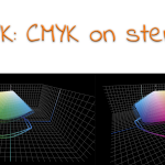
XCMYK: regular CMYK on steroids, that’s the title of an article I published a few years ago. XCMYK is a rather simple method to produce an ‘expanded’ gamut with your standard printing inks on your standard, four-color printing press. You only need FM-screening, or another non-traditional screening, and a higher ink density. Although it seems an exciting technology, I recently found that it’s tough to find a printer using it. Which is a shame: there is definitely a business case for this.
CONTENTS: Converting deep blue to CMYK | Enter XCMYK | One, exactly One | Also digital | Why is this important?
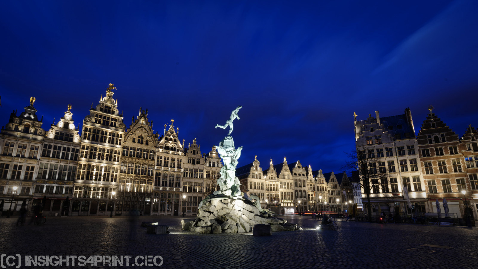
Maybe you know that I also have another passion: photography. And during the semi-lockdown due to the corona-virus, I started to take pictures of a desolate Antwerp (the city where I live). And I love to take photos at the end of the ‘blue hour’, the moment with the deepest blues, just before everything turns black. It’s a beautiful moment, but it also looks a bit threatening — the perfect atmosphere for a series on a pandemic.
Since I got a lot of positive feedback on my pictures, I started the idea of publishing a book. Digital printing and online print shops have made it affordable to publish books in short runs. So, it seemed an easy venture. Until I did the first RGB to CMYK conversion…
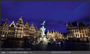
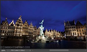
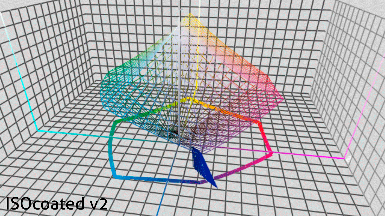
I knew that converting a vibrant, deep blue can be challenging. A few months ago, I published an article on the lousy color conversion in newspaper printing: the infamous ‘Yves Klein Blue’ became purple in my printed newspaper. But now it seems that also on coated papers, with a much larger gamut, the blue-to-purple issue still exists. Check the pictures below: the original in AdobeRGB, two conversions: one with ISO coated v2, the other with the more recent PSO coated v3. These don’t look good, the ISO coated v2 even awful! And remember: lots of printers are still promoting that profile as their preferred way to convert RGB to CMYK for coated papers.
Enter XCMYK
And then, I noticed, at the bottom of the list of profiles in Adobe Photoshop, the XCMYK 2017 profile, which I installed when writing the article comparing XCMYK to regular CMYK. So I checked it. I hoped it would be a bit better: the XCMYK gamut is a bit larger. And indeed, it delivered! Look at the picture below, that’s how I want my book to be printed!
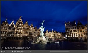
In the following graphs, created with Chromix ColorThink, you can see how a sample of blues get converted by ISO coated v2, PSO coated v3 and XCMYK 2017. Quite different.
One, exactly one…
So I had found what I needed to make my photo book look the way I want it! Except: try finding a printing company that uses XCMYK… Eventually, I found one – yes: 1 – printer, in Spain, that has published a showcase on it. Fortunately, I got a quick response to my info request.
But it’s a bit disappointing. Many, very many printers are complaining about tough competition and how difficult it is to differentiate. Well, here is a rather simple trick, with a limited investment (you don’t need to invest hundreds of thousands or even millions in new equipment) and almost nobody takes the effort to investigate it, to use it! Unbelievable! Stop complaining and start innovating!
And as I’ve shown with my pictures: there is definitely a market for it. Photo books, art books, books on travel and architecture, all print related to fashion, textile and interior decoration, interior design. Do I need to continue?
Also digital
XCMYK doesn’t only apply to offset printing, it can also be used in digital printing. Idealliance, the organization behind XCMYK, even claims: “Adoption of XCMYK has been high in the digital print segment, where it is used by many printers to achieve more pleasing results.” So, why doesn’t anybody advertise this? No digital press vendor, no printing company. This is a USP (unique selling proposition), out-of-the-box – if what Idealliance claims is true – but nobody advertises this… Try a search on XCMYK to see for yourself.
Why is this important?
Many printing companies have small margins. Investing in automation and standardization can grow the profit margin a bit, but it has its limits.
Having a ‘unique selling proposition’, differentiating with something unique, will create a bigger margin. And here is a new market: when using XCMYK, you can get a very noticeable larger color gamut, maybe not in percentage, but definitely in pictures, which should look very appealing to publishers of collectible books, like art books. There is some investment involved, mainly in testing and training, but it’s a lot smaller than the latest and greatest new press or finishing equipment. Why didn’t you try it yet?
And if you are a vendor of digital printing equipment: why haven’t you invested in promoting it?
Maybe I’m missing something. If that’s the case, please leave a comment!
You can find more information in the Idealliance – Guide to Print Production 20.1, which you can download for free.
UPDATE 28/04/2020: there is also another option to make the gamut bigger: adding extra inks. One of the options is adding Orange, Green and Violet (CMYKOGV). But you need a – much more expensive – 7-color printing press for that. And in this analysis you can see that the gamut of CMYKOGV is only 14% (!) bigger than XCMYK. That’s only a minor benefit, for a huge extra cost.
PS: here is my blog post with the images of a desolate Antwerp during the corona-virus lockdown.


Classic dilemma with the heavenly blue that always turns light purple.
The XCMYK method by the Idealliance is actually a great idea. Unfortunately most commercical printers have given up on FM and are sticking to AM – what they know and what they learned.
They are probably also thinking that this would make little sense when CMYKOGV is just around the corner. I personally don’t think it is around the corner in the traditional print business (magazines, newspapers etc.) but that is another subject.
For your photobook I would just look up a CMYKOGV / expanded gamut printer and have them print it. They are out there, although few of course in analog printing.
From a technical and commercial perspective it surprises me that not all digital printshops offer expanded gamut printing by now – or to turn this around, – it surprises me that not all manufacturers of digital print devices for production in 2020 offer expanded gamut printing of RGB images, taking advantage of the entire gamut of their devices as a default output with their devices. Or perhaps they do but their customers don’t know about it or don’t care?
There will always be customers that just want the maximum colour gamut (such as you and many photographers).
Best regards
Ingi
Thanks for your comment Ingi!
I don’t know if CMYKOGV is around the corner (except maybe for packaging/labels, to reproduce more colors with standard inks). It would also make the job much more expensive: you need at least a 7-color press… And that’s the advantage of XCMYK: you just need a 4-color press, FM-screening and a bit more ink. Plus: it gets rid of that old blue-to-purple issue.
I checked multiple digital print jobs and they all advertise ISO coated v2 or sometimes PSO coated v3 as their preferred way to deliver print jobs… Many (or most?) don’t even accept RGB! Which is a shame if you digital printing press has a larger gamut. That’s like driving around in a Ferrari in the city center…
The technology for extended gamut CMYK was already available in 1995, 25 years ago! Kast + Ehinger in Germany created their Novaspace system but failed at that time because most printers were no able to control their dotgain during plate production and print. When CTP came available with square spot technology new FM-screening systems came on the market. Several printers in Germany created an additional market for art books and automotive catalogs. K+E introduced Hyperspace icc-profiles with increased ink thickness, frequency modulated screening and a far larger gamut. Epple Inks did the same with their Aniva system. Some printers in Germany (Biering Munich and Cramer Greven) had lots of success, however they were not able to create a substantial market with loyal customers. The major obstacle was – I think – that there was no generic icc-profile and proofing system. Most printers focused on ISO 12647 and offered a standardized product. A few printers are nowadays able to print with extended gamut inks and FM-screens on uncoated paper. The gamut is great for photo books and art catalogs. However always in a special combination of ink-paper-screen and lithography.
Thanks Henk for these insights!
Let’s hope that now that there is a standard ICC-profile, some printers and customers might get interested…
Fun trivia fact: Chinese watch manufacturers also struggle with accurately representing the blue color of dials in online pictures of their watches. You buy a watch with a blue dial and end up getting one that has a strong purple cast. On watch forums they now call that color ‘blurple’.
It looks that the German ink supplier Epple uses the Aniva extended CMYK-system in Germany. They listed just one printer in their list of certified users. That is Druck + Graphic Peter Pöllinger in Munich. Several samples are shown on theire site. They claim a 20% larger gamut but don’t show any images in the purple region. See: https://www.grafik-druck.de/aniva-farbsystem/
This is an interesting insight as I was not aware of XCMYK. I did now about a software called Touch7 (touch7.co) that gives creative tools for designers in Extended Coulor Gammut.
I would be very happy to test your files on our Xerox colour systems, like the Iridesse.
Let me know if you are for it.
Thanks Frank! I’ll take a look into it!