

You may have read my previous article, on XCMYK and the business case: my ‘corona photobook’. Since the publication of that article, a lot has happened. And it’s an interesting story, and sometimes a sad one. But in the end: I got my book printed, in the quality I wanted! Meaning: deep blues that stay deep blue, and with a lot of detail too. With just four standard colors! Yes, it can!
CONTENTS: Two vendors | ‘My precious…’ | Jubels | Training makes the difference! | The full potential | Why is this important?
After publishing the previous article, I got contacted by two different digital press vendors. The first one pointed me to a printing company that had purchased a 6-color press. Interesting, so I contacted that printing company, with a few questions, including which ICC-profile they use for RGB to CMYK-conversion for the 6-color digital press. I also explained that I was preparing a photobook with difficult deep blue colors. A few days later, I got a reply, telling me that they don’t use the 6-colors for photobooks. They might use it for particular jobs like catalogs for paint samples, but photobooks? No, thank you! After insisting a bit, the CEO checked with his press operator and had to admit that they always printed in CMYK only. They never use the 5th and 6th color… But: he was open to print a few samples, I send him a test file, and many weeks later, I got some samples.
The second vendor that contacted me, suggested printing a few samples on his latest and greatest digital press in the demo room. Nice, but I told him that I needed a printer that would like to produce my high quality photobook – and get paid for that. I wasn’t looking for a few free samples. So, he contacted one of his customers, who contacted me. I also send him the test file, and a few days later, I received the samples. And – hurray! – my deep blues were deep blue! Yes! I was right: it could be done on a 4-color digital press. The printer followed up with me, and I said I was happy with the results and asked to make me a quote, 50 books, 92 pages, A4-format. Which I never received…
Meanwhile, my friends at De Grafische Vakpers (The Graphic Trade Press), a news blog in the Netherlands, published a slightly adapted and translated version of my article. And several people responded to my call. One of those claiming to have a solution soon connected on LinkedIn and wanted to make an offer, but after sending him the test file, I didn’t hear from him again.
‘My precious…’
A printing company that works with waterless offset and a higher density, also responded, with a lot of impressive references. But when asked if they could share the ICC-profile they use for the RGB to CMYK conversion, they said they don’t do that, “You understand why.” Well, no. I don’t understand why (unless I’m missing something). I know they put a lot of time, energy and knowledge in it, that it’s their ‘secret sauce’, which they cherish. But it is a profile that is 100% tweaked to their production process, it is of no use to any other printer. But for me, as a potential customer, it as a very valuable sales argument: I can use it for soft proofing, I can check upfront what the colors of my challenging pictures will look like in print. Since they don’t want to share it, I will never work with them, even with all those impressive references they have.
And this happened with several other printing companies: when asked which ICC-profile they use for RGB to CMYK conversion, they stayed silent. Or they use the common ICC-profiles that don’t fit my need, the ones I showed in my previous article: ISO coated v2 (purple shift) and PSO coated v3 (loss of detail).
Jubels
And then there was the response of Jeroen, the CEO of Jubels printing company. He immediately suggested making several samples – not just one! And a few days after I sent the test file, I got a nice set of samples: both coated and uncoated, both conversion with a regular CMYK and the XCMYK profile and printed on both the Xerox iGen5 and the Xerox Iridesse. Wow. He put together a really nice package, including also some extra print samples and brochures. That’s the way to do it! That’s the way to convince potential customers! (please, read that previous sentence again, to make sure you got it)
The different samples are really interesting. And they clearly show the differences between the profiles, between the presses. Now I could really compare the options. And the best one: the Xerox Iridesse on uncoated paper, with the XCMYK profile of course. Which was the same combination I had received from that other printer that I was happy with… And now it starts to get very interesting.
Training makes the difference!
Although the two sets of samples were produced with the same equipment on a similar paper, there were clear differences. Which means they are related to settings and/or training.
Here are the differences:
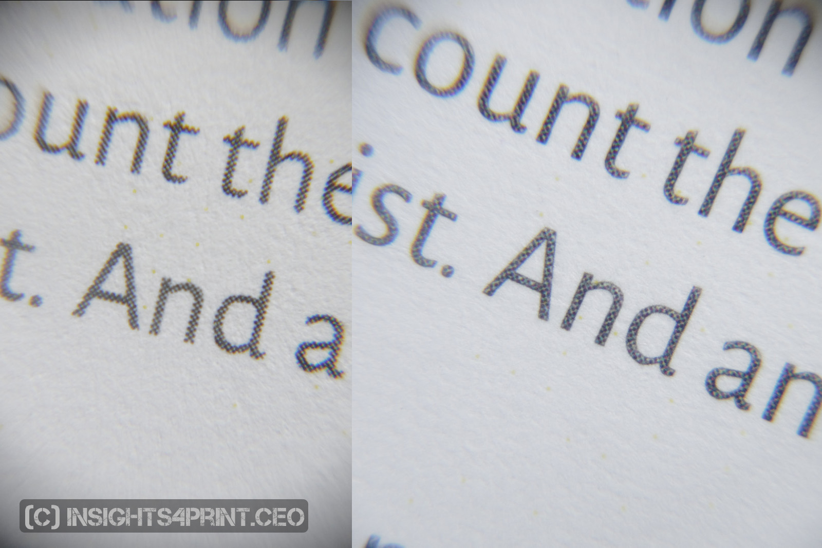
- Black text: in the first samples, these were composite colors, in the second (Jubels) samples, they were pure black. That’s just a setting.
- Color: although I was already pleased with the color reproduction of the first samples, the second was even better. The deep blues was even a bit deeper blue, just like I saw them on my screen, just the way I intended them to be. That’s training, maintenance (maybe even the environment) and knowing what your machine is capable off.
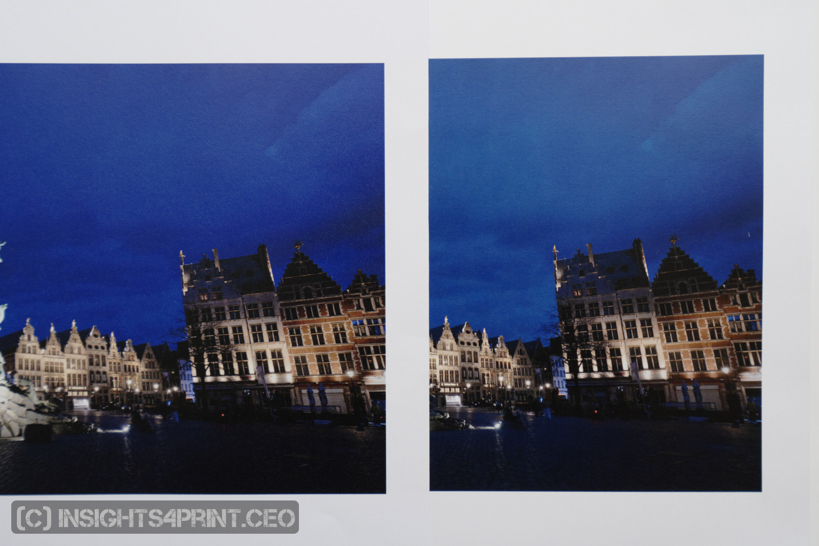
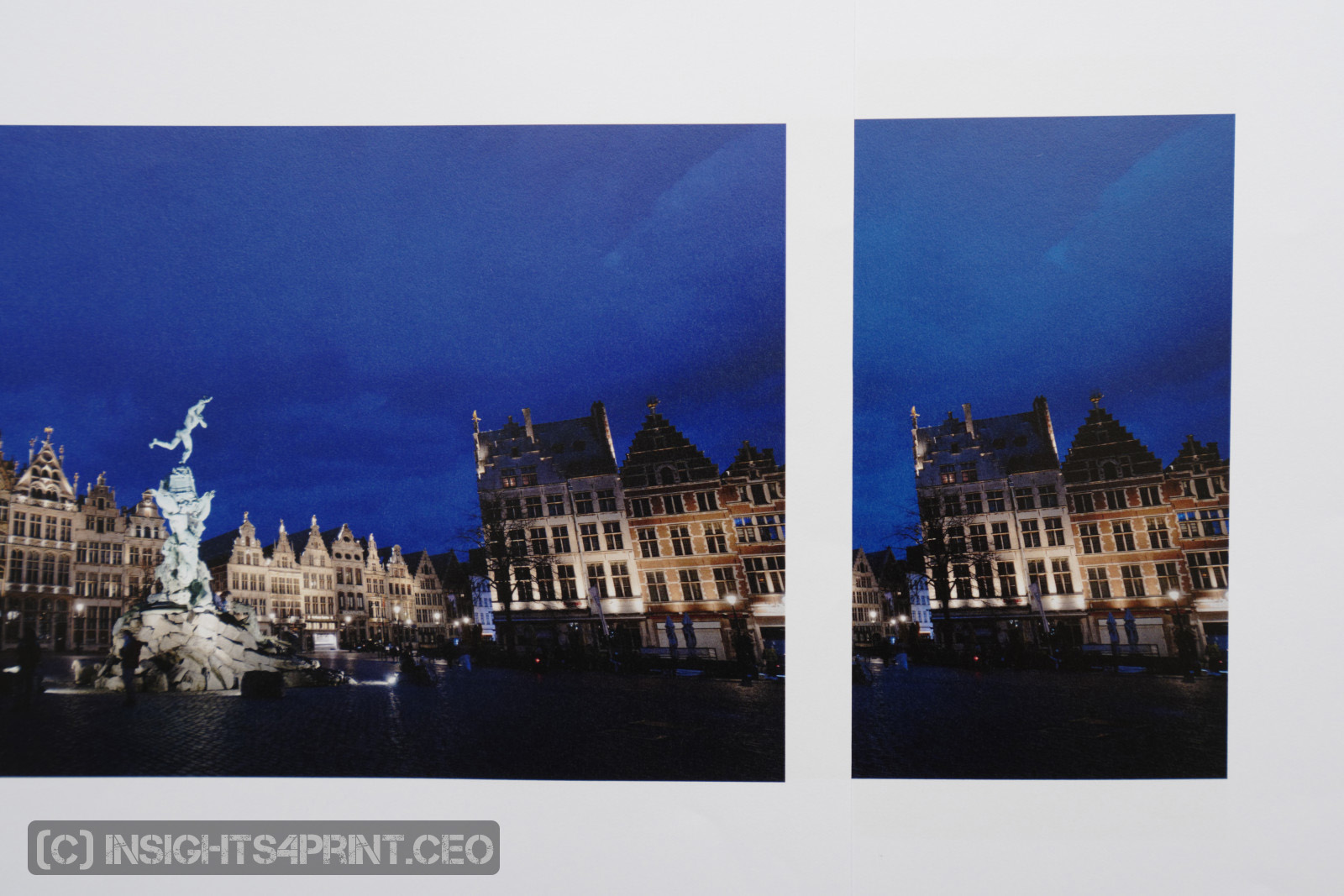
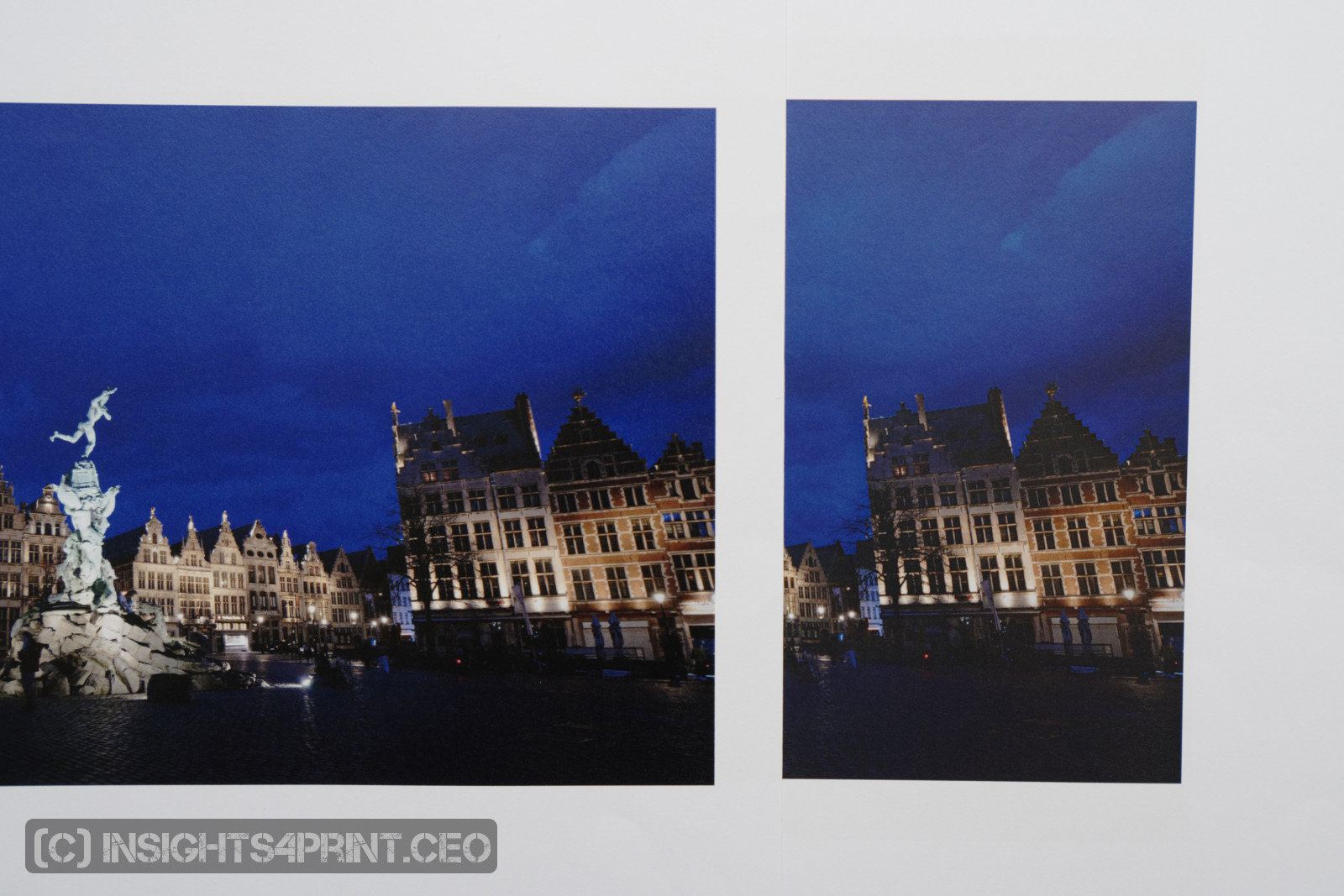
The pictures below are from the different samples I got. Please note that the color reproduction in this blog post isn’t 100% accurate, I don’t have the photostudio to do that and maybe your screen isn’t 100% AdobeRGB and calibrated, so you need to check the relative difference.
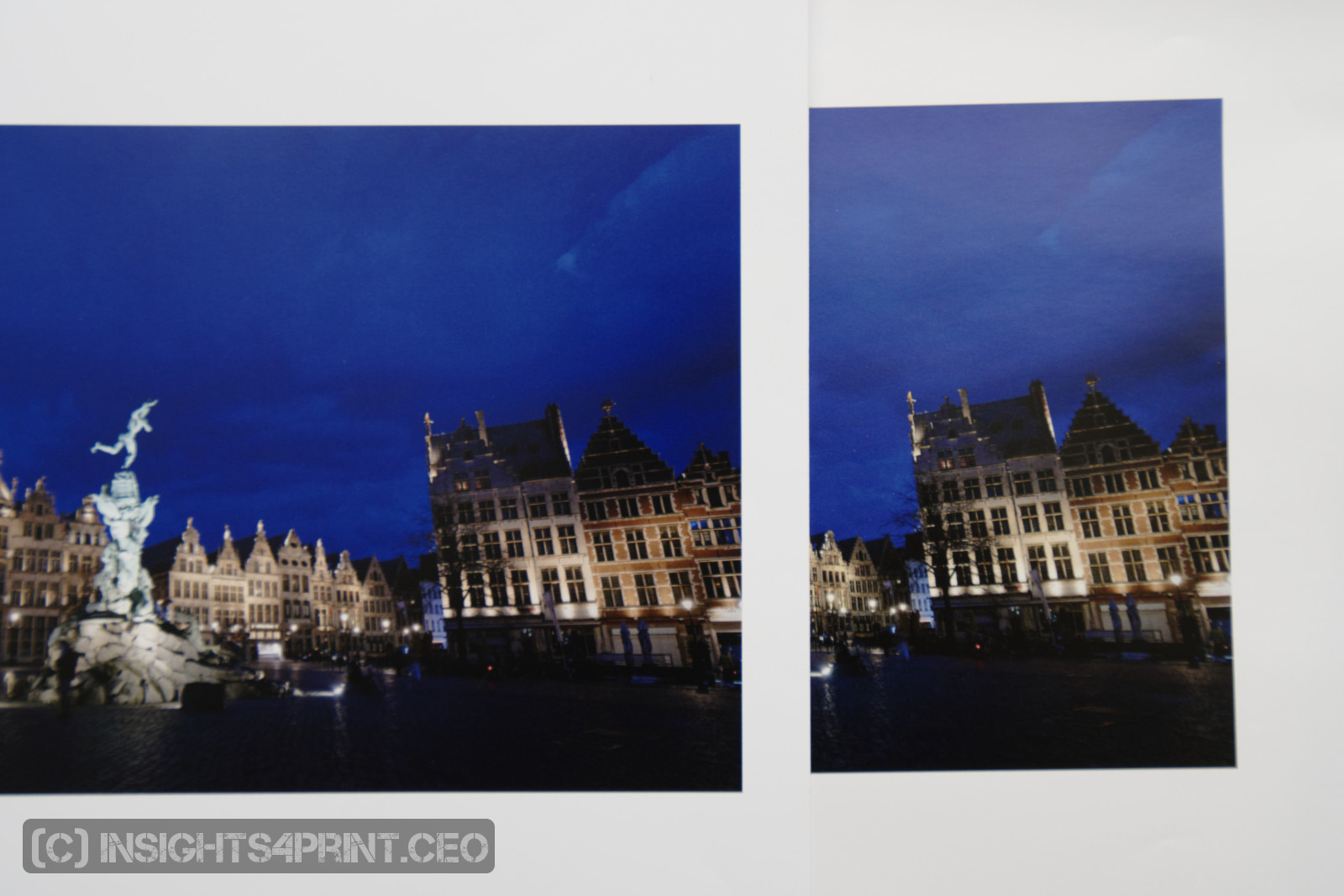
The picture below shows the difference between the sample by Jubels (left) and the other Iridesse print (right). Although it is blue in the right one, the left one does resemble my digital image more. The left one is how I intended the picture to be.
The next one shows how the XCMYK profile (left) compares to the a regular CMYK (right). Please note that I send a RGB PDF (PDF/X-4 with AdobeRGB images), the color conversion was done in the RIP.
The following shows the difference between the Iridesse + XCMYK (left) to iGen5 + XCMYK. The Iridesse is a more capable machine when it comes to color gamut.
The last one compares the Iridesse XCMYK (left), this time on coated paper, compared to the 6-color digital press (right).
When I first checked the samples of the 6-color press, I was in my dining room/home office. There I have a 6500 K fluorescent light and I noticed that some blues looked a bit purple. However, when I took the picture above, near a window (it was an overcast day, around noon), there was no purple shift! Which means there was some color shift due to the lighting…
The full potential
Over the past weeks, I had several e-mail conversations with Jeroen, and at one time, he said he didn’t really understand what my problem was: “We do this kind of work all the time.” He was a bit surprised when I told him the issues I had run into, the problems I had finding somebody who used the full potential of his equipment. Someone who could produce high quality photobooks, starting from a PDF with AdobeRGB images in it.
Why is this important?
Many printing companies have invested in digital equipment, which is often very capable. But the industry seems to be stuck on the idea that a printing company should only accept CMYK-files, and with – sometimes even age-old – ICC-profiles that don’t give the best possible RGB to CMYK conversion.
Digital press vendors have made a lot of effort to improve their solutions, also when it comes to color reproduction and gamut. But what’s the use of those improvements if printers stick to that very average standard CMYK? When printers don’t want to accept RGB PDF’s for high quality print jobs like this kind of photobooks? Photographers have made the shift from the small and limited sRGB gamut to the much bigger AdobeRGB, but printers haven’t changed the output side. It’s time to change that.
My photobook shows that you can get a much larger gamut, just with the standard four colors on a digital printing press. No extra color, no magic or ‘secret sauce’ needed! You just need to make use of the full potential of your digital press, train the press operators and help customers by doing the RGB to CMYK conversion yourself, with the appropriate tools and settings on your digital press, e.g. with the XCMYK-profile.
Yes, it can be done! And if you don’t believe it: buy the book and check it with your own eyes!
Eddy Hagen has the experience and technical expertise needed to get the best possible quality from digital color printing devices for the most discerning print buyers.
I think the issue is that they will then receive a wide variety of different RGB profiles and thus more color transformations need to be done. I think they keep to the CMYK method since it kinda forces the supplier to do work themselves. Less errors to happen and people perhaps stating transformation errors done by the printer. So less “he said that she said…”
Thanks Rombout!
I don’t share your fear. The wide variety of RGB profiles are probably only sRGB and AdobeRGB, with maybe sometimes ProPhotoRGB or ECI RGB. And the RIP should detect that and perform the transformation to the output profile automatically. Especially in a digital press that should not be an issue. And given the fact that recent digital presses can have a bigger gamut than the traditional offset gamuts, it’s worth to let the RIP of the digital press do the transformation from RGB to the destination profile.