

I’m disappointed, frustrated. A few weeks ago, I ordered two large format prints (100 cm wide) of images from my photobook on the lockdown in Antwerp. Both had – of course – a large number of vibrant deep blues, plus a touch of red. When I received the prints, the red was either desaturated or even something orange. The reason: the printing company has an ‘all sRGB-workflow’ and probably ignored the AdobeRGB profile that defined my very vibrant images. The feedback I got after complaining: “sRGB offers the highest quality”. No, not really… Let me explain it.
CONTENTS: Incomplete and incorrect information | Show me the profiles! | Flabbergasted | Who is to blame? | Why is this important?
In case you haven’t seen my corona pictures, please take a look, either at the e-book, or read the two previous blog posts about the book project (the challenge, the solution). As you can see, the pictures contain very vibrant colors, intentionally. To enjoy them to the fullest, you need to see them on a (close to) 100% AdobeRGB display, which becomes more and more common.
When printing a book, that is challenging: the gamut of regular CMYK in offset is a bit limited, especially in the blue area. But when going to a large format, fine art photo print, these vibrant colors shouldn’t be a problem: these large format printers usually have a large gamut, well, at least much larger than the regular CMYK in offset.
I checked the websites of about a dozen companies that print this kind of fine art photo prints, to see which one had the best offer, in terms of quality. I’m happy to pay a premium for that extra quality that I want. Already after checking a few websites, I noticed that the knowledge of basic color management is either very low in these companies, or they deliberately publish incomplete and therefore incorrect information, in an attempt to simplify things and not to confuse customers.
Most of the websites I checked, were talking about RGB profiles in general. As if sRGB and AdobeRGB are the same (no, they are not, they are very different). A few websites state that they only use sRGB. That is, of course, their right to do so, but it is a dealbreaker for me: I want to be able to use AdobeRGB as input profile, and I know why.
Show me the profiles!
Only in a few cases, the companies supplied output profiles, that’s what I was looking for. I want to be able to download these profiles to assess the quality I will get. I do this in two ways: I check how big the gamut is in the 3D color space (I’m using Chromix ColorThink, but you can also use this website: https://www.colorview.de). Next to that, I use the profile to do soft-proofing in Adobe Photoshop, on my nearly 100% AdobeRGB, calibrated screen.
And that’s necessary: one of the companies that offered ICC profiles, was – of course – bragging about the impressive colors, etc. What is interesting is that they use a photographic process, not inkjet print. So, I was very curious what that would bring me! And it was a disappointment: the color gamut of that fantastic solution was (much) smaller than a decent inkjet print…
The company that I have worked with in the past offers ICC profiles. But for the rest, only very few offer them. So after having checked the options, I eventually opted for a company that provides two options for acrylic prints, the regular one and the ‘fine art’ one, which claims to be “even more vivid, thanks to the modern 12-color printing method”. With that claim in mind, and because I saw that the gamut was a bit larger than my previous supplier, I ordered two prints.
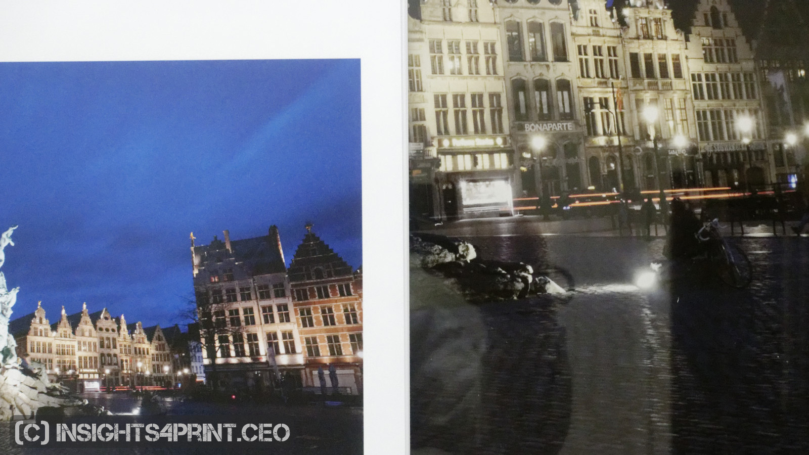
And great was the disappointment when I received those prints, especially when taking both the promise of even more vivid colors and the price (over 200 euro per piece) into account. The blues could have been more vibrant, but especially the red accents showed something was wrong. Very wrong.
Flabbergasted
After complaining about the quality, I got a long reply, which flabbergasted me (I always wanted to use that word!). They were claiming that they only use sRGB since this offers the highest quality. And they had lots of satisfied, notable customers, so I had to be wrong, not them!
[ sigh ]
I replied with the suggestion to read this color management tutorial first.
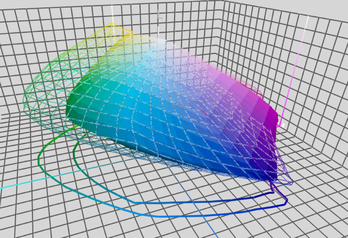
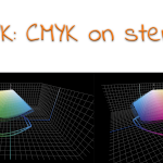
I also showed a few graphs: the first one with a 3D comparison of sRGB (the red one) and AdobeRGB (the grey wireframe). Plus: the colors of my two images plotted in that 3D space! Guess what: a large number of blue tints are OUTSIDE sRGB. Yes: part of my beautiful dark blue tones can not, can never be represented with sRGB. And if you have an sRGB only workflow, you can NEVER print them the way I intended them.
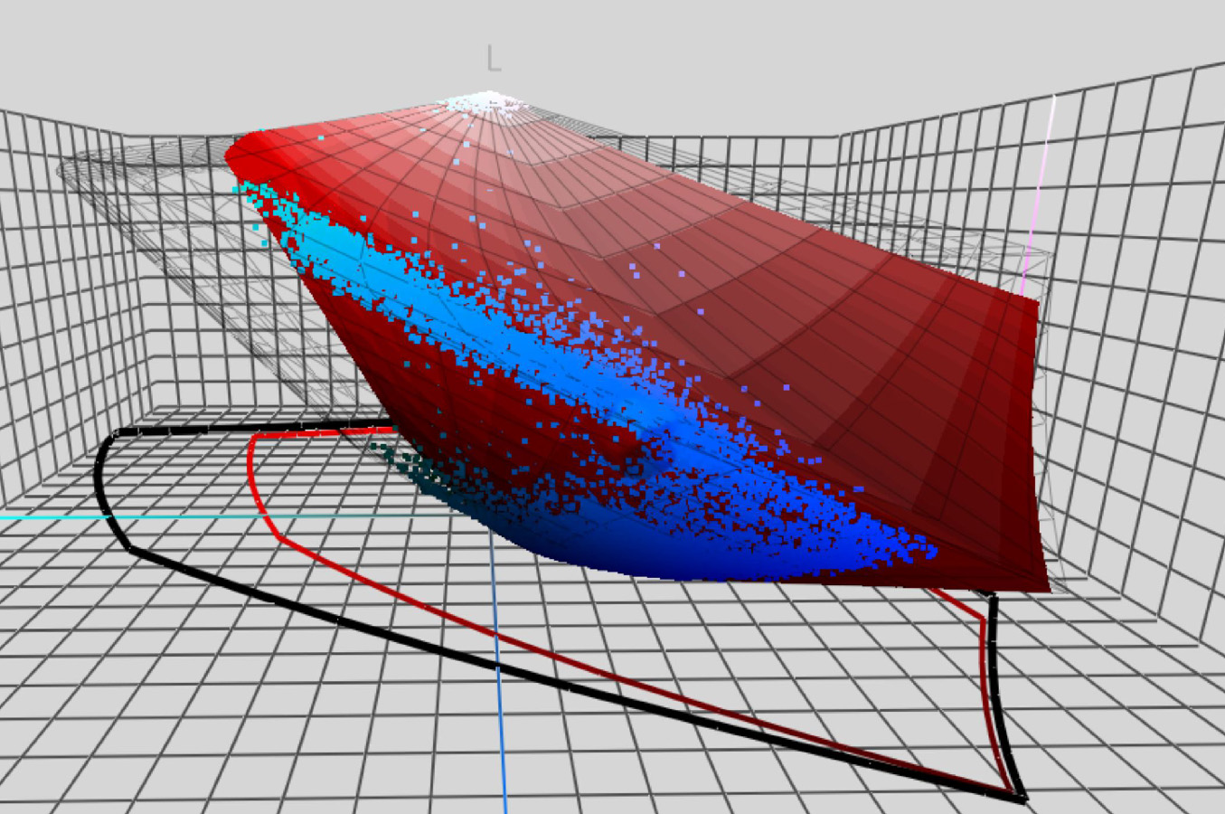
But the second graph is even more surprising: a comparison of sRGB with the gamut of the printing method of my choice. Guess what: the printer can produce many more colors than can be encoded in sRGB!
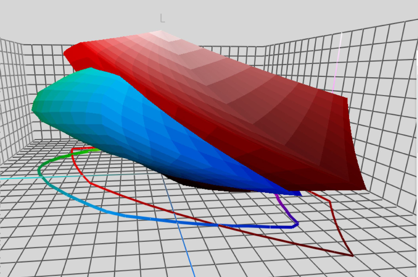
So, why would you invest in such a capable machine/substrate combination, with such a large gamut (meaning: very, very colorful), if you limit the input side to sRGB??? I’m lost here…
[ sigh ]
In one of the responses, they also claimed that if somebody would upload an image with another profile than sRGB, that they would print it according to that profile. No, they didn’t. They either just ignored the profile or assigned sRGB to my AdobeRGB images, which means – read the tutorial – that the ‘real world’ colors are changed! You are adding another ‘color translation dictionary’ to the numeric red, green and blue values in your images. E.g. 125 / 0 / 125 is a different color in sRGB than in AdobeRGB…
BTW: the explanation of what went wrong and how it could be solved, wasn’t consistent. But they did insist that they new all about profiles and how to deal with them.
The basics of ICC color management: who is to blame?
ICC Color management is designed to make color reproduction predictable. But this color management only works if the rules – all of them! – are followed in every step. And one of the basic rules is that you need to respect the color profiles. They contain the transformation of device-specific colors (RGB, CMYK) into independent, ‘scientific’ or real-world, colors (CIELAB). It’s via these independent colors that you can do color transformations. That’s what your RIP, DFE, color controller (or whatever the tool you use is called) will do: translate the picture (whether in sRGB or AdobeRGB) into the colors that the inkjet printer understands and into ink droplets onto a substrate.
If you don’t provide that crucial information (which RGB?) to the RIP, DFE or color controller, it has to guess what these numbers in RGB mean: it will take the default profile, which will be wrong in some cases. When you set your RIP, DFE or color controller always to use the embedded profile, it will never go wrong (unless the customer did something wrong, or you used the wrong rendering intent). Only if there is no RGB profile attached to the images, you might want to default to sRGB. If there is an ICC profile embedded, you must respect it, always, even if it seems to be a bizarre profile.
Calibrating your devices is, of course, a necessity, you need to bring them into ‘known state’, but color management is more than that! Respecting profiles, choosing the right rendering intents (the way colors are transformed) are equally important.
Since I was so flabbergasted, I contacted Paul Sherfield from the UK’s Missing Horse Consultancy, he is also the FESPA color ambassador. In case you don’t know FESPA: it is a global federation for the screen printing, digital printing and textile printing community. It organizes the FESPA exhibition and other events, and has a lot of interesting resources, with a focus on color management and large format printing.
Here is part of our conversation: “colour management is not widely understood or used correctly in this market sector, as you have experienced!! The main large forma DFE’s have very good colour management tools but, these are not often used and left on default settings using generic device profiles and often ignoring profiles and/or assuming sRGB. (…) The training in this area can be an extra charge on installation, so printers, unwisely, may cut corners in this area.”
So it seems to be a general problem… And it is a problem that is costing these companies money: the need to do reprints, and what they don’t see: they are losing customers. A one-time investment in decent training can easily solve this and will have an excellent ROI. They have the tools, they just don’t use it properly… As if they bought a Rolls Royce and only used it as a couch to sit on…
Now, I do admit that for many (or even most) photographers, those extra colors that you can encode in AdobeRGB don’t really matter. But for some – like me – they do. And unless you explicitely specify that images should be in sRGB, you have to take this into account. Period.
Why is this important?
If you invest in a capable tool, e.g. an inkjet printer with a large gamut, this has to fit your workflow. Or better: your workflow has to fit the tool. It makes absolutely no sense to invest in a large gamut printer if you limit the input by having an sRGB workflow.
Also: you need to inform customers upfront and do that correctly. If that company had said they want sRGB images, I would have never ordered prints with them. NEVER! Now they have a very dissatisfied customer – who even writes blog posts about it and informs his friends about his bad experience – and they had to invest a lot of time to try to make it up a little bit with me. This is really not what you want as a company, that is awful advertising, which costs more than having someone take a decent color management course, which will prevent these errors from happening…
PS: meanwhile, I got the reprints, they look better: the blues are really vibrant now, the red looks red. But it’s still not what my soft proof showed… the red is not entirely correct yet. But I’m not going to complain again, I’ll accept that this is the best they can do and go elsewhere in the future.


Hey Eddy
Very strange but not at all a surprise. Assuming sRGB if an icc profile is not embedded may be ok in commercial printing for amateurs that make their own marketing material and take their own pictures on their iPhone – but if you are marketing yourself to professional photographers and agencies, this of course does not make sense – since many photographers even turn in their photographs in RAW format as I understand it (correct me if I am wrong Eddy).
With modern software it is easy for this printer when preparing jobs for this 12 colour press to grab ALL data from an incoming PDF – CMYK and RGB – whether it is for an amateur or a professional photographer, with or without embedded icc profiles and convert it to Adobe RGB first (sometimes referred to as “normalizing”) – and then they should be able to convert the Adobe RGB data to the colour gamut of their digital press.
This should make even “difficult customers” like you happy – simply because they always take advantage of (close to) the maximum colourspace of the press – and if the focus of the job is printing of photographs, this must be the default request.
Hi Ingi,
thanks for calling me a difficult customer! 😉
I don’t think anyone submits RAW files to these kind of print services. Most off them only take JPEG and TIFF, I only saw a few that took PDF files (e.g. the company that I worked before and that does know how color management works: https://www.pictoonline.fr/en/help/faq?code=faq#page-picto-online).
Professional photographers do take pictures in RAW, to have complete control over how the image will eventually look. This RAW conversion is essential for the outcome: different settings means a different image. But it’s the photographer or photo studio that needs to do that, not the print service.
With a background in printing, it’s strange to see what the common practices are in this kind of print services (they are wrong and either they don’t know, or they don’t care).
Hi Eddy,
You wrote: “It’s strange to see what the common practices are in this kind of print services, (they are wrong and either they don’t know, or they don’t care).” I agree and I think that in most cases the sales guys or the “tech-reps” don’t know. I experienced that most companies buy digital printers and a software package for color management. Sometimes there was a limited training involved or the in-depth training was available for just one of the operators. Color management is one of the most essential parts of the workflow and with the proper tools and experience one can reach an optimal result. However, what you described in this blog and in the earlier blogs on the production of your photo books, most of the companies had the machines and tools but the operators and/or tech-reps did not have the knowledge and/or the experience. Some of the owners of expensive digital printing machines could not deliver the quality you requested. They had the machines, the toners, the paper and the color management systems but failed due to a limited knowledge and/or experience. Nowadays standard quality can be obtained with standard knowledge. For high quality (like your books and the additional prints your ordered) more knowledge is essential. If one print supplier claims that sRGB offers the highest quality, they don’t have the essential knowledge on CMS. The major problem is that they don’t understand their own systems and workflow. Both groups (printing companies and digital print providers) need far more knowledge on RGB-workflows and the processing of PDF’s including RGB-images. Groups such as ECI (European Color Initiative) and GWG (Ghent Work Group) offer the knowledge essentials. Trainers and consultants (like Paul Sherfield) offer the experience for our industry. So just do it!
Hi Henk,
indeed, also in ‘commercial printing’ there is a lack of knowledge. But they get at least the very basic thing right: honor the embedded profiles. There is a lack of knowledge what the opportunities of different workflows, different profiles are. In the ‘fine art photo print’ world, they just seem to think it’s not relevant to them.
And I completely agree: just do it! Invest in a decent training for all operators! You will get happy customers and also the operators will feel appreciated.
Being referred to as a difficult customer is a compliment Eddy. In fact my favorite customers back in my time as a printer were the ones referred to as “difficult customers” by many. If you make them happy they will come back again and again 😉
Lack of knowledge of basic colour management is a pandemic – not only among printers but also among designers. It makes their work seem difficult and complicated and causes them and their customers unnecessary stress. That’s for sure.
Best regards
Ingi
Hi Eddy, since 2004 I hav tried to “educate” labs and photographers how “simple” color management is: source profile (whatever) -> destination profile (whatever), conversion = relative colorimetric. I had a printing service for 5 years (stopped because of Corona) and I never had a “difficult” client. What the client wanted he got without proofing or discussing, from 10×15 tot 60x120cm. I accepted everything: ProphotoRGB, Adobe RGB, sRGB, Lab, CMYK, tiff, psd, raw, dng, jpeg, pdf… and never ever had a complaint about the quality. Even book printing was never an issue to me, I did the layout on my own desktop computer, printed a proof on my own inkjet printer and received my work exactly as predicted (without converting ANY image to CMYK). That is color management as it was intended. Keep the highest quality up to the final output. If interested, I still give workshops, because I don’t understand why people think bad quality is normal. And the best of all: it doesn’t cost more to produce quality prints!
Hi Marc, thanks for your comment!
And yes: it is simple! So why don’t these ‘professional’ photo printers just follow those simple rules?
Hi Mark,
How can one order a photo book from you? 😉
I am an amateur when it comes to photography, but I have been quite disappointed with the print quality in some of the chic, artsy photo book sites. I am just learning about sRBG and how they prefer that all photos be converted to this prior to uploading them and using them for the books ~ this may be simpler but not if you do not have the original, raw photo data and if your photos were already edited in an advanced software program. It doesn’t seem like it should be this difficult to print. Sigh…
It’s nice to read this post and know that I’m not alone!
~Karen
Hi Karen,
I don’t think Marc is producing books himself. But I’ll notify him that you replied to his comment.
Are you talking about photo books in run lengths of 1 or a few, just for you and maybe familiy and friends, or books that you want to sell? With a ‘professional layout’ (i.e. do the layout in a professional software program like Adobe InDesign)?
If you work with Adobe InDesign, you could try Blurb, but use AdobeRGB as input profile, not sRGB. Eventually you need to convert the document to CMYK (with their profile), before submitting it to Blurb. If you start with ‘better’ input, this CMYK-file will be better. Since I didn’t try them myselve, it’s no guarantee, but you could try it, by ordering one or two copies. Their CMYK profile is a bit better than regular CMYK profiles (please note: this is only to be used for ordering at Blurb, don’t use it with other print providers). Here is there help page with more info: https://support.blurb.com/hc/en-us/articles/360027277391-Preparing-color-images-for-InDesign-or-Blurb-s-PDF-Uploader-workflows
If you need a larger amount of books, let’s say 50 or more, check this article I wrote: https://www.insights4print.ceo/2020/07/deep-blues-with-just-4-colors-yes-it-can-be-done/ This is my story about the long search to find a printer that could produce a high quality photo book, one with a lot of challenging blue tints. I eventually ordered it with Jubels in Amsterdam (The Netherlands), who printed it on a Xerox Iridesse.
Hope this helps!
Eddy
Hi Karen, I don’t produce books myself, but I know a good printer in my neighborhood.
This is how I work: All my pictures are in raw, developed in Adobe Camera Raw. The pictures remain in Lab-modus – unless special Photoshop Filters are needed – then they are in Prophoto RGB (is way better than AdobeRGB) and saved as PSD from within Camera Raw.
I do the layout in Adobe Indesign, leaving the pictures as they are — you always can edit the pictures directly from InDesign (->Edit Original) if necessary. That’s it! Simple and fast.
When I need to export for printing the rest depends on the print service I use:
1. inkjet printing with my own printer: no conversion, only a custom printer profile I made for the paper I use.
2. Printing a book at the nearby printshop: export to PDF X-1a this converts everything to CMYK Coated Fogra 27 or 39 which is the standard for digital printing presses. The final result will be perfect!
3. Printing a photo book at Kruidvat: first convert the whole document to sRGB (save as a new document! so you can always turn back to the original) export the pages as JPEG and upload these JPEG’s in the photo book software of Kruidvat. Perfect and predictable results (almost). Eddy, maybe I could give an online workshop? Greetings, Marc