

In preparation of a future article, I should explain you the basic of color management. Don’t run away! The concept of ‘ICC based color management’ is not that difficult. But too many people can not or will not explain it in easy terms. That’s what I would like to do in this article. So grab a drink, a healthy snack and I’ll walk you through the basics of color management.
CONTENTS: The goal | Step 1: RGB vs CMYK (additive vs subtractive) | Step 2: Which RGB? Which CMYK? | Step 3: gamut | Step 4: Translations | Step 5: Rendering intents | Step 6: Black point compensation | Step 7: Calibration, profiling | New kid on the block | That’s all folks! | Why is this important?
The goal
The goal of color management is to get a consistent reproduction of color, no matter where or when it is reproduced. To set your expectations right: it is not possible to always get the colors exactly the same, no matter what some people might tell you! There are just too many variables in place. Especially with printed materials: a shiny foil will always look different from a gray newspaper. And think e.g. of the effect of a shadow falling on a box in a shelf, or the differences in light sources. Real life is not a lab environment, there are multiple factors that you, as a designer or a brand owner, can’t control. You should keep that in mind. You should keep your expectations realistic.
Step 1: RGB vs CMYK (additive vs subtractive)
There are two models to reproduce colors: either you are using light sources with a specific color, or you are using a white background and you put colored filters on top of that background.
The first model is called ‘additive colors’, because we are adding different color sources to merge them into a specific color. This is the RGB model: we mix Red, Green and Blue color sources. The monitor you are looking at is the perfect example.
The second model is called ‘subtractive colors’, this time we are subtracting colors from the white that is reflected from a ‘blank’ substrate. This is the CMYK model: we use filters – the printing ink – that will subtract a part of the reflection. A printed magazine is a nice example. In 4-color printing we use 4 filters: cyan (C), magenta (M), yellow (Y) and black (K, since the letter B was already taken by the color Blue…).
There are variations to RGB and CMYK, e.g. Hexachrome, but don’t bother about that at this moment. That’s more advanced color knowledge, we are focusing on the very basics.
Step 2: Which RGB? Which CMYK?
Defining a color as certain values in RGB or percentages in CMYK is not precise enough: if you use the same values for different output types, you might (or even: will) get a different color. Select a nice picture and view it both on your laptop and on your phone. Chances are that they will be slightly, or maybe even completely different on these two devices. So we need to define it a bit better, not just ‘RGB’ or ‘CMYK’. And we do that via a ‘profile’, or to be correct an ICC profile (named after the International Color Consortium).
In case of RGB, the two best known profiles are sRGB and AdobeRGB. But there are also others: Prophoto RGB, ECI RGB and a few dozen more…
When you create a new RGB image in a software tool, you will have to indicate which ICC profile you will use. However, in Adobe Photoshop CC, this is hidden in the ‘advanced settings’. Why it is important to indicate this, is to have a correct reproduction of the color you have chosen. Take e.g. the following color: R=125 G=0 B=125.


Do you see why it is necessary to use that profile?
A language analogy: in Western-Europe there are two important language groups: Latin and Germanic languages. Although e.g. Italian and Spanish are both Latin languages and therefor descent from the same root, they are different. They look similar, but they are not. The same with sRGB and AdobeRGB. They look similar, but they are not.
(in case you don’t see a difference between the two purple images, your browser doesn’t support ICC based color management; to check your browser, go to this page: http://www.color.org/browsertest.xalter)
Step 3: gamut
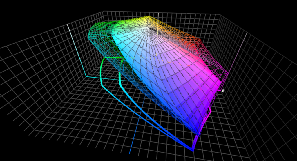
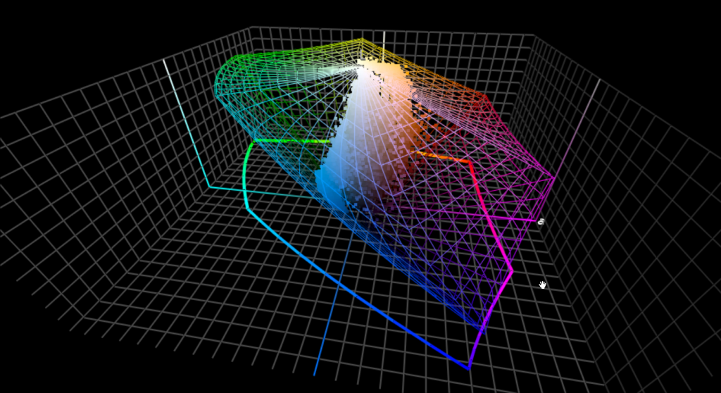
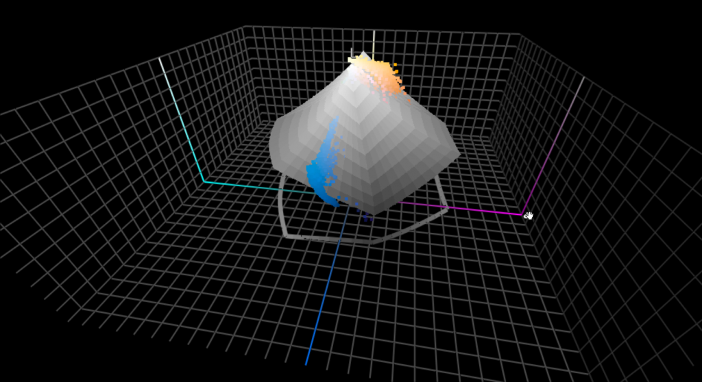
The ICC profile can be seen as a three dimensional description of all the colors that can be recreated in a specific situation. It’s easy to see that in CMYK profiles: they are linked to different types of output. A newspaper has a ‘smaller’ volume of colors that it can reproduce than a job printed on a nice glossy paper. Think about an apartment and the space available in an apartment: the newspaper ‘apartment’ is smaller than the glossy paper ‘apartment’. This 3D representation, the volume is called ‘gamut’. So a profile with a large volume is a big apartment.
At the end of the next step, I’ll show you sRGB and AdobeRGB in that 3D space. Be patient!
Step 4: Translations
Throughout the workflow you will need to translate the colors: a photo is taken in RGB (usually sRGB or AdobeRGB), if you want to get it printed, it will need to be converted to CMYK. Not just ‘a’ CMYK, no: the right CMYK profile! If you would use a newspaper profile and then print on a glossy paper, the colors will look wrong.
As with languages, you need a translation dictionary. This is built into the ICC-profiles. They have a translation to/from the original color space to a ‘device independent’ color space, usually CIELAB. This is a ‘neutral’, scientific description of color, which will make the translations easier. Think of it as Esperanto, which is an artificial language. Because it was designed and not the result of natural evolution over the ages, it is strictly organized and there are no ambiguities. So it can perfectly be used to translate from language A to Esperanto and then from Esperanto to language B. If Esperanto would be the second language of everybody on this planet, the world would be a very different place. We would be able to talk to everybody, to understand everybody. But back to color…
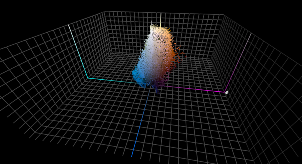
CIELAB, or also called Lab, is a three dimensional space to describe colors. The vertical axis (L) goes from black (bottom) to white (top). If we would run around that vertical axis, we would encounter all the different hues (color tints). And if we would go from the central axis to the outside of the 3D space, colors would go from dull to very vibrant.
Now that you know CIELAB, I can show you the difference between sRGB and AdobeRGB in that 3-dimensional space.
When doing the translations, you always need to use the correct dictionary, the correct ICC profile. That is the reason why you should always ‘convert’ to a profile’, never ‘attach’ a profile. Attaching a different RGB profile to a picture, will change the ‘meaning’ of the RGB values, will change the appearance of those RGB values: they will look different. Back to a language analogy: if you translate the word ‘mist’ with a dictionary Dutch to English or a dictionary German to English, you will get two very different results… It’s plain sh**, just try it in Google Translate! From Dutch to English, from German to English.


There is another tricky thing with certain ICC profiles: you can have different ICC profiles for the same kind of output, e.g. coated paper. If you look at the profiles mentioned in the ICC profile registry, you can e.g. find multiple profiles for ‘Type 1 coated’ paper. They will all convert to that specific type of paper, but there might be small nuances. Again a language analogy: it’s the same as using Google Translate or Bing Translator. When using them to translate a text from German to English, you will get an English text with the same meaning in both of them, but the wording might be slightly different.
Step 5: Rendering intents
Some gamuts are bigger than others. RGB gamuts are usually bigger than CMYK gamuts. When translating a picture from AdobeRGB to e.g. a coated paper, you have to make an important decision which will affect the colors: how will you do the translation, or in color management terms: which rendering intent will you use? Back to the apartment analogy: if you are moving from a big apartment to a smaller one, you need to make decisions what will happen to all your furniture and other stuff… you can not keep them as they were. There are two options for the new apartment: either you shrink everything with a magic formula, or you check what you can keep and throw the rest away.
The shrinking formula is called ‘perceptual rendering intent’. We shrink the complete gamut a little bit – simplified: we will multiply everything by 0,7 – so that it will fit into the smaller one. Which means that all colors will be a bit different. The other option is called colorimetric rendering intent (there are two variations of that, but don’t let that confuse you, when converting from RGB to CMYK you need relative colorimetric rendering intent). Here we are looking at the target gamut and all the colors that fit into it, we will leave them unchanged. And the colors that don’t fit into the smaller gamut (the most vibrant ones), we will transform those into the most vibrant colors that are possible into the smaller gamut. So we don’t actually throw them away, we transform those. But doing this, some nuances could disappear, this is called ‘gamut clipping’.

There have been numerous and endless discussions about which of those two is the best… From a conceptual point of view, perceptual is more faithful to the intent of the photographer. But in real life, relative colorimetric performs better. Unless when you want to convert to a rather small gamut like a newspaper. In my experience, when going to a coated paper, relative colorimetric performs better.
Over the years I have done thousands and thousands of conversions, I even made challenging pictures hoping to be able to demonstrate gamut clipping. And I only had a few pictures of very colorful flowers where you could see some clipping, but in those cases perceptual rendering also didn’t provide a nice rendering…
To prove my point that perceptual rendering intent, which changes all colors, has issues especially when using a wide gamut RGB profile like ProPhotoRGB, I only needed to test a few pictures. The third one I tried already proved my point: unwanted color changes, a dark black became dark gray.
Step 6: Black point compensation
I’m not going to bother you with the history and reason why you should use it, it’s just a solution for a ‘design flaw’ in the original ICC workflow. Just make sure that you have always selected the ‘black point compensation’ when converting pictures and you will be ok.
Step 7: Calibration, profiling
Getting a consistent color reproduction is only possible if the reproduction process (your monitor, a printer) work the same way every day. That’s why you need to calibrate your equipment. The calibration of your monitor will ensure that the color the monitor shows you is equal to the color that is encoded in the digital file (on condition that your monitor is capable of showing that color, that the gamut of the monitor is large enough).
The printing process will be controlled and adjusted in such a way that it performs according to an international standard (ISO standard). E.g. ISO 12647-2:2013 in the case of sheet-fed offset printing.
In some cases you will need to ‘profile’ your system, e.g. when you are using a very special substrate on a large format printer. This profile encodes the capabilities of that specific printer on that specific substrate.
New kid on the block: spectral definition of color
In the future we might see more and more use of a spectral definition of color. CIELAB is something very useful, but it’s not without flaws. Since we now understand color better than at the moment when CIELAB was designed and – very important – computer power and memory have significantly increased, we can use a more complex description. In a spectral definition of color, we will describe the amount of energy that is available in every wavelength available. It is much more information than CIELAB, making things more accurate, but calculations are much more complex. In the future we will certainly see this more for the definition of spot colors.
That’s all folks!
So, that’s the basics of ICC color management. There is of course a lot more, with exceptions and special tricks. And some of those things are really complicated, especially when you look into the way how things are done, into the math behind it.
But let’s make a final analogy: do you know how the USB protocol works? I guess not. You just know that you can plug the male and the female and something magic will happen. That’s the same with color management. You don’t need to know the math, you just need to know the basic use.
Why is this important?
If color reproduction is important for you, for your customer, you need to comply to some rules, you need to apply color management. And although it may seem something annoying from the perspective of a creative mind, you really need it. Otherwise your fantastic work will not look the way you want it to look…
PS: another relevant article discusses why colors might appear different on your screen. And in case you are a brand owner or a creative designing brand colors, brand logo’s, you might also want to check out my article ‘Brand colors and printing in CMYK: better safe than sorry‘.
PS 2: if you are a color scientist, a color management professional, keep in mind that I wrote this blog post with designers and brand owners in mind. Yes, some things are simplified and I did not mention some other things, but that was all on purpose. So that those designers and brand owners don’t run away, so that they are not left confused, because that’s what happens when you go into all the details… I tried to tell them just what they need to know to have that basic understanding. Nothing more.
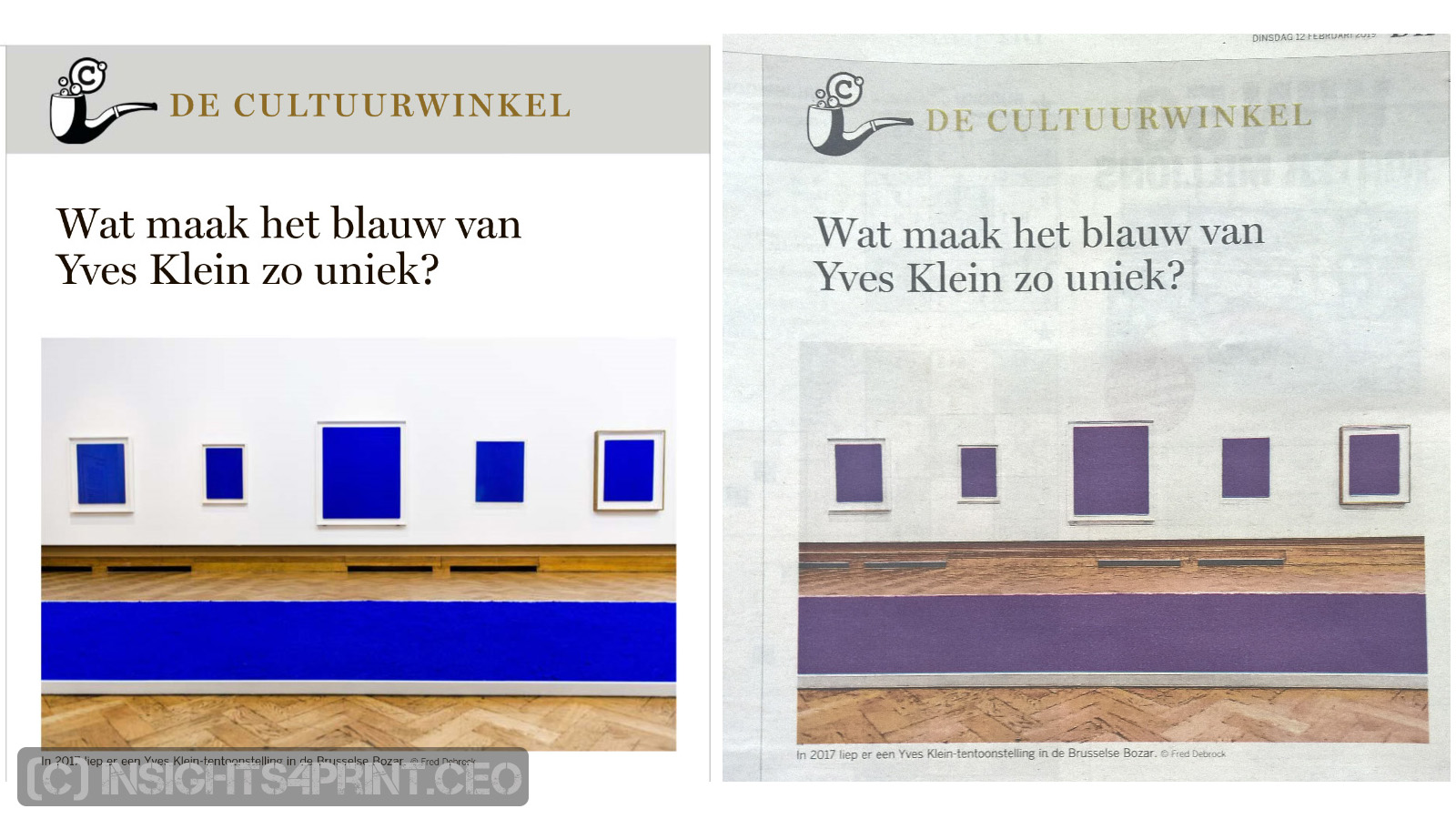
UPDATE 13/02/2019: color management isn’t perfect. And in some specific situations, you can get ‘weird’ conversions. Take e.g. the picture I found with an article in my newspaper yesterday. An article on ‘Yves Klein blue’, where the blue had turned into purple… This is a situation that can happen when converting images to a newspaper profile.
Great introduction .. thanks !