

It has been an interesting week. Tuesday my newspaper had an article on the (in)famous Yves Klein Blue. But the printed color was purple… Later this week, I noticed some images with better conversions, but with others, it was the same issue again. When it comes to converting blue from RGB to certain CMYK-profiles – especially newspaper, but also uncoated paper can be an issue – ICC-based color management can – still – go wrong.
For the record: I do read my newspaper on paper. Otherwise, it would just be news. I like the look and feel, plus research has shown that our brain processes information on paper differently from information on a screen, with a longer lasting memory as one of the effects. (a tip: if you really want to remember my words: do print this article, if you don’t want to remember them: keep on reading on your screen!)
So, when having breakfast and reading the newspaper – yes, I can multitask – I saw the article on Yves Klein Blue. But this didn’t exactly look like the color I remembered. OK, with artists you never know, so a specific blue might actually be purple for color geeks, so I checked the online version. And I can assure you: Yves Klein Blue is really blue.
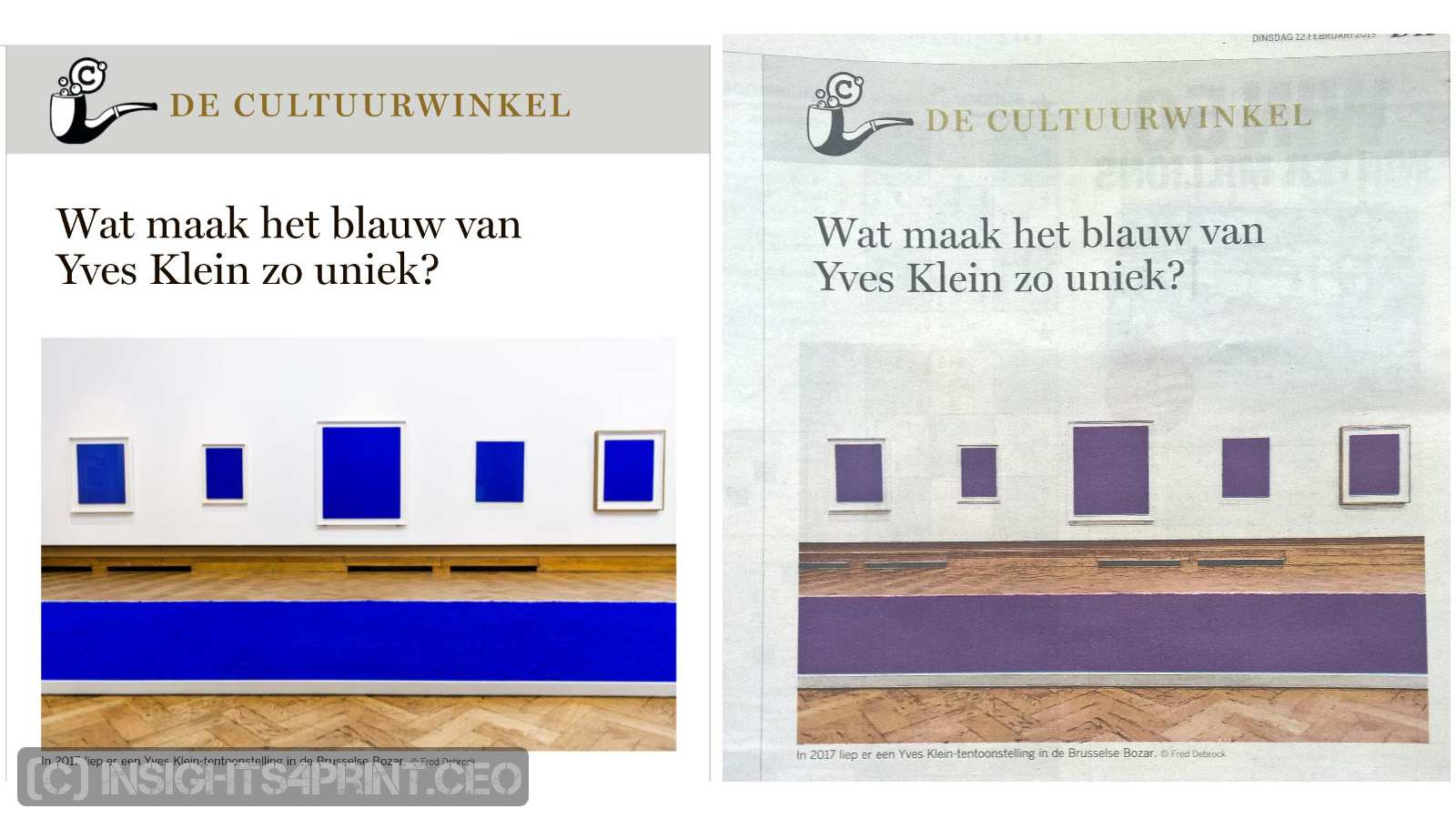
If you read my introduction to color management, you will probably ask what happened? Isn’t ICC color management perfect? Well, no: it isn’t. And the blue to purple conversion is one of the nitty gritty details that I didn’t share in the color management article, since I didn’t want to confuse people.
Color can be something quite complex and at the time when the development of ICC color management started (1993, with the launch of the first v2 profiles in 1994), both memory and processing power were rather limited. Especially compared with today. So, I assume that with today’s capabilities, clever color scientists could solve the issue, using more complicated profiles and algorithms for the conversion.
But then comes the next problem: implementing the new solution. That can take some time… As an example: do you use JPEG2000 or the original – and more limited – JPEG file format for your photos? Yep, you need a ‘killer application’ to get people moving. And a small, incremental improvement, to get from 90% to 99%, often isn’t enough.
Back to the interesting week. On Wednesday, I noticed an article with a Banksy mural painting that contained the European flag. And it was kind of blue! I hoped that the clever color scientists had already fixed the issue (I did try to pull some strings), but when looking at the digital version, it was quite clear that the flag wasn’t the deep blue the ‘real’ flag has, but a lighter blue/cyan.
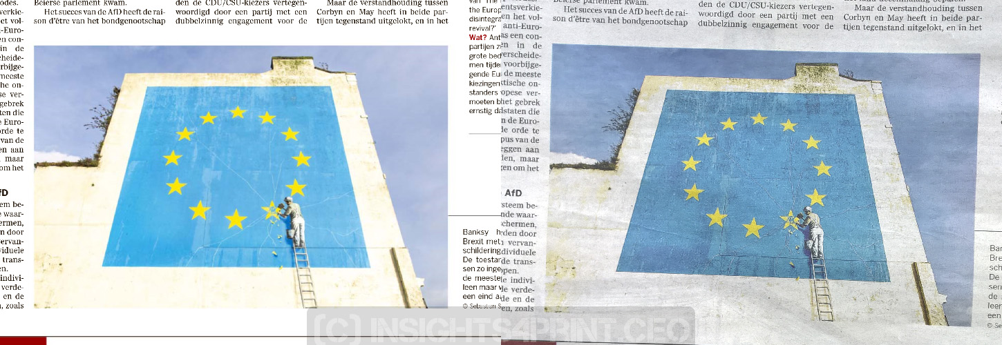
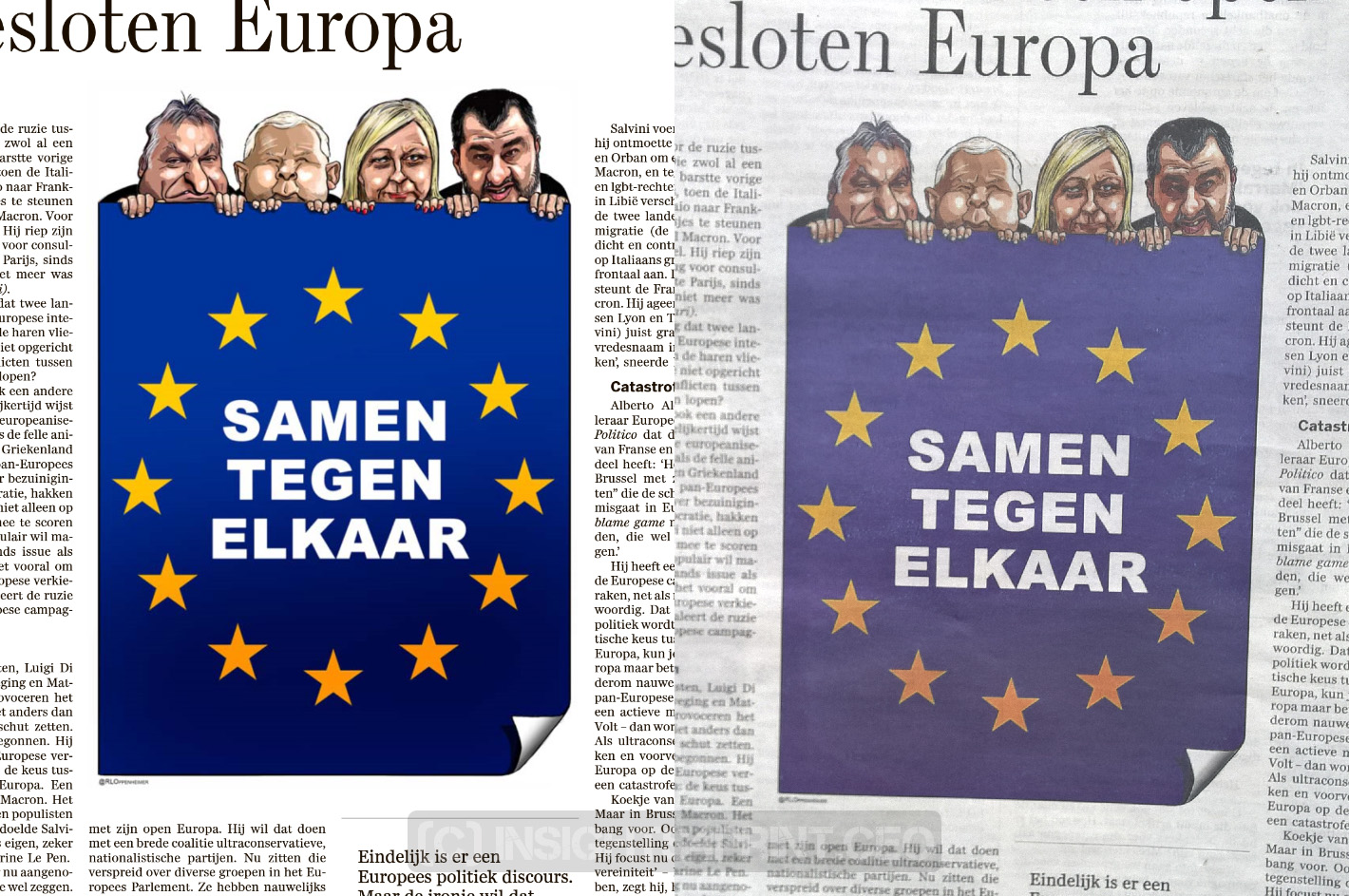
And today there were many examples in the newspaper: on page 2 and 3 an illustration with – again – the European flag. And here – again – the blue to purple conversion.
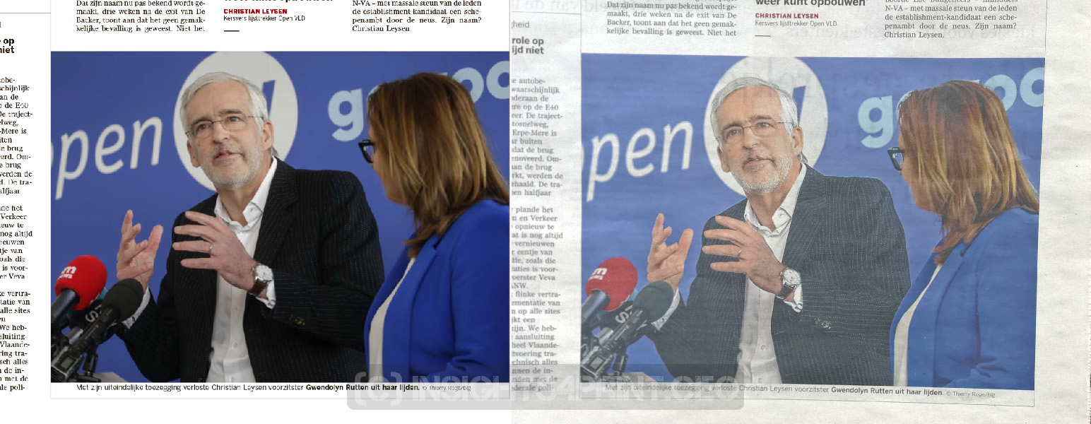
A bit further in the newspaper, there was a picture of a few people with a lot of blue in it. And this stayed blue! Hurray!
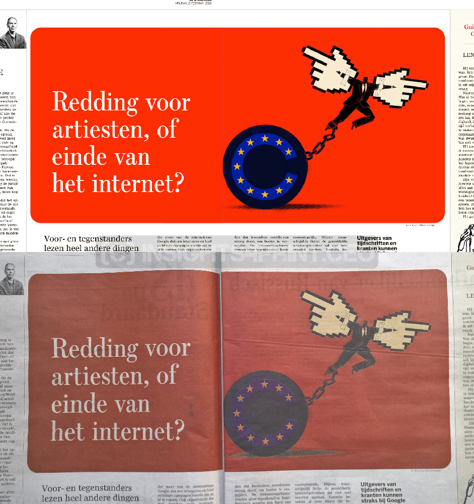
But at the last page, once again the European colors, in an illustration, and again the blue to purple conversion.
Why is this important?
ICC color management is a very useful tool, it has improved color conversions significantly. But it still has some flaws, with the blue to purple conversion as one of the most visible ones. The ICC consortium is working on a newer version, but at this moment I don’t know if this will fix the blue to purple issue. And if it does: will companies implement the newer and better solution? Remember the JPEG2000 example…
PS: John – the Math Guy – Seymour has an interesting article on Yves Klein blue. Check it out!
UPDATE 26/04/2020: also with coated papers, the blue-to-purple conversion still exists, as shown in this article.


You are right.The same is true for all super bright and clean colors – this is true for Reflex Blue and colors that contain a lot of it, Orange 021, Warm Red, – i.e. all colors that are not even in a shouting distance from the CMYK gamut – especially the CMYK gamut for uncoated paper. You cannot fix this with color management. You can get pretty darn close to these colors if you print in CMYKOGV but the problem is that newspapers and magazines run in CMYK and most printing presses in the world are set up to print CMYK. It may be a while until 7 color presses become the norm. I guess that will be around the same time people stop printing in offset and switch entirely to digital printing.
Thanks for you comment Ingi!
I guess you mean that you cannot fix this with *the currently available* color management. I’m convinced that clever color experts can design profiles and algorithms that are more complex the current ones that will fix the issue that blue turns into purple. That’s my main issue here: blue turning purple, not the fact that newspaper/uncoated paper has a limited gamut. And that is something that, in my opinion, could be fixed with better profiles, better algorithms. Processing power and memory aren’t the issue anymore that they were in the 1990’s.
Yes exactly Eddy. I don’t this can be fixed unless we change the rules. I am slightly interested in what Idealliance has been doing with their system to simply increase the density of Cyan, Magenta and Yellow in normal CMYK printing to reach a larger gamut. I also have a feeling that there is more we can do about the primary colors themselves – i.e. Cyan, Magenta and Yellow to increase the achievable color gamut for 4 color printing. I have always had a feeling they were not exactly the right primary colors to maximize the color gamut in printing. I have not done any formal research on this but they always look too dirty to me. To try to reproduce colors from the RGB gamut, I would have assumed ultra clean / vibrant primaries on the printing side. I remember looking at my colorbar as a printer thinking “Do I need to wash down the press and start over?”.
Perso, pour éviter cela, je mets toujours 30% de distance entre le cyan et le magenta même avec du papier couché 🙂