

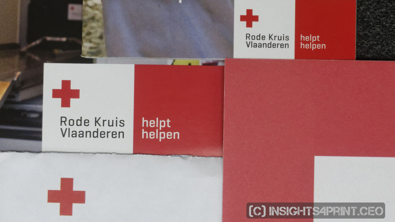
At the end of the year, I receive lots of letters. From charities to be precise. And the one that stands out – from a color perspective – is the one from the Red Cross. Next to the envelope and letter, there is also a leaflet and a small agenda included. Four different print products, with four variations of the Red Cross red…
CONTENTS: Let’s take a look | Red Cross brand guide | Why is this important?
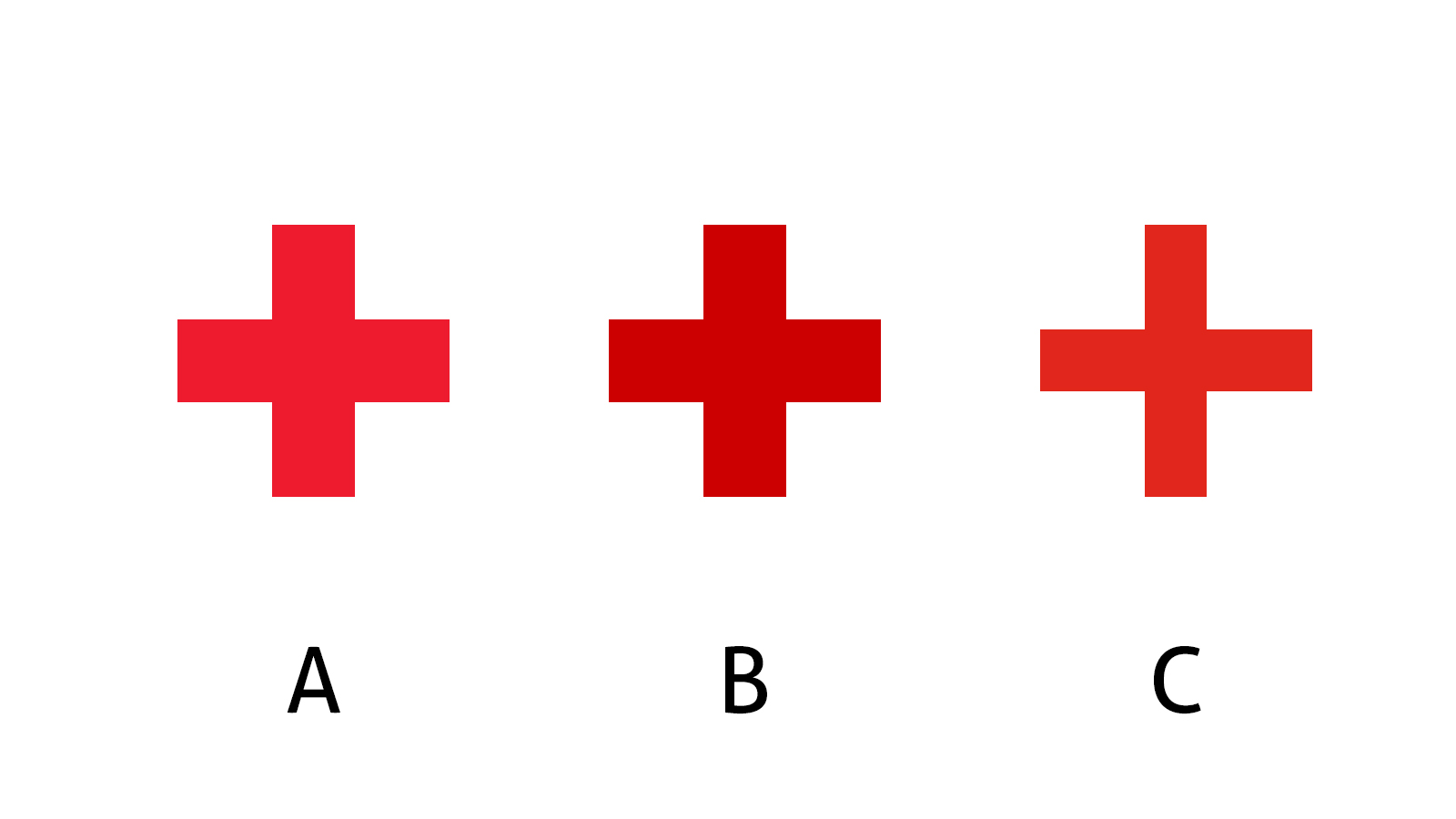
Before getting into the details about these mailings, let’s do a small test. Below are three variations of the Red Cross logo. Which one is, according to you the right one? And which one is it certainly not?
Let’s take a look
Below you see a picture of the content of the latest letter I got. As you can see, the color varies. Which is also due to the substrates: two times uncoated paper (envelope and letter), the leaflet is a coated paper, and the agenda (top part) has also been coated or laminated.
Here are the measurements:
| CIELAB (D50/2) | L | a | b | paper type |
| agenda | 48,4 | 62,4 | 45,1 | coated / glossy coating |
| leaflet | 49,2 | 58,5 | 32,5 | coated |
| letter | 54,1 | 46,1 | 22,8 | uncoated |
| envelop | 53,2 | 44,2 | 29,7 | uncoated |
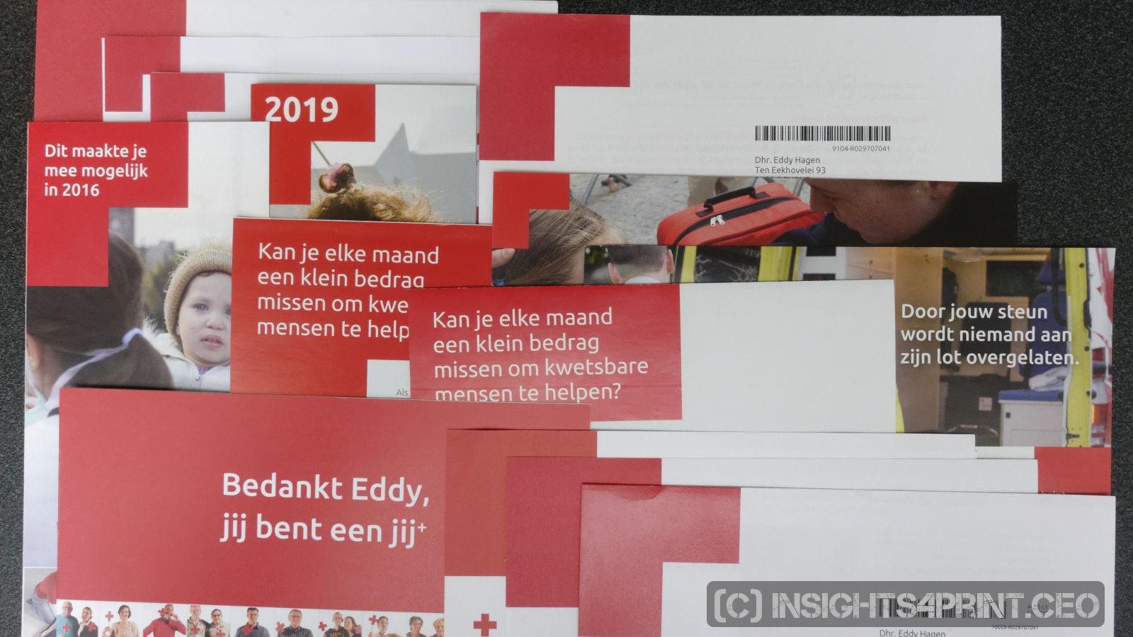
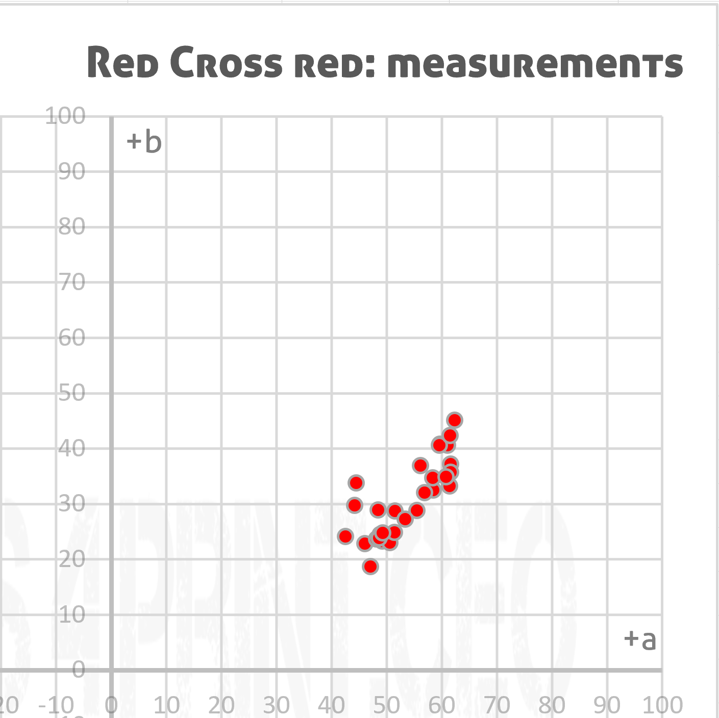
Over the years, I’ve collected a large number of these letters. As an exercise, I measured about two dozen of them. Below are a picture of the letters, plus a graph showing the measurements in the a/b plane of the Lab color space.
The Red Cross brand guide
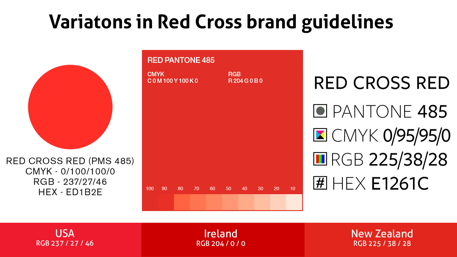
The big question is of course: what is the correct Red Cross red? To get an answer to that question, I went on a search to find their brand guide. And I was lucky! I did not find one, I found multiple… And the values for the color red in those guides were different.
(as a side note: do check my article on the research by Michael Abildgaard Pedersen: he checked over 300 brand colors in 156 brand guides)
This shows the complexity, but also the necessity of decent brand guides, that are enforced in the entire organization. No matter in what part of the world you live in, that brand logo should be the same everywhere.
Back to the differences seen: the 1 billion dollar question (literally) is whether this has an impact on the amount of the donations they get. My guess is: it’s not. My main driver to adjust the amount of money that I donate, is how much money I earned that year. Although I do notice the color differences, and on some occasions, I think they should be able to do a better job, I do immediately recognize that the letter is from the Red Cross. Which is the main goal of having a brand, a brand logo, brand colors. Do the color deviations influence my sympathy, respect? No.
Why is this important?
If you want your brand image to be reproduced consistently, you need to take into account some facts. First: you need a rock-solid brand guide (see also this article). Second: if you are going to mix different substrates (paper types, but also other types of substrates) and if you are giving some of them an extra treatment like coating or lamination, you will get different appearances, no matter how rock solid your brand guide is. Third: you need to enforce it throughout the entire organization, even if it’s global. Fourth: small deviations will not hinder brand recognition, brand appreciation. If it doesn’t come with print defects like hickeys and smearing, I wouldn’t mind.


Very interesting. Difficult to test color on monitors using RGB. I chose incorrectly! Great article!!
Thanks Gail!
But as far as I know, RGB monitors don’t influence the shape of logos… 😉
But it can indeed be a challenge to judge colors on a monitor that 1) does not have a large enough gamut and is 2) not calibrated.