

In case you wondered: I’m not the only one with a special interest for brand colors in real life. Recently I came across two research papers by Michael Abildgaard Pedersen from the Danish School of Media and Journalism, examining both brand colors / brand guides (300+ / 156) and print samples (226). In the first paper, he also proposes a new way to define colors in brand guides. Next to sharing the most important findings of his research, I will also build on his brand guide proposal and add a few extra things. If you care about brand colors, you should continue reading.
CONTENTS: The ugly truth about current brand guides | Towards better brand guides | The reality about brand colors in print | Now what? | Why is this important?
IMPORTANT UPDATE (03/11/2022): if you care about brand colors, check the new Project BBCG – a Better Brand Color Guide!
The ugly truth about current brand guides
Companies, organizations spend lots of money on the development of their brand, both the name and the visual appearance. This quest for the ideal brand identity is then finalized in a brand guide, a brand manual. Probably with the idea that with that brand manual, the precious brand colors will always appear as beautiful as the creators imagined. But that’s not the case.
In his paper called ‘Why most Brand Manuals fail when it comes to defining Brand Colors; And how to determine acceptable Color Deviations for specific Brand Colors’, Michael Abildgaard Pedersen has evaluated over 300 brand colors, as described in 156 brand manuals. Including 28 brands that are among the 100 best global brands. So, we are not talking about amateurs.
Next to the fact that most or all brand guides are limited – e.g. they never specify what a brand color should look like on textile, plastic foils or metal cans – Michael highlights ten reasons why brand manuals cause problems. And the first one is a fundamental one: where do the values defined in the manual come from? Think about that.
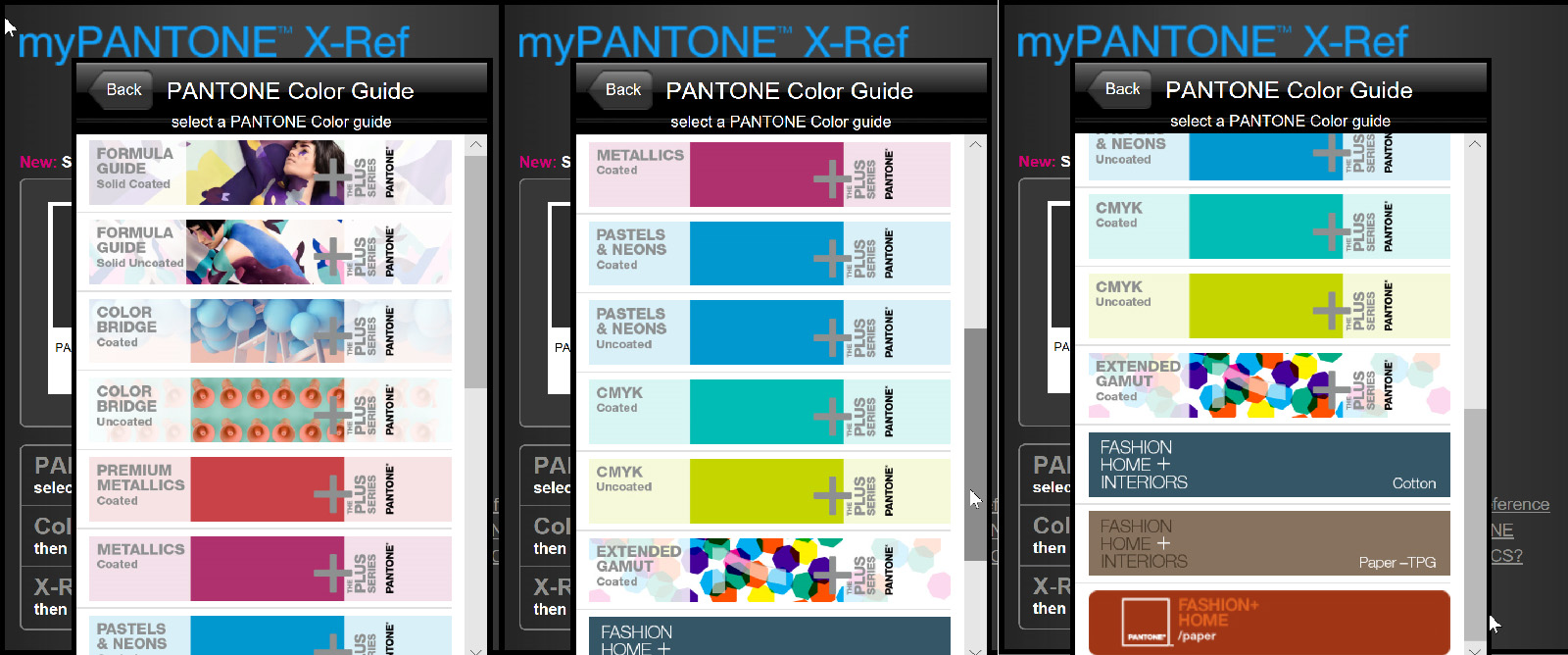
The origin of a brand color is most often a Pantone guide, the beloved tool of a designer. But there are different Pantone guides: there is the coated version, the uncoated version. Or to be correct: the Pantone solid coated and uncoated, Pantone PLUS solid coated and uncoated, Pantone PLUS CMYK coated and uncoated, Pantone PLUS color bridge coated and uncoated, extended gamut coated. Plus a few metallic guides, pastels & neons. And let’s not forget: the fashion guides, the plastic guides, the textile guides. This list isn’t complete: there are also ‘limited editions’ guides, like the “Limited Edition Formula Guide Coated and Uncoated, Pantone Color of the Year 2019 Living Coral“, plus a ‘solid to seven’ and a ‘bridge to seven’ extended gamut guides. And it does not include alternative systems like RAL, NCS, HKS.
The distinction coated vs. uncoated is, of course, a very important one, but as I showed in this research, there are also differences between ‘identical’ guides. And many Pantone colors can’t be reproduced correctly in CMYK, so companies that advertise in magazines, and especially newspapers, should be aware of the fact that a certain color is ‘out of gamut’.
Many brand guides include CMYK and RGB values. And once again: where do these come from? And for what color space are they? To quote Michael: “There are as many CMYK’s as there are paper types multiplied with the number of different printing technologies.” And also in RGB, there can be a big difference: the same values in sRGB and AdobeRGB will result in different colors, sometimes even significantly different colors. BTW: don’t think that your brand color will ever look ‘correct’ on the web, on a mobile device. Mobile devices are and will never be a calibrated environment. The technology exists, but the average person will never calibrate his tablet, mobile phone.
And the most important fail, at least in my opinion, is the fact that they usually don’t include tolerances. And that’s what we need in production! You will never get a 100% consistent color reproduction, fluctuations are inevitable. So, let’s define upfront what tolerances are allowed. And check whether these are feasible.
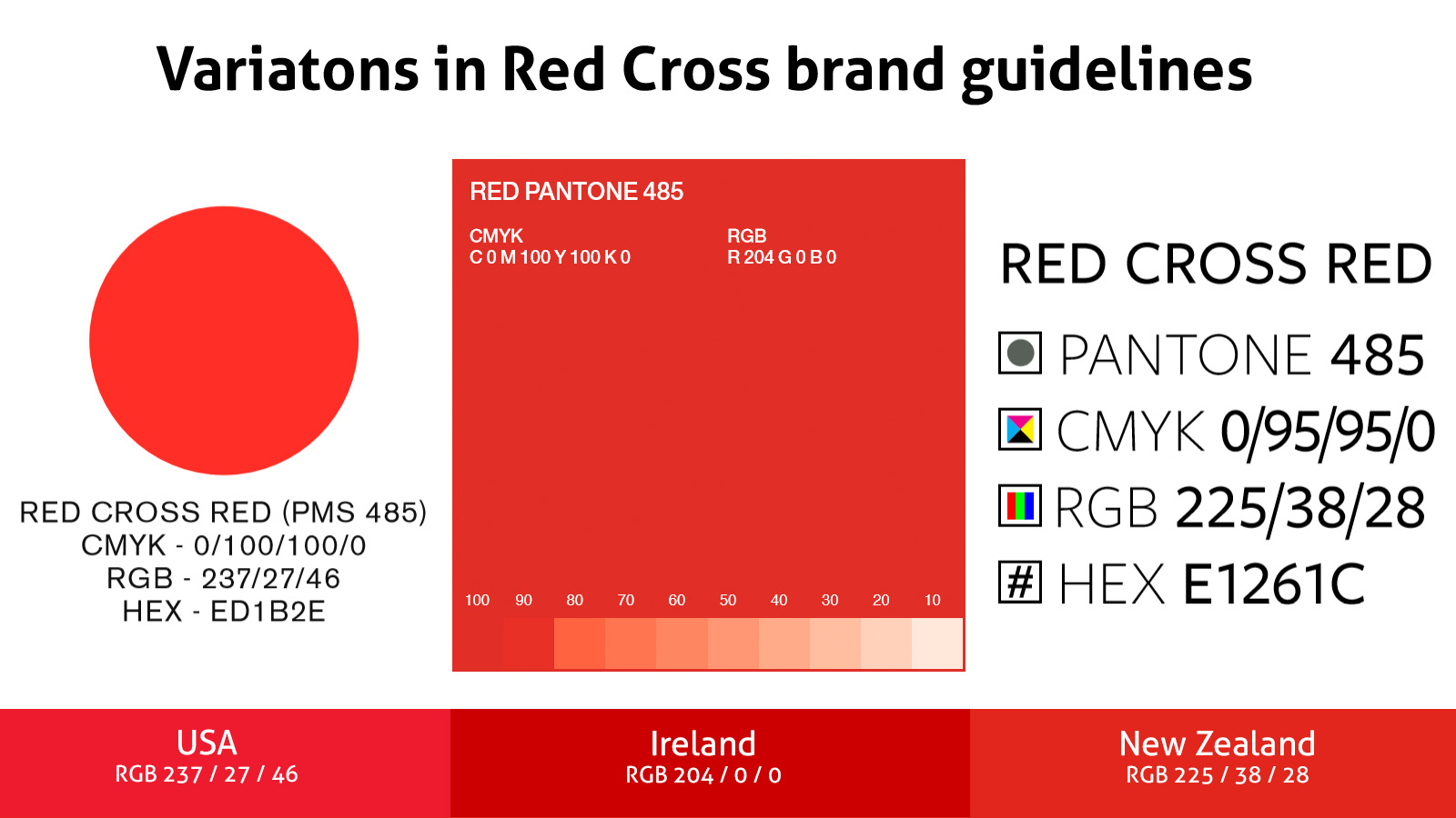
Next to the remarks from Michael, I would like to add another, important one: consistency between different branches. And let me explain this with an example, from the Red Cross. In preparation for a future article, I was looking at the brand guides of different branches of the International Red Cross. Below is an overview of the definition of Red Cross red in three different brand guides: from the USA, Ireland and New Zealand. While the Pantone color is the same in all three of them, the values of CMYK, RGB and HEX are different… The red rectangles at the bottom are what the different RGB-values look like when using sRGB.
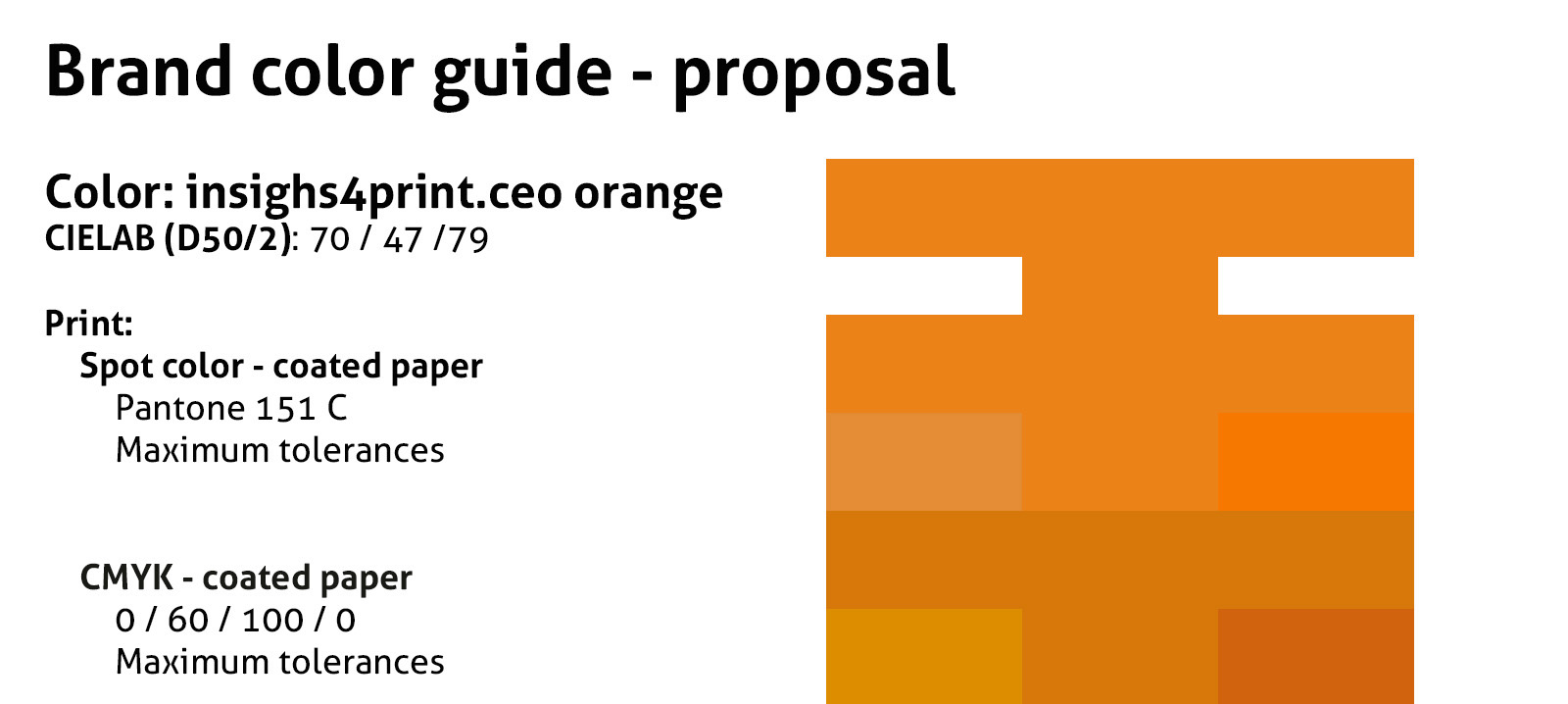
Let’s get back to that important question: where do the values come from? In his paper, Michael shows a bright orange as an example of a brand color: Pantone 151 C. For this color he mentions the following CIELAB values: 69,68 / 47,28 / 78,51. Which is different from what I get when I check this color in Adobe Photoshop (using AdobeRGB and PSO Coated v3 as workspaces). When I use PANTONE Solid Coated (the first one in the drop-down list), I get: 68 / 51 / 80. When using PANTONE+ Solid Coated (please note that PLUS sign!), which is much lower in the drop-down list, the values are: 70 / 47 / 79.
And let’s also add some resources you can find online and put them in a nice overview:
| Pantone 151 C | L | a | b |
| Michael’s paper | 69,68 | 47,28 | 78,51 |
| Adobe Photoshop + PANTONE Solid Coated | 68 | 51 | 80 |
| Adobe Photoshop + PANTONE PLUS Solid Coated | 70 | 47 | 79 |
| E-paint.co.uk | 69,68 | 47,27 | 78,51 |
| Toolstud.io | 67,446 | 41,845 | 74,261 |
| Encycolorpedia.com | 67,450 | 41,839 | 74,253 |
| Executiveprinters.com | 66 | 53 | 86 |
Towards better brand guides
Below is the proposal Michael makes for a better brand guide. Which is certainly an important improvement over current brand guides.
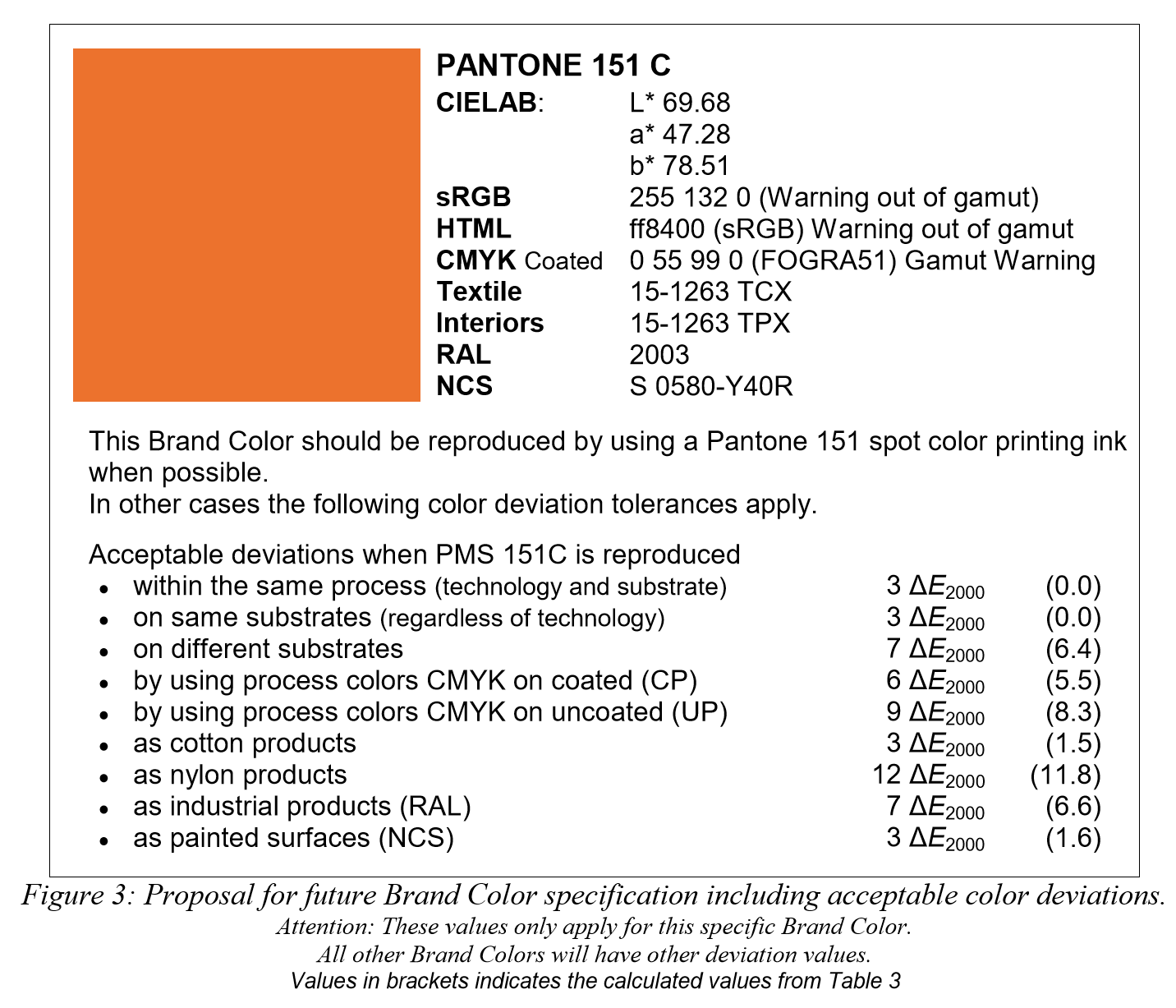
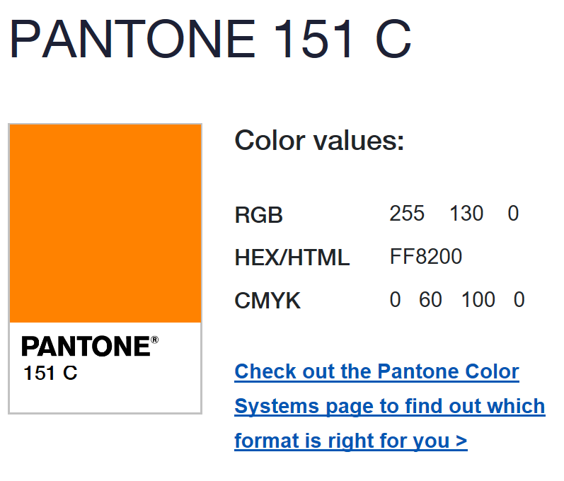
Regarding the CMYK values he uses: these seem to be based on a color management algorithm. I’m not fond of that. Color management can be a good starting point, but I prefer to manually select the ideal color. Including a 99% (or 1%) is making things more difficult than they have to be: make it 100% (or 0%) and you will have less troubles in print. So, my conversion for that Pantone 151 C would be 0 / 55 / 100 / 0. According to the Pantone website, this should be 0 / 60 / 100 / 0 (see figure below).
Personally, I would also include the AdobeRGB values. For two reasons: more and more monitors, mobile phones have a gamut that is larger than sRGB, some even larger than AdobeRGB (some OLED displays). So the time might be right to move away from sRGB and go to AdobeRGB: why limit the brand colors on the web to the small sRGB gamut? And second: showing two different RGB values will clearly show that there are differences in RGB definitions, it will make (less technically skilled) people think about that.
What would also be a nice addition, is to show what the brand color will look like when printed on different paper types, different substrates (with digital print all around and cheap online printers that shouldn’t be a problem). On a nice coated paper it will look different from an uncoated paper, a newspaper, and certainly a brown corrugated box. And include visual samples to show which deviations are acceptable. Don’t forget: even when printing a brand color with spot color ink, a change in ink density will influence the color appearance. Since color has three properties (hue, chroma, lightness) and you can have variations both in plus and minus, in the ideal color guide could show up to six acceptable deviations, maximum tolerances.
That would, from a production point of view, be a quite ‘foolproof’ brand guide.
But I guess that nobody will ever implement this. For two reasons. The first reason is that the people who design brand guides often don’t have the technical background to achieve this. And – much more important – who wants to present a brand guide that shows where it can go wrong and by how much to the CEO of a company that just spend tens of thousands, maybe even hundreds of thousands, euros for that new, unique brand identity? This is a liability, this is a way to get your invoice rejected. But it is the reality that print buyers will be confronted with. On a daily basis. The people involved in choosing that unique color should be aware of this. And that includes the CEO, the CMO.
The reality about brand colors in print
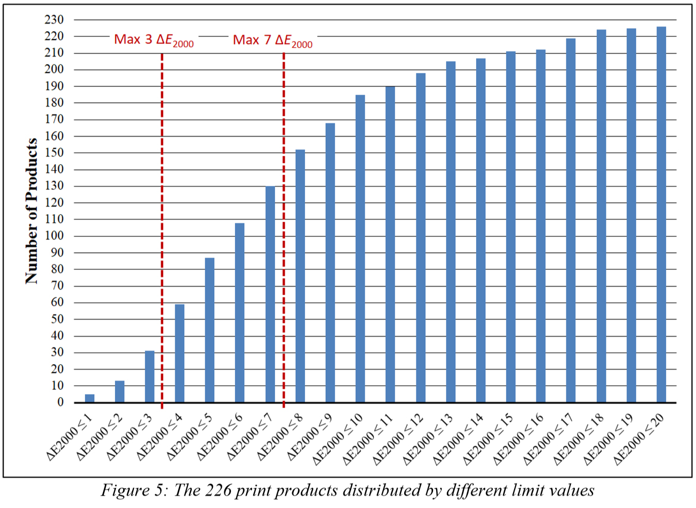
For his second paper: “Reality Check: What to expect when buying different print products for a campaign. – Brand Color reproduction across print substrates and technologies”, Michael collected 226 printed samples from 43 companies. A diverse group of samples: printed on paper, foil/film, nylon, polyester, metal and cotton. And printed with different print technologies: offset, flexo, screen, gravure and digital print. Two thirds (66%) were printed in CMYK, the rest used spot colors. An interesting set of products.
With this number of samples, he could do a lot of measurements, make interesting statistics. The first: only 13,7% of the 226 print products were within a 3 dE00 tolerance! More than half had a deviation above 6 dE00, 19% even above 10 dE00.
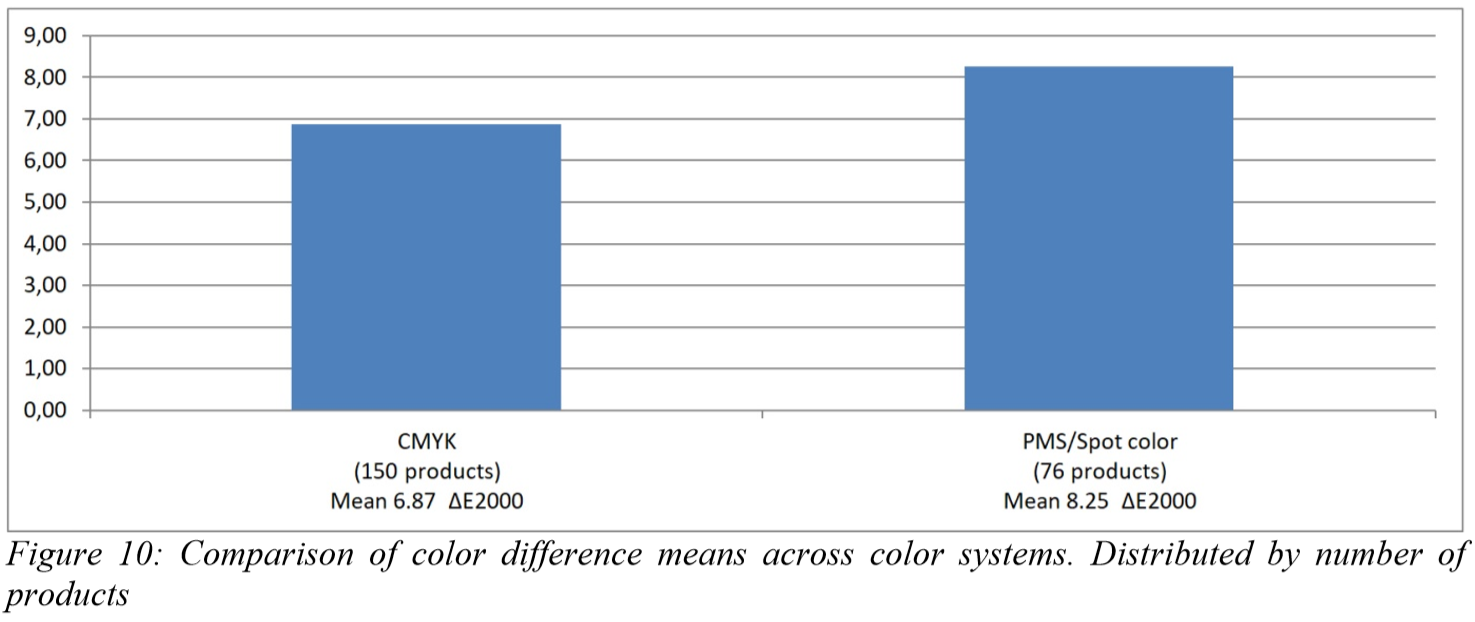
One of the numbers that struck me is the difference between brand colors printed in CMYK versus spot colors. One would think that when printed in spot colors the deviation would be lower, but that’s not the case: 6,87 dE00 mean for CMYK versus 8,25 dE00 mean for spot colors. Is this because printing in CMYK is much more standardized and better controlled than printing with spot colors? Or is this due to the type of substrates? Or might the differences between individual color guides, used for ink mixing, be the main reason?
When looking at substrates: those that were printed on cotton had the lowest deviation (6,27 dE00 mean), slightly better than paper (6,52 dE00 mean). Metal had the highest, with 11,55 dE00. The differences between print technologies are however quite limited: 6,76 dE00 mean for offset as the lowest, 8,95 dE00 mean for electrophotography as the highest.
Now what?
These two research papers certainly make you think about brand colors. So, what should we do?
One important topic, action point, is educating all shareholders in the print production chain, which included brand owners and the decision makers within those brand owners. They should be aware of the fact that their color will e.g. look different on different substrates. That fluctuations in production are normal and that the maximum deviation should be defined upfront. And this in collaboration with production partners, to make sure that the maximum deviations are realistic.
Brand guide designers should also be educated in the little, but very significant, details of color reproduction. Which also means: the limitations. They should be able and willing to paint a realistic picture in their brand guides. In an ideal world, the brand guides should include physical samples of all possibilities in the guide, not just simulations on a coated stock.
For production: standardization is key. Once brand guides become ‘rock solid’, print producers should adhere to them, which means controlling and managing all the variables in the process.
And maybe also one last thing: we might need to rethink the premise that the carefully picked brand color always needs to be exactly the same. As I’ve shown before, our color memory is really poor, people can’t even correctly remember an iconic color like Coca-Cola red. And we see color differences when we are actively looking for differences, even between identical copies. And in normal life, people just don’t pay attention to relatively small color differences, just look at the Milka case! Or in summary: we should not be too fanatic about relatively small color differences. And in case you want to bring up the (in)famous Loyola University study on color and buying behavior: show me the complete study, not just a quote! It’s an urban legend, it’s a hoax. Unless you can show me the full study and prove me wrong. (UPDATE 27/02/2019: after a long search I got a copy of that famous study, and it’s not about print quality!)
Why is this important?
Brand colors are important, companies and organizations spend tons of money on creating a brand logo, on picking unique colors. And then they assume that every reproduction will exactly be the color they picked, not that slightly different one.
These two papers by Michael Abildgaard Pedersen clearly show there’s something wrong with brand guides and reproduction of brand colors. Which confirms what I’ve written in previous articles. To get a more consistent reproduction of brand colors, we certainly need to start at the origins: improve the quality of brand guides. This article includes some ideas.
PS: I do encourage you to read the complete research papers by Michael!
Hi Eddy, talked about this matter with Fons Put yesterday — at a VIGC event in Ghent. Color consistency over “all” platforms is obviously still a huge issue. As a graphic designers we still struggle with this. Lots of tools seem very promising but the reality is often a disillusion… We used to work with the Digitaler Farbatlas 5.0 from Studio Oldenburg in Germany which helped us a lot. It covered hundreds of color systems which could be compared in carious ways. One of the nicest features was that you could search for a Pantone color and look for a RAL color close to it. The app gave three options with corresponding delta-E deviations so this helped us a lot to specify brand colors. Unfortunately the most recent version of this software no longer supports Pantone colors!!! Don’t know why but this is the reason I no longer am using this software. Wonder whether there exists some other tool or software which can do the job.
Hi Chris, thanks for the comment.
As long as the references used are incomplete and not 100% reliable, color consistency will always be an issue.
A reason that Farbatlas stopped supporting Pantone colors might be a legal issue. But also: the Lab values for Pantone colors that you can find from different sources, in different applications are not consistent. So which values should they use in the Farbatlas? Picking ‘the wrong one’ could be a liability for them.
This inconsistency in Lab values for Pantone colors is one of the reasons why I placed the Lab-values as the first value in the brand guide proposal: that’s much more reliable than referring to a Pantone number. Using a printed color guide is not a good reference, see e.g. the results of my little test: https://www.insights4print.ceo/2018/11/your-color-guide-and-you-first-results/
But we should at least get the references, the brand guides right. That’s the necessary first step. That’s something that is feasible and could already eliminate some of the issues. A consistent reproduction over all platforms will always be difficult: a nice coated paper is different from a coated paper, which is different from a newspaper and all of these are very different from a brown corrugated box.
I assume that differences in the specification of brand colors in absolute CMYK percentages is the major problem in packaging printing. I wrote several articles on this subject. However only in Dutch for Dutch and Belgian print and design magazines. I agree that the CIE-Lab values are the most important ones. Establish these values based on printed tests on the proper substrate. PMS and HKS guides are great for creative people to help them to get an idea on what they want. Printing technicians have to help them to obtain the proper values (based on icc-profiles) to define their brand colors and check the quality.
Thanks for your comment Henk!
Defining brand colors for the omni channel is a constant problem for designers, when you need to deal with both at the same time, colors for the real world and colors for the Internet and TV.
The Spot Matching System, from Spot-Nordic in Iceland is a new, user friendly, solution for designers that would like to select colors that are ready for use in professional printing (CMYK for coated and uncoated paper according to ISO 12647), for web (sRGB) and for film and television (Rec. 709 RGB).
The SMS color palette consists of 470 media consistent colors today – see http://www.spotmatchingsystem.com/services.
What if your brand guideline has your corporate color as Green 368C and the closet match you can find is 369C: is this acceptable to use instead of the official pantone? How do you define an acceptable tolerance?
Thanks for you comment Tristan!
As you could read in the article: it’s not a good idea to define a corporate color by a Pantone number… (in case you didn’t read it yet, also check this article, then you ‘ll see why: https://www.insights4print.ceo/2018/11/your-color-guide-and-you-first-results/). It’s better to use a more scientific method: define it as CIELAB-values.
If the visual match is closer to what is assumed to be the corporate color: go for it!
Acceptable tolerance: either you use color tolerances defined in ISO-standards. Or, the more labor intensive way, you set up an experiment with a huge amount of variations and you let a large group of ‘average persons’ decide what’s acceptable to them and what’s not. But, beware: if people know they are judging color, a large part of them isn’t objective anymore: the uncertainty principle of visual color evaluation (https://www.insights4print.ceo/2017/08/uncertainty-principle-visual-color-evaluations/)
I’ve wondered about this for a while. Thanks for the in-depth explanation! Still I ask myself wouldn’t it be great If we all chose 1 master color book in which brands and creatives could select their master colors and standardize the translation.
Ideally, in this (wide gamut) master colour book colors get ratings on how well they translate onto popular media.
Colors that deviate too much (inherent with certain media) can still have their own specialized color books.
I don’t like monopolies, it makes Pantone expensive, but simplicity and standardization does make life easier.