

In my previous article, I discussed the tolerances that the tools used in print quality control have. At least: in theory. To check this in practice, I launched a survey: ‘Your color guide and You’. The goal was to get an idea of how people use color guides in daily life. With an additional assignment for volunteers: the measurement of four patches in those color guides. The goal? To know if the theoretical tolerances I mentioned in the previous article are also there in real life. At this moment (19/03/2019), 46 people participated, with 19 also supplying measurements. Although it’s still a relatively limited sample, the first conclusions are significant. Let’s dive into the numbers!
CONTENTS: Participants | Age | Measurements | Where did we go wrong? | CxF to the rescue? | Why is this important?
Please note: this article was updated in August 2022, with the most recent results.
To start, here’s a breakdown of all participants. The first number is the number that answered the first questions regarding the use of the color guides, the second represents the number that also provided measurements.
- Print buyers: 12 / 2
- Print production (incl. prepress): 26 / 15
- Suppliers: 10 / 4
Most people use the color guides both for picking colors and as a physical reference for print jobs/press checks/ink mixing (63%), with 27% using it only as a physical reference and 10% only for picking colors.
The importance of an exact color match between the color guide and print jobs, on a scale from 0 (not important at all) to 4 (critical), is on average quite high: 3,1. And it’s a bit higher for print buyers (3,5) than for the other two groups (both 2,9).
Age
But let’s move to the more interesting stuff: how old are the color guides used? In case you read the previous article, you will know that Pantone advises replacing the color guides every 12 to 18 months. Does this happen in real life? Not really… The average age is 4,3 years, with a maximum of 18 years. And two people couldn’t even remember when they bought it, so these might even be older dan 18 years.
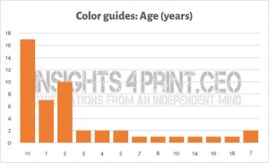
When looking at the color guides that are ten years or older, or have an unknown age, they are all (also) used as a physical reference for print jobs. And in most cases, an exact color match is considered critical (on average 3,7). And that’s a problem, a huge problem.
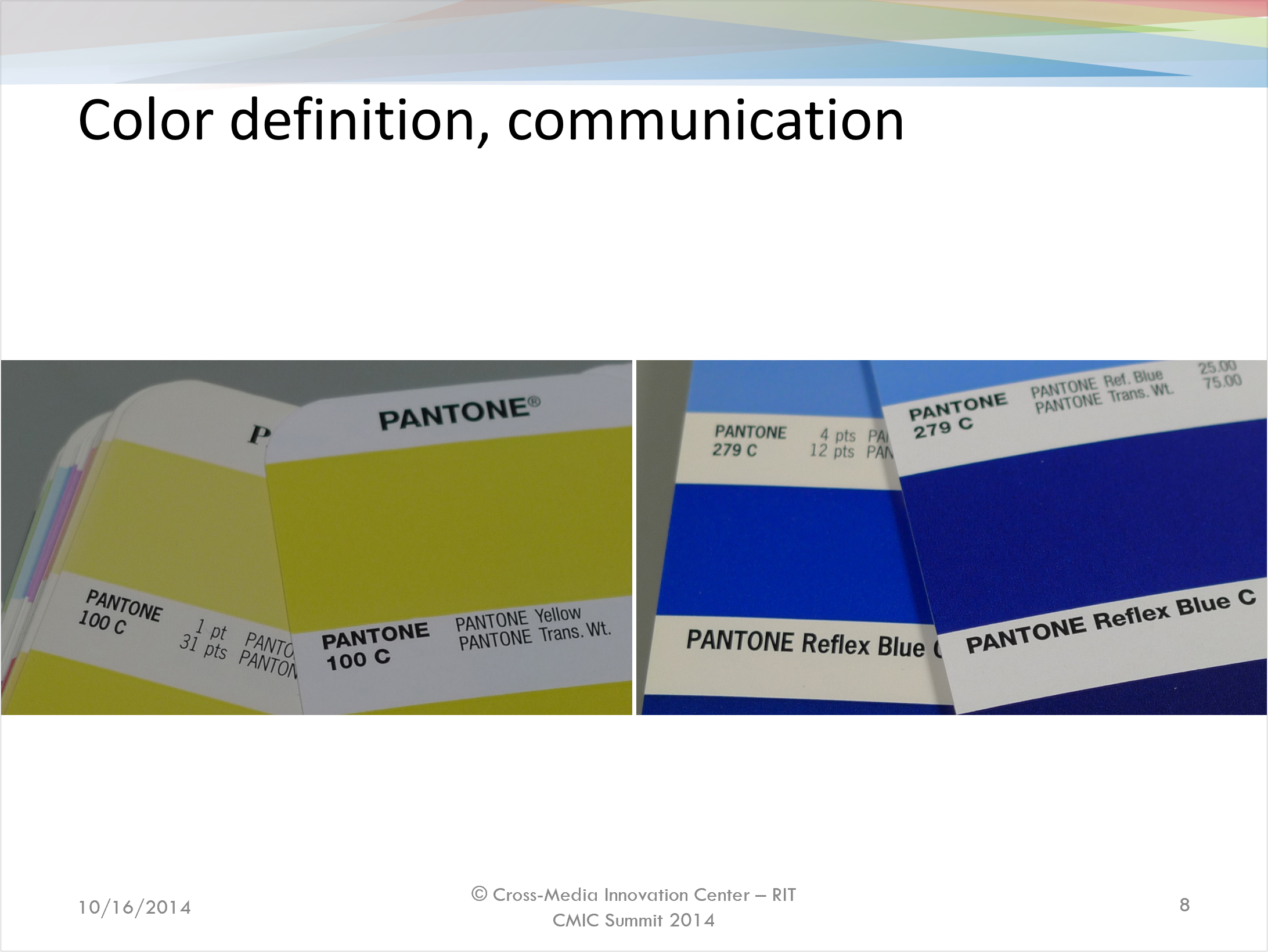
Below is a slide from a presentation I gave in 2014 at the CMIC Summit from RIT, a presentation titled ‘Process control, tales from the trenches’. In that slide, you see pictures of two color guides. The left one is an ‘old’ Pantone Matching System guide, probably from 1999. The right one is the first generation of the Pantone Plus guides, probably from 2010. Look at the difference between the two yellow patches!
One of the tales from the trenches in my speech (you can see the complete presentation here at Slideshare), was from the Artevelde University College in Ghent (Belgium). One year (2006) they had students measuring two brand new color guides, both right out of the package. In total 452 patches were measured, the average deviation was 2 dEab, in 22% of the patches it was over 3 dEab, the largest deviation 9,46 dEab. Another year, they checked 56 patches in four guides dating from 2003 to 2006. Here the average was 3,95 dEab, the maximum 11,87 dEab. When I showed these results to representatives of Pantone at Ipex 2010, they claimed that their production tolerances are narrower than these figures, but they wouldn’t reveal the exact numbers. Now they are publically available: maximum 2 dE00, for about 90% of the colors.
Measurements
So the 1 billion dollar question is: what kind of deviations do we see in the test? Are recent color guides within the specifications? Before sharing the measurements, maybe I should first show the tolerances Pantone mentions on their website.
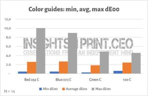
And here’s the summary from the 19 participants that shared their measurements.
The average age of the measured color guides was younger than the global average: 3,6 years, with over half of them being bought the past year. But there is one exception: one designer is still using a color guide from 2002! That guide is 16 years old… And you know what’s interesting: although the deviations compared to the digital value are significant, it is not the one with the highest deviations.
Below you can see the measurements plotted in the a/b plane.
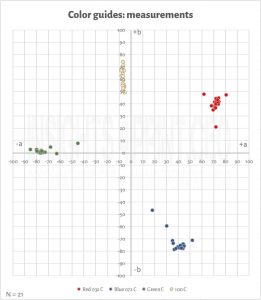
Please note that the maximum color deviations in the first graph are compared to the ideal Lab-value of the color. In the previous version of this article, this was derived the Pantone library in Adobe Photoshop. With this update, the Lab-values come from Pantone Connect, all deviations were recalculated.
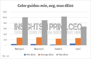
If you compared the most extreme measurements, the number would be higher. And that’s what happens in real life, that’s one of the points I wanted to make in my previous article: dE has no direction, so one deviation compared to the goal could go into one direction, the other into the opposite direction. As a test, I took two extremes in for Red 032 C, the color deviation is 14,8 dE00! And for the record: both these guides were bought in 2018.
UPDATE: after reading the comment by Ingi Karlsson, I realized that I forgot to mention something: the deviations from the color guides that were still ‘valid’, under warranty. I got fourteen measurements of ‘valid’ guides, the average dE00 of all patches is still 2,4; the maximum deviation is 10. Only half of the measured patches were below 2 dE00.
Where did we go wrong?
So, where did we go wrong? Why are these measurements higher than what you would expect? That could be a complicated question. It could be the color guide, it could be the measurement device, including maintenance and calibration. And here’s another interesting fact: the strongest deviation in Red 032 C was found with a device that was calibrated, with X-Rite Netprofiler, only the week before. So, what happened?
Also interesting to mention: two participants provided me with measurements that looked quite odd. When I contacted them, they noticed that they made a human error. Another factor to take into account.
So, where did we go wrong? It’s difficult to tell, but these findings do show that we should take color tools and procedures very seriously. And we might need to up our game and get tools that are within much tighter tolerances.
Or we can just get real about the tolerances in print production.
CxF to the rescue?
When it comes to exchanging color information, CxF could be part of the solution. This makes it possible to exchange the most detailed color information possible at this moment. And it can also be used as a reference for quality measurements. But it has one downside: it’s a set of numbers, any physical representation of it might/will show deviations, it will not be 100% exact. So you need to have faith in such a workflow.
Why is this important?
In my previous blog post, I already raised the question about tool tolerances in print production. This study shows real life: 15 people measured four samples in their swatch book, with their spectrophotometer. And the readings differ. From the ‘ideal value’, from one another. How can we get tight tolerances, as 2 dE00, when the physical references used by the print buyer on the one hand, and the printer, on the other hand, might be e.g. 5 dE00 apart?
There’s still some work to do if you ask me…


Interesting suff Eddy. My comment is that 2 DE 2000 is roughly 4 DE 76, so the average deviation on the measured colour samples is not that far off. But we actually don’t have an ISO standard saying what is a recommended colour deviation for spot colours, so that has to be put in place first. And the trouble with DE2000 is that it is colour (hue) dependant, since it imitates the human way of “seeing” colours”. So what is an acceptable colour deviation is not fixed, but somewhat depending on what colour (hue) we look at. And physical colour samples are just guides, not the absolute reference. We should be used to agreed upon aim values for named spot colours (brand/logo colours) and the corresponding acceptable colour deviation expressed as DE 00. Pantone LIVE and similar technologies are the correct way to go.
Thanks for your comment Paul!
Please note that my measurements are DE 2000! Only the old measurements from the Artevelde University College were in dE 76.
And as I concluded: there is still some work to be done…
Interesting stuff. There is a good reason why Pantone LLC offers warranty for their color guides only for 12-18 months. The paper changes it’s white point gradually with time and some of the pigments used in Pantone inks fade more than others with time. I honestly don’t think it a fair picture to let people measure formula guides that are outdated many years ago and then offer that up as an argument that Pantone guides are not within an acceptable Delta E2000. What would be interesting however is if you asked owners of Pantone Formula Guides under warranty – say bought within the past 12 months, to measure a few colors using the M1 standard. To try to avoid instrument deviations, it should be possible to limit the measurements to using i1Pro2 + i1Profiler for instance. Honestly, companies, unless they are Pantone Live subscribers, that don’t even bother to renew their Pantone guides annually, should not be offering printing or other production of Pantone colors. Same goes for Designers. They should not be presenting Pantone colors to customers using color samples that are outdated, faded and not what they will look like when printed. Color- and in general quality conscious brand owners that are paying money for professional design should simply insist that all physical color samples that are presented to them for approval during the creative process are up to date and under warranty by the manufacturer (Pantone LLC in this case). On the other hand at the same time it would not be unfair to make the demand that Pantone undergo that each color from all their guides and printed samples, plastics and textile is within a DeltaE2000 of 2 from their own reference LAB/spectral value, as long as the sample/guide is not older than 18 months old and has been kept under normal conditions (not left exposed to daylight for days at the time).
Thanks for your comment Ingi!
I wanted to get a clear picture what people in the print production chain (including designers, brand owners and suppliers) are using in the their daily life. Without any restriction. The fact that many are using a color guide that is too old, is one of the findings of the survey. And also one of the thing that I clearly pointed to: if your color guide is older than 12 to 18 months, you can not claim tight tolerances, since your reference might be completely wrong. If you want tight tolerances, you need to update and maintain your tools (including calibration of measurement devices).
And that realistic view of print production is also the reason why I included the measurements of the ‘old’ color guides.
But: I did also look at the guides that are still under warranty. I only now realized that I forgot to mention them in the article (with exception of the two extremes in Red 032 C, they were both from 2018). I got nine measurements, the average dE00 of all patches is still 4,5; the maximum deviation is 10,9 (compared to 11,9). And as I mentioned in the article: the one with the highest deviation in Red 032 C was bought in 2018 and the measurement device had been calibrated with Net Profiler the week before…
Once again: my intention was to take a look at the reality of color guides. And point out weaknesses. Including the fact that people are using tools that are too old to be valid.
A dE2000 of 4 is way too much. 2-2.5 max would be acceptable.
Hi,
Somewhere in the article you describe Photoshop as a source of LAB values for Pantone Colours, if you don’t have access to Pantone Live. Photoshop doesn’t mention the illuminant of the LAB values it uses for its Pantone colours, and that’s like saying it’s 10 degrees outside without you knowing if it’s Celsius or Fahrenheit. However, if you measure a Pantone swatch with different illuminants, you’ll notice the Pantone LAB values in Photoshop, or any other Adobe CC package, will be closest to M2. Suppose you measure a perfectly produced Pantone 100 C with M0 or M1, you’ll get a dE if you compare with Photoshops M2 Pantone 100 C, and this might already be a source of confusion. The lighter a colour is, the higher the difference will be. Mind you, this is already a problem with rip vendors using M2 Pantone reference values if media ICC profiles are M0 (Fogra 39 simulation) or M1 (Fogra 51).
Pantone has reference values for M0, M1, M2 and even M3, so you can’t compare oranges with apples.
Regards,
Yann
Thanks for your comment and clarification Yann!
Here is the information from Pantone on how to get Lab-values when you don’t have access to Pantone LIVE: https://www.pantone.com/customer-service/help/?t=L*a*b-values-for-PANTONE-Coated-colors
And while you are correct, what matters more is the differences between the measurements of the different guides.
BTW: most of the measurements (80%) were made with M0. The one measurement with M2 had an average dE00 of 6,4 and a max of 7,8 dE00 (but this was just one measurement of course).
I deliberately didn’t specify the measurement mode, to make sure everybody used their ‘regular’ way of measuring colors. The same goes for the backing used, I didn’t specify that either. The backing can also make a difference.
So, as I already concluded: there’s still some work to be done. Also on educating every player in the complete chain from design to print production and quality control how to measure, to communicate colors.
IMO Pantone guides do not have matching colours because the process they use for printing the guides is not capable enough. For a better understanding of the variability of the printing process for the guides, it would be of interest to know what the range of ink film thicknesses there were that resulted in the variation in colour values. The average steady state ink film thickness for their process is only related to the ink feed rate of their modified press. From this kind of information, one can then determine what ink feed rate variability is required to produce a target range for the colour of a specific ink.
Of course the simple solution to their process variability problem is to develop an ink feed system that feeds ink to such a tight tolerance that it will result in very low variation values for their targeted colour values of their ink sets.
This solution is valid for producing colour guides or for offset production printing. Something the industry, in both cases, is not serious about.
Interesting stuff Eddy but not surprising to anyone who has measured a pantone reference book before I’d argue.
I’m relatively new to the colour field (8 years or so) but isn’t today’s best practice to use the Lab reference in pantone manager as a target and reference for colour critical spot processes though? We even use them when refining .icc profiles.
Physical samples have always had deviations and my understanding is, they were only ever intended as a quick visual guide. Pantone provides the industry with tools to measure quite accurately using pantone manager and spot library’s. There is a licence code on the reverses side of every deck of swatch books (at least my last two sets did, last replaced in 2015 for the record)
Your research appears to generalize to a degree, that even today, a large proportion of colour critical spot work is based on visual rather than measured references, which I find a little ironic, given the participants of the study will have used instrumentation to take part, all suggesting that many have the tools and possibly the knowledge to work with spots in an accurate way. Perhaps (and possibly hidden in the finer detail of the research) many people no longer see or have a need to replace their physical samples now, hence the high average age of the books ?
In the digital world, most RIP’s also include the pantone library and allow the user to refine and measure to the specified Lab reference, virtually negating the need for up to date visual references. I suspect this is likely to be a contributing factor.
Thanks for you comment Jason!
It’s certainly not something new, I’ve addressed this issue with Pantone already many years ago. But it’s the first time, as far as I know, that so many people were involved and that the results were publicly shared.
About the use of Pantone guides: no less than 89% of the 46 participants in the survey said they are using them as physical reference for print (probably not for every job, I didn’t include a question how often). And on the question to rate the importance of an exact color match between color guide an print jobs, on a scale from 0 (not important at all) to 4 (critical), the average score is 3,2. So it’s really much more than just a quick visual guide.
You might also want to talk to a designer, a brand owner about this, to see how they look at it. For many of them their copy is the absolute truth, that’s the reference, not a digital value. Many brand manuals use Pantone colors as the reference, not the Lab (or spectral) equivalent.
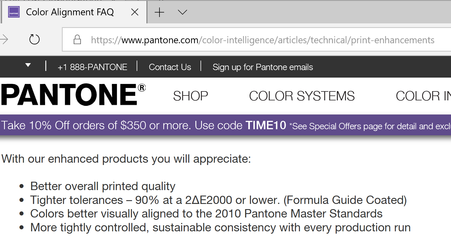
BTW: you might want to replace your copy: Pantone specifies you have to replace it every 12 to 18 months… 😉 (more on that: https://www.pantone.com/color-intelligence/articles/technical/print-enhancements)