

Your logo, your brand colors are important to you, especially when you’re a designer or a marketer. You care about how it is being reproduced, whether it is on a website, on a printed piece of paper, or any other kind of reproduction. And you should take all those kinds of reproduction into account when choosing your brand colors… I already covered this in a previous blog post and last week I got the perfect example why you should use that approach.
CONTENTS: The new logo | A safer approach | Why is this important? | Update
IMPORTANT UPDATE (03/11/2022): if you care about brand colors, check the new Project BBCG – a Better Brand Color Guide!
Last week I got a mailing from an organization that is rebranding itself. It will have a new name and a new logo. To announce both, they sent out a brochure and a personalized letter with it. When I opened the envelope, the difference in color between the brochure and the letter was immediately apparent to me (but OK, I’m a color nerd, it’s in my DNA to see those color differences).
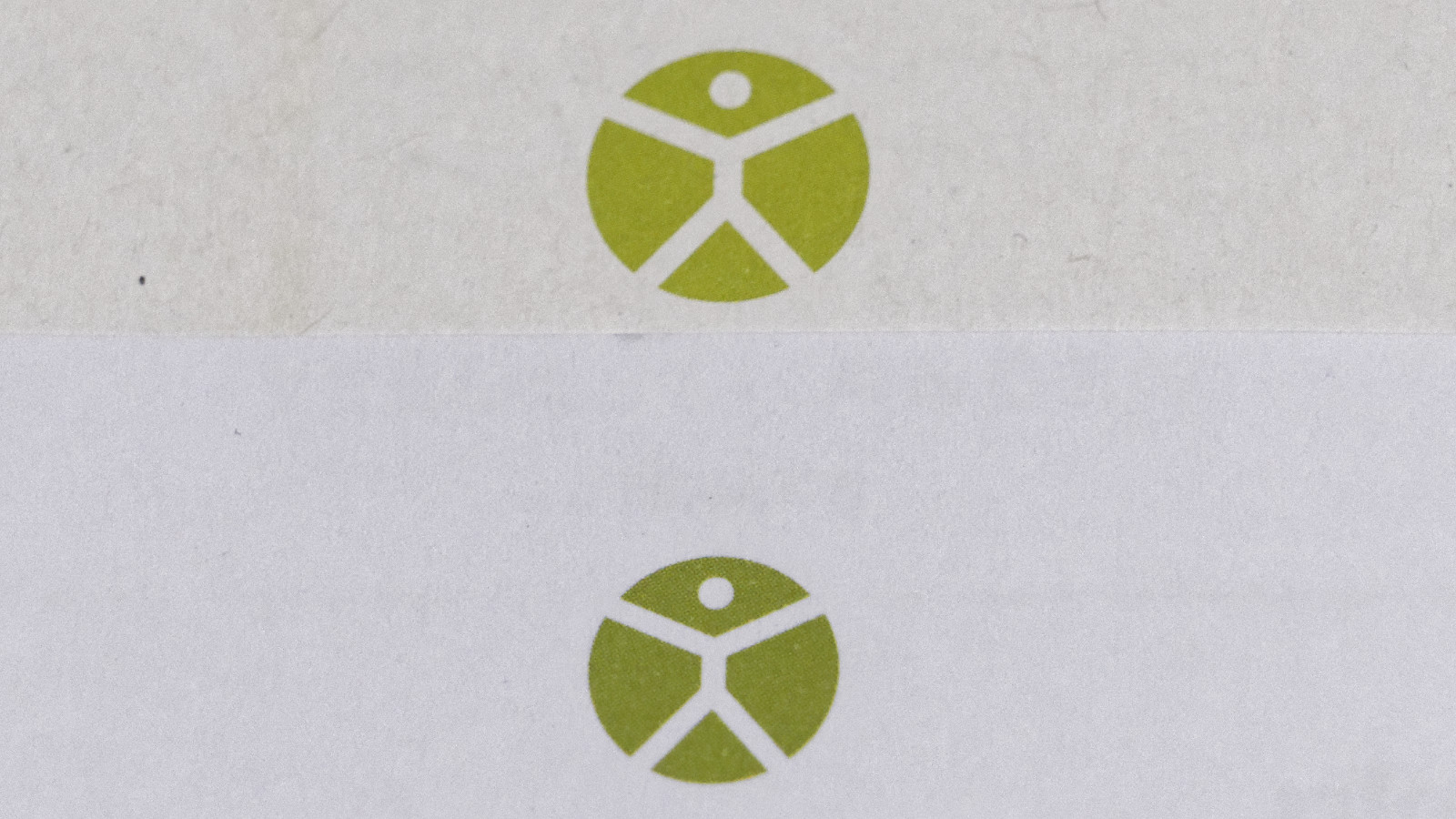
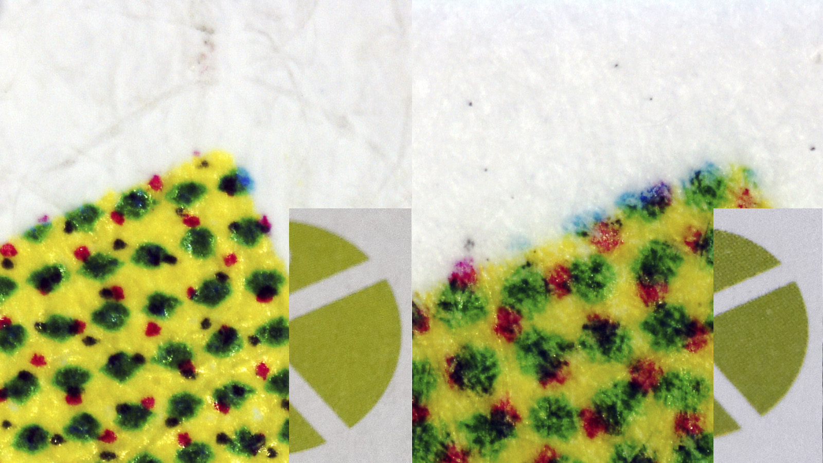
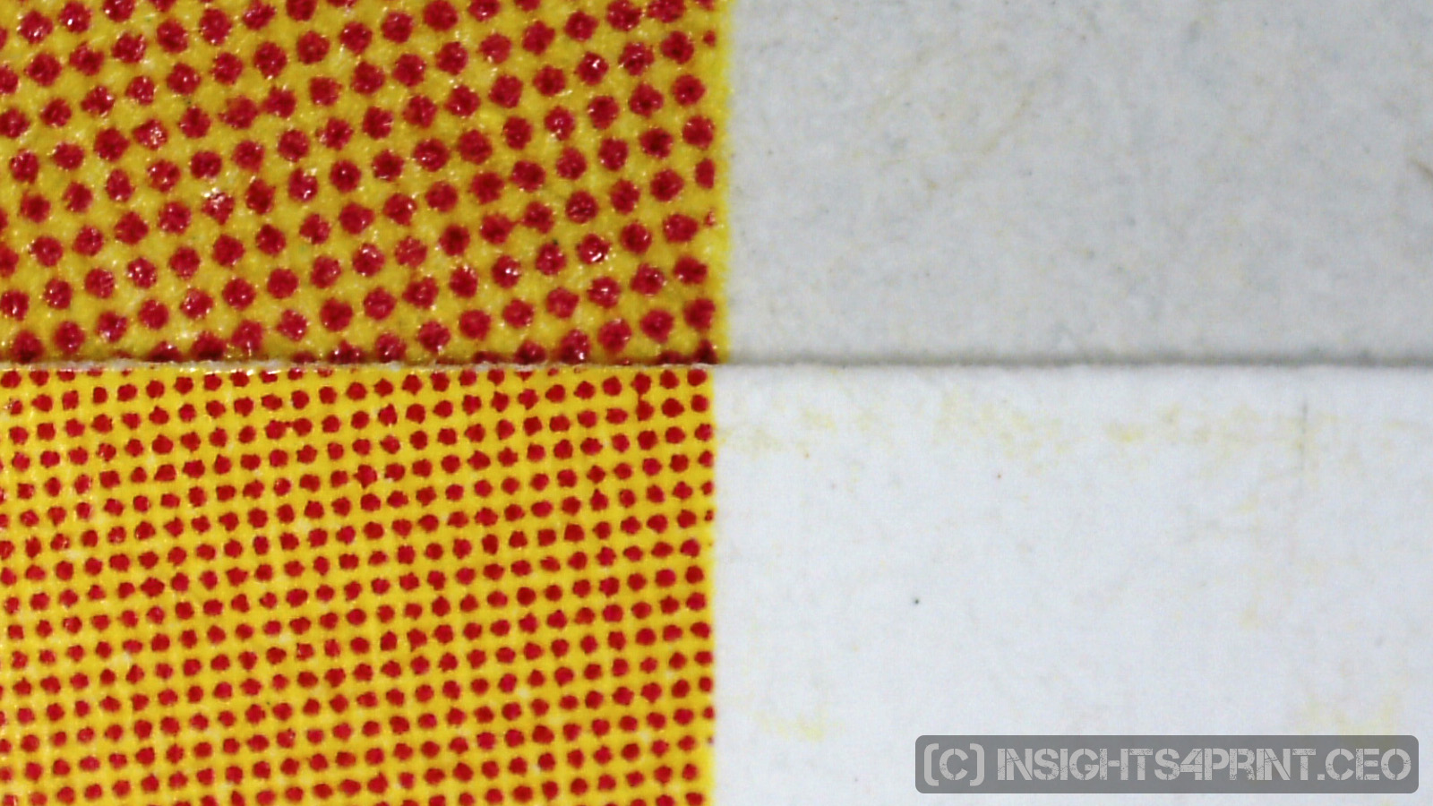
Since the difference in color is significant, I took my loupe to have a closer look. And this revealed that both logos were printed using the four colors: cyan, magenta, yellow and black (CMYK). Which is something I really advise you to avoid: when designing a brand color, the fewer color channels in CMYK used, the more stable a color will be in print. When using all four colors to print, minor deviations in multiple channels might result in rather big changes in the reproduced color.
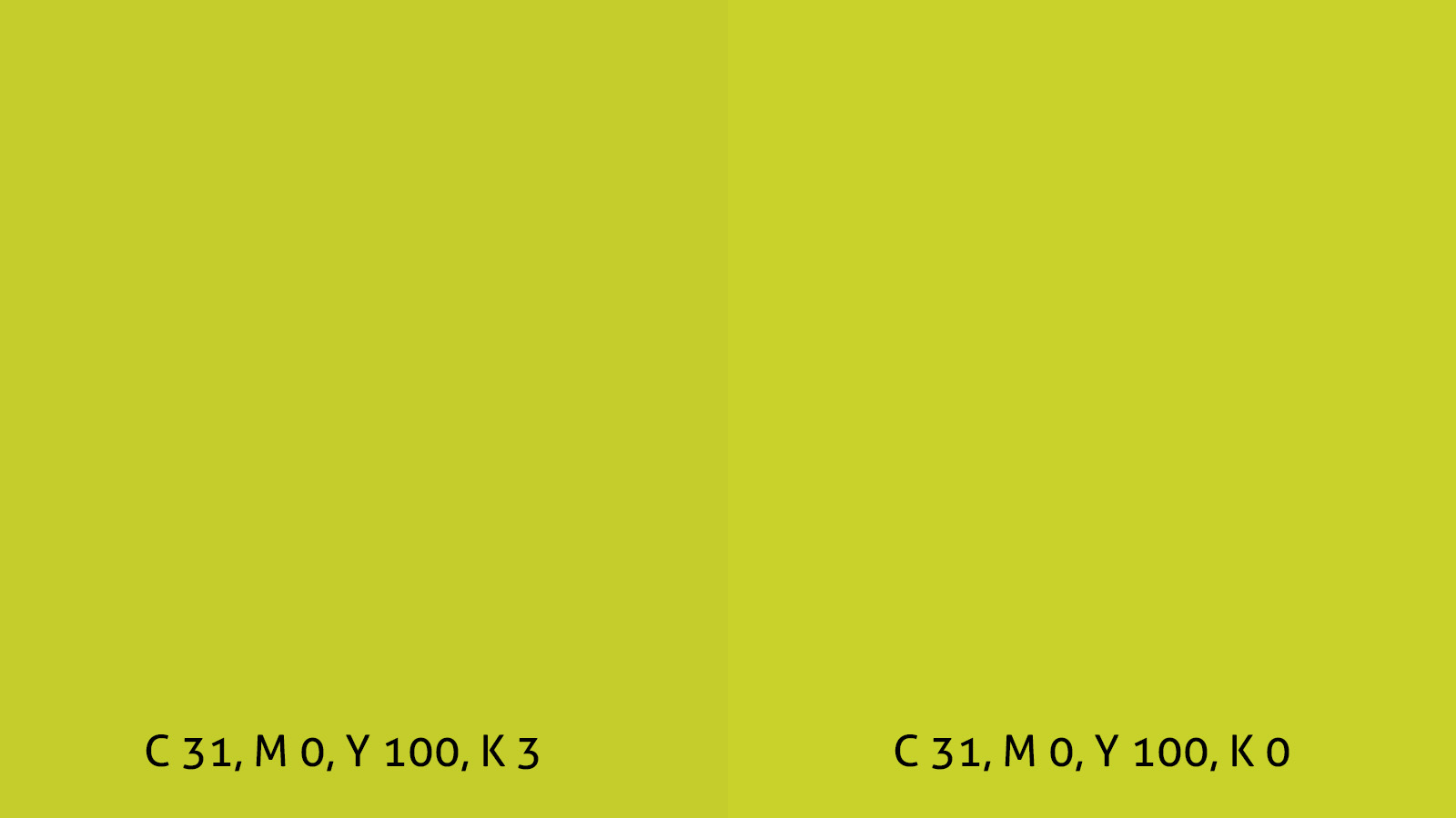
So I was wondering how that green brand color was designed. And fortunate for me, the organization’s website had the original files for download, both in RGB and CMYK. The RGB version is in sRGB with the following values: 182, 191, 0. The CMYK version, with the Coated Fogra 39-profile attached, shows these percentages in CMYK: 31%, 0%, 100%, 3%. That’s a conversion I would not choose: the 3% K (black) will be bigger in print (certainly on ‘bad’ paper types), making the color look darker. Changing this to 31%, 0%, 100%, 0% could prevent, or at least limit color shifts in print.
When looking closely looking at the printed results, I noticed that there is also magenta in the printed logo! A color that is not in the Original CMYK file. What might have happened, is that there was a color conversion at the printer. Maybe the printer got files with the RGB logo in it, or if the files contained the CMYK version, this was converted to another CMYK ICC profile, another CMYK color space (if this is something completely new to you, please check my tutorial on color management).
When converting the sRGB logo to CoatedFogra 39 in Adobe Photoshop, I get the following CMYK values: 36%, 10%, 100%, 1%, which is already a bit closer to what I saw using my loupe.
(for fellow color nerds: I used relative colorimetric rendering intent and black point compensation)
And then there is the second, much darker logo on the personalized letter. I guess that this has to do with the paper type and printing technology (next to the color conversion, since there is also magenta). This could have been printed with (high speed) inkjet, on a rather rough paper type. This will make the drops of ink spread more than e.g. an offset ink on a nice coated paper. Hence resulting in a darker color.
A safer approach
As I’ve already said, when designing brand colors, the fewer channels you use, the better. And also: stay away from percentages that are close to 0% and 100%. A 2%, a 98% will be very difficult for some printing processes, on some substrates. Therefore you should design your brand color with the most difficult scenario in mind (e.g. a newspaper print). Eliminate low percentages, turn high percentages into a 100%. This will involve manual tweaking! And that might take some time, some trial and error, but once you’ve chosen safe CMYK values, you’re set for a long time.
Changing those percentages will change the color that you see on your screen. But you need to keep in mind that when reproducing the color in print, there are a lot of variables. Many of those will influence how the color will be reproduced (think paper and dot gain). But some will change the perception: different light sources have a different ‘composition’ and will show colors different. The same color under a tungsten light or a D50 ‘daylight’ will look different.
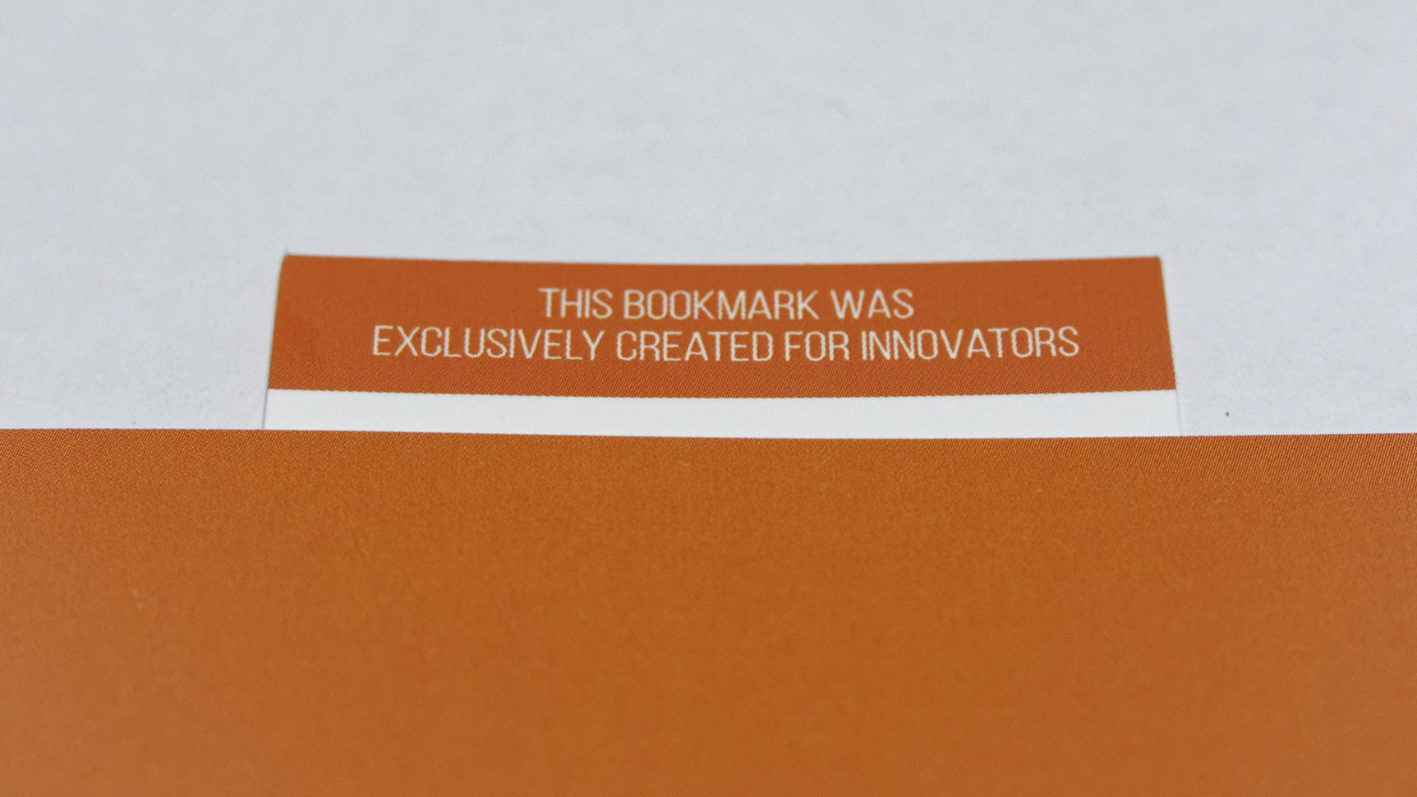
With that in mind, I carefully choose my brand colors. The two brand colors of my new venture, TheInnovation.Menu, are black and orange. Black is of course 100% K, orange is 64% M and 88 % Y. Last week I designed new business cards and also a bookmark, as a goodie for training attendees. I designed them in CMYK, with the values I just showed you. And today I got the print jobs… There is a slight color difference between the business cards and the bookmarks, but it’s certainly acceptable. And it might even be caused by the finishing: the bookmarks have a matte lamination, the business cards are just plain paper. And more important: the deviation is much less than the one in the example of the green logo.
Why is this important?
Your brand colors are important to you. That’s why you should carefully choose them and make sure that they can easily be printed, on different substrates, with different technologies. A few rules of thumb can help you pick colors that have a higher consistency in print. Pick the color in CMYK (don’t rely on automatic conversions starting from RGB, Lab or a ‘spot color’), limit the number of channels used (two is better than three, three is better than four) and stay away from percentages close to 0% and 100%.
Even when taking these rules into account, you might get color deviations, but they will be smaller. And do communicate upfront with your print provider! Make sure he will keep the CMYK percentages the way you designed them. Making a color conversion – how well intended it might be – will change the composition and might turn your brand color into something different.
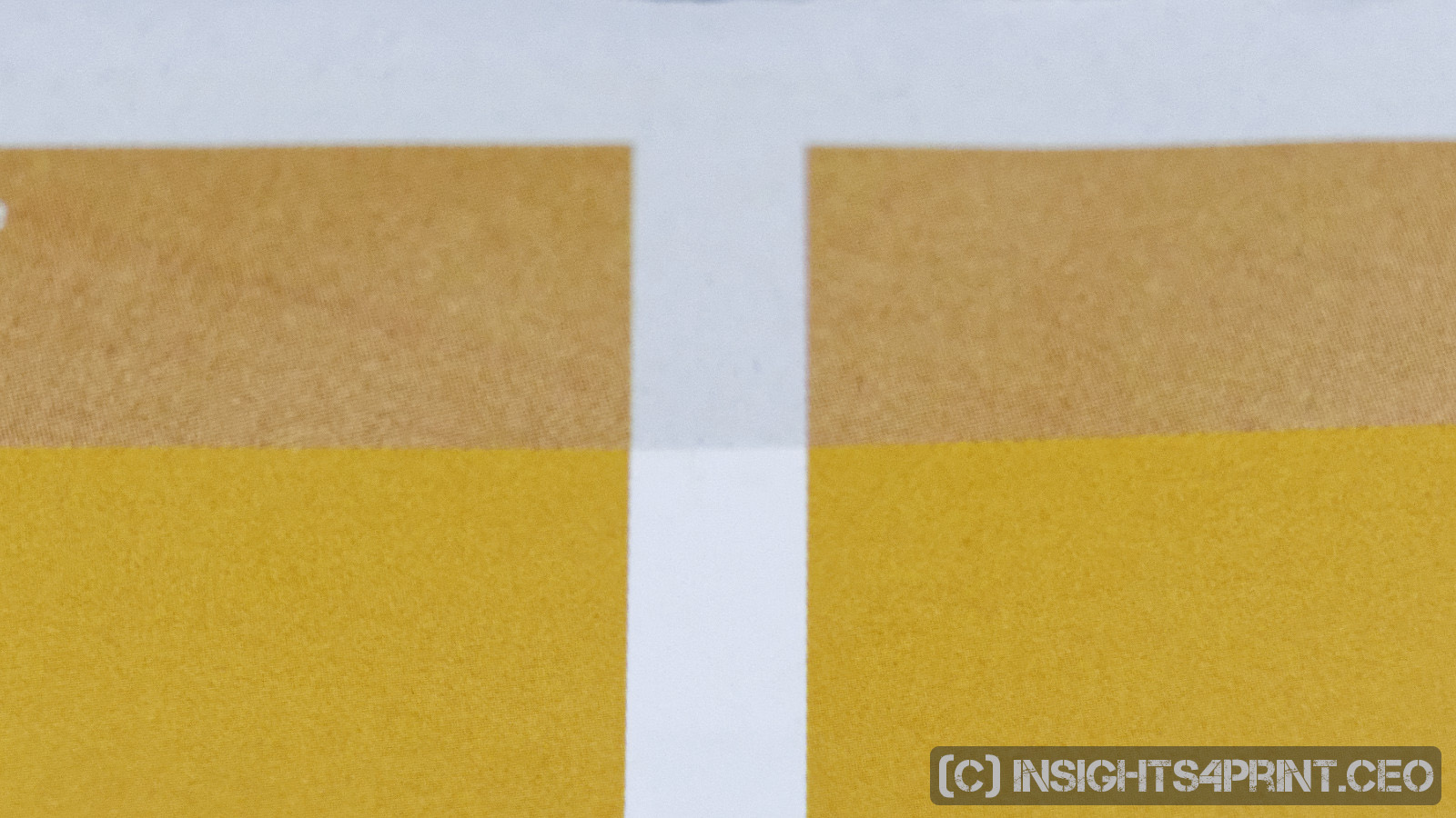
UPDATE 19/10/2017: yesterday, just after I had hit the publish button, I went through my mail and saw another interesting example of brand colors. You can see a difference between the orange on the envelope and the orange on the folder. This time, however, the colors are designed in the right way: only magenta and yellow. The difference is caused by the (much darker) color of the paper of the envelope… This is something you can always encounter: different shades of paper, even different surface textures might (will) influence the color, the perception. Some people claim that you can automatically correct this with ‘substrate corrections’, but I wouldn’t go there. This is a theoretical concept, I haven’t seen practical, real life examples (including visual perception tests!) of it yet. What you could do, is manually tweak the CMYK percentages for substrates that are ‘different’. But only taking into account what I said before: stay away from percentages that are close to 0% and 100%…
So, to conclude: you have to have realistic expectations. Printing on a substrate will always have variations, deviations from the ideal (abstract) color. There are so many variables that can influence the color, including the light source that the consumer is using. A variable that you can’t control.


Be the first to comment