

With a color printer close to every desktop, the question arises: “Why should we spend all that money on preprinted letterheads if we can print the logo together with the rest of the letter?” Although this looks a valid proposition, not all logos are created equal and with some ‘unique’ colors it will be very hard to get a consistent and correct reproduction of that unique color. Here’s a nice example I received a few days ago.
I’ve already covered the difficulties when choosing your brand colors, first in a more theoretical approach, the second time with a concrete example I received in the mail. It is extremely important that you take into account the possibilities, and even more: the difficulties, of reproducing brand colors in print. Some unique colors are not reproducible with standard CMYK inks or on your standard office printer, e.g. a very vibrant blue like Pantone Blue 072. Other unique colors are very difficult to reproduce with standard CMYK: if one or more of these color channels contain percentages below 5% or above 95%, you might get into troubles. And when printing in flexo (e.g. on flexible substrates or on cardboard) without the use of the latest and greatest technologies, you might even have troubles outside that safety margin. That’s why I advocate tweaking your brand color in such a way that they can be easily reproduced in standard CMYK: get rid of the low percentages, lift the percentages close to 100% to the full 100%. And use the CMYK-version of your logo in print designs and ‘preserve numbers’ when applying color management.
The organization that provided the nice example for the second article, once again gave me a nice example to elaborate on this topic: last week I received a mailing with an envelope printed in one color and the letter printed with a digital printer. The colors looked very different…
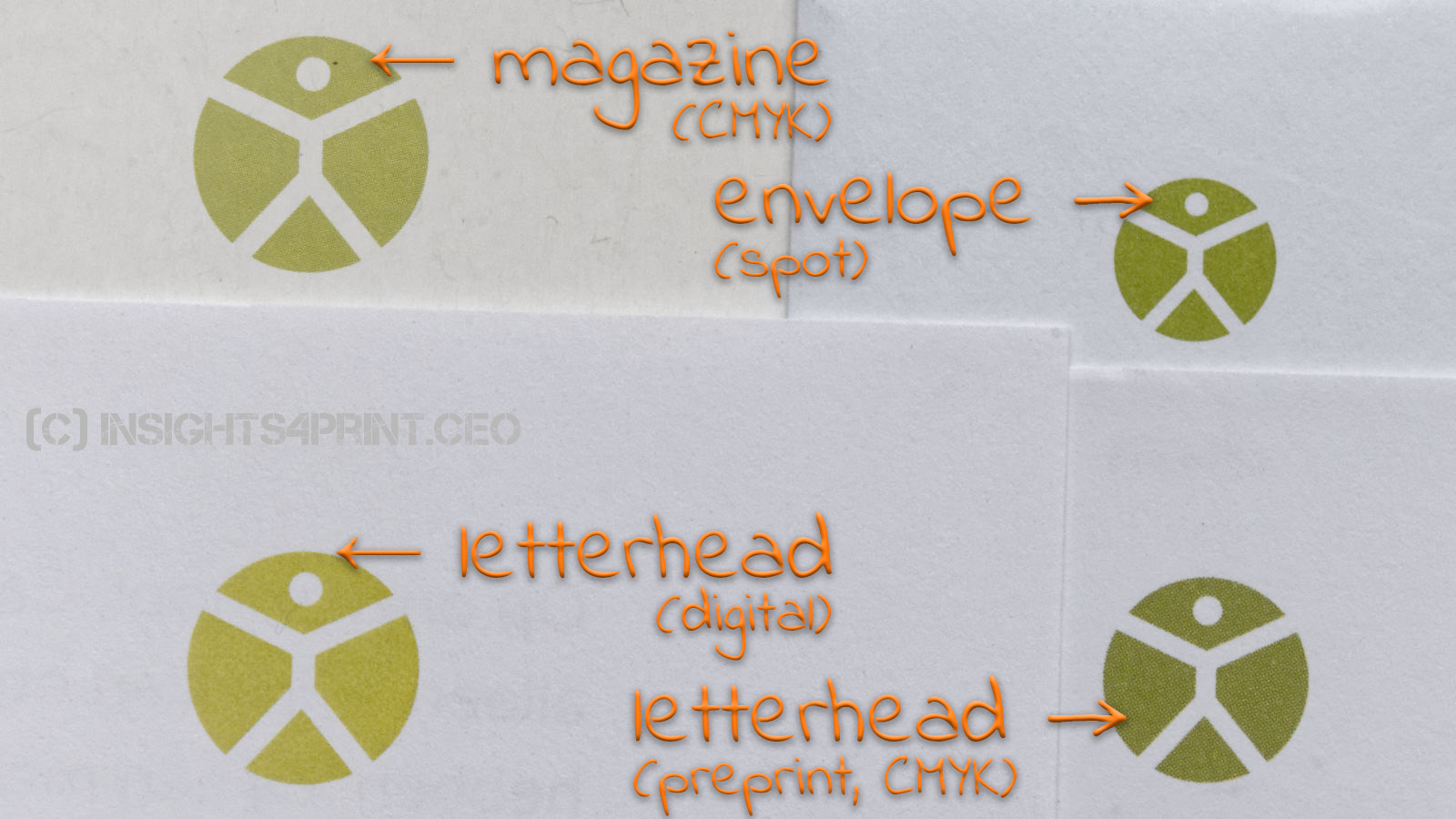
As discussed in my previous articles, there is reason why this kind of brand color is rather unique: it is very hard to reproduce correctly and consistently in CMYK. If you want such a unique color, you need to bite the bullet and be willing to invest in spot color printing. Otherwise, the color of your logo will be all over the place. I guarantee it!
And it’s not that difficult to test this upfront: print the different candidate brand colors or logos on multiple different printers (inkjet and toner, low end and higher end), on multiple occasions and in multiple quantities. Such a small exercise will give you some idea what variations to expect over time.
It is important to note that digital printers might not have the same tight color tolerances that you expect from your offset printer. High-end presses will have inline color control systems, but lower end systems don’t. And it doesn’t only depend on the technical capabilities of a press: also the environment might influence the output. In the past, I’ve heard and seen issues with digital printers that were – literally – in the wrong spot: placed next to a South oriented window, which resulted in a working temperature that shifted significantly during the day, from ‘fresh’ in the morning to ‘super hot’ at noon. Even a high-end inkjet proofer, can’t deal with such variations. The temperature shift will mess up the calibration completely.
Why is this important?
Your brand image, your brand colors matter. You spent a lot of time, effort and money to choose those colors that fit you. Don’t mess it up with wrong choices, e.g. saving a bit of money by printing it with a desktop printer. All the investment in the design will be wasted.


Great article. I like to go one step further. Check the selected colour also in sRGB on your screen. If you cannot reproduce the colour consistent in sRGB it will be a nightmare to match your brand colour in both print and screen.