

Color is important, that’s something everyone in the printing industry agrees on. But how good are we, as human beings, when dealing with color? In this article, I will discuss two studies. The first concluded that our color memory is biased, even when the reference color is still visible. And the second might be even more revealing: a ‘five-second memory test’, with 40 participants and four reference colors, showed that in only 40% of the cases the right color was picked from a set from ten. Which I found quite shocking. But when I looked at the delta E from the different colors, compared to the reference, I was flabbergasted… Our color memory is seriously flawed. And it’s time for the printing industry, for brand owners to take note of that.
CONTENTS: The first study | Sidenote: color and CBIR | The second study | Practical implications | History of proofing | Why is this important?
It’s not my first article on our color memory. I already mentioned that our color memory works in large categories. I’ve shown that you can’t correctly remember an iconic color, not even Coca-Cola red (updated link 09/07/2022!). And I’ve taken a look at brand colors in real life, e.g. the Milka case. But for this article, I’ve taken a look at research about color memory. And there is a lot of research done on that topic. Unfortunately, that research usually doesn’t reach the printing industry, nor brand owners.
The first study
‘Why Some Colors Appear More Memorable Than Others: A Model Combining Categories and Particulars in Color Working Memory’, that’s the complete title of the first study. This is the study behind the first article I published on color memory. Now that I had the time – and courage, I admit – to read the complete paper, I can share you some more relevant information.
A part of the study was devoted to color identification, where category labels had to be given to 180 colors. The intention was to determine color categories and color boundaries (when a color could be attributed to two adjacent categories).
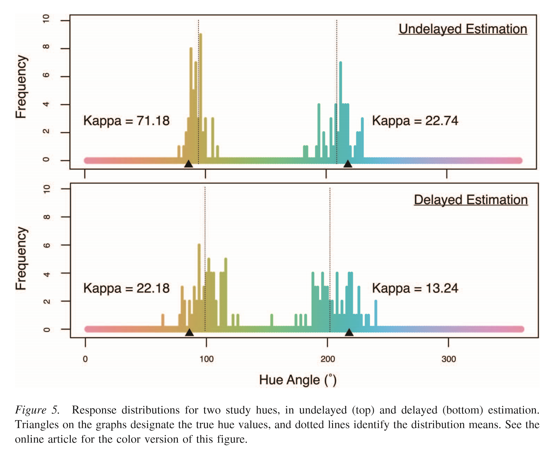
In the second part, participants had to pick the color that was the most similar to the ‘study color’ from a wheel with 180 colors. And this was done in two versions: an undelayed version, where both the study color and the color wheel were visible, and undelayed, where the study color would only be visible for a short moment and after it disappeared, the color wheel was shown.
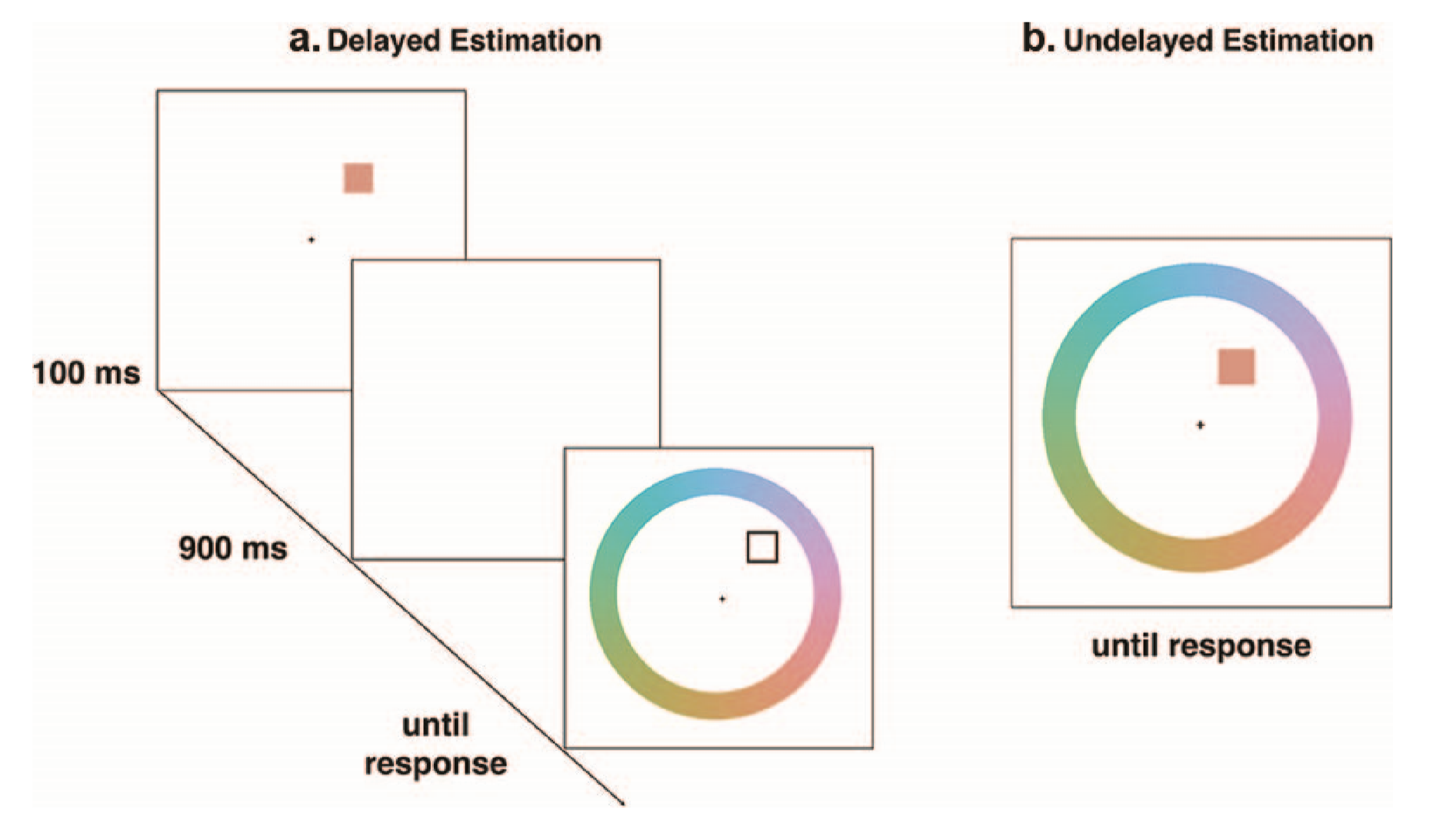
The main results are that responses drawn from working memory are significantly biased away from category boundaries and toward category centers. And: the same pattern is already present without a memory delay! When translating this to common ‘press check’ practices: print buyers might think a color is more shifted towards the category center than it actually is. And that’s a good reason to make the use of a spectrophotometer mandatory when color is critical, if there are discussions about a brand color.
An interesting anecdote about this study: when they researched existing literature, they found that other tests, including a previous test of their own, did not use calibrated devices (monitors) and therefore did not have reliable results…
Sidenote: color and CBIR
As a side note: I also came across a study discussing one of the issues with ‘content-based image retrieval’ (CBIR): in some situations, CBIR suggests results that are very non-intuitive to humans. The reason: color matching in CBIR is based on a color space and measuring distances between colors. But the closest measured distance is visually not always the best match… That’s why I don’t have unconditional faith in color management algorithms (as I discussed here).
For that reason, the writers of the paper suggest a system that is not based on a color space and measured distances, but a system that is based on color categories and ‘focal colors’, which improves color matching.
The second study
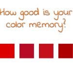
The second study is even more revealing. It’s called ‘Color matching from memory’. The researchers did an experiment with 40 students, half of them with, half of them without any color-related training. They picked four target colors and for each of these colors also nine ‘distractor colors’ were created: variations close to the target color. During the test, the participants were first shown the target color, for five seconds, with the intent of remembering it. After that, they had to focus on a white card for five seconds, and then they were given a stack of ten randomly arranged color chips: the target and the nine distractors, and they had to pick the ‘right’ color from that stack.
This may seem a rather easy task, but it isn’t. Globally, in only 40% of the cases, the right color was picked. That means that the large majority did NOT pick the right color. They could not remember it correctly, even after a delay of only five seconds between seeing it and making their choice. Which is kind of shocking to me. But that wasn’t even the most shocking fact…
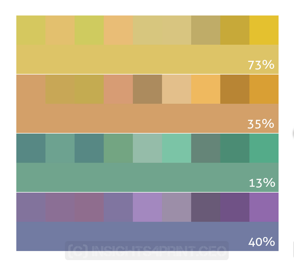
The report only mentions the colors used by their Munsell values. It does not mention the deviations between the ‘distractors’ and the target color. So, I converted the Munsell values to Lab-values, using the CMC19 software (http://wallkillcolor.com/Munsell19/CMC%20Instruments.htm), and calculated the deviations. And these were rather high. The table below shows the different colors, the deviations in delta E 2000 between the target and the closest color distractor, and the percentage of participants that picked the correct color.
| Target color | Min dE00 | Correct (%) |
| 2,5Y8/8 (yellow) | 3,5 | 73% |
| 7,5YR7/8 (yellow/red) | 5,9 | 35% |
| 10G6/6 (green) | 1,8 | 13% |
| 5PB5/6 (purple) | 9,8 | 40% |
And this is quite revealing to me: even with a minimal deviation of nearly 6 dE00 for the yellow/red color, which would be unacceptable for many brand owners and print buyers, only one third (35%) of the participants could pick the right color! Remember: there was only a five-second delay between viewing (and remembering) the target color and picking the right color. With a longer delay, the number would probably be even lower.
For the record: all participants had been tested with the Farnsworth-Munsell 100 Hue Test and had normal color vision and at least an average color discrimination ability.
For more information, please check the full paper.
Practical implications
As the first research showed: our color memory is biased, even when doing experiments without any delay. A practical implication is that for color critical work, you need to use a calibrated and well-maintained spectrophotometer to judge colors when there is a discussion.
Next: we need to discuss what ‘critical color’ is. Even when confronted with quite large deviations between the target and distractor colors, only a minority could pick the right color. So this brings in question how important the ‘exact’ reproduction of brand colors is.
This groundbreaking research also showed that a visual evaluation of color differences is flawed: with one out of four seeing differences between identical copies, which is the foundation of my theory called ‘the uncertainty principle of visual color evaluations‘. BTW: there is also a difference between seeing a color difference and finding it disturbing.
As I stated before: I’m not advocating bad print quality. Print quality should be good and consistent, e.g. across a sheet, within a print run. But print quality is more than just color. It’s also about print defects. A deviation of 2 or 3 dE00 in the brand color, probably nobody will notice it. But bad registration, smearing and hickeys are very visible. And bad color management conversions, like the (in)famous blue-to-purple conversion, are also very visible too.
Over the three decades that I’m in the printing industry, print quality has improved significantly and the deviations have become much smaller. But that race to even smaller numbers has to end. There is no more justification for it.
Also, hour-long discussions on the subtle difference between Pantone 135C and 136C; and which one reflects best the company values, are a waste of time. When looking at Pantone 135C, our mind already makes a different interpretation of it, shifting more towards the category center.
History of color proofs
I guess some people won’t like what I just said and will keep demanding very small deviations between proofs and production prints. So, it might be time to ask this question: why do we have color proofs?
If you’ve been around in the printing industry long enough, you might remember the time when four-color jobs (CMYK) were printed on one- and two-color presses. This was also the time when even a densitometer was something exotic and very rare. Press operators relied on their vision and their skills to get full-color jobs right. And that’s the state of printing where color proofs originated.
At first, color proofs were actually printed. When a prepress house made the offset printing plates, they printed proofs with these plates, on a flatbed proof printing press. They printed the individual colors and the combinations of colors, with ultimately the full CMYK, on separate sheets. And this could be printed on the actual paper. The complete set, printing plates and the book with all the colors prints, individual and combined, was provided to the printer, as a visual aid to get the job done. In Flemish, this was called a ‘gamma book’.
This was, of course, a quite expensive way of making proofs. So other methods took over. One example was Dupont Cromalin. I clearly remember those: they had very vibrant colors and a glossy finish. And that was used as a proof for e.g. an ad in a newspaper… These vibrant colors could never be reached in a newspaper, but both the printer and the advertiser knew how to interpret that proof and get a good result.
But over the years people have become more stringent about proofs: they are considered the absolute truth, not a guideline that needs to be interpreted. And they should be obeyed without any doubt, within the tiniest deviation possible… And that’s where it can go wrong. Please remember: proofs these days are mostly made with different materials (paper, ink, technology) than the actual printing, which means that the appearance can be different, especially when viewed under non-standard conditions.
Why is this important
Color is important. But our color memory is seriously flawed, even within a very short timeframe. Making it virtually impossible to remember a brand color correctly. Which refutes the general wisdom that an exact reproduction of the brand color is mandatory for brand recognition, for sales.
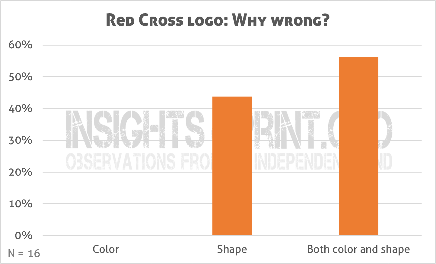
PS: although the sample size is limited, I think it’s a great moment to show some results of the ‘Red Cross’ logo test I recently launched. It showed three variations of the Red Cross logo, all with a slightly different red and one had a slightly different form. There was no agreement on which one was right, but there was a large agreement which one was certainly wrong: the one with the slightly different form (only one person had a different answer to that question). And when asked why it was certainly not the right one, 100% said ‘wrong shape’. Just over half combined it with ‘wrong color’. My conclusion? Form matters more than color. BTW: all three colors were ‘right’, they came from three different brand guides (USA, Ireland, New Zealand).


Be the first to comment