

Iconic brands come with an iconic brand color. A color we will never forget. Well, that’s the intention of the designer, of the company. But how good is your color memory? Can you accurately recall that iconic brand color? Let’s do a short test to find out…
CONTENTS: Short-term memory | Brand color memory | The setup | Why is this important?
About a year ago, I published an article about our color memory, which has been the most read article for a long time. It reports on a study by researchers from the Johns Hopkins University in 2015. In this blog post, I would like to do a small, similar test to check our color memory. Will you participate? Please???
Test #1: short-term memory
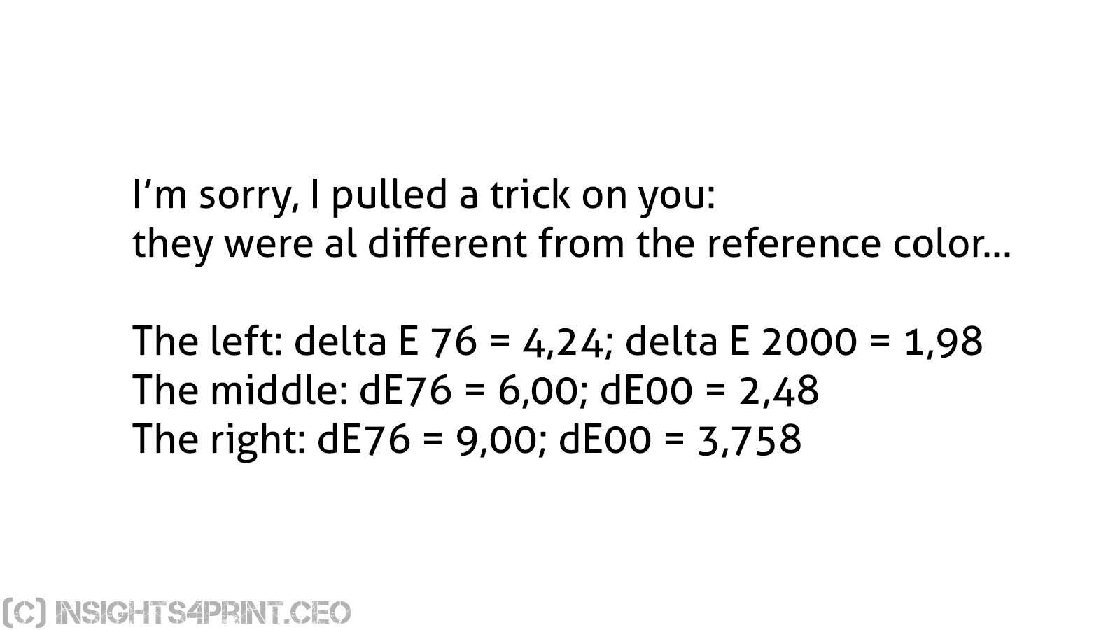
In this first test, we will test your memory for a specific red. First, it will be shown to you, a bit later, you will be asked to pick that color from a few samples. The highest color difference between the reference and the other colors is delta E 1976 = 9,00; delta E 2000 = 3,75.
The colors are all within the sRGB color space, so if you have a decent, recent monitor, it should work. Please note: we are comparing colors on the same monitor, so calibration is less of an issue with this test. It is a relative comparison. But make sure there isn’t any light falling on the screen, e.g., from a window. That might hinder the test. And make sure the screen is at the maximum brightness level.
Please click on the slides to advance. In total there are 13 slides, after the last slide, you’re back at the first slide.


Test #2: brand color memory
The second test is more challenging: it checks your long-term color memory. The test is to identify the real brand color of an iconic brand: Coca-Cola. You will see six variations of red. All of them are very specific brand colors, from the following companies: Adobe, Coca-Cola, KitKat, Netflix, Target and Vodafone. Most of them are known worldwide, the reason for picking them.
The color differences, compared to the Coca-Cola red, go up to dE76 = 21,11 and dE00 = 9,18.
For this test, calibration is more important than in the previous test: you want to see the exact color red. This is not a relative test, it is an absolute test. As with the previous test: the colors are within the sRGB color space, so a – calibrated – sRGB monitor should be sufficient.
What do you think? Which one is the real Coca-Cola red? Again: click on the slide to advance.

If you want to know the answer, please fill in the form below. The answer will be e-mailed to you right away! The e-mail address and other info won’t be used for any other purpose. The extra questions are for analysis purposes only, to see if there are differences in the different groups. As soon as I’ve received sufficient answers, I will include a statistic with chosen colors and update it on a regular basis.
(Please note: your e-mail address will only be used to send you the right answer and to give you an update of the global results. In case you don’t like giving your professional or private e-mail address, you might consider creating a specific address for this kind of uses with a free e-mail provider, such as G-mail.)
The setup: sequence vs adjacent colors
As you probably have noticed, I’m showing the colors in a sequence, not next to each other. And that makes a difference. We are very good at seeing color differences when two colors are placed next to each other, or even on top of each other (the general practice in ‘press proofs’). But when trying to remember the exact color from our memory, it becomes much more difficult. Even when the colors are shown with only a few seconds apart, making use of our short-term memory.
If you ever want to replicate this test, e.g. with a different color or maybe even in print, make sure that there is a short pauze between showing the different colors.
Why is this important?
For some brand owners, marketers, getting the brand color within the tiniest tolerances, is kind of religion. But does that matter? If my feeling is right, if other studies that I’ve seen are right, our color memory isn’t that good at exactly remembering a brand color. Yes, we will remember that it’s a vibrant red. But which vibrant red? That’s another story. I guess you could easily swap Coca-Cola red with Adobe red, without anyone noticing, or anyone bothering… Except for the brand owner, maybe.
PS: don’t forget to share this test!
(and another PS: there is something wrong with the counter below… for some reason the counter on this page – and this page only – doesn’t work properly)
Re: Should we rely on color memory or color measurement?
Color is a visual sensation. Color memory is an extension of the visual sensation which is subjective and difficult to specify. Thus, color memory has no official role in buying and selling.
All manufacturing industries begin with specifications and use tools to measure and control the process. In packaging printing, using a spectrophotometer to specify the spectral reflectance of the Coca-Cola Red is the first step. The second step is to specify the Coca-Cola Red in terms of CIELAB values under specified light source and observer conditions, plus a tolerance.
Now, it’s up to the printer to demonstrate conformance to specifications. In short, the remedy is to rely on color measurement, not color memory.
Hi Bob, thanks for your comment!
Of course we need to rely on color measurement and specifications. But we have to ask ourselves where the specifications come from, what they are based on. And that might be a flaw in current practice…
If the basis for very low tolerances (some print buyers demand dE of 2 or even 1…) is that people will otherwise not recognize the color of the printed package in the supermarket as that iconic brand color, then it’s flawed. Because that’s where color memory does play a role. And our color memory is weak, very weak.
Even if it’s based on a color comparison study, it’s flawed. Because in that case the researcher will (probably) have asked if two color patches were considered ‘identical’ or ‘not identical’, framing participants to look for differences, even if they would not notice them in real life. That’s what my other article clearly shows: 2 out of 3 participants claimed to see differences between identical boxes… More: https://www.insights4print.ceo/2018/05/groundbreaking-color-study/
So there is a lot of opportunity for research here! 🙂 But the difficulty is that participants shouldn’t be framed (or guided) in their observations, their actions. Even knowing that they participate in a test will change their behavior, will change the test results.
PS: how many print buyers know the difference between the deviation tolerance and the variation tolerance? Between dE76 and dE00?