

Since I launched the ‘iconic color memory test’ on this blog, over 4,5 years ago, 399 people have participated in the test. The main conclusion: there is no agreement on what the right Coca-Cola red, the most famous brand color, is. But there are more, even quite essential, conclusions you can draw from this test. Let’s dig in!
CONTENTS: The iconic color test | Detailed results | And there is more… | Statistics… | Why is this important? | Update
Brand colors are important, that’s the narrative. And part of that narrative is that customers won’t buy a product if the brand color deviates from the right color. So: deviations in print can only be tiny, otherwise, this will result in a loss of sales.
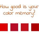
Now, this narrative, of course, means that our color memory needs to be very good, how can you otherwise know if the color you see is different from the ‘right’ color? That’s why I set up the ‘iconic color memory test’, to check if people can recognize the most iconic color in the known universe: Coca-Cola red.
I had already seen some studies showing that our color memory isn’t flawless, but I wanted to check this with the most iconic color. And what I suspected was proven: there is no agreement on what the ‘right’ Coca-Cola red is. Please note that I explicitly asked to judge colors, to pick the right color. So, the mindset of people was on color.
So, if there is no agreement on the right color, can you still hold the narrative, the claim that customers won’t buy a product if the packaging color deviates from the ‘right’ one? Can you still demand a very tight tolerance compared to the ‘right’ value, if people can’t remember colors correctly and therefore can’t judge if the color of a package is the right one? For the record: I’m not suggesting color can be all over the place. During a press run, it should be consistent. I’m disputing the tiny tolerances compared to the ideal value.
BTW: when shopping, people aren’t judging colors, they only use color categories – categories, not specific colors! – as a clue to find the desired product. That’s what happened to me lately, as I showed in this blog post, on a package of breakfast cereals that tasted differently… (spoiler alert: I bought another variety, the color was about 10 dE00 different from the one I usually buy).
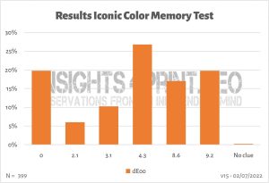
Detailed results
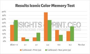
And we can look into more detail: I did not only ask for the right color but also asked several questions to know more about the participants: whether a calibrated monitor was used, whether they were involved with printing, age and chromosome pair (XY has more chance of color blindness). And when looking at these additional questions, it becomes interesting…
Everyone involved in color should know that you can only trust a color on a monitor if the monitor is capable (large enough color gamut) AND calibrated. Was there a difference between people looking on a calibrated monitor versus a non-calibrated device?
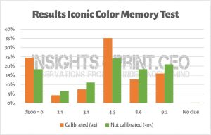
The number of correct answers increased from around 20% to 25%, but there was an even bigger increase for the color with a 4,3 dE00 deviation…
And there is also something weird: when looking at the demographics, 78% of the print professionals – seventy eight procent – did this test on a non-calibrated monitor! They should know it’s not valid that way!
So, why did so many print professionals use a non-calibrated monitor? Aren’t they aware of the – rather basic – color fact that the colors on a non-calibrated monitor can’t be trusted? Or is it because it was just a simple test, without any financial consequence? If they behave the same in their profession, this is a liability.
By the way, a small anecdote: a long time ago, I visited a large and famous prepress house with many famous brands as customers. We had a meeting there in the evening. The personnel had already gone home, but in the production department, all computers and monitors were still on. They also all had the same image (background) on the monitor. From the back of the room, I noticed that the 20 or so monitors I could see, showed different colors… They were not calibrated correctly. When I mentioned this to the managing director, our host, he quickly made up an excuse: “These computers are not used for color-critical production!” Yeah, right…
This, BTW, also relates to a previous article: the Google 41 shades of blue, the 200 million US$ test. In short: Google did A/B testing to find the most profitable ‘blue’ for search advertising. And, according to the internet, they found one that made 200 million US$ extra in search advertising. However, it has one flaw: Google had absolutely no control over the color output. They had no way to check whether the monitors of people participating in the test were calibrated. Whether the monitors had a large or a small color gamut. And BTW, the increase in revenue was not even 1%… is that statistically relevant?
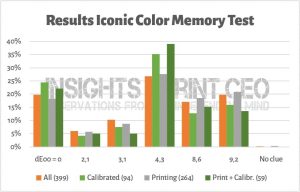
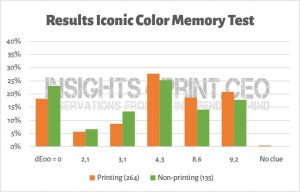
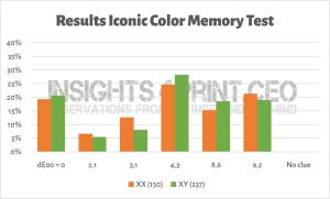
Since I already mentioned the demographics, let’s look at the print professionals and others.
And digging a bit deeper in that: only the people who used a calibrated monitor both groups.
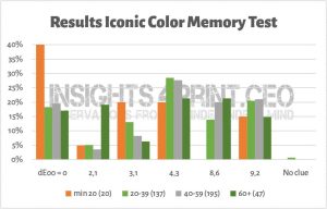
And what about chromosome pairs, XX vs XY?
And what about age?
And there is more…
Another thing that strikes me: no one, literally not one person asked about the reference I used. When I created the test, I couldn’t find any official brand color guide from Coca-Cola – the red is their second secret formula (*) they claim – I had to rely on ‘internet sources’. I had no idea whether these values were correct or not. And nobody asked… I thank you all for your confidence in me, but you should always ask where the values of brand colors you get, come from!
(*) 29/10/2022: the original article is no longer online, but here is an archived version.
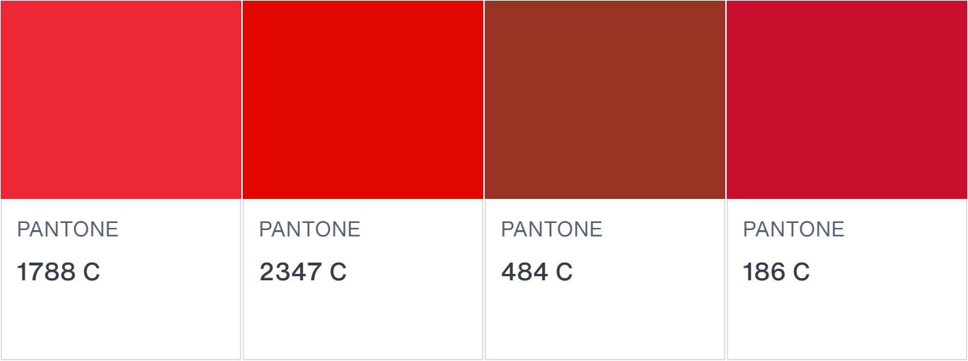
Since I recently read a scientific paper mentioning a Pantone color for Coca-Cola red, I again searched for the color values. Here’s what I found, and where. Some of the sources seem to be subcontractors of Coca-Cola and these look like official brand guides. And for the record: the RGB values I used for the test, was pretty close to the one mentioned in those brand guides. But even if the values were very wrong, the conclusion of this iconic color memory test would have stayed the same: there is no agreement on what the right Coca-Cola red is.
| Source | Pantone | RGB (*) | CMYK |
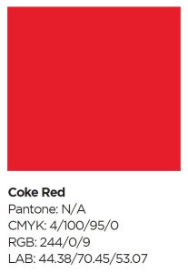
| https://usbrandcolors.com/coca-cola-colors/ | Coke Red | 244-0-0 | 4 / 100 / 95 / 0 |
| https://brandpalettes.com/coca-cola-color-codes/ | 1788 C | 230-29-43 | 4 / 99 / 93 / 1 |
| https://wikicolors.net/brands/coca-cola/ | 2347 C (nearest match) | 244-0-0 | 4/ 100 / 95 / 0 |
| https://www.garudapromo.com/blog/pantone-cmyk-and-rgb-colors-explained/ | 484 C | 8 / 92 / 100 / 33 | |
| https://www.schemecolor.com/coca-cola-red-color.php | ? | 244-0-9 | 0 / 100 / 96 / 4 |
| https://imborrable.com/wp-content/uploads/2021/03/BRANDBOOK-COCACOLA.pdf | No equivalent | 244-0-9 | 4 / 100 / 95 / 0 |
| https://peernetgroup.com/wp-content/uploads/formidable/22/Coca-ColaLicensingGuidelines.pdf | Closest: 186 C | 244-0-9 | 4 / 100 / 95 / 0 |
| https://talenthouse-misc-upload.s3.amazonaws.com/Global+Coca-Cola+Icon+Design+System+Guideline.pdf | n/a | 244-0-9 | 4 / 100 / 95 / 0 |
| https://creditunion.coca-cola.com/wp-content/uploads/2017/05/CCCU-UsageGuidlines-11-22-2016-for-cu-logos-page.pdf | Coke Red | 244-0- 9 | 4 / 100 / 95 / 0 |
(*) added 04/07/2022: as mentioned by Henk Gianotten in his comment, I did forget something here… I should have added a note about the ‘RGB.’ Just to be sure, I rechecked all the reference and NONE of them mentions whether it’s sRGB (the most obvious choice) or AdobeRGB, or even another kind of RGB. This is a huge flaw when defining brand colors! The same numbers in sRGB and AdobeRGB will give a very different color! I assume all numbers are sRGB, but they should have mentioned it.
Since several different Pantone numbers were used, I checked the colors in Adobe Photoshop…
And there is even more! In one of those official looking brand guides, there is the description of Coke Red as seen below. And – hurray – it includes LAB values! But these values don’t agree with the RGB values, neither in sRGB, nor in AdobeRGB… Why? How did they get to those LAB values?
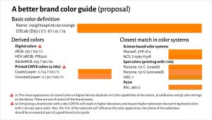
So here is an urgent plea to brand owners: if you take your brand colors seriously, publish the specifications! Share them as ASE files! Don’t do secretively about it, that’s just silly. If a malicious person wants to reproduce your brand color exactly, he only has to take a few measurements with a spectrophotometer (and you can get a decent one for about 300 US$) to get very close to the ‘right’ value. And do make sure all the values agree…
By the way, here is a proposal for a brand color specification. It’s an evolution of the proposal I already made in this article, which builds on the proposal from Michael Abildgaard Pedersen, which resulted from his investigation into the reliability of brand color guides (they are terrible!).
Statistics…
And I have to add one more: statistics. I never had a decent statistics course during my education. I only have basic knowledge. So, if someone with more knowledge can explain what I am to describe here, feel free to submit a comment! Enlighten me!
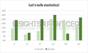
When adding new entries to my Excel table, I saw the answers shift significantly. To check and visualise this, I did the following exercise: with nearly 400 answers, I put them in groups of 100 answers, in chronological order. In the graph below, you can see how different the results are.
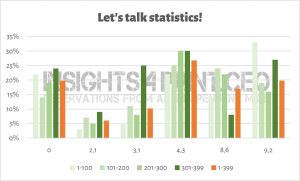
And especially if I take groups 101-200 and 301-399, there is a difference that looks rather significant to me. Is there a statistical explanation for that? I did check whether there were considerable changes in the composition of the participants in the different groups. There are minor differences, but are these influencing the result? I’m not sure.
And seeing this, please keep in mind that most of the color studies you will find, have only a few dozen participants, at the most… So how representative are the conclusions in that case?
Why is this important?
Can you correctly identify a specific brand color? This test shows it’s much more challenging than people – especially brand owners, print buyers and consultants – would like to believe. So, how important are the tiny tolerances some brand owners demand (and often make the lives of printers miserable by doing that) if people can’t agree on the ‘right’ color?
And another important lesson is that, despite the importance of color, many people still use a non-calibrated monitor to judge colors. Or was this test an exception? And do the print professionals always use a calibrated and capable monitor in their job? Maybe, but caution is needed.
Probably the most important conclusion is for brand owners: if your brand colors are precious, publish your brand color guidelines! And make them ‘foolproof’.
Added 04/07/2022: I forgot the most important one! It’s so obvious to me, but I do need to repeat it again and again: never trust your eyes when doing a color assessment! Only trust recently calibrated measurement devices. And spectrophotometers are within reach of everyone, even designers. The cheapest decent one is only 300 US$!
PS: if you want to know more about Coca-Cola red in real life, check out this article I published a couple of years ago.
UPDATE 13/07/2022: Here’s something interesting! Colgate launched a similar brand recognition test on LinkedIn, with 4 different shades of red. Guess what: after more than 6000 votes, no agreement…

The fact is that even the biggest and richest brands still use brand colours that cannot and consequently ARE NOT correctly reproduced in 90% of all cases the colours need to be used for marketing. Being aware of this the people in charge of those brands have a relaxed attitude when it comes to use of these trademarks in any media, – so as long as it is the right logo being used and it looks decent, they will not make a big deal of it if the colours don’t look like they did the last time the logo was printed or used for a website or an outdoor sign or whatever. This casual and in fact rational attitude of those in charge of trademarks, ad agencies, brand managers or whatever again means that it is no wonder that no one can guess what the actual Coca Cola colour should be, – because it is actually different everytime you see it, and even if, for instance, a printer, HAD the correct LAB value, they would probably not be able to reproduce it since most likely they are printing a CMYK job and the original brand colour most likely well outside the gamut of CMYK.
This is an interesting exercise but I am afraid it will only be relevant when companies raise the bar and start using brand colours that CAN be reproduced in every media. Only then will we be able to check if that thing referred to as “Color Memory” is a myth or not.
Of course all brand colours should be defined by a LAB value and checked first if it CAN be presented in the media where it is supposed to be marketed (in general CMYK printing, online and on Television + since recently in the Metaverse). Otherwise you might as well define your brand using Crayons.
Thanks for your comment Ingi!
On the fact that brand color guides should be (much) better: absolutely agree! There should be only one source of truth, and it should be defined in such a way that there is no room for interpretation. It is unbelievable that big brands, who sometimes spend huge amounts of money on picking a brand color fail so miserably in this, not too difficult, excercise…
On color memory: there have been multiple studies, outside the printing industry, showing that our color memory, even on a short term, is flawed. We remember colors as part of a color group, not as a specific color.
Here are a few:
http://hub.jhu.edu/2015/06/02/color-perception-research/
https://www.academia.edu/16433216/Why_some_colors_appear_more_memorable_than_others_A_model_combining_categories_and_particulars_in_color_working_memory This one had two parts: a delayed and an undelayed excercise to pick the color shown from a color wheel. In both cases, the color memory deviated.
https://www.academia.edu/35403099/Color_matching_from_memory Here the differences between colors where quite large, but even in those cases, people had difficulties picking the right color from a series of 9 colors.
This may well be correct – i.e. that our colour memory is by average not as great as some have stated. For me as a professional offset printer for 20 years and since lately referred to by some as a colour scientist, I just feel it is the DUTY of designers to select and define brand colours in such a way that there is no mistake what they are and how they should be reproduced – in all and any media where said colours will and should be displayed. This should be done at the design stage, – not after the artwork has been presented.
If you cannot do this, you should not have the right to call yourself a Professional Designer. That puts you in the category of Amateur in my book, – talented Amateur perhaps, but Amateur never the less.
I agree 100% on the fact that brand colors should be defined properly.
And that definition should be shared publicly, both as a brand guide AND as ASE- and CxF-files. Only then we can have a reliable brand color reproduction.
A more commercially available way to present your colours is simply presenting them in their native web format – sRGB.
That way the whole world (not just printers or designers) can SEE what your colours look – and should look like.
As an example if you go to http://www.spotmatchingsystem.com and scroll a little bit down the page, you can SEE the actual brand colours of the Spot Matching System and you can yourself check what the LAB value of each colour is in any graphic program you may be using – be it Adobe Photoshop of CorelDraw or whatever.
Of course this is only possible if you use SMS colours that for sure can be reproduced for any commercial media – including CMYK, analog and digital on coated or uncoated paper., web, TV and the Metaverse, VR, AR…. you name it.
Great article! I agree that better systems as ASE and CxF have to be used.
I want a few details to be corrected and mentioned. In your chart on sources your RGB-values should be labeled as sRGB. In the Coca Cola brand book Coca Cola mentions their CMYK values 4,100,95 and 0. Their sRGB-values are 244-0-9. This is common practice in prepress. The HEX-value however is wrong. Coca Cola mentions F40000. It must be F40009. Details? Yes, but in a brandbook these figures must be correct, I assume.
Thanks for your comment Henk!
I’ve added a note to the table, about the RGB values. To be sure, I rechecked all references and NONE stated which RGB was used, no mention of sRGB, AdobeRGB, …
The HEX-values: once again proof that we need to get better brand guides, that these need to be made by people who have know what they are talking about, who have at least some basic color knowledge…
In a brand color guide, these details matter al lot, you are absolutely right.