

It is embarrassing, very embarrassing, especially for me… But I’m going to tell you anyway. I have to. Because it clearly shows what I’ve been telling for a long time: our color memory, our color perception is flawed, very flawed, unless you really focus on it. Meaning: there is a vast difference in how the printing industry looks at color versus the outside world.
CONTENTS: My Coca-Cola collection | My breakfast cereals | On and Off | Why is this important
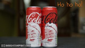
I’m confident enough to claim that I notice much more issues with color than the average Joe Sixpack. When I go shopping, I always check the Coca-Cola shelves. I don’t drink Coca-Cola, but I’m always interested in finding deviating colors. Like these two cans from a few weeks ago. Which were a nice addition to my collection of several dozens of Coca-Cola cans, with a variety of shades of red.
And when I point other people in my neighborhood, people with no relation to print, that is, to these issues, they all have that strange look on their face: “What are you talking about? Is that really an issue??? Is the print community really spending its time on this kind of futilities?”
But this morning, I found out how flawed my color memory, my color perception IRL is…
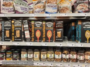
My breakfast cereals
I had already noticed that my favorite breakfast cereals tasted different. But I couldn’t get a grip on it: was it a bad package? Was it out of date? Did they forget an ingredient? (Peanuts! It should contain peanuts!)
It was only this morning, several weeks after purchasing it, over a week using it every morning, that I noticed the difference: I bought the right brand but a different variation!!! (yes, you can laugh aloud now, please do, make fun of me!)

However, the error was not as strange as you might think… Look at the two packages: the accent color is in the same color region… And that’s what I was looking for: a yellowish orange (or orangish-yellow). The shop where I bought these didn’t have the ‘Ancient Grains’ variation in the past. And with the two colors being alike (that is: from a consumer perspective), and with my ‘I need to get my groceries as fast as possible’ mind in place, I just didn’t notice the different color. Nor the different name, the different layout… For the record, the difference between the two accent colors is about 10 dE00. And I didn’t notice. Me, the guy that has published dozens and dozens of articles on color…
On and Off
And this reminded me that while shopping, my critical color memory is only on when I’m in the neighborhood of Coca-Cola or Kellogg’s products… For other products, it’s usually off… Like with most – if not all – other shoppers. And that’s the difference between consumers and people doing a press check, people working in print: they are ‘framed’ to look for – often very tiny – color differences. It is their job to spot tiny color differences (even if there are none!), the kind of tiny color differences that wouldn’t get noticed in real life, being: in a situation without that ‘color framing’. The average shopper has a very different mindset: getting out as soon as possible, finding the cheapest stuff, … (please do check the results of this survey on shopping behavior)
I’ve seen multiple studies showing that our color memory, even color vision is flawed. Most studies come from outside of the printing industry and therefore not having that bias towards wanting to confirm the supposed importance of tiny color deviations,
Why is this important?
For a very long time, even decades, some in the industry have claimed that consumers are influenced in their shopping behavior if brand colors are not spot on. Even referring to studies that are actually about something very different. However, if you look at studies about our color memory, how we can compare colors, what influences shopping behavior and just real life, you see a different picture.
Because the printing industry is framed towards color, people in the industry become very critical about color, they will even see the tiniest difference (especially in a P1 ‘critical comparison’ setting with a huge amount of light: 2000 lux). But in real life? Even people involved with color, people who have a lot of color knowledge, don’t always have their ‘color critical’ mindset active. We are all humans, and with a mindset that’s not by default on color, we just don’t notice what the printing industry considers obvious…
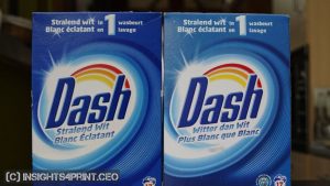
PS: it also took me several weeks before I noticed the differences in the blue of these Dash packages… And I have bought cans of Coca-Cola in the past because I was 100% sure they looked very different, which eventually turned out to be an exact match to the previous one.
UPDATE 13/01/2022: I just published a new article, which kind of explains what happened to me when shopping for breakfast cereals: during shopping it’s one part of our brain that is active, System 1, which is fast but inaccurate. And System 1 is very different from System 2, the part of our brain that is active during press checks and similar activities. Check out the article!


I agree, most consumers cannot see those differences. The ISO-standard mentions: “Prints and proofs should be viewed under D50 light with 2000 lux at the center and at least 1200 lux at all points on the viewing table surface”.
As you mention that’s the ultimate lighting condition. Consumers don’t have that amount of light so cannot see those differences. These standards however are needed to help printers and print buyers to check what was agreed and were the are paying for. The tighter the quality levels, the higher the price. It’s the professional print buyer who raises the bar.
By the way, On your picture I saw the superior figures on the price labels. It must be a Jumbo shop because they don’t use the official delimeter for the prices in euro. Just superior figures which is fine. Albert Heijn in Belgium (and Holland) uses a period instead of a comma. That’s wrong but Albert Heijn claims that their international pricing software is used for the USA and Europe. In the US a period is the usual delimeter between dollars and dollar cents. We in Europe have to use the comma between euro and eurocents. Albert Heijn is not able to meet the European requirements.
Although this is not a color problem but today (exactly 20 years after the euro swith) it still hurts!
Thanks Henk!
I once installed a lux meter app on my smartphone, to check the lighting conditions in a few supermarkets. And there it’s a lot less than 2000 lux, often even less than the P2 condition ‘practical appraisal of print’ (translated: “does it look good”). Especially at the lower shelves, some were even below 100 lux. The less light, the harder it is to see color differences.
What also influences the perceived color in a supermarket, is how the boxes are positioned. This will influence the amount of light falling on it, it might have shadows.
And interesting that you noticed the decimal! I never noticed it (but I have to admit that I rarely look at the prices). And it is a Jumbo, there is one right around the corner.
What? Peanuts have no place in breakfast cereals! Peanuts need salt, and preferably also beer…
Yes, I know… And before I tasted this variety I would have agreed with you… 🙂 Just try it. It’s a British brand btw… (from Halstead, Essex)
Mr. Hagen,
Thank you for your very interesting article and it is shocking that Google would do a study and not lock down all the result evaluations. Your study was very eye-opening and I appreciate all the work you did on this.
One other thing I think retailers my not test is comparative tolerancing. I think it is more important than an exact ∆E matching. The color consistency of all the packages on the shelf must be considered. For example, if my tolerance is 2∆E but one run is within my tolerance but with a red cast and one run is in my tolerance but has a green cast, it is very unacceptable on the shelf side by side because it is about a 4∆E difference in comparison. Consumers will see it and wonder if one of the products is old and the other is fresh. Or they also might conclude that the quality control of the packaging represents the quality of what is in the package. Side-by-side comparative differences are critical and should be part of any color test. Also, metamerism and gloss is a moving target as the lux changes.
Hi Michael, thanks for your comment!
On Google: I think this might be general problem in our modern society. Many (often very clever) people are so focused on their specific field, that they forget the bigger picture. That’s what IMO happened at Google. They were so focussed on tweaking their color codes and interpreting the massive amount of data in A/B testing, trying to find a pattern in that data, that they forgot what is for us (being in a color focused industry) evident: the quality and calibration of monitors and other types of screens. Every research team should include somebody with a very broad focus, someone who sees the bigger picture and therefore the possible flaws in a specific setup.
Comperative tolerancing: I’m in favor of that and I’m happy that you look at it that way, not in the very restrictive 2 dE way some consultants do. I would even go further than you suggest. And this has to do with what I just said about (too) many people focused on their specific field and forgetting the bigger picture. I’ll explain: the printing industry is very focused on color, but only color in a flat world (samples next to each other on a table), with a lot of light (the P1 setting for color control). And in this setting (flat references and samples, with 2000 lux), you can see tiny color differences, especially if you put the reference on top of the print sample. But in real life, it’s different. The amount of light in a shop is (much) less than 2000 lux (and very often also not standardized in color temperature, not the highest CRI). And it is also in 3 dimensions: folded packages, curved cans. And folded boxes are often not put in a perfect straight line, meaning: light will fall slightly different on the different packages, resulting in slightly different colors. And shelves also produce shadows, significantly influencing the perceived color.
In case you didn’t read it yet, check this article, about a test I designed and which was executed by a student: https://www.insights4print.ceo/2018/05/groundbreaking-color-study/ If you look at the test with the folded samples: they are all over the place! The only reasonable explanation I have for that, is that not all samples were in a straight line, resulting in different lighting and different appreciation of the color difference.
So I’m not sure whether consumers will detect a 4 dE color difference. And even if they do, if that would influence their buying decision (as I showed in this survey: https://www.insights4print.ceo/2019/03/new-survey-the-influence-of-color-deviations-damaged-packages-on-shopping-behavior-and-brand-loyalty/, and which was also shown in this research: https://scholarworks.rit.edu/cgi/viewcontent.cgi?referer=https://www.google.be/&httpsredir=1&article=7108&context=theses)
I guess that when a color has a red cast in one run and a green in another, the difference will be more than 4 dE (unless it’s in a grey tint)? Or can you give a another concrete example?
So there is still a lot of stuff to talk about, to research. 😊
Thanks again for taking the time to post a comment!
Just came across your page this week when trying to track down the source of a pesky color stat that seems to have been made up but was recently cited again in a HubSpot blog, which sent me on a wild goose chase.
Anyways, I had a thought when reading this blog. Maybe the times you’ve sworn the Coke cans look different have to do with the lighting in the stores. Meaning, they probably do look different than normal when you’re shopping, but then when you get home and look at the cans in the same light, they look the same.
Hi Sam, thanks for your comment! Coca-Cola cans often do look very different: https://www.insights4print.ceo/2019/09/brand-colors-irl-the-coca-cola-case/
But I indeed had times when I thaught they looke different, but when arriving at home, they were just the same as the previous one. And for the record: I’m talking about the same shop, with the same lighting. It’s just that I *want* to find Coca-Cola cans that look different, making my brain telling me they might be different…