

The package of a product is important: it not only ships and protects products, it also conveys the identity of a brand. Brands are very proud of their unique brand image, they demand no less than perfect packages on the shelves in the supermarket. But how do consumers look at that? Will they buy damaged packages? Or packages that look ‘different’ than normal? A new survey tried to find answers to these questions. The results contain some surprises: promotions from competitors and empty shelves are significantly greater dangers to brand loyalty than slightly damaged packages or packages that look different than normal. And as a side note: it’s hard to design objective studies on human behavior. Let me explain why.
CONTENTS: It’s hard | The participants, their shopping behavior | Brand loyalty challenged? | Digging deeper | Real-life experiments | Yes, but… | No excuse! | Why is this important? | Updates
Damaged packages and packages with a color that’s slightly off will hurt sales and make people shift brands, forever. It’s an often-heard argument used to demand no less than perfect quality in packaging printing. But if I look at my own shopping habits, that’s not true. I buy certain food products because I like the taste. I buy certain cleaning products because they work well and, as a secondary property, smell nice. As an example: I recently switched to cleaning products that work with enzymes, which perform much better than all other products I’ve ever used. I don’t mind color shifts, not even slight damages. So, am I that different from other people? Or is there no basis for that claim about color quality and brand loyalty?
It’s hard
Objectively studying human behavior, e.g. shopping, isn’t easy. There are a lot of factors that can, also subconsciously, influence the behavior, and therefore the results. When doing experiments with color, researchers usually choose to use a standard lighting condition. While it certainly does have its merits – otherwise you don’t have control of an important part of color: the light source – it also does have a downside: by being in a very specific environment, participants might not show normal behavior. They might react differently compared to when shopping in a supermarket.
Also, the wording of questions, or even revealing what the survey is about, can trigger different results. This phenomenon is well known in ‘behavioral economics’. A classic example is this one: when a doctor suggests a medical treatment to a patient and says that the survival rate is 90%, it is more likely that the patient will agree then when the doctor would say the mortality rate is 10%. Objectively they are the same, but we react differently. This is called ‘framing’.
Another example is this study. By telling people that they would participate in a color study and explicitly ask whether they saw color differences between two samples, they became ‘more aware’ about color and sometimes too aware: 1 out of 3 print professionals in the test claimed to see color differences between two identical copies… Influencing people’s mind by e.g. telling what a study is about, is called ‘priming’. This can be a real danger when conducting experiments and surveys. If you want to know more about this kind of things, I can highly recommend ‘Thinking, Fast and Slow’ by Nobel Prize winner Daniel Kahneman.
Why all this information? Well, to be sure that participants would answer as correctly as possible, I didn’t tell them that my intentions were related to color (participants should never be able to figure out what the ‘intended response’ is). I told participants that it was a survey on some aspects of shopping behavior. And I didn’t send this survey to my professional network: they would immediately have made the link with color and this would have biased the answers, the results. On top of this: I had included a few control questions, to check certain answers. Which turned out to be a good idea.
The participants, their shopping behavior
The survey was only published in Dutch/Flemish, via Google Forms. I put the link on my private Facebook page, three persons also shared this with their friends. I also send an e-mail to family, friends and some other people I thought might be willing to participate, some of them forwarded it also to their family. All participants are first or second degree contacts, about 50/50. Being a zero-budget study, I did use ‘convenience sampling’, meaning that the sample is not completely random. But compared to a lot of studies I recently read, it is closer to a random sample than many of them.
Eventually, 108 people participated. Most of them were female (71%). The ages were: 2% <20, 28% between 20 and 39, 57% between 40 and 59, 13% 60 and older. Only 8% had a professional relationship with print production or print design. Most of them go to the supermarket once or twice a week (59%), 31% three times a week, 7% a few times a month, 2% less frequent (Q1).
This table shows the answers to some general questions about their shopping behavior.
| 1 | 2 | 3 | 4 | Average (on scale from 1 – 4) | |
| Q2: Time spend in the supermarket (1: out as fast as possible – 4: I take all the time I need) | 28% | 37% | 28% | 7% | 2,15 |
| Q3: Brand loyalty (1: not at all – 4: very loyal) | 10% | 16% | 45% | 29% | 2,93 |
| Q5: Discount coupons (1: never – 4: very often) | 16% | 43% | 26% | 16% | 2,42 |
| Q6: Coca-Cola products (1: never – 4: very often) | 20% | 42% | 18% | 20% | 2,38 |
Brand loyalty challenged?
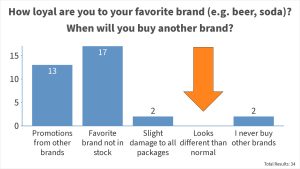
One of the things I wanted to find out, is when consumers are disloyal to their favorite brand. What needs to happen to get them to buy another brand (Q4)? I offered the following standard options, plus the possibility to add another one. Participants were asked to check all that apply.
- Promotions that make another brand cheaper
- When my favorite brand is out of stock
- When all the available packages of my favorite brand show slight damages
- When I have the impression that the available packages look a bit different than normal
- I never buy other brands
- Other
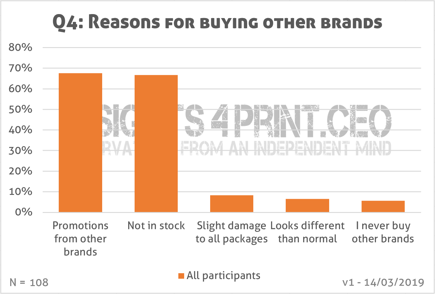
And here is a first interesting result: very few people would buy another brand when the packages are slightly damaged (8%), when the package looks different than normal (6%). Now, this isn’t a complete surprise to me, it’s something I already suspected, especially what concerns color deviations. And it was also one of the conclusions of a thesis by Kate Goguen (RIT, 2012) called: ‘The Influence of color on purchasing decisions related to product design’. She concluded: “Both genders agree that quality is not something that would ever be sacrificed for the perfect color.”
A few persons also listed another reason. “Trying out new brands” and “shifting brands when a brand is unethical” are the most important ones.
To know how good people are at recognizing brands (Q7), I recycled an old test: can you recognize Coca-Cola red from six different versions of red? Below is the image used in both the original online test and this survey.
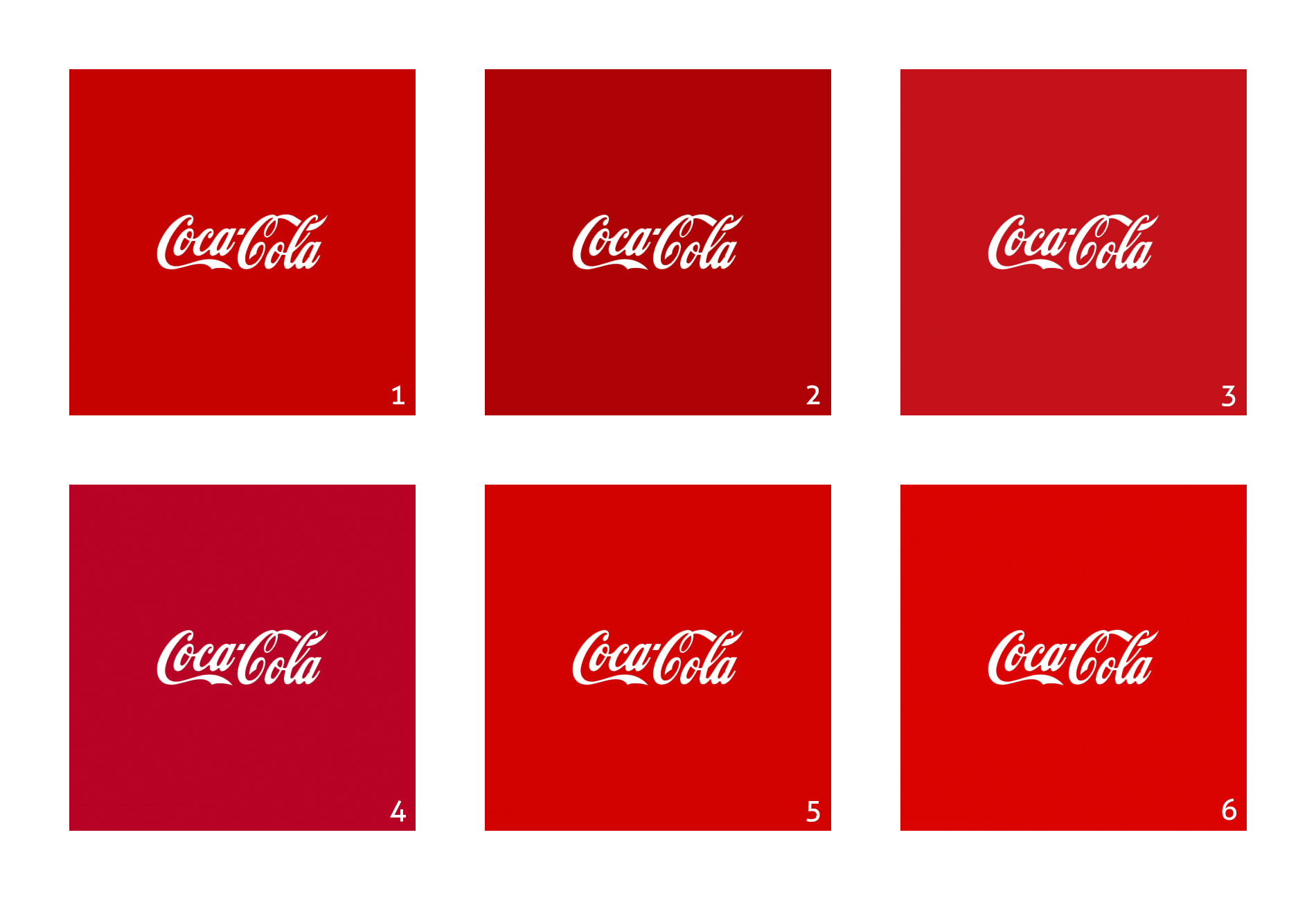
These are by the way all specific brand colors, in alphabetical order: Adobe, Coca-Cola, KitKat, Netflix, Target and Vodafone.
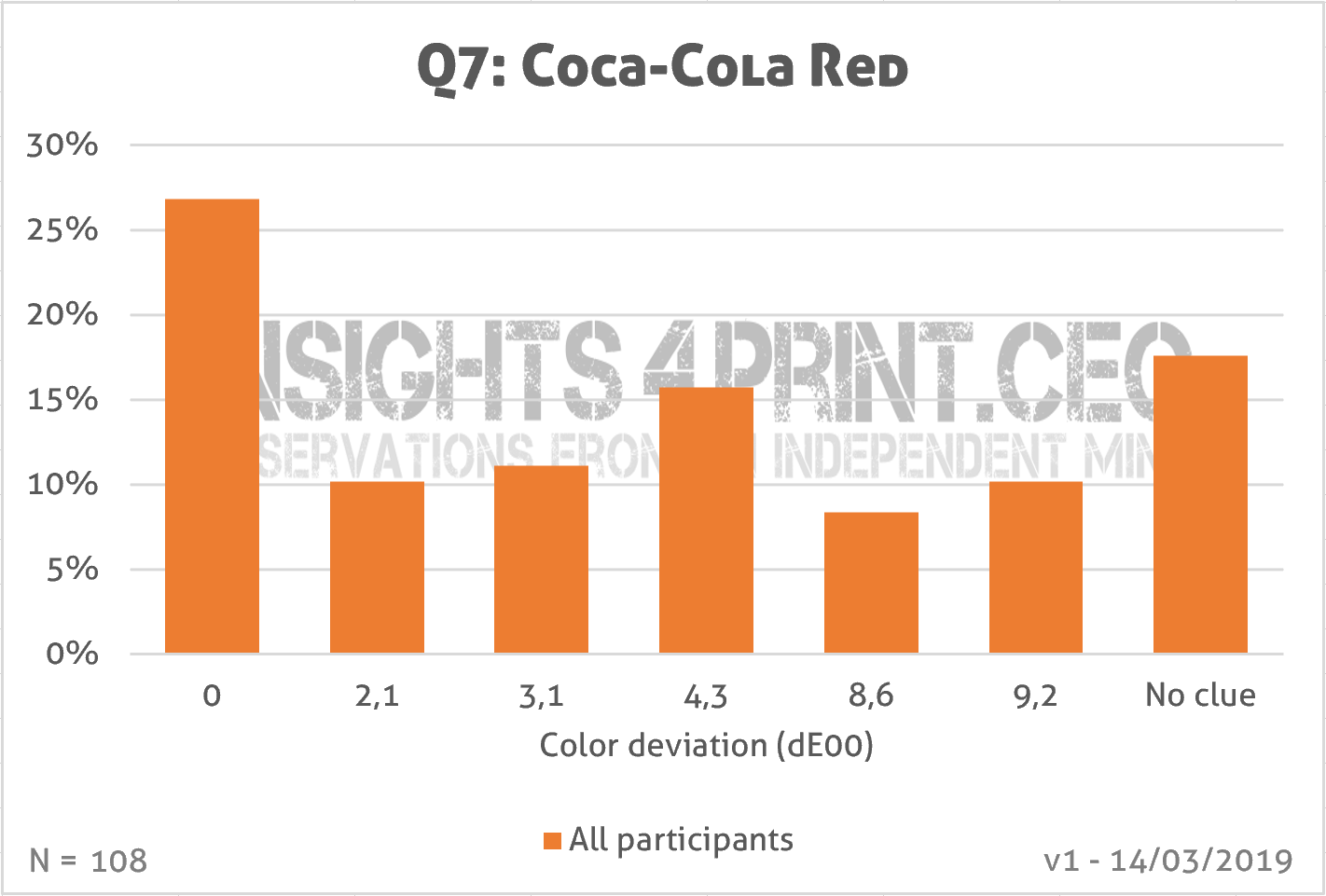
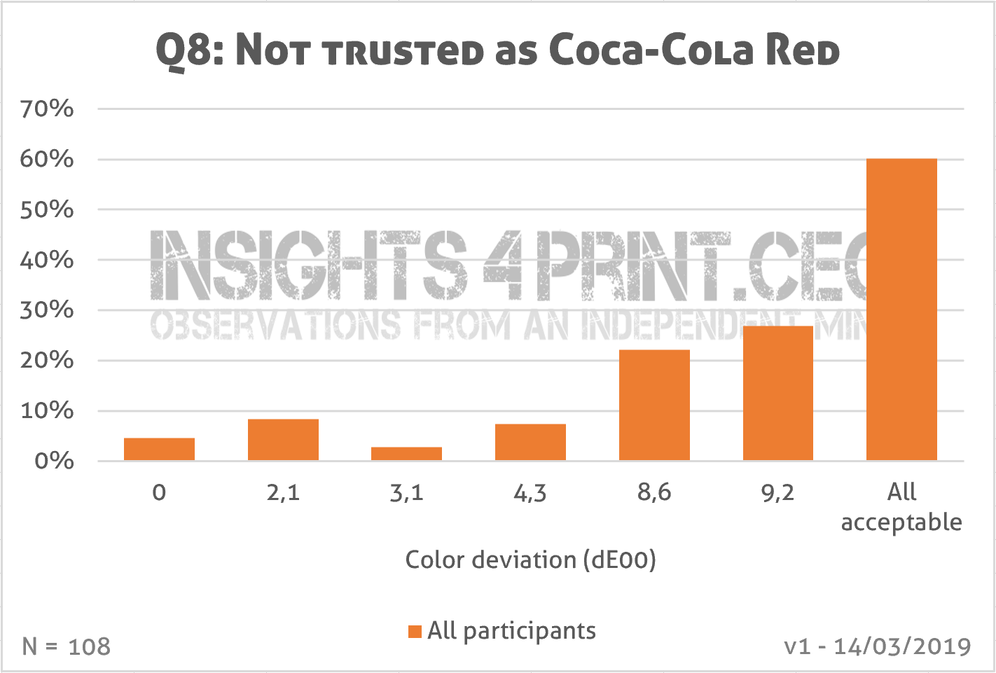
In the graph below you see the results. The answers are ordered by color difference from the correct color, in delta E 2000. Color deviations ranged from 0 (correct color) to 9,2 dE00. There was also an option: ‘I have no clue’.
To get a better insight, I added two extra pieces of data: a selection that only shows people that buy Coca-Cola products, and the results from the original ‘Iconic Color Memory Test’, which has over 320 participants at this moment.
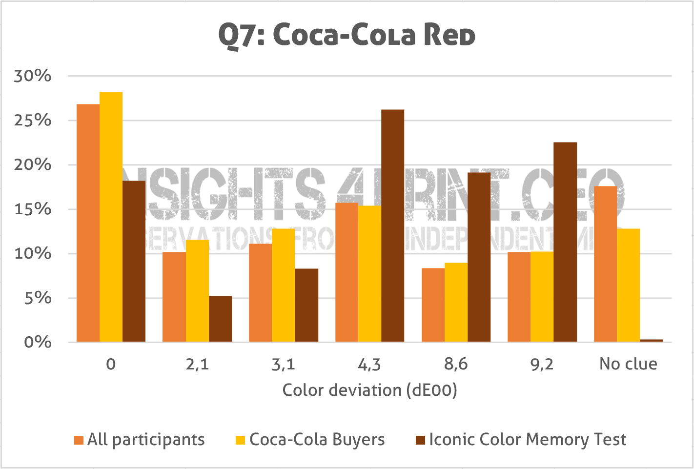
And this shows something interesting: the results from this survey are better than the one from the older test… And what especially stands out: much more people said ‘I have no clue’ in this survey, compared to the test. This probably has to do with the setup of the original test: I challenged people, asking how good their color memory was. So, people didn’t want to admit they didn’t have a clue. They preferred to take a guess. In the survey, saying that they didn’t have a clue, didn’t have any implication. While in the setting of the original test, admitting one didn’t have a clue, would imply that color memory wasn’t good. A nice example of priming.
Now, I didn’t just ask which one is the right one, I also asked if there were colors that they wouldn’t trust, colors that they would leave on the shelves (Q8). With multiple answers possible, it becomes very interesting…
If your first reaction is that about 1 out of 4 people would even reject a 2,1 dE00 package, justifying very tight tolerances, well, you need to take a second look. And then you will see that the ‘rejection rate’ isn’t growing with the increasing color deviation in the lower dE’s, the 3,1 dE00 even has a lower rejection rate than the right color. Which would be logical: if someone rejects a package with a 2,1 dE00 deviation, he/she should certainly reject the one with a 4,3 dE00 deviation. But that isn’t the case… It is only when going to the larger deviations (8,6 and 9,2) that there is a clear and gradual increase.
At this moment I see two possible reasons. The first: the calculation of color deviations and the CIELAB-system are faulty. CIELAB does have some issues, but these are minor and would probably not explain this result. So, it must be my second guess: the results in the lower deviations are just random. Which does have some serious implications when it comes to defining which color deviations are acceptable for customers, which color deviations will impact sales. BTW: the majority explicitly said that all colors were acceptable to them. Which doesn’t mean that there shouldn’t be any tolerances and quality control, but more on that later.
An interesting exercise is to put the answers of Q7 (the right color) and Q8 (don’t trust this one) together.
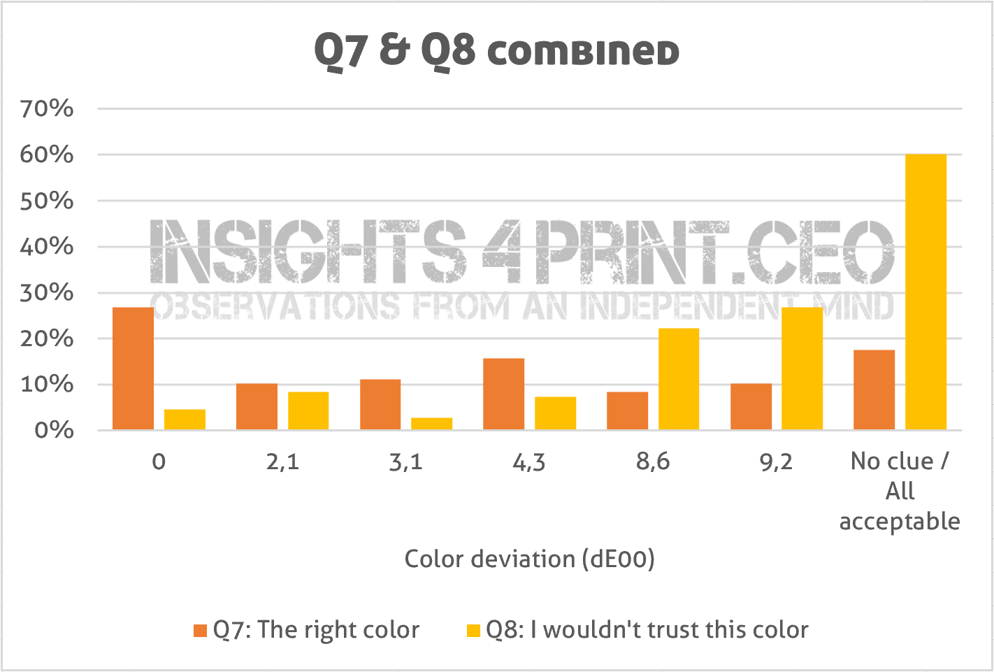
Once again: this looks a bit random. All colors have their fans, their opponents.
The next question was what people would do when they noticed that the package of their favorite product looked different (Q9).
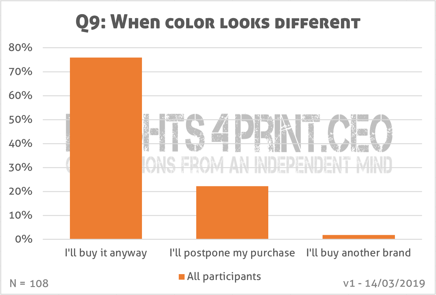
And here is another interesting result: only two people claimed they would buy another brand, while the large majority would still buy it, about 22% would only postpone the purchase. This should be looked at in conjunction with Q8: what kind of deviation is unacceptable?
Conclusion? Brand loyalty seems pretty high when it comes to deviations in packaging, both damages and looking different.
And the last question was how often they had purchased another brand or just didn’t buy a product because the colors looked ‘different’ than normal. How frequently does this happen (Q10)?
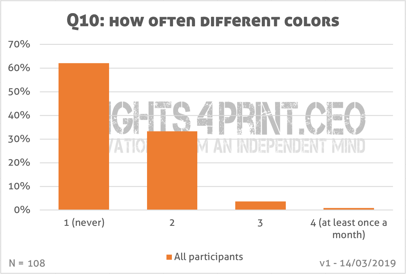
It rarely happens…
And I need to add an important note: would people notice this kind of color differences while shopping, in real life? And not only in a test environment and when asked explicitly if they saw a difference? (remember priming!) Which is very difficult to test: you should design a test in such a way that the participants are unaware of the fact that they are part of a test or experiment, in such a way that they behave like in real life…
Digging deeper
For these last two questions, I wanted to dig a bit deeper, to know something more about the persons that answered that they would buy another brand (Q9), the persons that quoted 3 and 4 on the frequency scale (Q10). And here come the control questions in play: were their answers consistent?
The persons that would buy another brand aren’t rushing through the store: they both gave a 3 rating in the question about the length of the shopping visit. The first one is a frequent shopper (once or twice a week), the second one not really (only once a month). Brand loyalty is resp. 3 and 4. When asked when they buy another brand, the first one did indicate the color deviation, the second one didn’t, contradiction the answer in Q9. They both picked the right color red. And when asked which color they wouldn’t trust and would leave on the shelves, both indicated three colors out of five deviating colors, with two colors overlapping both: the two highest deviations. So, next to the right one, still two of the other colors were acceptable to them, with the 3,1 dE00 overlapping both. BTW: the frequent shopper of both is someone who works in the printing industry and is, by nature, a bit more critical when it comes to color and color deviations.
Five persons gave a 3 or 4 rating on Q10, one indicated in Q9 that he would buy another brand, two that they would postpone the purchase, two others would buy the product anyway. Two of the five had indicated color as an issue for buying another brand in Q4. Two didn’t have a clue which one was the right color (Q7). (So how can you then leave a package on the shelves for looking different if you don’t know which one is the right one?). Two said they wouldn’t leave any of the colors on the shelves, one only indicated one color as ‘not trustworthy’ (the 4,3 dE00 color) and the other one placed two colors in that category (Q8).
What should we conclude from this deeper look? That it’s really a good idea to include control questions, to check whether certain behavior is consistent. And it isn’t as straightforward as you might think when only looking at those last two questions (Q9 and Q10).
Yes, but…
Since there might be a lot of questions or remarks about this survey, I’ve already listed the most probable ones. Yes, but…
Yes, but… you didn’t have control over the visual appearance of the logo variations, that was under uncontrolled, non-standard conditions. Absolutely true. But over 99,99% of the occasions when people are confronted with a brand logo are under non-standard conditions. TV sets, smartphones aren’t calibrated devices. Supermarkets don’t use D50. Your fridge, your dining room, your living room don’t use D50 lighting, with the right amount of lux. Outdoor advertising ‘suffers’ from changing light temperatures whole day long. Standard conditions only occur during print production. And during research projects.
You also need to consider how we see brand colors in real life. I already wrote a post on that, with some practical examples.
Yes, but… what about all those studies that say that color has to be perfect? Right, that’s an interesting one. There are indeed a lot of studies, articles, books on the fact that color has to be perfect. But that’s in the context of choosing brand colors: you need to have a color that fits your business, your product. E.g. you should never use tobacco brown for the logo of toothpaste. In these studies, people identify colors by their name. And color differences are expressed as this color versus that color. E.g. red versus green, tomato red versus raspberry red. In printing, however, we talk about colors in numbers. And we use complex equations to measure the deviation between two colors and use these to define tolerances in production. We are usually operating on a much finer level of color differences than people involved in color psychology. A perfect color means something very different from the point of view of color psychology (it has to fit the brand) than for print production (a small deviation). Please read those studies again with this difference in mind. And if you come across interesting ones: please do share them! I’m always eager to learn.
One of the persons that said that color has to be perfect, was Carlton Wagner (Wagner Institute for Color Research), already 30 years ago. And this was in the context of choosing the right color for a brand, a product. In case you don’t remember: this was also the age before print standardization (the first version of ISO 12647-2 was published in 1996). Over these three decades print quality has improved significantly, especially flexographic printing made an incredible jump forward the past decade, but also offset printing improved significantly. What was considered ‘excellent color’ 30 years ago, would only be good, maybe even only just good enough according to current measures.
Yes, but… you didn’t specify the dE of what is ‘other than normal’. Please remember that the intended audience of this survey were average consumers, people who have completely no idea what dE is. A way to detect what they consider acceptable color deviations, was the question asking which of the six variations they would not trust and leave on the shelves (Q8).
Yes, but… I saw other studies on damaged packages and color deviations that concluded the opposite. That might be true, but I haven’t seen those yet, so I can’t get into detail on them. In the case that conclusions are different, we need to carefully look at the setup of those studies and especially the wording of the survey questions, to check for possible ‘priming’. Consider this question: “Would you buy a product that has a damaged package?”. I bet the majority will answer “No!”. Because this is a clear case of priming: you are literally asking someone if they would perform an act (buying something) with a negative connotation (damage). Of course, people won’t do that! That’s the reason why survey designers need to be careful about the questions. Priming is a real danger, priming will give biased results.
And it’s also advisable to include control questions: I had three questions related to packages with ‘other than normal’ colors (Q4, Q8, Q9). As we saw above: the persons with a different answer than the majority, weren’t always consistent in their answers.
You should also check who participated in studies, where they were recruited. Very often college students are used in research, because they are close and easy to convince to participate. But are those young people, who are drilled every single day to question everything and be critical, a representative sample of the average consumer?
A last remark on other studies on consumer’s reactions on color deviations: do not only check the procedure and the wording of the questions, but also check about what kind of deviations we’re talking, expressed in delta E 2000 (dE00). In the studies I’ve seen on color and brand image, we’re talking about differences between e.g. red and green, between light and dark, between dull and highly saturated. Which are deviations that are easily double digits dE00.
The ideal way to know how consumers respond, is to experiment in a supermarket, without people knowing they are part of an experiment. E.g. by putting slightly different versions of a package on the shelves and observe what happens. But that’s not easy to do. Trying to emulate a shopping environment, in real life or in virtual reality, might look like an alternative, but then people know they are part of an experiment, which might influence their behavior. A solution would be to tell that the experiment is about something completely different, e.g. the route that people take in a shop while having to retrieve ten different items and put it in their shopping baskets. That might be a feasible setup.
Using virtual reality in a test is only a solution when the graphics are state of the art: it should also show the shadow effect of the shelves, of the curvature of a can, of the fold of boxes. All of them influence our color perception. A good example for that is the test that I already mentioned. With flat samples, 1 out of 3 print professionals and 1 out of 4 in general claimed to see a difference between identical copies. With folded boxes this was much higher: about 2 out of 3 saw differences between identical copies. The only reasonable explanation is the effect of being folded and the placement (e.g. a slightly different degree in placement will influence the color perception).
Real-life experiments
Without knowing it, my supermarket ran an interesting experiment a few months ago: they had two different versions of the same cereal package on the shelves, the red logo was a bit lighter and more vibrant in one case. And on top of that: the one with the most vibrant color red was damaged. After noticing that, I went to the supermarket every single day, to check which packages were sold. After one day, the some undamaged ones were sold, although the logo was less vibrant. After three days, also the damaged one was sold.
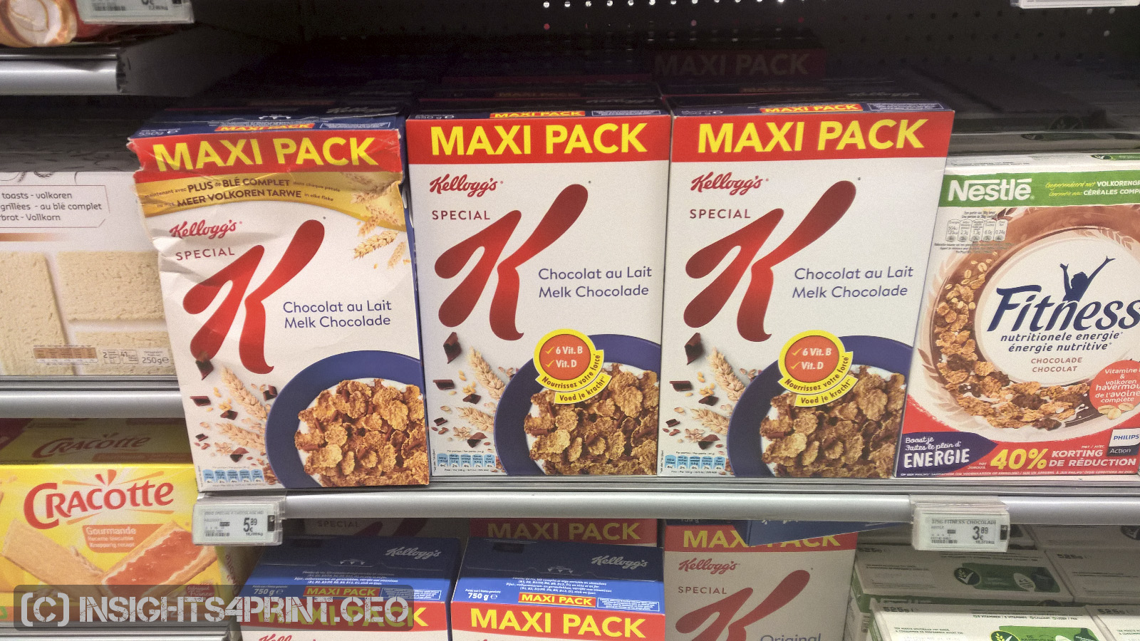
OK, I hear you: maybe the personnel removed it. That could be the case, I couldn’t check that. But consider this: if the policy would be not to put this kind of damaged packages on the shelves, it wouldn’t have been there in the first place, or it would have been removed after one day. Which wasn’t the case: I saw it two consecutive days.
A real-life example of priming: when looking at the picture below, what do you notice?
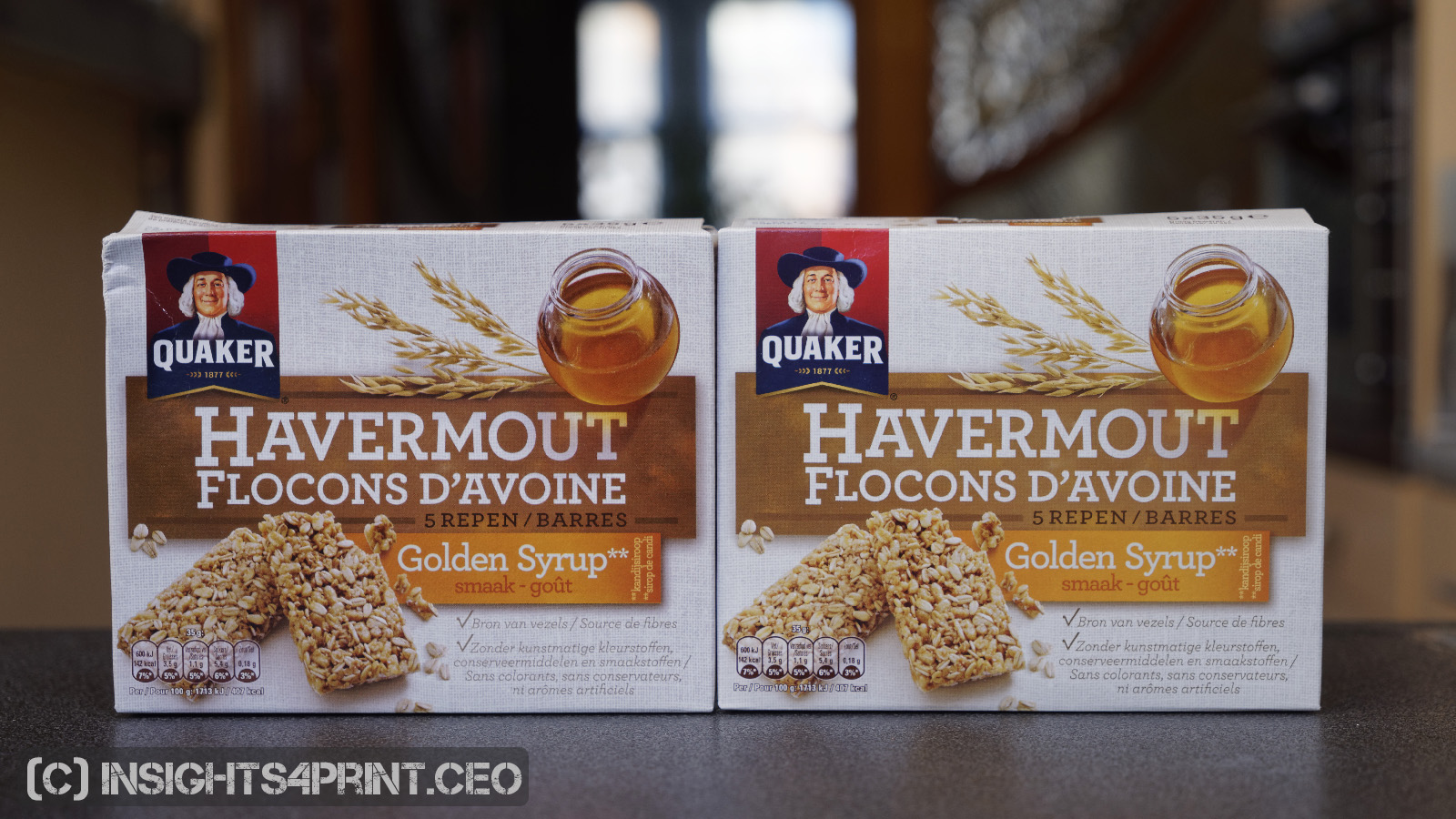
If I would have asked: do you see the color difference in those two packages, you would certainly have answered yes, immediately. But by asking it differently, “what do you notice?”, you plug into your normal mindset, not into a color geek mindset. And I did this test some time ago, with these two packages. I had noticed them in the supermarket and brought them home. When asked, my girlfriend only noticed the color differences after I explicitly asked whether she saw color differences, in the yellow, not before. Not even when I asked if she saw differences between the two packages (it was at this point that she noticed the damage).
People who live color, like you and me, would have noticed it immediately. But the average consumer doesn’t live color like we do. And this kind of differences don’t get noticed, unless you specifically ask to notice it. And that might be the reason why other studies had different results. So, reread the studies, not only the conclusions, but do check the setup, do check the questions asked!
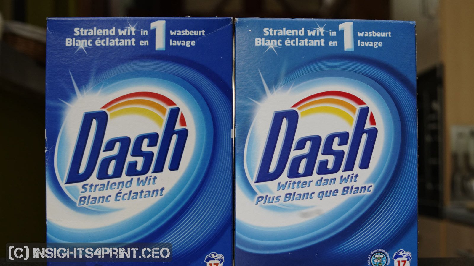
A last real-life example is my purchase of a new package of Dash washing powder. Early last year I noticed that I was almost running out of Dash to wash my white clothes, so I put it on my shopping list. In the super market it wasn’t that difficult to spot: it has a very specific blue background and a red/orange/yellow ‘rainbow’. In the supermarket, I didn’t notice anything. It was only the day after that visit that I noticed that the blue was significantly different from the old box! I didn’t even notice it when I put the new box on the shelve with the rest of the detergents. And as you can see below, this is a significant difference: 11 dE00. And I thought I was always wide-awake when it comes to color… For the record: the vibrant one is the old one.
No excuse!
Please note: the results of this study are no excuse to deliver bad print quality. Printers should take pride in their job and deliver good to excellent color. What this means for me: complying to ISO standards and frameworks as PSO and G7. The color deviations in there are fine and every printer with decent (recent) equipment and skilled operators can reach those targets, if they get the right input (please check this article about brand guides). Every printing, converting company should have decent quality procedures and the necessary equipment in place to check quality on a continuous basis.
But cutting the tolerances of ISO-standards in half, and with that: making the life of printers very hard, there is no foundation for that, that’s what this study showed. And please, don’t forget: two different spectrophotometers measuring the same color patch can already be 2 dE00 apart! These tools aren’t perfect, they come with tolerances.
Why is this important?
Brand colors are important. But this research showed that consumers have a rather wide tolerance when it comes to colors and their buying behavior, their brand loyalty. Even slightly damaged packages are no reason switch to another brand. Promotions of competing brands and empty shelves have a significantly higher influence on sales than damages or colors that look different.
Based on the findings of this survey, there is no need for brand owners to demand tighter tolerances than the ones that are in ISO standards. Deviations like the ones in the ISO standards won’t hurt brand loyalty.
It’s probably safe to say that people will sooner switch brands due to changing tastes or new offerings, due to promotions from competitors than due to this kind of issues with packaging. That’s what I already saw in my personal life, that’s what I saw in this survey.
PS: if you like, you can download a complete overview of this study, including the survey questions translated into English. It will be sent to you via e-mail when you fill in the form below. If you would like to get a CSV-file with the download of the Google Form data, please contact me via the form. The data is in Dutch/Flemish, but the complete overview that I mentioned above contains a translation. The personal data (name/e-mail/questions) will be stripped, but for the rest, the data will be original. And if you would like to replicate the survey, feel free to do so! Just be careful that you don’t ‘prime’ participants…
UPDATE 13/01/2022: I just published a new article, which includes results from eye-tracking studies, showing how much time shoppers put their attention on a package. And it’s probably a lot less than you might think… The article also covers the two different approaches our brain has: System 1 (fast, but inaccurate) vs System 2 (slow, but accurate), This is a concept from ‘behavioral economics’, and it’s very relevant to how we look at color…
UPDATE 23/07/2023: here’s something interesting… a few weeks ago, I asked the same question about brand loyalty in a FOGRA webinar I presented, a webinar on brand colors in real life. Now let that sink in for a moment: the participants in that seminar were all print professionals, interested in brand colors and brand color reproduction. With some even having their business model built on the myth that exact brand color reproduction (meaning: tight tolerances) is essential for a brands succes. And guess what: NO ONE answered that they would buy another brand when their favorite brand ‘looked a bit different’… Read that again: not one of the participants, all print and color professionals picked the ‘looked a bit different’ option.
So, when not triggering their ‘brand colors should be within tiny tolerances’ part of their brain, something very different showed: looking a bit different is NOT a deal breaker, they would NOT buy another brand for that reason…
A bit later in the webinar, I showed cans of Coca-Cola with rather different colors and I claimed that nobody noticed, nobody cared. Someone responded that the marketing department noticed (yes, but they are paid to do so, that’s one of the reasons how they make themselves relevant, but there can be a disconnect between marketing people on their job and in real life, as shown in this article) and that also in consumer focus groups this came up. Well… focus groups can under some circumstances be useful, but they can also be very tricky to find relevant conclusions. E.g., it depends on the questions asked: “Is the accuracy of our brand color important?” – “Of course!” (why would you otherwise ask me???) Plus, group pressure can be devastating: people will state they agree with others, while having a different opinion.
I prefer to look what happens in the supermarket. And in that real world, even damaged packages get bought… A different color? Only ‘color experts’ will notice, on condition that the ‘color critical part’ of their brain is active. If it isn’t, very strange things can happen… Read the article on the time when my breakfast cereal tasted very different…
The same person also shared a paper that should prove the importance of color, and therefor the importance of tiny tolerances in print: ‘The Value of Color Research in Brand Strategy‘. However, read that paper, not just the introduction. There is NOTHING about accuracy of brand color reproduction in that paper. NOTHING. And there is one test on the use of color: “To further examine consumer’s ability to identity a brand by color, participants looked at four colors and were asked to match each color to an unlabeled brand of laundry detergent.” FOUR colors, these were probably many dE00 apart… (for the record, I contacted the author to get more information about this, she didn’t get back to me) So, once again, a paper with an ‘interesting’ title is begin abused to justify the quest for tiny tolerances… Please, always read beyond the title, beyond the introduction. I read many papers, but didn’t find ANY that is about small tolerances in brand color reproduction, proving that tiny tolerances are necessary. Because they aren’t. Check out this article on the origins of the (in)famous “Color increases brand recognition by 80%”. If you do have a paper that shows the importance of tiny tolerances in brand color reproduction, please do share it! I would love to read it and check how it was tested! And I would love to be proven wrong, that’s how I learn new stuff.


As you know, I tried to explain in the past that differences in the CIE-LCh notation are easier to understand tha CIE-Lab. Lightness seems less important than Hue en Chromacity. Our brains seem to mention color shifts better than the differences in intensity. That’s why – I think – the presentation of C and H values are more important in these discussions. Printers and designers need to understand both presentations of our color model. You mentioned Kellogg’s and Quacker in this article. I recently experienced color shift in Lidl’s Crownfield packages too. I will send you the digital files.
You are right Henk. And of the two, Hue is probably even more visible than Chroma.