

Kellogg’s is launching new packaging for several of its products. Well, at least in my country. With both old and new types of packaging next to each other on the shelves, it’s an interesting topic for a new episode of ‘brand colors in real life’. And the redesign is also the perfect occasion to check some neurological research about color perception. Let’s take a look!
CONTENTS: New packaging | Color contrast and constancy | Why is this important?
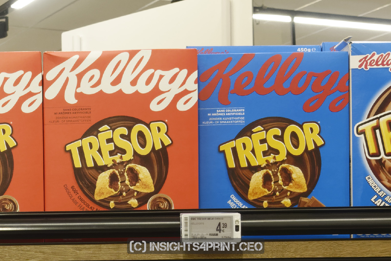
The new packages really stand out. The name Kellogg’s is much more prominent. From the point of view of promoting the Kellogg’s brand, this is, of course, a good idea. It’s impossible not to notice the name. But how about the brand color? The design of some of the new packages is rather challenging on the perception of the brand color… Which was immediately clear to me.
But let’s first take a look at all the different packages and what the Kelloggs’s brand color looks like on every one of them. And I do emphasize: how it looks, how we see it. Not what it reads when you measure it with a spectrophotometer. Because that doesn’t represent how we see colors: measurement devices use a fixed viewing angle, with a fixed light source that will shine light on the sample in a fixed way. It’s the same for every measurement, which is a necessity when measuring colors: you need to be able to compare measurements. Therefore the exact same measurement conditions. But this is very different from how we look at colors, e.g. in a shop: lighting can be (very) different, there are different viewing angles, and many more parameters might influence how our eyes register colors.
To get an idea how our eye sees these colors, I wanted to have an unbiased, objective way to compare the different packages. So, I used a camera and took pictures of the shelves. I also did this on several occasions, with different packages. But let’s just take one of them to perform the exercise.
I used the following procedure to measure the colors: the pictures were taken in RAW, converted with a RAW converter (DxO PhotoLab) to TIFF with lossless compression. The only adjustment I made during RAW conversion, was applying ‘noise reduction’ in DxO, to get rid of sensor noise. The pictures were taken without an absolute color reference like X-Rite ColorChecker Passport. Which means that I will only refer to relative differences, not to absolute values.
After this conversion, I took measurements in Adobe Photoshop, using the full resolution TIFF (so not the lower resolution JPEGs I’m showing in this article). You can identify the different spots by the (small) black square next to the numbers. I did an averaging of either 20 by 20 pixels or 8 by 8 pixels, depending on the size of the brand color, and then took the color sampler to get the Lab-values. For the placement of the selection, I enlarged the image to 400% or 800% to be sure that the selection did not include any artifacts.
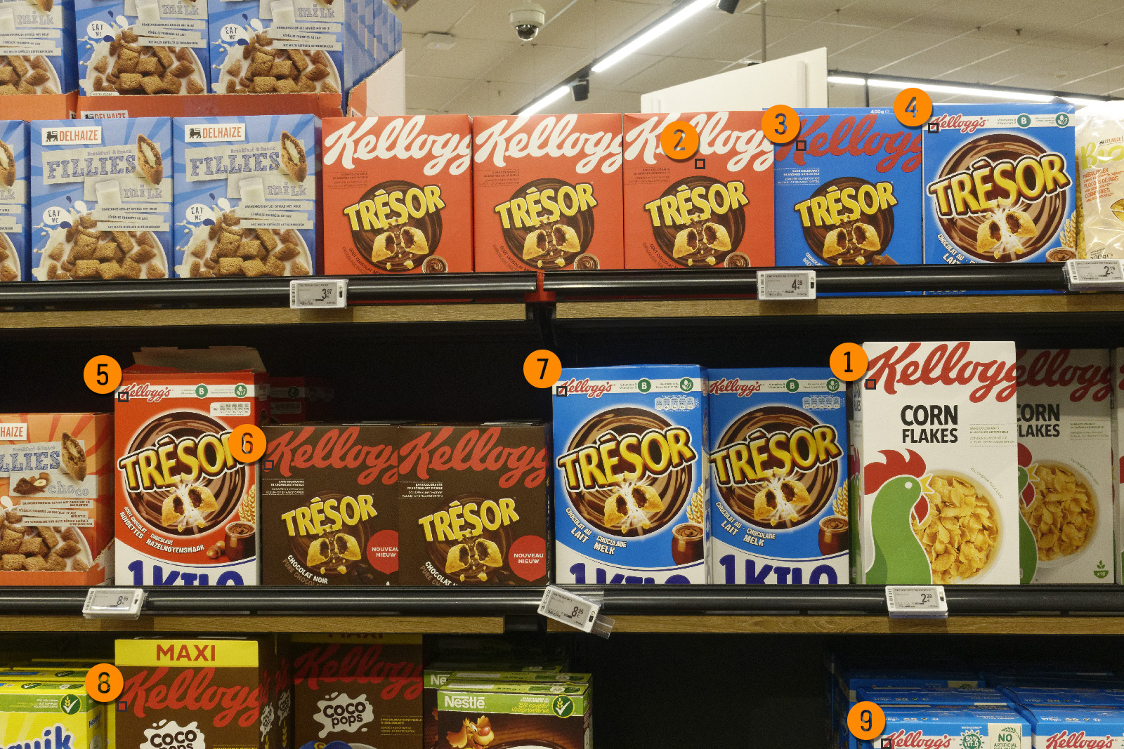
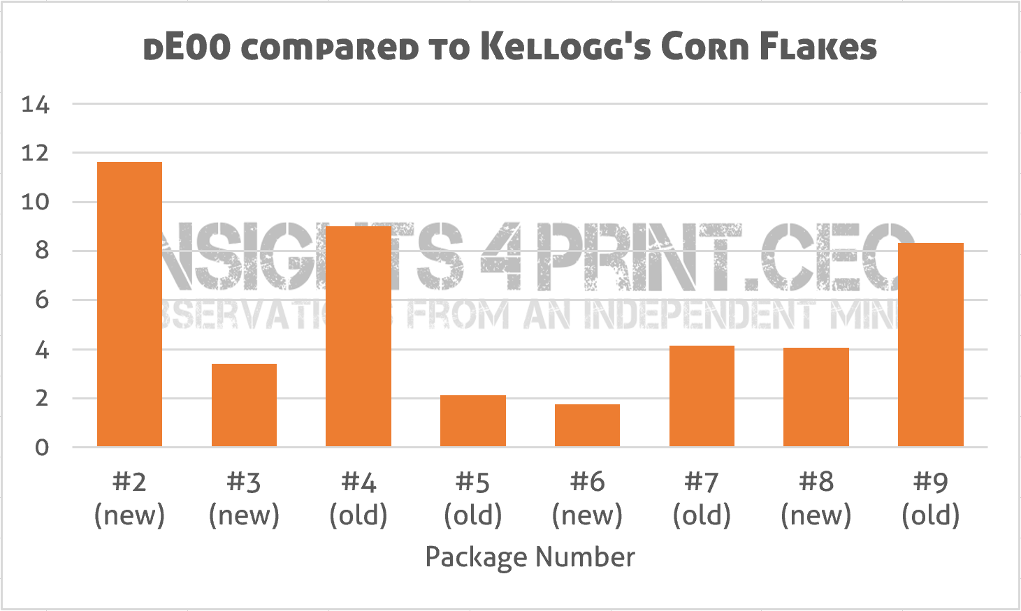
When using the good old Kellogg’s Corn Flakes as a reference, I get the following deviations in dE00.
To compare the differences in a more visual way, I added them as color patches to the original picture.
In the case of number 2, you can argue whether this is the right Kellogg’s red, it indeed looks more like orange and the name Kellogg’s is only visible as the inverted color. I did check the color again during my next visit to the shop and it is really red.
Numbers 3, 4 and 7 are interesting: these are three different versions of the same product. The ‘normal’ old one, the ‘normal’ new one and the 1kg old one. When taking the large old one as a reference, the other two show a dE00 of 3,1 (#3) and 5,7 (#4).
Another interesting comparison is 2, 3 and 6, which all have a new design with a large amount of Kellogg’s red. Compared to #2, the other two show a dE00 of 9,2 and 11,5.
So where do these differences come from? Well, at least one reason is the difference in light: the bottom row is much further from the light source than the top row… And with a smaller amount of light reflecting from the package, the colors will look darker. The inverse square law of light at work (please note that the inverse square law applies for point sources of light, for light tubes it’s a bit different, but the amount of light will also decrease with an increasing distance; unfortunately I couldn’t find online references with more information on that).
And there’s more with the lighting: at that spot in the supermarket, the shelves are not parallel to the lighting, they are under an angle. Which means that not every spot at the same height will get the same amount of light (which would be the case if the shelves were parallel to the lighting). Does this show? Yes, it does. Maybe not to your eye, since our brain corrects for all kinds of deviations, but the camera did record it. On the top shelve, there are three identical packages next to each other. When taking samples of the top left, bottom left, top right and bottom right, there are deviations up to dE00 6,8.
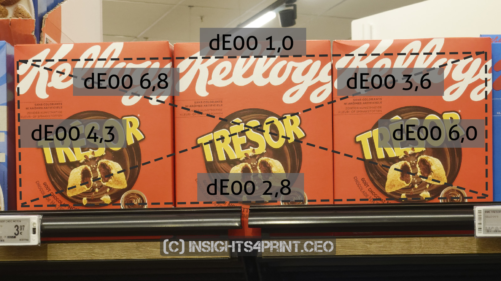
You probably didn’t notice this difference. As I already covered in a previous article, our ability to compare colors that are not on top of each other, is limited. Even in an undelayed comparison.
And this comparison also clearly shows that as a brand owner, you can’t control how your brand color will appear in a shop. It depends on multiple parameters: the lighting and possible shadows, the gloss of the package, the placement, small dents, … But our brain will probably ‘adjust’ all those brand colors to the ‘right’ color, the same way it will adjust lighting (‘chromatic adaptation’). Small deviations in print, e.g. the ones from ISO-standards, will remain unnoticed in this kind of setting, due to all these other parameters influencing color perception. Which was also visible in the result of the comparison of folded boxes in this study.
Color contrast and constancy
But I also wanted to cover the redesign itself, because there is a link to scientific research, research you may have seen before: color contrast and constancy.
The first source I would like to mention, is research by Dale Purves, Research Professor at Duke Institute for Brain Sciences. On his website, he has several interesting visual tests. Below is one of them. The question is what colors the following squares on the top row of the two cubes have: the second one in the left cube, the third one in the right cube.
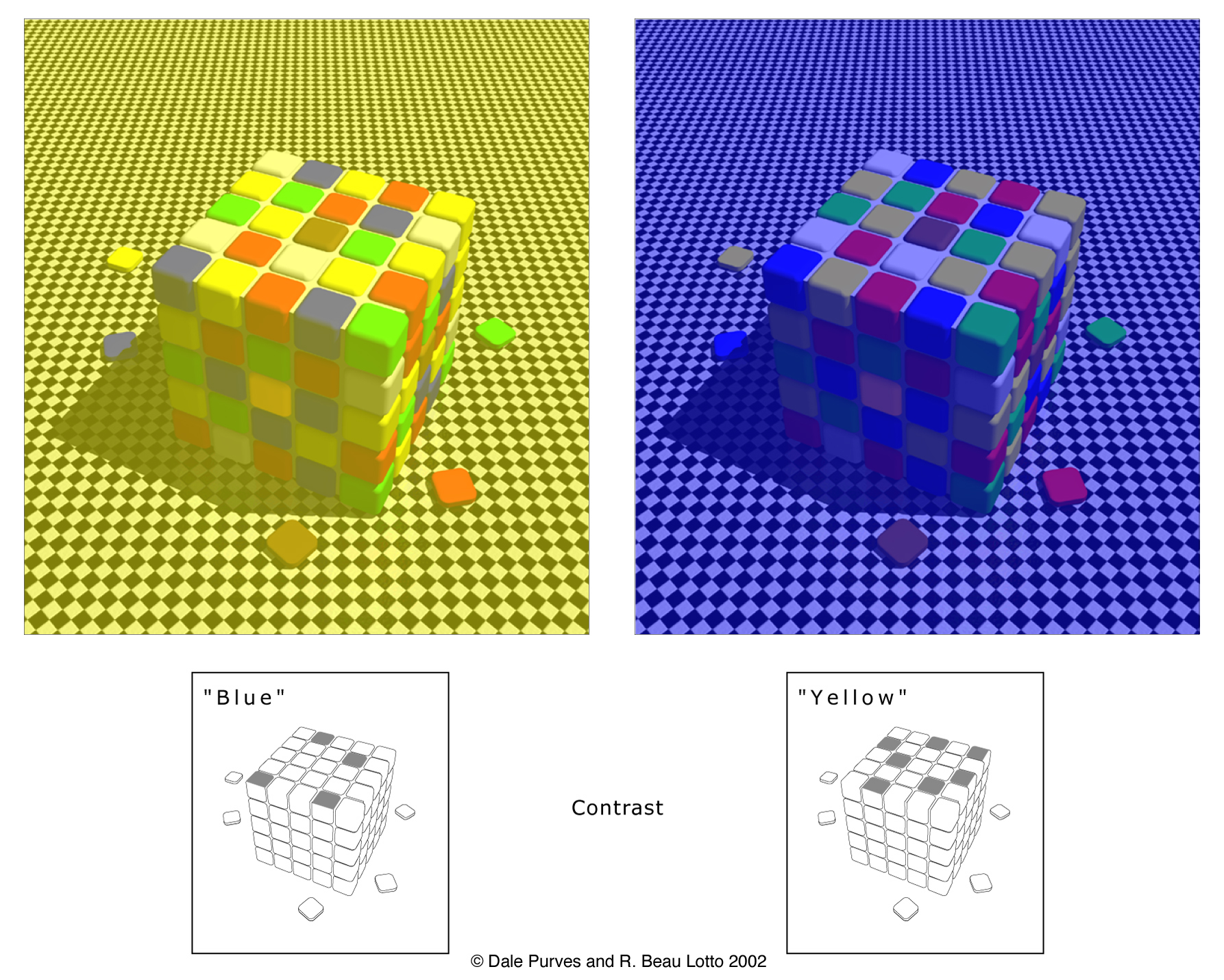
Chances are that you will answer: blue and yellow. But that’s not true, they are both grey. If you would put a mask on it, covering the rest of the image, it will become clear. It’s our brain that is messing around and makes them look different, as a result of ‘contextual differences’. This is something that has been known for a long time.
Another interesting example is this one. Which ones of the orange squares are identical to you?
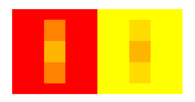
Once again, you might be fooled: it’s the middle ones. Again the ‘contextual differences’ fool your brain.
The author of this ‘orange’ color perception illusion, Akiyoshi Kitaoka from the Department of Psychology at the Ritsumeikan University in Japan, has more interesting illusions on his website.
And the last one I want to show you is from research by Dale Purves and Fuhui Long. It shows colors that are identical, but look different and colors that are different which appear identical…
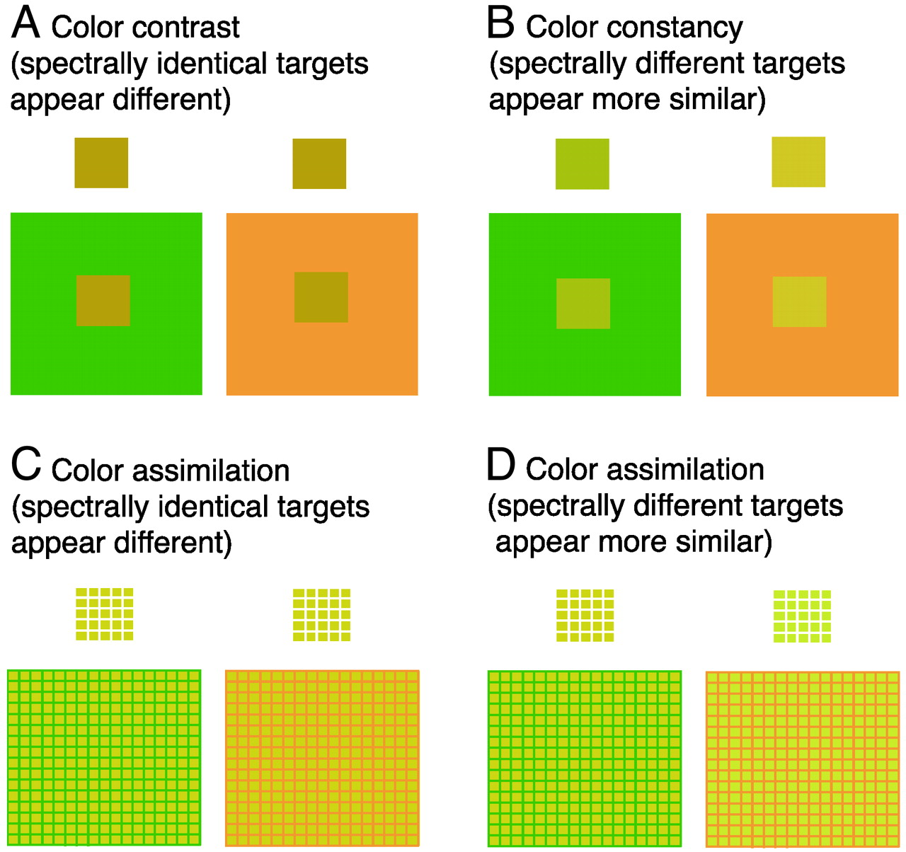
And this last one clearly shows the relation with packaging and especially the new design of some Kellogg’s packages. Since they do have that ‘contextual difference’, the red brand color will appear to be different. So you might have an exact spectral match of two boxes with a different design, but the brand color will look different. To make the brand color look identical, you will need to print a different color. You might want to read that again: the exact spectral match of two boxes will appear different; to make them appear identical, you will need to use a different brand color.
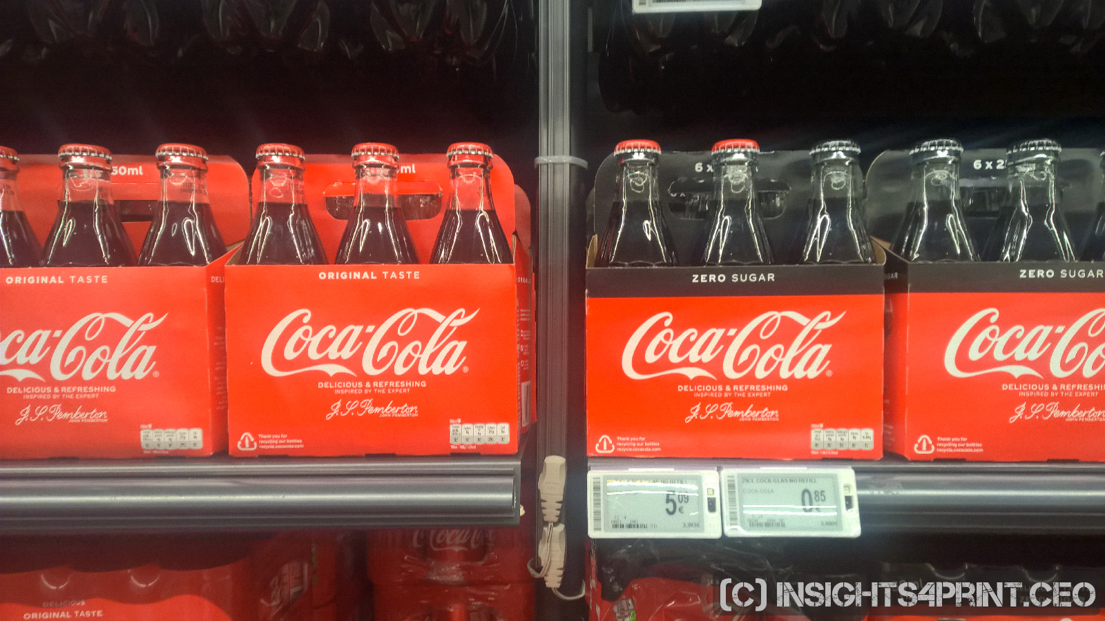
You can see another example of this effect when comparing regular Coca-Cola with Coke Zero: the black color influences the perception of the red.
Does any brand owner, designer, printer take this into account? As neurological research has shown, over and over again, this kind of design choices will influence the appearance of a color, of that precious brand color.
To quote the first sentence of the research paper by Purves and Long: “(…) color percepts do not correspond to the spectral characteristics of the generative stimuli.” You might also want to read that sentence again: visual perception does not correspond to the spectral characteristics. So, what does this mean for brand colors in real life? That is: in real life, outside the standardized, rather artificial, environment of the press room, the press check.
Why is this important?
Brands care about their brand colors, they ask no less than perfection when it comes to reproducing the brand colors. Well, at least when it comes to reproducing the brand colors in print (in digital, on TV, it’s a very different story). And while you can get perfect measurements of your brand color in the confined environment of press checks, you can’t control real life, with all these different parameters influencing the perception of color.
As I showed with the picture of all these different Kellogg’s packages, the lighting influences what our eye registers. And that’s only part of it: our brain also interprets – and sometimes: messes with – the information that our eye has registered. And that’s what’s risky with the new Kellogg’s design: we perceive the red of the different types of packages differently. To make the perception identical, we need to change the spectral characteristics, which means: change that sacred brand color.
So, here’s the choice: a perfect spectral match? Or a perceptual match? Or, maybe, it’s not that important at all. Our color memory is poor and we have a broad tolerance when it comes to recognizing a brand color, as I showed in my previous study.
PS: as you may have noticed, this is part one, which of course means that there will be a part two…

Totally fascinating. Amazing how our brains will “correct” so many things but I find the question of will it matter the biggest take away.
Most brands will care more about the brand and not the science behind the reality of how the brand will be seen.
Thanks for another insightful post.
Thanks Matthew! Yes, our brains are an amazing tool. And also one that, to a large amount, still is uncharted territory, including certain aspects of color perception.
This is very interesting Eddy. From a practical point of view, instead of changing the brand colors/color combinations to appear the same to us between packages, it would be easier to keep certain aspects of the overall design fixed, – i.e. don’t mess with it. Here I am of course referring to the Kellogg’s logo itself, which should preferably be separate on white background in a fixed location on the box. It is confusing and chaotic to me, from a consumer perspective to have the logo big on some packages and small on others. In fact it gives me the feeling of inconsistency, – so if the design is not consistent, can I expect the content to be consistent and from the same source? Of course you have seen it a thousand times what happens when you have a brand logo in different sizes and you look at the logos, – even printed on the same sheet. The smaller logos appear to be darker than the bigger logos. If you invert the logo (white text, red background in the case of Kellogg’s), the red background appears lighter than the red logo on white background. So, yes, from my perspective, fixed size, background and position for the logo itself for all cereal boxes that are in the market should be a must for any brand. The designer can change this of course, – but then change it globally on all cereal boxes in the market at the same time, to avoid confusion.
Thanks Ingi! What I should have stressed more in the article is that the ones with the small logo are the ‘old’ boxes, the ones with the big logo the ‘new’ ones. I was just lucky to find so many different series next to each other… I have replaced the graph with the deviations with a new one that mentions whether a box is an old or a new design.
But your point is very valid: look at the difference between the ‘new’ boxes (with the big logos). The red logo in the overal blue package really looks different to me.