The previous article about color memory started some discussion on LinkedIn, with a number of people strongly defending very tight tolerances. Packages should always look exactly the same, also with reorders, with e-commerce in mind. Let’s put it to test and do a few real-life checks of the visual appearance of color in packaging.
CONTENTS: Examples | So: we should skip print quality checks? | Why is this important?
For this test, I went to the supermarket, bought some products with very specific brand colors and started taking pictures of them, because a camera is more objective in registering the visual appearance than our brain. Let’s see what my camera tells us about brand colors.
Example 1: different Coke cans
In the first image, you see a number of Coke cans that I’ve collected over the years. These are from different series (purchased at different moments in time).
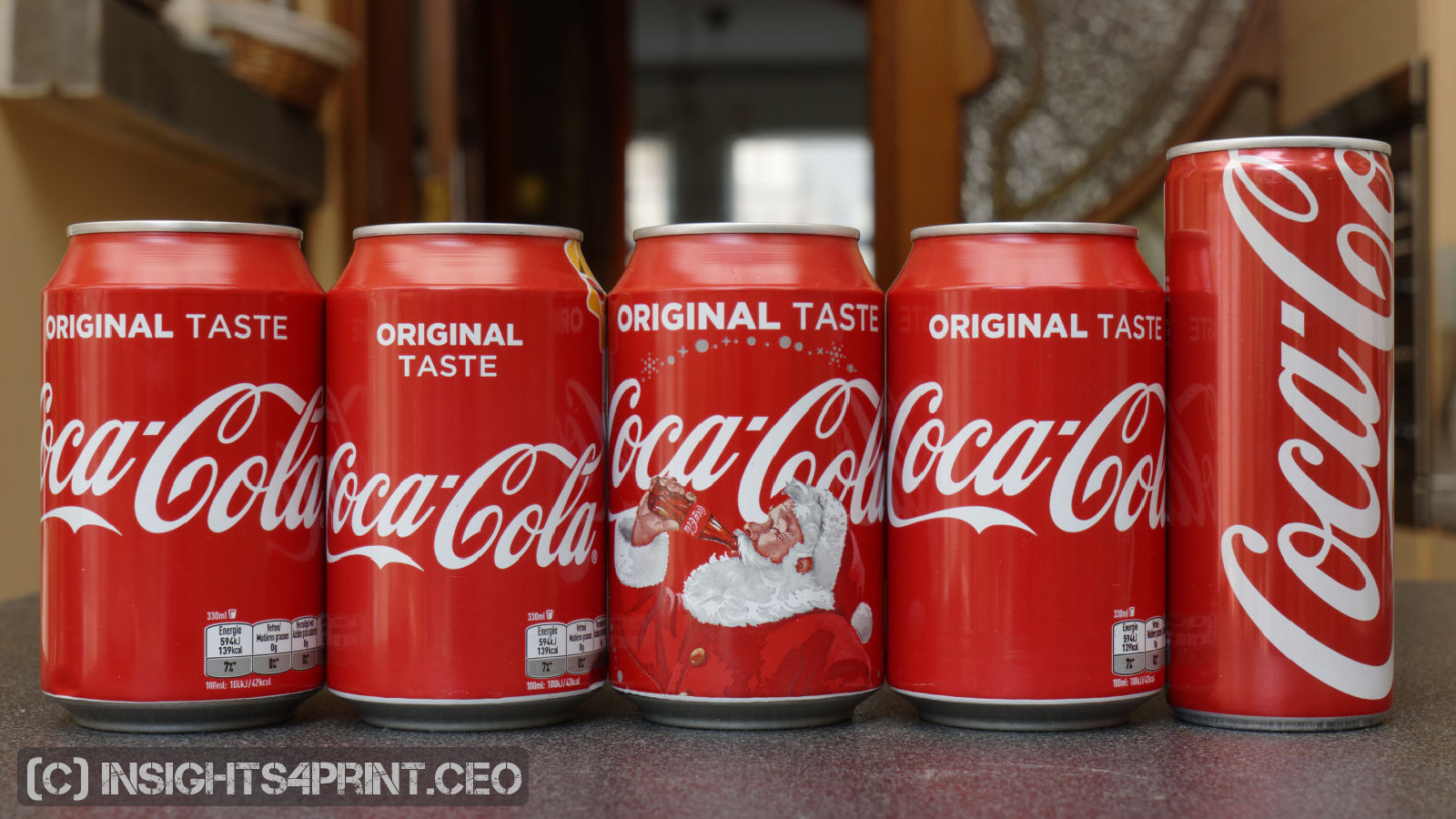
The first thing you should notice is the fact that the surface of the cans is glossy. Meaning that you get all kinds of reflections. And those reflections make the color look different. So, depending on the surrounding environment, the color that will touch your retina, will be different.
Also, if you look closely, you will see that there is a shadow where the cans touch each other, caused by the curvature of the cans. The closer you get to the point where the cans are touching, the darker the observed color becomes.
Yes, I hear you: but our brain corrects for these reflections, these shadows! And you are right! And that’s the whole point of my plea: your brain will correct deviations in color appearance and will identify all these variations being the ‘right’ Coke red.
Another thing that you might notice in the first picture, is the one on the right: that it is printed with transparent ink, not an opaque one as the others. And that delivers a very different visual appearance, do check it yourself in the supermarket. Now, if that very different visual appearance would influence buying behavior, because buyers don’t recognize it as Coke red anymore, shouldn’t Coca-Cola have banished that version of Coke cans? Well, they didn’t.
Example 2: regular Coke vs. X-mas Coke
One of the people who commented on LinkedIn works at a company providing packaging material to Coca-Cola. He mentioned that the X-mas edition of Coca-Cola has a different red: it is a bit darker. Which surprised me a bit, so I checked my collection of cans very closely. And: yes, it’s slightly darker, I guess a few delta E.
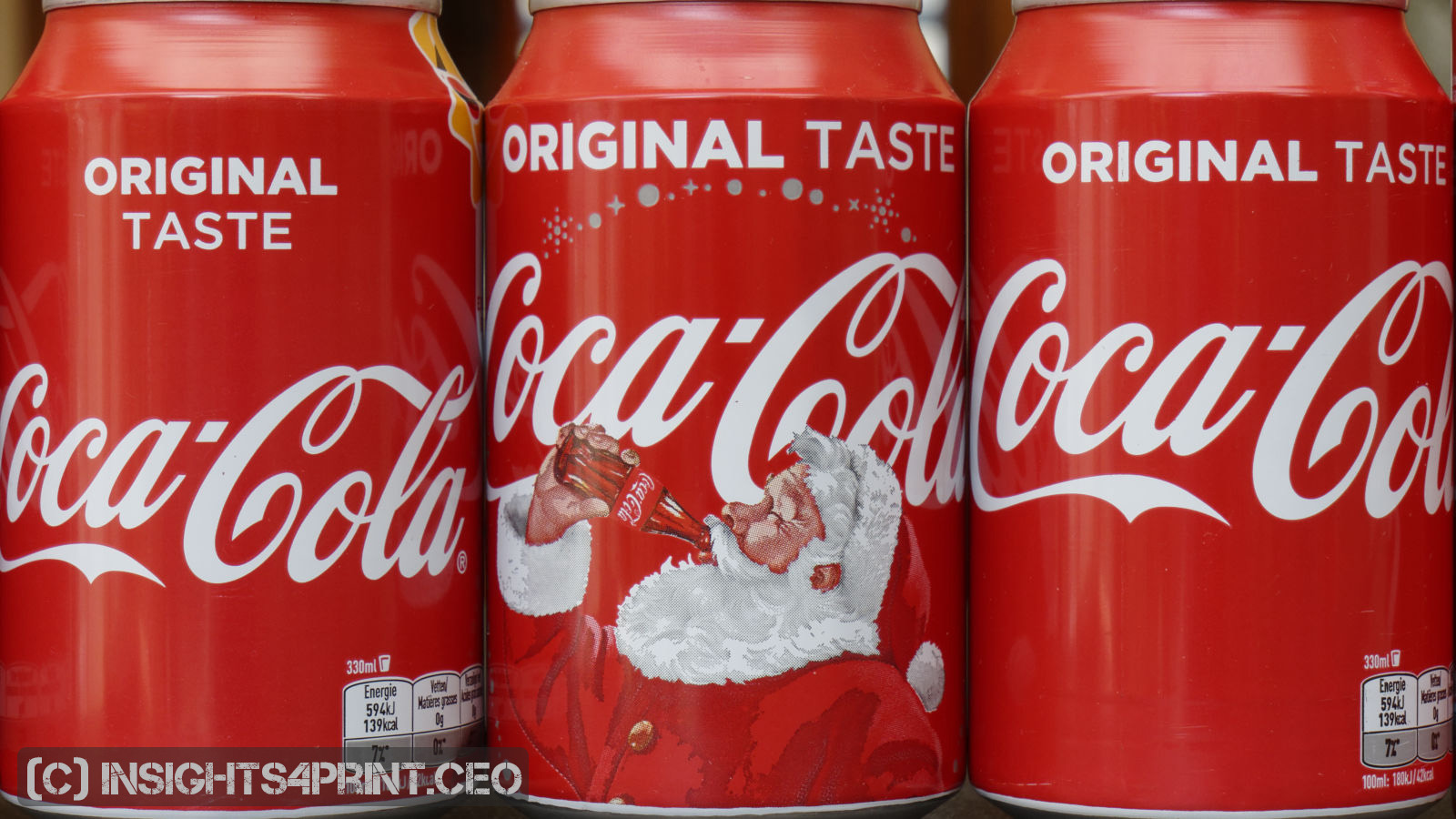
This example proofs a very important point: even the infamous and holy Coke red has different formulas, depending on the time of the year. And does this color difference impact sales? I guess not. Otherwise Coca-Cola would not use that variation.
Example 3: the substrates
Cans, bottles are usually sold in packs, nicely wrapped with a shrink foil. Of course, that shrink wrap foil is printed and is part of the branding. But did you ever look closely to the real color appearance? Check out the image below.
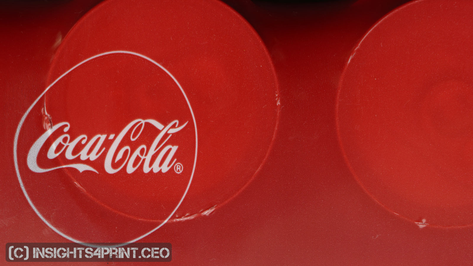
As you can see, the color will vary significantly (far outside the requested tolerances), depending on whether it touches a can, or if there is a void. The difference in color between the lightest and the darkest red in the image is significant. But you probably never noticed. And if you did notice: you probably didn’t mind.
Another issue with shrink wrap packages is the place where the film shrinks, where two pieces of film are shrunk together. That will also influence the visual color appearance, as shown in the picture below.
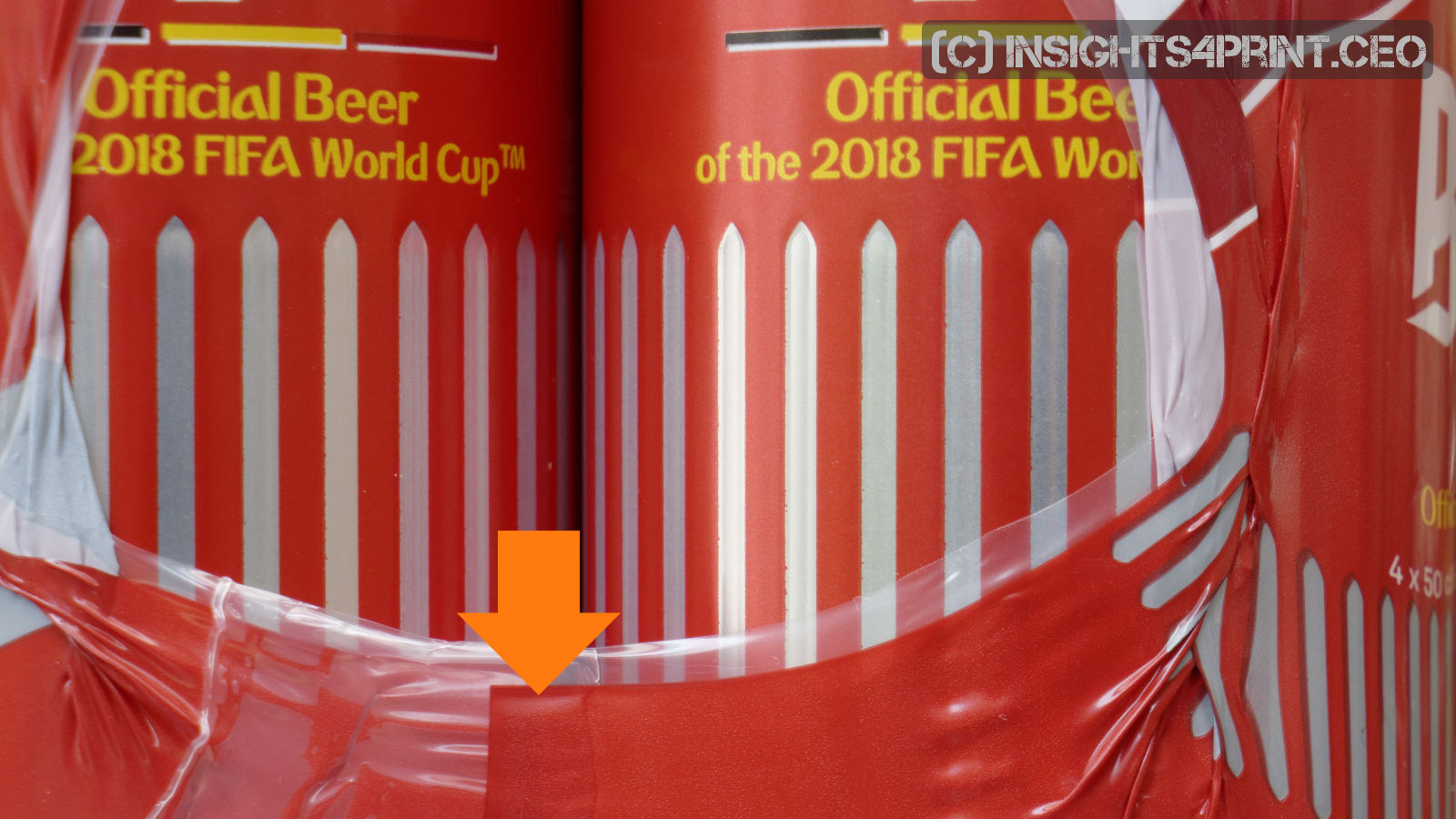
And in the picture above you can already see the effect of different substrates: the shrink wrap film has different visual properties (e.g. reflection) than the aluminum can. Which, ones again leads to differences in the visual appearance of the color.
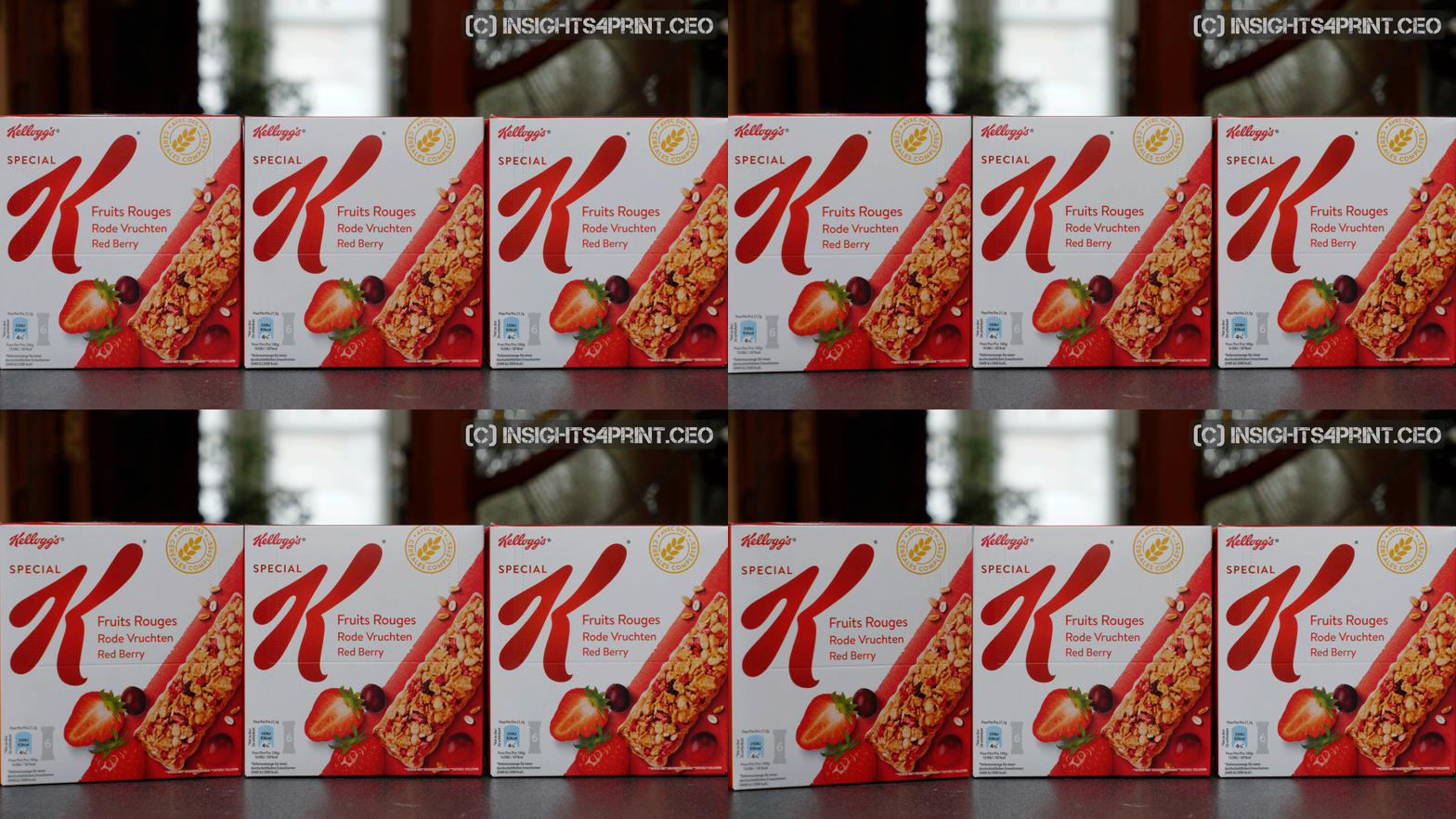
Below is another nice example: granola bars, individually packaged in foil and put together in a cardboard box. The foil and the cardboard are very different substrates, with very different visual properties. It’s impossible to make them appear in the same way. Just to name one reason: the box is flat, the foil is not.
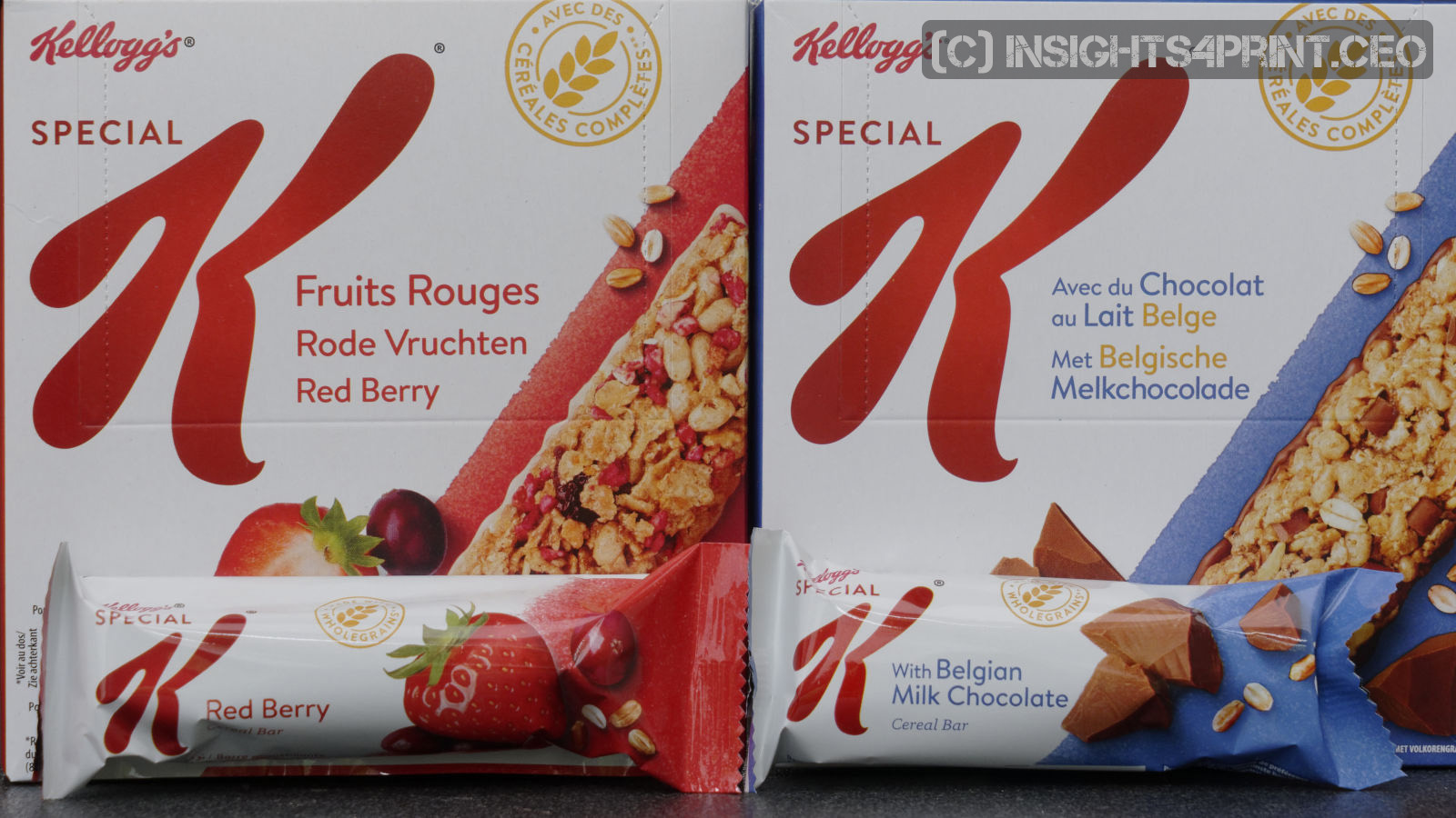
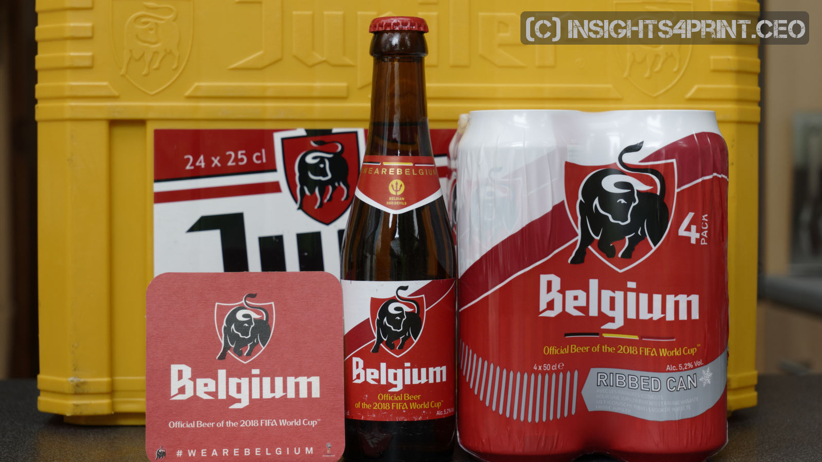
And one last example to show the influence of different substrates: check the red of the cardboard coaster. This will always be quite different, due to the substrate.
Example 4: the place on the shelf
The shelves in the supermarket are not as ‘sterile’ as the light booth in the print shop. While the light booth in the print shop has a very even light distribution (as mandated by ISO-standards), the shelves in the supermarket don’t. And e.g. shadows on the shelves are very common. Once again a real life factor influencing the visual color appearance. But as long as both the color and the logo design look more or less like our memory color, memory design, we will trust that it’s the right brand.
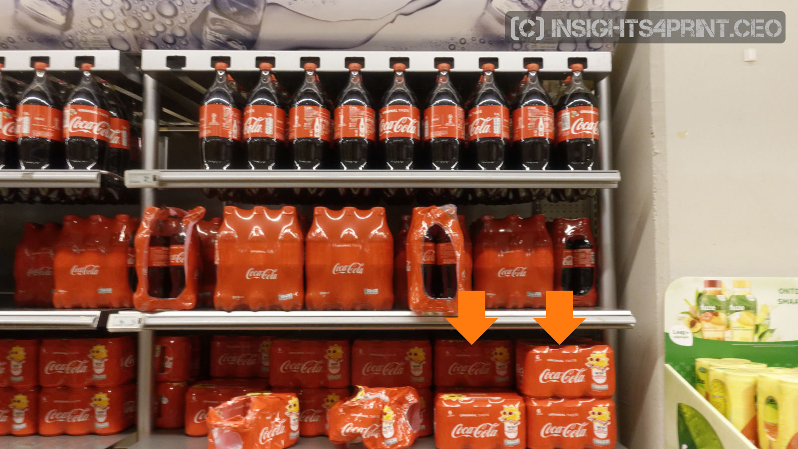
And it’s not only the shadow that influences the color appearance, also the placement can influence it. In the animated gif below I tried to simulate the effect of placing a box in a slightly different angle. Check for yourself how the red K of the package on the left changes when turned.
Example 5: the Coke cans
In the past I’ve looked at a lot of Coke cans, I’ve touched a lot of Coke cans. And it was only when taking pictures for the third time that I noticed there was a variation in two of the Coke cans, probably due to the ink zoning on the printing press… I had touched those cans many more times, for a much longer time than the average consumer, but hadn’t seen it before.
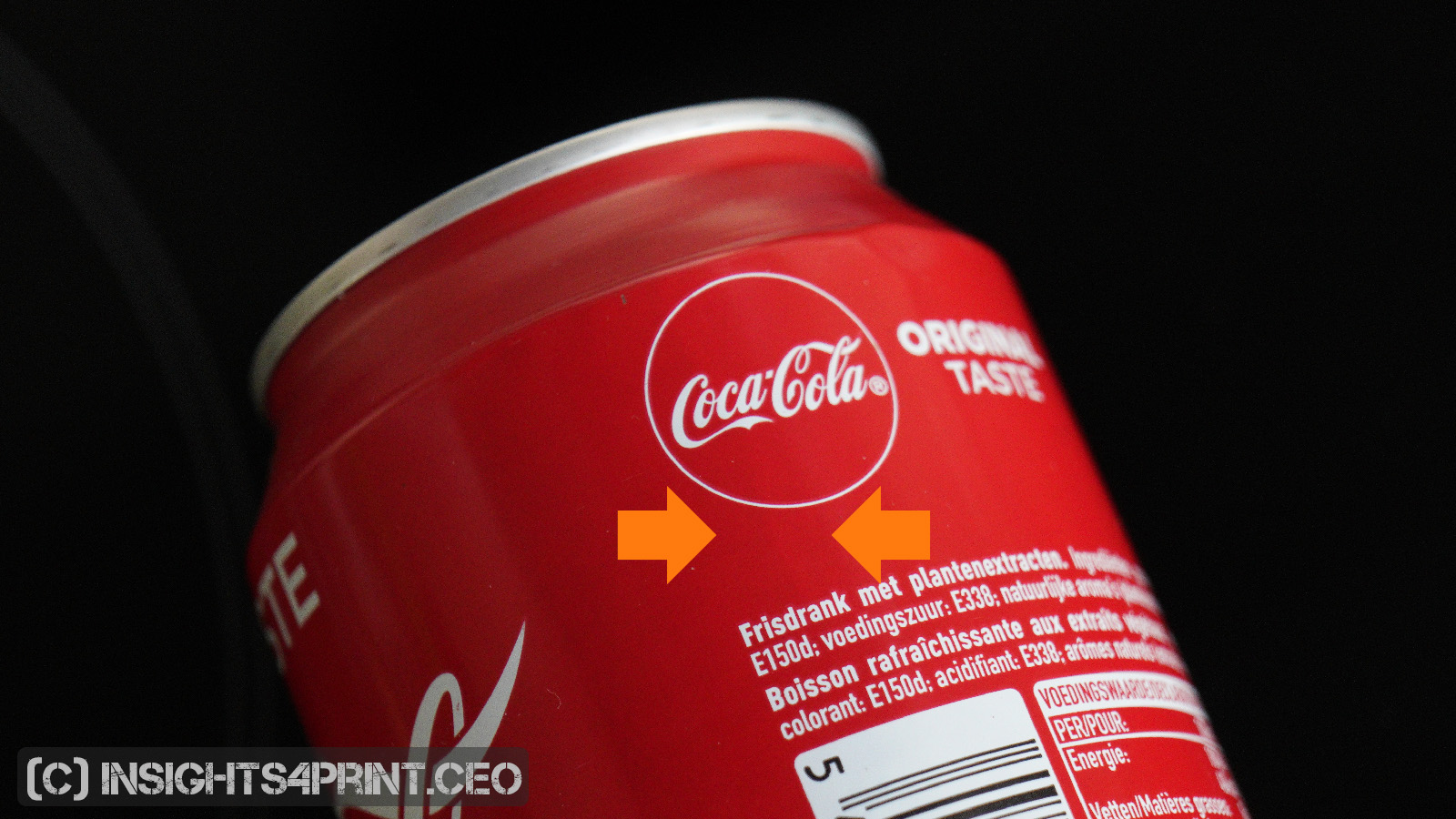
It wasn’t easy to take a decent picture of the difference, due to all the reflections, the picture above was the best shot. Even though the difference is rather significant. But: probably nobody has ever noticed, we’re talking about fast moving consumer goods… And even me, who specifically looks at the colors of Coke cans, didn’t notice it until after a very long while.
Example 6: the design
Let’s take a close look at the image below. The red used in the 0,0% looks a bit different to me than the red in the shield, in the line. What do you think?
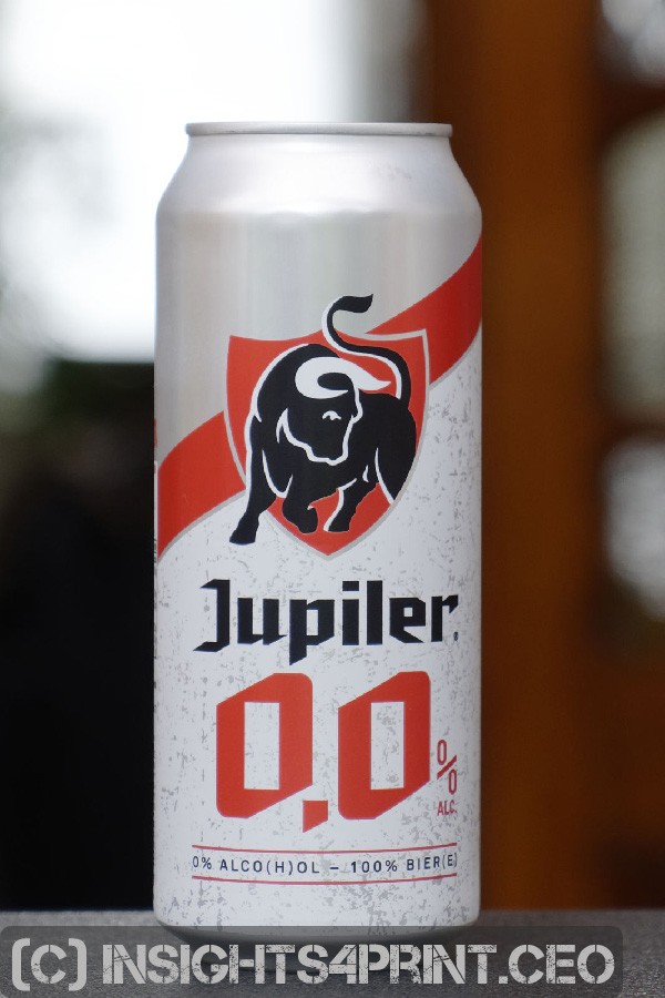
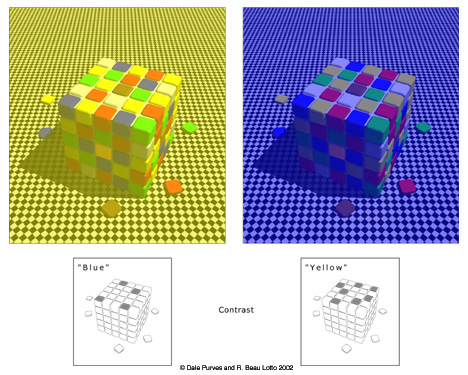
Does it look different to you? Well, it probably isn’t different. But there are two factors influencing your color perception. The first is the design: the 0,0% has a lot of white around it, making it appear slightly different. It is amazing how our eye can be tricked when looking at colors. Researcher Dale Purves from Duke university has a number of impressive examples, below you can see one of them. But do check their website!
And there is another factor why it might have looked different: because I insinuated that it looks different. That’s a psychological concept called ‘framing’. And this is the danger of the press check: print buyers are supposed to find color differences, so they are going to look for differences, until they will find some.
So: we should skip print quality checks?
No! That’s absolutely not my plea. We should keep quality checks. But we should be realistic about it and not reject print jobs (which results in a lot of waste) because of small difference in the brand color, one that’s only visible under a strong light and when you look a long time at the samples.
We certainly do need print quality control to check for print errors. Fortunate for you, next to granola bar boxes I already showed you, was another box. One with a very prominent print defect, as you can see below.
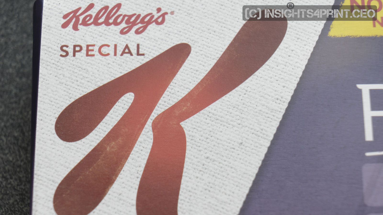
This print defect makes the box, the product look ‘dirty’. That is the kind of deviations that will influence buying behavior: consumers will think something went wrong with that product. E.g. contamination with a chemical product, making them pick a ‘clean’, uncontaminated box.
Why is this important?
These ‘real life’ examples of the visual color appearance of packaging show that the color can vary significantly, depending on a number of factors. Real life is different from the ‘sterile’ environment of the press check. That’s the reason for my plea for reasonable tolerances when doing a press check.
In Flanders we have an expression: don’t try to be more Catholic than the pope. That’s how we should look at color deviations.
PS: in his blog post on color memory John ‘The Math Guy’ Seymour does an interesting experiment with a study from Signs.com from a few years ago. Do check it out!



Be the first to comment