

Right after I had published the article about real-life factors influencing color appearance in packaging, I opened my mailbox and found another very nice example. This one with a number of factors influencing color appearance in marketing. It is so nice that I have to share it with you.
CONTENTS: The letter | The fifth color | Why is this important?
In my mailbox was a letter from ‘Kom op tegen Kanker’, an organization that raises money for cancer research. In the picture below, you see the logo four times. Two times on the envelope, another one on the letter and the fourth on the leaflet. And they all look slightly different. Let’s take a look at what’s happening here.
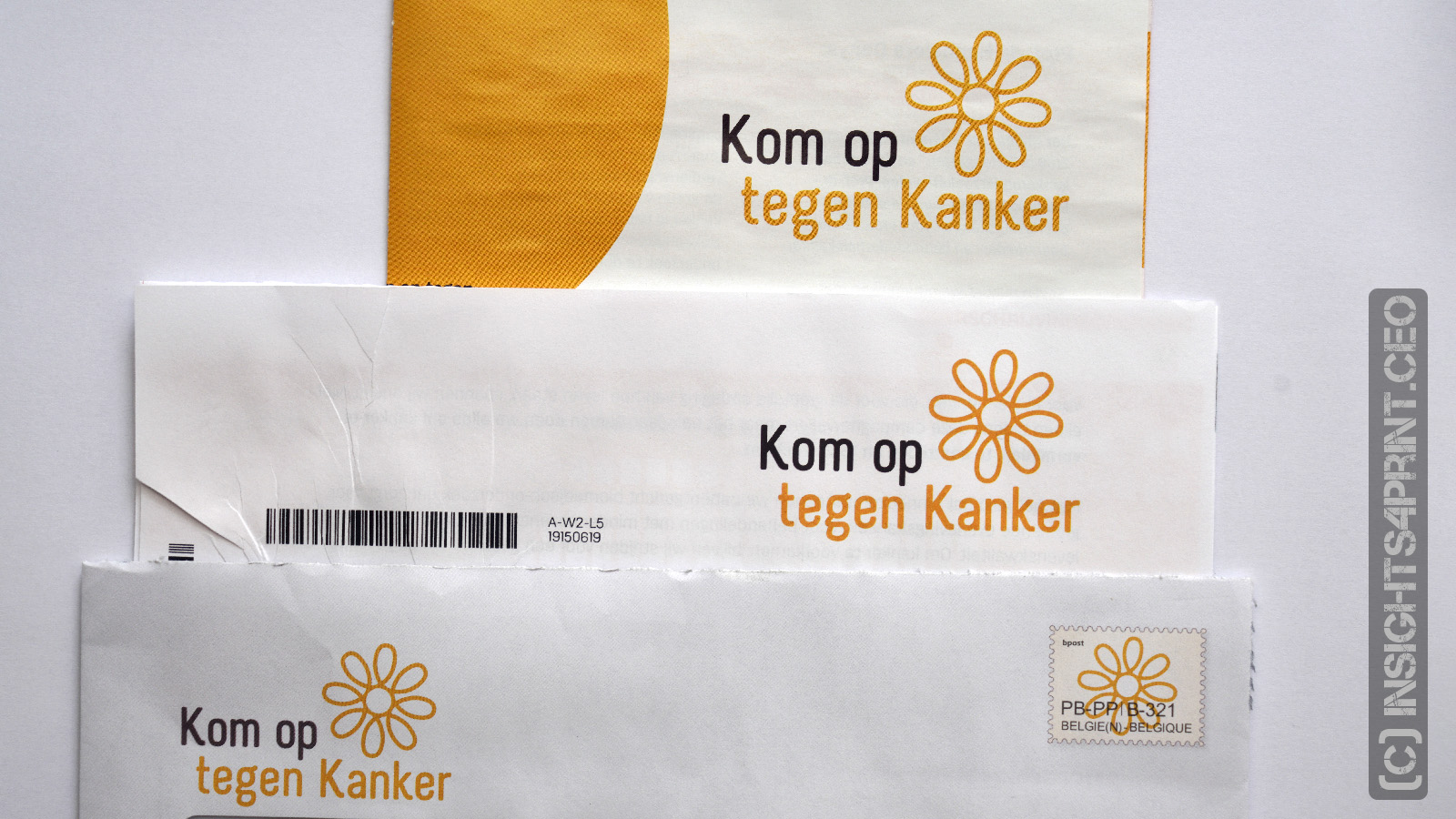
The envelope
The logo on the ‘stamp’ at the right looks a bit different, but I guess that when you would measure the yellow, it won’t be different: it’s printed on the same paper, with the same ink, on the same printing press.
As I described in my previous article, design can play a role in shifts in color appearance. The background of the stamp has a light yellowish tint, tricking our brain into believing that the yellow of the flower in the logo is more yellow than the one on the left.
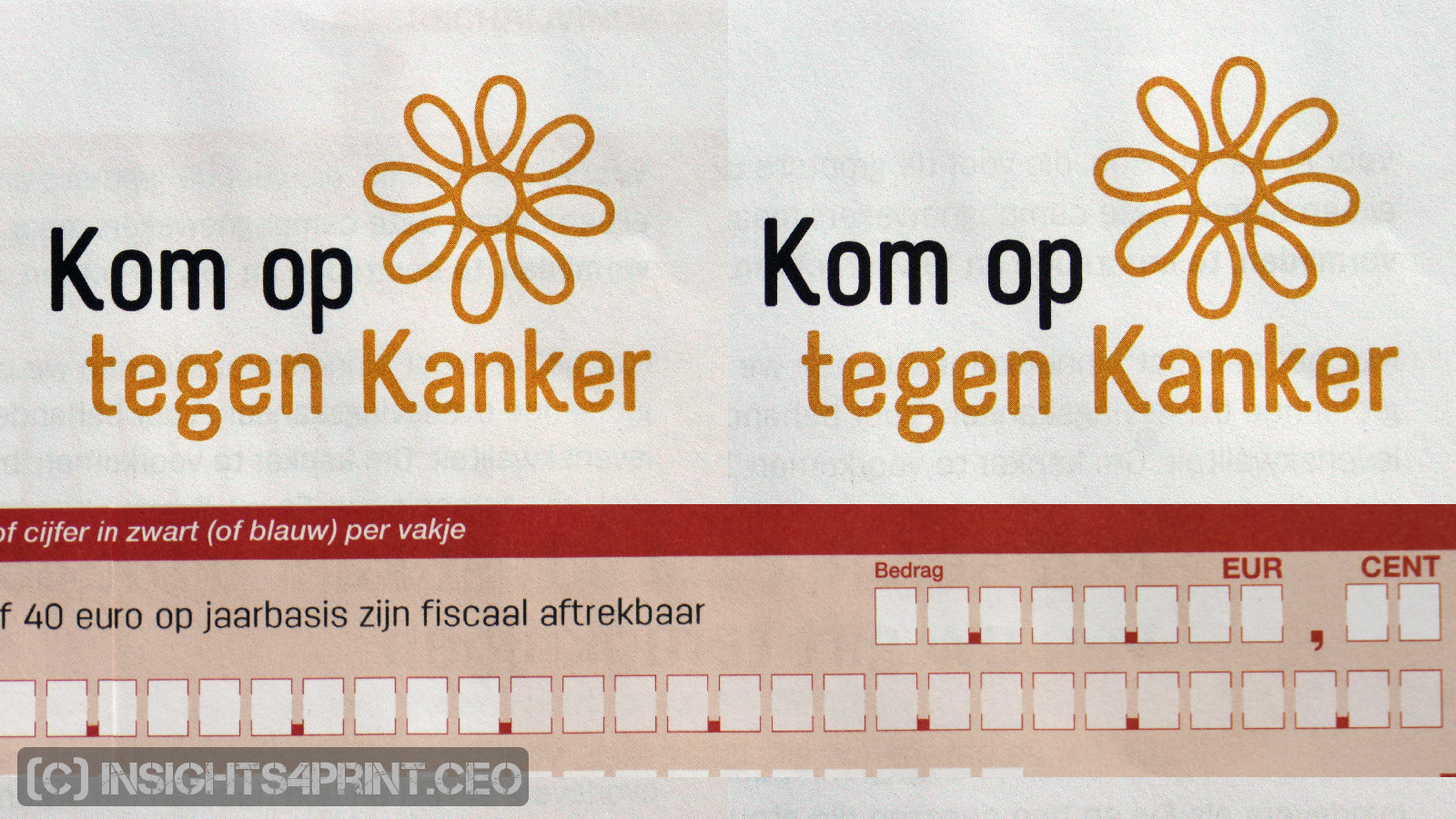
The letter
You probably have already noticed that the paper from the letter is different from the envelope, influencing the color appearance. But there is also something else at play: the paper isn’t completely opaque, resulting in the red of the payment form behind it shining through the paper. And that, again, influences the perceived color.
The leaflet
Well, this is a clear one: again a different substrate, resulting in a different color appearance.
The fifth color
Paper is the fifth color, you may have heard that before. And some researchers are trying to compensate for that. Whether this is feasible, I’m not completely convinced: color appearance is a very complicated thing.
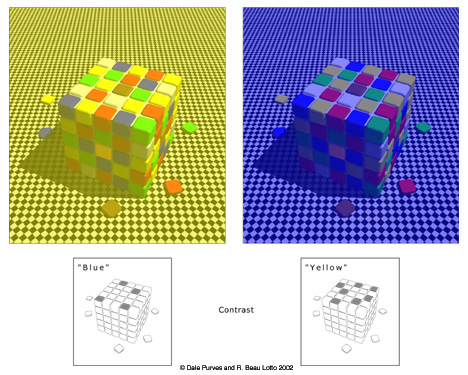
And even if you would correct the printed logo for the other type of paper and get a perfect colorimetric (measured) result, the consumer will still see the different background, influencing the overal visual appearance. Just take a look at the optical illusion below, which I also included in the previous article. Only if also the visual appearance, the human interpretation of compensation that paper color is thoroughly studied, I will believe that it can achieve its goals.
Why is this important?
Many factors influence the visual color appearance, I’ve said it before. And we have to be realistic about that: you can’t manage a color, a logo that it will always look exactly 100% the same.
So, don’t try to be more Catholic than the pope! Be realistic and focus on print defects, on having print jobs look as nice as possible. Even if this means that there is no 100% colorimetric match between the different jobs.


Be the first to comment