

Designers, brand owners, and the like have heavily relied on the Pantone libraries in Adobe Illustrator, InDesign, and Photoshop. But the romance is over. Later this year, these libraries will no longer be included in the updates of these Adobe applications. Which has made many people nervous, even very nervous. But there is no need for that, there is a much better way to safeguard the precious brand colors! Here is how brand owners and designers should deal with the Adobe–Pantone breakup.
CONTENTS: Spot color does not equal Pantone color | ASE files to the rescue! | But my secret brand color! | ASE: The easy way | ASE: The color geek way | Some examples | Why is this important?
IMPORTANT UPDATE (03/11/2022): if you care about brand colors and want to be independent from Pantone libraries, check the new Project BBCG – a Better Brand Color Guide! A free framework for rock-solid brand color definitions, more print-safe CMYK conversions and easy brand color exchange: using .ASE files.
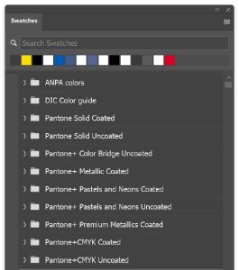
First, we have to make something very clear: spot colors do not equal Pantone colors, and Pantone colors do not equal spot colors. I have the impression that some people think they are interchangeable, they are not. A spot color is a color that will be printed with a specific ink, it will not be printed with the standard print colors, the ‘process colors’ (CMYK, or in case of an extended color gamut, maybe CMYKOGV). For every spot color, there will be a printing plate, they will be included as a separate ‘plate’ in the print-ready PDF. Spot colors are often used in packaging: if you look at the print control bars on the package, you can see which colors are used. There are multiple libraries for spot colors, and you can even create your own, e.g. based on a measurement of a physical sample. That way, you really know what it will look like (in case you aren’t aware of it: printed color guides are not perfect, the deviation from the digital value might be higher than you would like).
Pantone is a collection of colors, which first became available as printed samples (the color guides) and later as digital collections, with digital values in applications like Adobe Illustrator. The Pantone colors used in a design can be printed as a separate ink (in that case, they are spot colors). But, the Pantone color guides are often used as a tool to choose a particular color for a design, which eventually will be printed with only process colors. Then it is not a spot color. Pantone is a commercial company, so they want to make money with their colors, by selling color guides and licenses for digital libraries. That might be the underlying reason for the breakup: a discussion about license fees…
ASE files to the rescue!
But let’s look at how you can secure your brand colors after this breakup, even with less hassle and fewer errors than before! Adobe has something compelling in their applications, something that is underused and undervalued: color swatch exchanges via ASE-files.
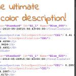
You might not have noticed it, but you can export color swatches that you have created for a specific project, product, client. If you have grouped them, you can export the entire group. And you can send that file to other people who need to use those colors, they can easily upload those swatches into their Adobe applications.
And that is really powerful: instead of creating extensive brand guides (which are very often very, very flawed), a best practice is that brand owners create those ASE files, one per specific output type (coated, uncoated and this both for process and spot colors, plus web/sRGB, …), and make these available to everyone involved in the production of any kind of output that shows that precious brand color. This would prevent lots of misunderstanding, misinterpretation and people interpreting the brand guides in their own – and therefore faulty – way!
Yes, I hear you, dear brand owner: your brand color is special, and you don’t want to share all the specifics about it… You don’t want to spread your secret formula into the wide world, counterfeiters could know what your recipe is! Well…
But my secret brand color!
It was probably Coca-Cola that introduced the myth of secret color formulas. Even today, their website states: “Coca-Cola red: our second secret formula”. (*) Which is complete nonsense! This statement is just silly! There is absolutely nothing secret about a color: take any color measurement device, even the cheapest one (60 US$!), and you will know what color it is, within very reasonable margins. And from that measurement, it is extremely easy to reproduce it, within normal margins.
(*) 29/10/2022: the original article is no longer online, but here is an archived version.
Except for some security printing applications, think banknotes, there are no secret colors. Get real about such claims!
ASE: The easy way
So, now that we’ve settled that there are no secret color formulas, let’s get to work. The easiest way to make and share your brand color is via the Swatch menu in Adobe Photoshop, Illustrator, InDesign. Create a new document, or use an existing example and make sure that this document is set up properly: check the ICC profiles, especially the output.
Now create a new color, your first brand color, or pick it from the existing document. You can choose how you want to define it: RGB, CMYK, Lab. Or you can even load spot colors. If you want to work with spot colors during printing, choose that option. If you want to print only in CMYK, you might want to opt for defining your brand color in CMYK. Why I prefer that option, that’s something you can find in this article: better safe than sorry.
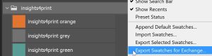
When you have created your set of brand colors, you can right-click and export the set as an ASE file: ‘Export Swatches for Exchange’.
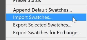
A designer who wants to use it, has to import it into the Adobe application and voilà, the right colors appear in his Swatches panel and – even better – the exact color definition will be used in the PDF on export! It’s as simple as that.
ASE: The color geek way
Some people, like color geeks, might find this a bit too easy and want to have even more control. And yes, that’s possible! Defining a color in RGB, CMYK and even Lab isn’t the most detailed color definition you can get. You can even do it in more detail, by describing which wavelengths have which amount of energy. That, and other parameters, can be included in a CxF file (yes, told you it would be geeky 😉). And such a CxF-file can be included in an ASE file. And once PDF v2 is widely supported, it can also be included in the print-ready PDF. This presentation provides a very good overview of the use of CxF and the export to ASE files.
Many tools can do that trick, below are a number of them. The list certainly isn’t complete, check the color management tools you are using at this moment to see if they support the export of CxF info to an ASE file!
If you are a supplier of such solution, feel free to leave the details in the comments section.
UPDATE 03/02/2022: it seems to be a bit more complex, it’s not the full CxF info that is put inside the ASE file, only the Lab-values of the solid (Adobe ASE files don’t support the full CxF information, at least not yet?). Later on in the process, that information can be swapped with the full CxF info (kind of like we used to swaps low res and high res images in OPI). More on CxF in this follow-up article!
Some examples
I tried to find some brand owners who share their brand color specifications this way. And I did find a few. But guess what: all of them are universities… I wonder why. Anyway, here are a few good examples:
- Northwestern has a very good list of ASE files: coated and uncoated, both for process colors and spot colors, and RGB. They also included basic instructions how to install them. Unfortunately, you need a username/password to download them.
- Georgia Tech also has ASE files for download, but again you need a username/password.
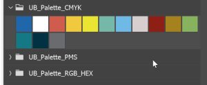
- University at Buffalo has the ASE files available for everyone.
I downloaded the different sets from University at Buffalo and imported them into Adobe Photoshop. What they forgot to do, is make separate colors for different output types: coated and uncoated. And even with the RGB colors, it could still go wrong: they should have added that these are for sRGB (use the same numbers in an AdobeRGB file and they will be different, just try it!). But I’m very happy that they do offer ASE files! Although not perfect, it does make the life of people who need to use their brand colors.
Why is this important?
The Adobe-Pantone breakup has serious consequences. Those who want to keep working the old way either have to pay Pantone a yearly fee for the full functionality of Pantone Connect, or they have to apply some tricks before updating (the respected Dov Isaacs pointed it out in this thread on PrintPlanet.com).
But now is a good time for a better approach. One that will immediately deal with the errors made in the past and the variabilities of the old way of working. Sharing brand colors as ASE files will save time, it will make brand color reproduction more consistent. But brand owners and designers have to get real about having a ‘secret color formula’ first. There is none. Not even Coca-Cola red.
IMPORTANT UPDATE (03/11/2022): if you care about brand colors and want to be independent from Pantone libraries, check the new Project BBCG – a Better Brand Color Guide! A free framework for rock-solid brand color definitions, more print-safe CMYK conversions and easy brand color exchange: using .ASE files.
PS: you can of course also switch to another spot color systems. But even in that case, exchanging your brand colors as ASE files, will still be the way to go to reduce errors in color selection, color definition during design and layout.


Basic color information. It scares me that the basics require restatement so often in forums where the participants should already have a command of color theory and ink technology. The article has useful information. Aside from using the Adobe color set, distributing the color palette (ASE) is, again, a basic quality control (re: brand integrity) practice. Brand guides are important tools. Poorly created brand guides are poor tools. Essential to quality: if color is critical, stand on press and sign off on the press sheet. Otherwise rely on the technology described in this article. It will likely produce acceptable results.
Thanks for your comment Robert!
You’re right, it should be basic information and people should know it, but the reality is not like that. Many designers, brand owners (including the people doing press checks!) have no technical, print related background/education. Many are ‘creatives’, often self educated in using tools like Adobe Illustrator, InDesign, Photoshop. Many can only do the very basic stuff in these applications, maybe even don’t understand some of the (color) settings.
Regarding your remark that if color is critical, you need to do a press check / sign off on a press sheet. I completely disagree. We should get rid of press checks, they are completely unrealiable. In a real-life test I designed a number of years ago, on seeing color differences between samples, there was also an identical copy included. Guess what: 1 out of 3 ‘print professionals’ claimed to see a color difference between the two idential copies! More: https://www.insights4print.ceo/2018/05/groundbreaking-color-study/ And that’s not the only issue with press checks… I can tell you horror stories about that, and technical facts that most people are not aware off but which do influence the result. But that’s for a next article. 🙂 The way to go? Specify realistic tolerances, standardize production and measure with well maintained and calibrated devices.
PS: on the practice of press checks, check out this comment my article just got on LinkedIn. A printer who agrees with ending the press check practice: “Heard too many clients asking for a reduction in 1% cyan……” There is even more information in his comment.
Thank you for your write-up. In fact the ISO 17972-4, already being establish where, the spot color inks color data is able to be measure and keep into the PDF /X. I fully agree with you that spot color never a Pantone, many of them just use the name of Pantone in the PDF, but eventually the files being printed, they replace with the ink. So, the impact still very much face based on the proofing stage, where the spot color never looks the same in the print. This is due to “no ICC profile” being created for spot color. We need to think a little deeper that the spot color ink characteristics in term of opacity and also sequence of spot over spot effect.
Pantone only provide “Solid” 100% LAB values but many ink companies able to produce the same with smaller dE but they opacity of the ink can be very different when having the gradient of the spot color. Furthermore, today packaging design using so much spot color tone/gradient in the artwork.
Thanks for your comment! That’s really interesting, helpful information for people working with spot colors!