

I hit a nerve with my article on the Adobe-Pantone breakup and how brand owners and designers should deal with it. And most reactions were very positive, acknowledging that NOW is the right time to make a slight change in how brand colors are communicated. So, if you are a brand owner, a designer who takes brand color seriously, it’s time to embrace CxF and ASE files! And no, don’t run away. Using them is easier than remembering what these TLA’s (three-letter acronyms) mean!
CONTENTS: Measurements vs Pantone libraries | Anatomy of CxF file | CxF in Adobe Creative Suite | Too complicated, too expensive! | CxF in real life | But Pantone LIVE! | Why is this important?
IMPORTANT UPDATE (03/11/2022): if you care about brand colors and want to be independent from Pantone libraries, check the new Project BBCG – a Better Brand Color Guide! A free framework for rock-solid brand color definitions, more print-safe CMYK conversions and easy brand color exchange: using .ASE files.
As I explained in the previous article, it is really easy to exchange (brand) color information in the Adobe Creative Suite: via ASE files (Adobe Swatch Exchange). There are two options to create those ASE files: a very easy one (everyone can do this!) and a color geek one. This time I will go into more detail on the color geek method. As I noted in a minor update on the previous article, it’s a tiny bit more complex than I thought, but still very feasible for everybody who takes brand colors seriously.
Measurements vs Pantone libraries
But before diving into CxF (Color eXchange Format) and the flow you need to get such a file, first again a bit more on my statement that creating ASE files based on the measurement of a physical sample is an excellent way to go. It is all about predictability. Suppose you measure, with a calibrated spectrophotometer, a physical sample you have with you. In that case, you will have a reliable, device-independent description of that color, e.g. CIELAB (D50/2): 70 / 47 / 79, or in short: Lab 70 / 47 / 79 (don’t run away from that, your spectrophotometer will tell you what it is). When you communicate that color to a printer, he (or she) knows what you want as a brand color. He can use that description as the input for his quality control, or even his ink mixing if a specific ink needs to be mixed.
In the case of Pantone color guides and libraries, that might be different… As I’ve told you before: the printed Pantone color guides are maybe not as reliable as you would like. First: Pantone’s tolerance on its website says that about 90% of the printed colors in those printed guides are within a 2 dE00 tolerance compared to the digital value. So about 10% is outside that 2 dE00, nobody knows which colors those are… Plus: given the fact that dE doesn’t show direction, one guide (e.g. yours) can be 2 dE00 off in one direction, another (e.g. the guide of your printer), can be off 2 dE00 in the other direction, meaning: your Pantone color guide and the one from your printer are 4 dE00 apart from each other! And in real life, it’s very often even more than that 2 dE00…
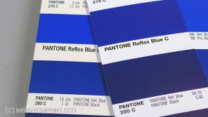
In the past, new versions of Pantone color guides have shown a significant difference compared to the previous one. Below are two versions of color guides, an ‘old’ and a ‘new’ one (picture from 2012). When you had your brand color specified as ‘Reflex Blue C’, or even worse: ‘280 C’, it shifted significanlty.
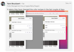
And even worse: also digital libraries can differ, as someone mentioned on LinkedIn. On top of that: these are not constant, they evolve over time (based on samples of the printed guides?). During a recent discussion on LinkedIn, somebody showed the CMYK equivalent of some Pantone grey. A few hours later, he posted an update: Pantone had changed the composition of that color… Would you find it acceptable if a different shops would have a different interpretation of what a kilogram is, that this could change over time?
All of this won’t happen if you have measured the color you saw, the color you liked! CIELAB (D50/2): 70 / 47 / 79 will always be the same color. You can bet on that! That’s why you should always define your precious brand colors this way, why you should avoid using Pantone names, or references to other color systems.
BTW: if you look at the Pantone libraries in Adobe Creative Suite, the colors are stored as Lab-values. There is nothing magical about these libraries, they are just a large set of Lab-values…
Anatomy of CxF file
CxF is based on XML, which means that you can open the file in a text editor (e.g. Notepad++) and ‘read’ what is in there. And there is a lot of information in a CxF file!
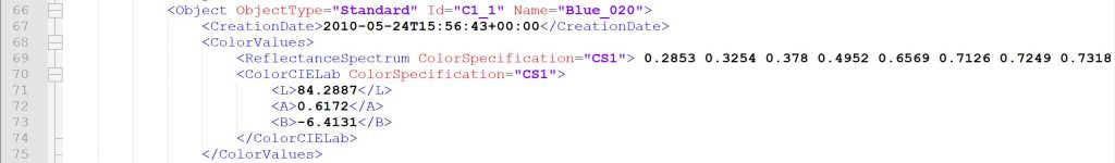
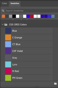
I received a CxF file from CGS Oris, here are some parts of the file. E.g. the definition of the color ‘Blue_000’. You can see the spectral reflectance of that color (all those numbers in line 13), that’s the most detailed info you can get! Plus also the CIELab specifications (lines 15, 16, 17).
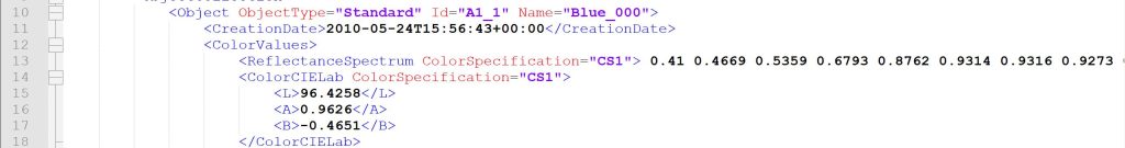
Wonder what 20% of that Blue looks like? It’s in the CxF!
Wonder how it was measured? It’s in the CxF!

Wouldn’t you love to have all of that information? It’s possible! It will take a little bit of effort and costs, but then you are set for the rest of the life of that specific brand color!
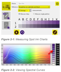
First, let’s look at the easiest way. You need to print a 100% patch of the brand color on the specific (types of) substrates you use, preferably with the printing technologies you use. That could mean multiple prints, but remember the result: no more discussion about brand colors!
Once printed, you can measure that 100% brand color and with clever software like CGS Oris CxF Toolbox, the different percentages can be calculated. Having all of that information, you can create and export a CxF file. And the associated ASE file.
The ‘full option’ way is to print the brand color in different tints (percentages) both on a white and a black sheet. Based on measurements of these printed patches, you will get the most detailed and accurate color information possible! And once you have that, you can create the CxF and ASE files.
CxF in Adobe Creative Suite
Now that you have created that invaluable CxF file for your precious brand colors, you want to get it to everyone involved in design and print production. And this differs a little bit from what was in the first version of the previous article. The information in the ASE file is limited to the Lab-values, you will not get spectral information nor the different tints. But, as I said before, you get the same info as in the Pantone libraries you are probably using at this moment!
So to use the CxF information further down the process, a clever trick needs to be applied. A trick you might know if you have been in the industry long enough (or if your boss still hangs on to old technology): OPI. This is (was) a ‘swapping system’ to temporarily use low-resolution images instead of high-resolution images. Remember: two decades ago, workstations’ memory and processing power were somewhat limited, and working in real-time with high-resolution images was not feasible. So they were replaced by low-resolution images, which were ‘swapped’ to the high-resolution ones upon output. The CGS Oris tools now apply this kind of trick to replace the color name from the ASE file with the full-blown CxF information.
Do check this with your prepress workflow provider! Or do check out the CGS Oris tools.
Too complicated, too expensive!
There could be many arguments why brand owners could be reluctant to use force CxF and the associated ASE files. E.g. that it’s too complicated for a designer. But it’s not: the designer only has to load the correct ASE file, the ASE file that the brand owner provides, and use the colors in that ASE file. If every designer uses those colors, brand owners will significantly limit the issues with brand colors.
Another argument is that designers won’t buy a spectrophotometer. That might actually be true, but they don’t need to. They don’t need to create that CxF file: it’s the brand owner who should be responsible for creating these CxF files, it’s at their benefit! And they only need to do that once, upon creating the brand identity, the brand guide. If brand owners don’t have the expertise in-house, they can ask the help from their prepress agencies and printers. These have the equipment – and probably the expertise – to create the samples needed to measure spectral data and create that CxF. The tools they use can probably create CxF files.
And, BTW, a spectrophotometer isn’t out of reach of designers anymore. For 300 US$ you can already get one.
From the point of view of brand owners, one might argue that it’s too expensive. Creating measurement-based CxF files (the full-blown ‘geeky’ version) does come at a cost. You need to print actual inks on actual substrates, using real presses. Yes, that will cost you. But did you, my dear brand owner, ever calculate the cost of having a person physically on-site to attend a press run? Or maybe even attend every press run? You won’t need that anymore when the printer has the CxF information! You will save a lot of money by avoiding unnecessary travel, giving a very high ROI to the investment of having to create CxF files.
CxF in real life: walk the Johnnie Walker way!
To some, it might seem too complex to work in real life, but it’s perfectly feasible. During the demo I got from CGS Oris, they showed me the brand colors libraries of several customers: some included thousands of entries! Different brand colors on different substrates, it’s all in the CxF color libraries. That’s how you get consistent color information, consistent color reproduction! You can read a case study from one of their customers here.
A short search on the internet also provided me with the example of Diageo. The name Diageo might not ring a bell, but it’s the company behind brands like Johnnie Walker. If you scroll down to ‘Getting the measure’ in this article, you can read the story from Diageo. This is a quote from Diageo in that article: “Using CxF greatly simplified the approval cycle and gave us confidence that the demanding light pastel shades would be faithfully reproduced to the satisfaction of our design team, which was indeed the case.” Wouldn’t you love that?
(emphasis mine)
But Pantone LIVE!
Yes, there is something called Pantone LIVE. And guess what: it’s built on precisely the information you can find in CxF… With one difference: their license fees. Check yourself what is the most appropriate solution for you!
(source: Finally, A Good Way to Specify and Manage Pantone Colors for Packaging Applications | LinkedIn)
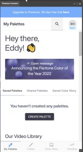
BTW: the solution Pantone suggests replacing the standard libraries in Adobe Creative Cloud is the Pantone Connect plugin. Which is a paid subscription, it will cost you about 60 US$ per year. But there is a free basic version available, which I installed and tested. Don’t. Don’t try it. It’s just awful! You will get a nervous breakdown trying to use it (or at least, I almost did).
The time is right to switch to ASE files for color exchange and CxF if your brand colors are precious.
Why is this important?
Brand colors are precious and many companies spend a lot of effort and money to secure a faithful representation, reproduction of their brand colors. For a very long time, Pantone libraries were used as the reference. But Pantone colors can not be used as a unique color reference: individual color guides can have relatively high deviations, digital libraries can change. There is a need for a much more rock-solid solution. CxF and the associated ASE files can deliver such a solution. With the announcement that the Pantone libraries will disappear from future updates of the Adobe Creative Cloud, the time is right to switch to that more solid solution. Your brand deserves it.
IMPORTANT UPDATE (03/11/2022): if you care about brand colors and want to be independent from Pantone libraries, check the new Project BBCG – a Better Brand Color Guide! A free framework for rock-solid brand color definitions, more print-safe CMYK conversions and easy brand color exchange: using .ASE files.
PS: WhatTheyThink.com last week published an interesting article, by Dan Gillespie, Director of Technical Services, Alder Color Solutions. This part surprised even me: “Most folks don’t realize that the Pantone libraries that have been included in the Adobe Creative Cloud apps for more than eight years now are much older versions than what is available today. For example, the Coated and Uncoated libraries were last revised by Pantone in September, 2019 (v4)—but these updated libraries were never included or updated within Adobe Creative Cloud apps.” [sigh]
(emphasis mine)
Great post Eddy.
shifted significantly….. Don’t. Don’t try it. It’s just awful! You will get a nervous breakdown trying to use it (or at least, I almost did…..
Well that’s outstanding summery regarding PANTONE these days!
Thanks JW! 🙂