

It’s a controversial topic, but we need to address it. And now is the right time: do we still need visual, on-site press checks (press approvals)? Is it still necessary for a print buyer or brand owner to travel to a printing company and give guidance to achieve the desired print quality? Let’s take a deeper look at this!
CONTENTS: The origins | The rules of a press check | Anecdotes and horror stories | Special tactics | Karat Digital Press | The uncertainty principle of visual color evaluations | The way to go: CxF and spectral measurements | Why is this important? | Updates
IMPORTANT UPDATE (03/11/2022): if you care about brand colors, check the new Project BBCG – a Better Brand Color Guide!
And the first question is: why did we get press checks in the first place? Where did this habit originate? Well, let’s go back three or four decades. Those were the days when there was no standardization at all. Ink sets were not standardized (meaning: the CMYK inks from vendor A looked different from the CMYK inks from vendor B), procedures were not standardized, many (or most?) printing companies didn’t even have a densitometer to check the printing process. In many cases, prepress houses made printing plates (for flexo, that’s often still the case, but offset plate production has been done inhouse for a long time already). And I probably forget multiple other variables in the process.
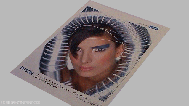
Unless there were printed proofs, that is: printed with the same inks as the press run, and on the actual substrate, the printer had no idea what the print should look like. Even the first proofing systems didn’t exactly look like the actual print: Cromalin proofs were very glossy, with vibrant colors. And those were e.g. used as proofs for magazine or even newspaper ads…
In those days, the printer probably needed guidance to achieve the desired colors. And that guidance was given by a professional, someone who understood the printing process, the variables. A peer to the press operator.
A lot has changed since then. Printing has become highly standardized (and as a result, both quality and consistency improved significantly), process control tools are accessible for everybody (you can buy a spectrophotometer for 300 US$!), and proofing systems are much closer to the actual print.
The rules of a press check
When doing press checks, some rules apply: the international standard ISO 3664:2009 – “Graphic technology and photography — Viewing conditions”. 2009 indicates the year of the most recent revision (it seems experts are working on an update at this very moment).
The most important aspect of this standard is that you have to use the right light. Which is D50, and the general CRI (color rendering index, kind of the ‘reliability’, the conformity of the spectral power distribution of the light source) should be 90 or higher.
But that’s not the only rule… there are others that some people tend to forget.
ISO 3664 also distinguishes P1: ‘critical comparison’ and P2: ‘practical appraisal’. The difference between the two is the amount of light. For P1, this should be 2000 lux (+/- 500); for P2, this should be 500 lux (+/- 125). P1 is what you will see at the printing press: with this amount of light, the press operator can see even the tiniest color difference. P2 is what the print buyer should use: he/she should make a practical appraisal of the print quality: does it look good?

And there are even more requirements, one of my favorites is the neutral surroundings (art. 4.1.5): “The visual environment shall be designed to minimize interference with the viewing task. (…) Walls, ceiling, floors and other surfaces that are in the field of view shall be baffled or coloured a neutral matt
grey, with a reflectance of 60 % or less.” And for this one, I’ve seen many mistakes. Because this not only entails the walls, it also includes the clothing! That might seem silly, but it isn’t. Clothing will reflect the light, and if you are wearing a vibrant red t-shirt and you are too close to the print samples, this will change the light that falls on the print samples a little bit. Below is an animated gif of a test I did a long time ago. One of my former colleagues put on different jackets (if I recall correctly: black, fuchsia, red and yellow), then he looked at a print sample as if he was checking the quality. I took a picture each time. Look at the paperwhite and the skin tone, how these change!
It’s absolutely dull (sorry, that’s just the way I am), but when doing a press check, you should wear something neutral, like a grey coat.
I’ve also seen quality rooms with grey walls (good!), but a colored border about 20 cm high just above to table where the samples were put (bad!). And quality rooms next to an outdoor window, with a lot of daylight coming in.
Anecdotes and horror stories
Those anecdotes about the quality rooms are just minor ones. I’ve seen a lot worse. And they really make you question if visual press checks are (still) a reasonable thing to do.
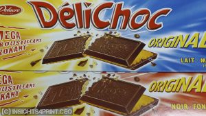
It might be my favorite one: the Délichoc case. I’ve shown this picture many times in training sessions, and one time, during lunch, the sales manager of a packaging printing company approached me: “Do you want to know the story behind those Délichoc packages? They were printed at our plant.” So, he told me the story. The dark chocolate version was the first one to be printed. The Délichoc product manager did the press check for this one, but she prefers milk chocolate. So, for her, chocolate has to have a light color to look delicious… Therefore, the dark chocolate package became much lighter. The milk chocolate variety was printed the week later. The product manager couldn’t attend the press run, so the press operator decided on the color. And guess what: he preferred dark chocolate. And so, the milk chocolate became darker. I found both packages next to each other in the supermarket. The sales manager added that he had seen a vast shift in print buyers over the years: from print professionals to people with no background in print. As a result, the only thing they could discuss was price…
Another one involved some doing a press check, signing off the ‘OK sheet’, but rejecting the complete run when it was delivered a few days later. The reason: it didn’t have that nice, shiny gloss anymore! The ink had dried, losing that shiny gloss…
The different gloss isn’t the only thing that can change during drying: also the color as such can change! In my previous job, we were involved in ISO 12647 certification. One time, we checked some samples from a large order printed in the South of Europe, the samples were flown in by plane. They were within the specified tolerances. Several days later, the rest of the print job arrived via road. When some samples from that part of the job were checked, it seemed that while drying, the colors had shifted a few dE00…, making them fall outside the tolerances. So, the colors can shift, unless you are doing a press check with instant drying (e.g. UV). That’s a reality.

A famous photographer always wanted to do press checks for his books late afternoon, and he always took the samples outside: with the sun descending, the reds looked the nicest…
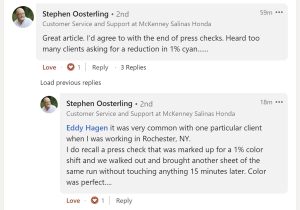
In a recent LinkedIn discussion, several people added interesting anecdotes. Among which: a customer demanding a 1% increase in the cyan (you won’t notice that). Another one had a regular customer who came in wearing pink (!) glasses, all the time, also when checking color quality.
Special tactics
To function properly and not lose money, printing companies sometimes adopt special tactics. A packaging printing company that got very tight tolerances imposed (1 dE!), handpicked the samples sent to the customer. Some printing companies prepare special sets of samples for a press check: first, they will give a bad one (a setup sheet) to the printer buyer (“You messed up again! Awful!”), then they provide a better one (“Ah! That’s better, but you still need to adjust this a little bit, but glad you listened to me!”) and the third one is the proper one, the one that is representative of the print job. Which might already have finished the day before.
And you know what: I can’t blame printers ‘cheating’ this way if they are dealing with customers who lack any knowledge of the process and its variables, who have no clue of normal variations, whose brand guides are flawed, whose color guides are flawed. The profit margins in the printing industry are already relatively thin, and the cost of the packaging substrates easily exceeds half of the total cost of the print job. So, every sheet, every meter substrate wasted on baseless demands for color adjustments brings down that already thin profit margin. In many cases, press checks are more about power than about color quality.
Karat Digital Press
And my last example shows that perfectly. Do you remember the Karat Digital Press? This was a cooperation between prepress technology vendor Scitex and press manufacturer KBA. They had developed a new concept for an offset press, which would very consistently print the digital jobs sent to the press (it was offset, but had digital plate imaging on press: DI, direct imaging). I attended the global introduction of this new kind of press. The speaker from Scitex in detail explained how it worked and why color corrections should be done in prepress, not on press. Doing it on the press is, with a fully standardized printing process, not necessary (even counterproductive) and way too expensive. It’s much more interesting and cheaper to do this in (a standardized) prepress.
At the end of his presentation, he asked if there were questions. And there was one, from the only person in the front row, a person with a vibrant green suit. His question: “If I want to come to the printing company and do a press check, how can the colors be changed on the press?” [sigh… double sigh] The Scitex person had done a great job explaining why this should be avoided, why design and prepress need to do their part of the job so that nothing needs to be changed on press… But this person, a print buyer, still wanted to influence the printing process! It’s all about power… And guess what: KBA changed the design of the press! They added a heating/cooling element to the inking system, so that by changing the temperature, they could slightly influence the amount of ink. A nice concept messed up by a power game.

(in this article you can find a bit more information on the Karat Digital Press)
The uncertainty principle of visual color evaluations
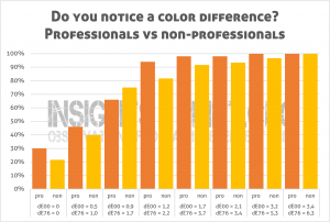
There is something called framing and priming, concepts from the exciting field of ‘behavioral economics’. And this is something that plays when doing press checks. Just the fact that a print buyer enters a printing company for a press check, makes him/her more critical about color. “It’s my job to find color differences!” And with that mindset, people see color differences even when there are none. And how unlikely that may sound, a color perception test that I designed and which included two identical samples, showed it. Nearly one out of three ‘print professionals’ claimed to see a difference between the identical copies. That’s how I got to my theory, ‘the uncertainty principle of visual color evaluations’: you can’t visually judge color objectively if you know you are judging color. That’s why we need to rely on measurements.
And to show the effect of that priming and framing, to show that I’m not making things up, the last anecdote: over a decade ago, a very large Dutch magazine publisher switched from physical proofs for advertising to digital proofs (PDF). Guess what: the number of complaints dropped drastically. The team addressing the complaints went from 1,5 FTE to almost zero, in no time…
The way to go: CxF and spectral measurements
Of course, some print products require decent quality control, more than advertising or most FMCG products. Last week I saw an excellent example of playing cards, where the extra set of higher value cards had a different color than the basic set (the basic set was printed in CMYK, the extension with a spot color). Also, wall and floor coverings need special care, as do hair colorings.
And specifically for those colors, the best way to go is CxF and spectral measurements. With the definition of your brand colors, your targets colors (e.g. a brown instead of K for hair colorings) as CxF, you get the most detailed description of a color. One that is not influenced by the wrong light, the wrong color t-shirt, or even colored spectacles. One that is not influenced by priming and framing. And every printer can measure the prints and compare these readings with the CxF color description. That’s why your brand colors, your brand color guides should be defined that way. If you take brand colors serious, you need to adopt CxF (and ASE files to communicate brand colors with designers).
There are multiple tools available at this moment that can track color, based on measurements, during press runs. They will also deliver a full report of the complete run, showing the variation, and compare these with the tolerances specified in the applicable ISO standards and best practices (e.g. PSO / PSD, G7). That’s the way to go. That’s how you will get the best quality each time, all the time. Objectively, not subjectively. And with that, you have my opinion on the basic question of this article: we don’t need visual press checks anymore. We need to apply the existing tools to follow up on print quality, as it happens, and report on it afterward.

You might disagree, or maybe I missed something. And if you do disagree: feel free to leave a comment! I won’t bite, I won’t censor! 😉 Please do mention your position, to know your background, the background of your views.
Why is this important?
Press checks have a long history, at one time, they were necessary to get the desired result. But the historical reasons for press checks have gone. In standardized print production, with international standards and best practices for every printing technology, there are much better ways to get to the desired print quality. It might be a leap of faith for some brand owners and print buyers, it might look like losing control, but when applied correctly, you will get more consistent print quality and even better reporting than before.
It kind of looks like 15 to 20 years ago, when printers and print buyers needed to be convinced of standardizing print production (ISO 12647). Some printers (and their customers) thought their ‘special sauce’ was making their print exceptional, but eventually, they turned out to have a lesser quality (smaller gamut) and higher waste (setup). Standardization brought them better quality and less waste.
And dear print buyer, you can still visit your printer from time to time, e.g. to have an excellent lunch, to celebrate the gains in quality and consistency.
UPDATE 02/04/2022: I got some feedback on this via a private message. Here is a short summary.
It concerns a large packaging printing company (a few dozen sites, about one hundred presses with various technology). About 90% of the jobs, the files used to come from outside prepress houses. With a huge variety of profiles used… (over 50) That used to be the problem. “There were more cases than not that the profile used to make the proof did not match our print condition, be it the wrong substrate (category) and/or a different ink system.”
They implemented G7 across all sites and technologies and reduced the number of profiles to a dozen, based on the ‘condition’ (stock, ink system, screening). “It worked great.”
With both the reduced number of profiles and the standardization of the printing processes, proofs became much more reliable, printers could meet those proofs. If not: the process had drifted. “But by no means should a customer be on-site to help correct that. And in general, there should be no need for a customer to do a press approval.”
“So, no, these days there should be no need for press approvals, in terms of ‘outside people’ coming in to approve color. I know some customers like to come in and tweak the color AWAY from the proof because they want to design on the press. That should not happen. (…) Presses should run to make a product, not be the final stage of the design process.”
So here is the advice of a large packaging printer: fix your design and prepress, use the right profiles for proofs and standardize your printing processes. This way, you don’t need press approvals.
UPDATE 13/01/2022: I just published a new article, which includes results from eye-tracking studies, showing how much time shoppers put their attention on a package. And it’s probably a lot less than you might think… If the time needed for a press check would reflect the amount of time a shopper looks at a package, there would be very few, if any, discussions between print buyers and printers anymore. Check out the article! You will be amazed…


Hi,
I especially love the ‘Anecdotes and horror stories’ part!
One of my favorite anecdotes is the colour check in cosmetics. Some customers apply the product (lipstick) on their skin (arm) and compare the colour to a digital proof under a desk light (sometime near a window)….
Thx! 🙂
Were the skin tones of these customers standardized? 😉
my career started behind a one-color small offset press and had to mix my ink by hand. I have experienced every kind of color mixing and associated control. when I finally had to deal with the color “white” as a consultant in the paper industry. from that moment on, all science and measurement methods were thrown into the trash, because even with a spectrometer you couldn’t achieve the result of the original. but the best part is that most graphic designers do not want to approach the original at all, but rather the combination of what can be achieved with ink and paper. of course mainstream printing is a product that mainly has to create the image that the marketing wants, but the paper color is now also in between. with a shortage of paper, other manufacturers are taken, which therefore give a different effect. and finally, judging by the press is also a culture thing that feels good, right?