

Did you ever hear about the concepts of ‘selective attention’ and ‘change blindness’? These are something weird, fascinating, intriguing. And above all: very real. And it probably influences how consumers behave in a shopping environment. Making it relevant for packaging printing.
CONTENTS: Selective attention, change blindness | Selective attention and packaging | An anecdote | An analogy | Why is this important?
Let’s start with a short video, which contains an exercise. It’s not as easy as you might think, make sure you are focused! If necessary, grab a cup of coffee first.
So, what did you think? And did you succeed? ?
Spotting differences or changes when you have a specific and other task is quite tricky, even for things that are hard-wired in our brain. Take a look at the next video.
This test was performed numerous times in different settings and the result was always the same: most people did not see that the person they were talking to was switched with another one…
Selective attention and packaging
And this is where it becomes relevant to packaging printing: what do consumers focus on when they are shopping? Finding what they need, within a short time frame. Or maybe detecting deals and discounts (when on a tight budget). But their focus is not on identifying small color differences in the brand color between individual packages. If the shape and color category look more or less right, consumers will buy the product. And btw, consumers: that includes you and me.
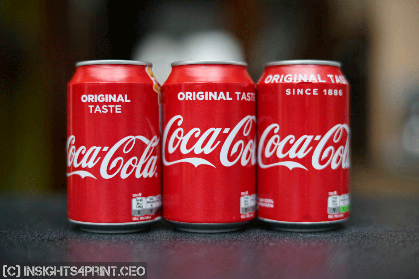
You might disagree, stating that you will always see even the smallest color difference in a brand color, also that delta E of one. After all, you are a color professional. Well, did you notice anything unusual about the image with the Coca-Cola cans while you were reading the previous paragraph? It’s not a picture, it’s an animated gif, showing between different versions of that image, every one of them with a slightly different red. At the end of the article, I show the two extremes between which the animated gif switches.
An anecdote
If you read the results of my survey with consumers on their shopping behavior, you will have noticed that there was two persons who had a different opinion when it came to color deviations. One of them I know him quite well, he works in the printing industry and he is also a – talented – amateur photographer, attending photography exhibitions regularly. When I visited the exhibition of Stephan Vanfleteren – a photographer who is world famous in Belgium – I noticed that at the beginning of his career, he used different types of paper for his black and white prints. Usually, it was a yellowish baryta paper, but there were a few pictures that had a blueish cast in the paperwhite. Once you notice it, it becomes obvious.
I visited the exhibition with a colleague of mine, she didn’t notice. And when returning home, I sent a message to the person from the survey. And he acknowledged that he hadn’t noticed the difference either… Even though he is ‘picky’ on color differences. But he was ‘off guard’ when visiting the exhibition, focusing on the aesthetics, the beauty of the photographs, not on color differences of the substrate.
Being a photographer myself, I checked my archive – which is a fancy word for ‘junk room’ – and I did find some old photographs, more or less from the same period. Most of them yellowish baryta paper, but also a few on PE paper, with a more neutral white (not the blueish from the exhibition). I checked the paperwhite: Lab: 89,5 / 1,0 / 7,5 versus 93,1 / 0,6 / 0,4. Which is above 6 dE00 color difference. And even the ‘picky’ guy from the printing industry didn’t notice.
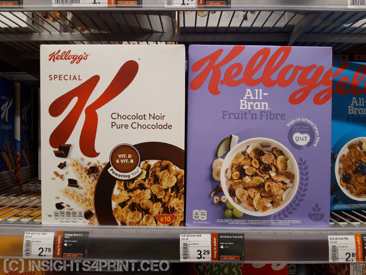
Below is also a picture from last week: look at the red of the Kellogg’s logo on the two boxes. They look quite different to me, but I guess nobody noticed, I guess it didn’t have any influence on sales. Why? Because of selective attention and being focused on something else: finishing that shopping list, finding those discounts you hope for.
An analogy
It’s like typographic errors in a text: when reading a novel, a newspaper, people won’t spot the difference between a hyphen (-) and an en-dash (–). But for a proofreader, it’s part of the job description to spot them. So proofreaders will notice them. At least while proofreading. When reading another text, especially when it’s not for work, it will – again – depend on the focus…
Why is this important?
We only notice differences when we are really focused on that specific property. In the printing industry, that’s color. But outside the printing industry bubble, that’s not color. In the supermarket, that’s retrieving the product we want in the wide variety of offerings, finding this week’s promotion. That’s why small color deviations don’t matter in real life.
PS: the animated gif
I shot a picture of the three cans of Coca-Cola. In Adobe Photoshop I changed the Hue (Ctrl+U): -4; +4; +6. The sequence of the animated gif in the article is as follows: 0; +4; +6; +4; 0; -4. And it runs continuously.
This is the one with switching between the extremes.

And the original one, using ten discrete steps to switch between the extremes. It starts with the ‘normal’ picture and runs continuously. Once you know there is a difference and you focus on it, you will see it. But only then…
I completely agree. The human brain is capable of dismissing typos in text when in “reading and gathering information” mode. It is also capable of dismissing color differences.
Still, I don’t recommend skipping proofreaders or depending on other color matching systems for your brand colors than the Spot Matching System.
If it is about presenting YOUR company, you want everything to be perfect. No typos, no color fluctuations. It will help you sleep better – and you are not open to being picked on by your peers who will use everything to get ahead.
If you are a student preparing an essay, it’s ok to include the occasional typo and picking any colors from any color palette for your headlines.