

The new Pantone guides have arrived! Designers probably celebrated this – additional colors to choose from!!! – but in the printing industry, the reactions were a little bit different. In just a few days, there were MANY complaints on LinkedIn about the lack of consistency between the previous printed guides and the new ones, even within new guides. Plus: those new ink formulations… Pantone is now using homeopathic level ink formulations (as low as 0,1%!).
CONTENTS: 500 colors | The First Wave | The Second Wave | Why homeopathic level formulations? | Why is this important? | Updates
When Lawrence Herbert launched the Pantone Matching System in 1963, it absolutely made sense, it was a big step forward. Those were the days when printing was not standardized at all, spectrophotometers were unaffordable, and printers mixed inks themselves, purely based on vision. The launch of the ‘Pantone Matching System’ was a blessing! For the first time, both designers and printers had a decent reference, for 500 different colors.
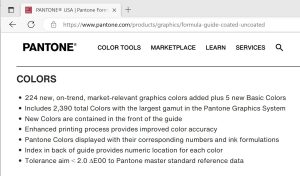
But over the years, everything has changed: print is now standardized, spectrophotometers have become within reach of even designers, and there is digital printing. Plus: Pantone has boosted the number of colors, from 500 to 2390! The latest edition added no less than 224 brand-new and ‘market-driven’ spot colors (their words, not mine). Designers might applaud this (more colors to choose from!), but printers are scratching their heads…
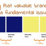
I’m not going to discuss whether we need those extra colors: they are probably very close to another color in the previous editions. I already showed that Pantone 2747 C and 2748 C are only 0,6 dE00 apart, 100 C and 3935 C even less: 0,25 dE00. Please keep in mind that printed products will always show deviations (between ideal value, proof, and the print run). A 0,25 dE00 difference between two spot color definitions is nuts. Plus, as shown in my previous article, tests with eye-tracking revealed that the total amount of time a consumer looks at a package while shopping is minimal: on average less than a second. Coca-Cola cans only got one-tenth of a second of attention!
But there are more important things to discuss…
The first wave
The first complaints I saw on LinkedIn were about the visual differences between the new and the previous version… I have to add here that Pantone, in the latest version, claims to have a “Tolerance aim < 2.0 ∆E00 to Pantone master standard reference data”. It’s just an aim, no ‘contract’. They don’t say how many colors are actually within that 2 dE00… While Pantone DID specify this in a previous version of that information. At that moment, they claimed about 90% of the colors were within 2 dE00 from the master color, meaning: they acknowledged that about 10% was outside 2 dE00. Which ones? I don’t know… do you? They probably changed that to a ‘tolerance aim’ to avoid this kind of discussion, or me nagging about it.
And in case you didn’t know, there is something about delta E: it doesn’t show direction. So, you could have a specific patch in one color guide that is 2 dE00 away from the master data in one direction and the same patch in another guide that is 2 dE00 away in the opposite direction, making the two patches 4 dE00 apart. Let’s round that <2 dE00 tolerance aim to 2 dE00, then both guides are within tolerance, but will show a very visible difference between the two patches. And this might be a bigger variation than what a picky brand owner considers acceptable. I discussed this ‘chain of tool tolerances’ in more detail a few years ago.
The second wave
After the first wave of complaints about consistency, there was also a second wave: the new ink formulations. Pantone has added five new basic inks AND increased, in most cases, the number of inks you need to mix a specific color. All pictures I saw from an old one next to a new guide, showed multiple examples where at least one or even two basic inks were added. Even the iconic Reflex Blue is now a mixture… (see this post on LinkedIn)
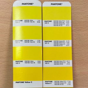
And there is even more: I quickly noticed that some of those mixtures are at a homeopathic level… The first I noticed was 101 C: 0,25%! So: 2,5 grams in 1 kilogram.
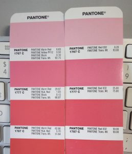
But it can be worse: 1767 C has 0,10% of PANTONE Black in it. That’s 1 gram per kilogram.
In case it’s a bit difficult to imagine, that’s like putting 1 gram of ketchup in 1 kilogram of mayonnaise. Got it? And now, ask yourself two questions:
1: how easy – or difficult – will it be to mix that ketchup in the mayo evenly?
2: will you notice?
Offset ink is a relatively viscous substance, ketchup and mayo are probably easier to mix than offset inks… And I would love to see someone calculate the color difference of 1767 C with and without that 0,10% PANTONE Black! I guess it is a very low, to extremely low dE00, in the decimals, or even lower. If you have ink-mixing software, please try this and leave your calculation in the comments!
ADDED 17/02/2023: this morning one of my contacts e-mailed me this: “Hey Eddy, yesterday at [name of event], I had the chance to talk to various ink manufacturer technical support teams. They all confirmed that the tiny amounts of ink specified in the recipes are absurd because they are well below the tolerance of their weighing instruments used for mixing.” Wow. Just wow.
Why homeopathic level formulations?
One wonders why Pantone would choose such formulations. I see two possibilities.
The first is a simple one: with more basic inks needed to mix spot color inks, ink sales, and therefore income from license fees for Pantone might increase (on condition the amount of spot color inks used by printers stays the same). I also wonder what the influence of these small amounts will be on ink waste: you need to clean the equipment… And how long will that bucket of low-percentage inks last? Will it expire after a while? Will it create an ink film on top that you have to discard? Not friendly for the environment AND the finances of a printer. But it might also increase ink sales, benefitting Pantone’s bottom line. Because that’s what it might be all about: improving Pantone’s bottom line.
The second: there is a disconnect between the – probably very clever – color scientists at Pantone and real life. More specifically: how print shops handle spot color mixing. In a theoretical color model, these formulations make perfect sense! That 0,10% PANTONE Black will indeed get the formulation that tiny bit closer to the ideal value, to the master data. But try to get that right if you want to mix a limited amount of a spot color, e.g., 1 or 2,5 kg of ink… And even in a large batch, it will not be easy to evenly distribute that 0,10%; even with a batch of 100 kg, that’s only 100 grams of that black ink.
And this is the same story I’ve highlighted before: clever people can forget something very practical: real life and deviations in real life. That’s what I explained in this article, called ‘Brand colors and printing in CMYK: Better Safe than Sorry‘. That’s why in Project BBCG – A Better Brand Color Guide, we insist that people do NOT rely on automatic conversions to define the CMYK equivalent for a brand color, but try manual tweaking with a few realities in mind: the fewer inks, the better (using GCR: gray component replacement); staying away from low percentages; turning close to 100% into 100%.
The Project BBCG tutorial explains this in great detail, including many visual samples to explain the different concepts and why these are important for consistent brand color reproduction. The tutorial is available in multiple languages. Project BBCG also shows how brand colors can easily be exchanged with creative people: via ASE files, which are an excellent way to exchange color palettes in Adobe CC applications. A sample ASE file, and for the color geeks: a CxF file, can be downloaded from the project website.
Why is this important?
Once again, we see why we need a different approach and get rid of Pantone colors as a brand color definition. We need a framework based on science, common sense, and the tools you already use. Project BBCG brand color definition is based on measurements (Lab values), proven principles such as GCR are used to optimize the color conversion to CMYK, brand color definition exchange via ASE files. Everyone can do this! Everyone benefits from it: brand owners, designers, and printers.
BTW: the Better Brand Color Guide also includes other factors influencing color appearance (e.g., coating and tinted papers). You should specify upfront what is allowed and what is not if you want better control of a brand color.
PS: Have you ever checked their website’s ‘About Pantone’ section? This is the first sentence: “Pantone provides a universal language of color that enables color-critical decisions through every stage of the workflow for brands and manufacturers.” (bold is mine)
Can you read that without laughing? Or feeling angry? Or maybe their definition of ‘color-critical’ is slightly different from the definition of most, if not all, brand owners…
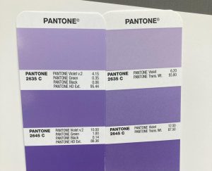
UPDATE 16/02/2023: If you think 0,10% is extreme, look at this picture, at the formulation for 2635 C, that has 0,06% of PANTONE Black in it! That’s 0,6 grams per kilogram! Really Pantone, really??? This is a joke.
(Picture shared by Darren Lightfoot on LinkedIn)
UPDATE 17/02/2023: 2 days ago I posted the image above on LinkedIn, which turned into a very active thread, with lots of discussion. After only 48 hours, the post was viewed over 23.000 times, was reposted 21 times. Kai Lankinen made a nice summary of the most important topics. And this one made me proud…
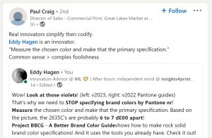
UPDATE 17/02/2023: Look at this article by Matthias Betz: he found several ink formulas that must be incorrect! Pantone 107 C and 108 C have the same ink formulation! Exactly the same! How is that possible??? And that’s not the only ‘duet’: 113 C and 114 C; 106 U and 107 U; 108 U and 109 U; 113 U and 114 U. After posting this, Ingi Karlsson noticed that 1767 C has Yellow PY 12 in it, while 1777 and 1787 have Rubine Red (see picture above). And probably there is also something wrong with 100 C and 101 C (in the second the values of Opaque White and Yellow PY12 are probably switched).
UPDATE 12/03/2023: Matthias Betz made another interesting comparison: the Pantone Color Bridge guides from last year and this year. Guess what: differences up to 7,01 dE00 between the ‘same’ solids… And he only compared one page… Check out his article!
UPDATE 12/03/2023: And you might also want to check this LinkedIn post by James A. Wallace, who compared a Pantone guide with an X-Rite SpectroProofer passed proof. Check that 7633 C…


Hey Eddy
I am looking at the new recipes and trying to figure out if there is a linear relationship between the “base” colour on the page and the variations. It is strange that in the top colour, they seem to replace Rubine Red with Yellow PY12, – which ruins that hope for me – i.e. that Printers might make their lives easier by mixing a base colour and then just add either Black or Transparent – so at least the SHADE is correct. Could you take a picture of a few full pages for me so I can have a closer look?
You mention those very clever scientists. If they are so clever, they would have figured out that their very clever software can calculate a LAB value from a recipe, just like it can calcuate a recipe from a LAB value. If they had stuck to the original method of building the system from PARTS (16 parts – like they used to), they could have added the new base colours and used the old approach to add them to the system, still enabling Printers to mix the colours using whole numbers – typically making the minimum amount required to mix a base colour for each page 160 grams.
If you have an old Pantone guide that still contains the PARTS (Pt.) from 1 to 16, you can see for yourself that on each page, around the middle section, there is a base colour that can be used to mix the other colours on the page.
Those are the colours I used to mix and keep in stock, to make it quick, easy and safe to mix the other colours, just by adding either Transparent or Black. I am sure I am not the only Printer that used to do this.
Thanks Ingi!
The pictures I showed, are not mine. I don’t have the new guide (and don’t intend to buy one, since I don’t have a use for it).
And there is also the option that the clever color scientist were given the explicit instruction to create new formulations that would result in printers needing to replace their current stock of ink, not just a small extension to the old formulations…