

Pantone has launched a new color guide with even more colors than before, but only in CMYK, the Pantone CMYK Guide. Their information states that many of these colors are kind of ‘in between’ the standard Pantone spot colors, especially where the spot colors are more than 2 dE apart. My first reaction: WTF are you doing! Have they never heard of tolerances in print? It is virtually impossible to get print jobs in the narrow tolerances that this new guide implies, unless you spend a massive amount of time and pay a lot of money. If you ask me: Pantone is selling an illusion. And it’s not their first fault with launching new color products…
CONTENTS: Pantone CMYK Guide | Three strikes… | Alternatives | And one more… | Updates | Why is this important?
IMPORTANT UPDATE (03/11/2022): if you care about brand colors, check the new Project BBCG – a Better Brand Color Guide!
When Pantone launches a new product, I’m always a bit suspicious… I have a history with Pantone products, especially with flawed Pantone products. I’ll get into that later in this article. So when I saw in my LinkedIn newsfeed that they had a new Color Guide, I immediately started looking at it. And it didn’t take more than one minute to find the flaw: it’s selling an illusion. Let me explain.
To quote the website: “Just think of it – the Pantone CMYK Guide offers an incredible 1,889 coated and 1,653 uncoated unique colors that have no Pantone Spot Color equivalent less than 2.0 Delta E.” Yes, I thought of it, and got nightmares. So, these colors are kind of ‘in between’ Pantone spot colors, they are closer than 2 dE apart (BTW: which dE?). Pantone implies with this offering that you can accurately reproduce colors within a margin that is much less than 2 dE. If you can’t accurately reproduce them with a margin much lower than 2 dE, it doesn’t make sense to launch such a product, doesn’t it?
Pantone states the Pantone CMYK Guide is printed according to G7, which is a good standard, no bad word about G7. But have you ever looked at the tolerances that G7 specifies? Well, look at the table below…
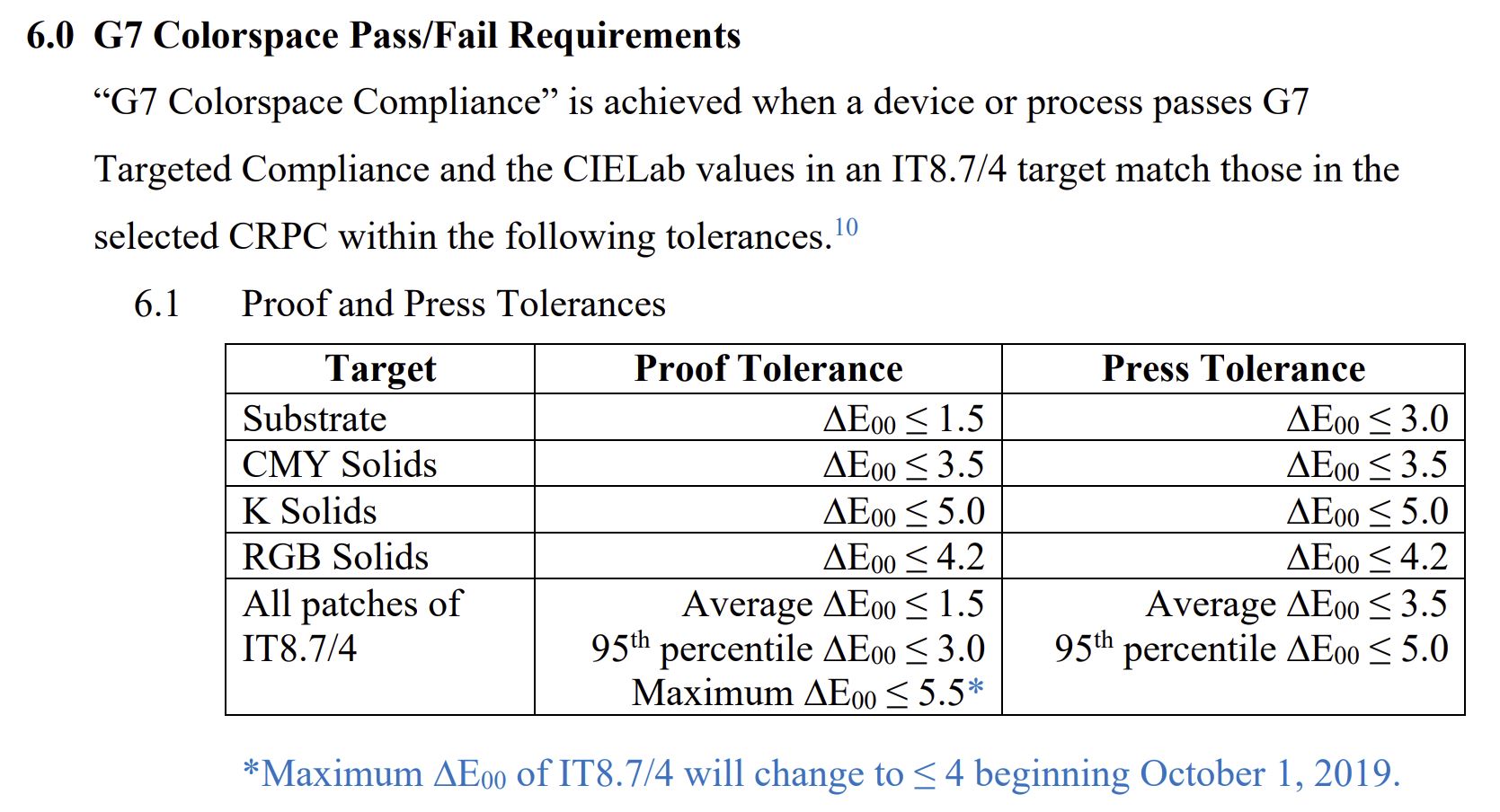
As you can see, the standard Pantone used for the printed version allows a higher tolerance than the colors in the guide are apart. Which means – in case you didn’t figure it out already – that the color you will see on paper might be closer to another color in the digital or ideal version… Printers will know this, they have to live with that reality every day. But brand owners, print buyers and designers might not… And that’s why I’m so mad at Pantone. They are making the life of printers miserable by implying things that are almost impossible to achieve (unless you have a significant budget, time and resources).
You could compare this to a chemical company starting to sell its product by the kilogram instead of per 10 kg, but still using scales having a tolerance of 3 kg… One bag labeled 54 kg might only contain 51 kg, another one labeled 52 might have 54 kg due to that tolerance. That doesn’t make any sense! Nor does this Pantone CMYK Guide.
BTW: if they printed their guides according to G7, what is the tolerance between the perfect color and the printed version? And what about the tolerances between individual copies of the guides? I asked these questions as a comment on their LinkedIn post. One day later, I still didn’t get a reply… (UPDATE: a few hours after publishing the original article, they did reply, see the update below!)
Three strikes…
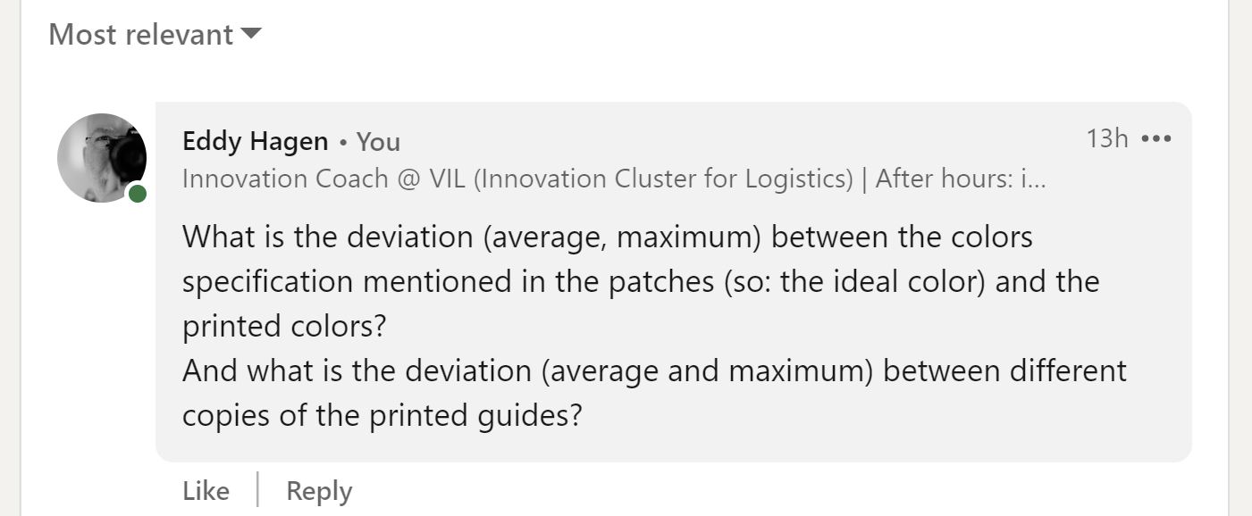
And this isn’t the first time I had an issue with Pantone. If you have been around long enough, you might still remember the Pantone Goe color system, launched in 2007, at GraphExpo. It was flawed: it had RGB numbers next to all the colors, but they didn’t state which RGB… AdobeRGB (the most common in prepress), sRGB, the more exotic ProphotoRGB, or even another one? When I asked a Pantone representative at their booth for more information, I was treated as if I were an idiot. He was unbelievably arrogant, I had dared to question Pantone in their color knowledge! I send out an open letter the same day, which was covered in more than 100 magazines (here’s one that is still online). Only then they noticed, or acknowledged, their error and immediately started changing the (online) documentation. But the printed guides did not mention that it was sRGB…
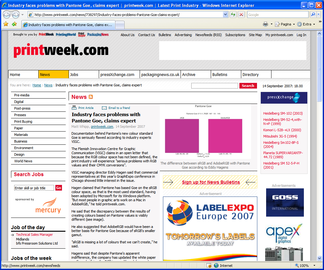
Two years later, they launched an iPhone app, myPANTONE, implying that designers could use this as their reference, this was the headline of the press release: “myPANTONE iPhone Application Puts the Power of the Entire PANTONE Color Library in Your Pocket”. When putting two iPhones next to each other, with the same patch on the screen, the difference was huge. Once again, only after showing this to the print community, they adjusted their claims: it was not a reference for print, but only to have an idea of what the color would look like… Really?
A few years ago, I asked printing companies to measure four patches in their copy of the Pantone spot color guide. And even when looking at the guides that were still under warranty, most of the measured values were outside the tolerances that Pantone specifies (being: 2dE00 for about 90% of the colors; so about 10% is outside that 2dE00: do you know which colors? I don’t.). More on that in this article.
So, this new guide isn’t the first flawed product. And what is really bad: designers, print buyers and brand owners have an unconditional trust and believe in the Pantone products: for them, it is The Absolute Truth. And that makes the life of printers miserable: designers, print buyers and brand owners use flawed references and demand unrealistic tolerances. This needs to change!
Alternatives
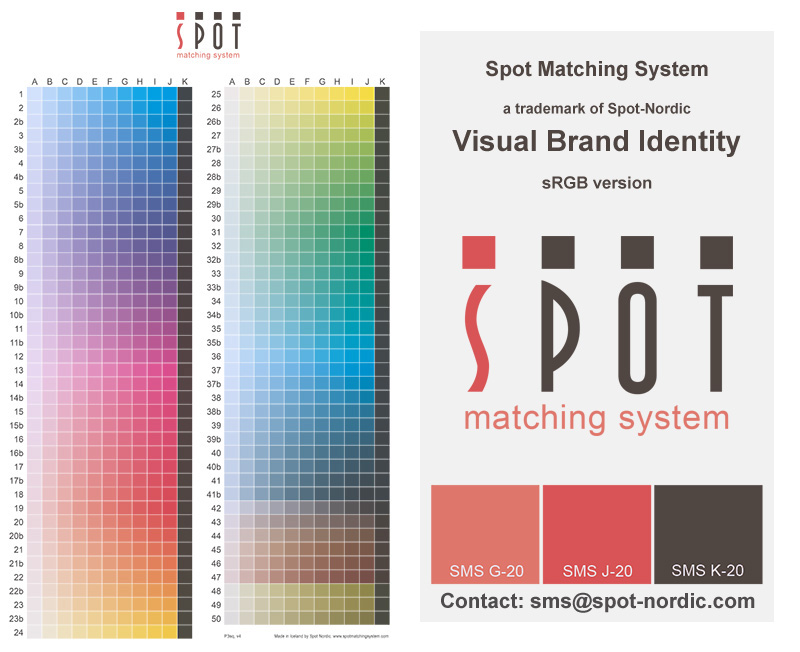
There are alternatives to the Pantone guides. When looking at reproduction in CMYK, check out the Spot Matching System from my friend Ingi Karlsson and his company Spot-Nordic. SMS is a system designed by a seasoned printer, someone who understands the ins and outs of the printing process. And he doesn’t offer an unrealistic amount of colors: with the number of colors the Pantone CMYK guide offers, they are so close together the difference is futile (see this article). You can also check out this ‘Getting started guide’.
Of course, you could also go to a science-based system like the Munsell Color System or NCS (Natural Colour System) and convert those colors to CMYK.
And one more…
I can’t share the details yet, but Michael Abildgaard Pederson, associate professor at DJMX, has analyzed the Pantone Extended Gamut system. Pantone claims that this system can accurately reproduce 90% of all Pantone Spot colors (PMS) by using seven process colors (CMYK+OGV). He will present his findings at the IARIGAI conference in September. Guess what… [sigh]
UPDATE: Michael has published his results!
Why is this important?
Color is important. (*) But to be able to provide accurate color reproduction, all the tools need to be of a certain quality and should take into account the magnitude of natural variations in the process. Once again, Pantone has proven they lack sufficient, ‘real life’ print production knowledge. Or that they just don’t care.
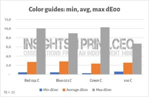
Unfortunately, designers, print buyers and brand owners have an unconditional, almost religious belief in their Pantone guide. Their specific copy of a Pantone guide is considered The Absolute Truth. Although the printed guides have to deal with the same realities as every other print: variations in print production. It doesn’t make any sense to design a color system with colors closer to each other than what is considered normal, acceptable tolerances of that process. In the case of G7 and the color patches of the IT8.7/4 test chart (you could call that the print geek color guide, with 1617 patches): an average of max 3,5 dE00, 95th percentile: max 4,0 dE00.
Why Pantone, why?
(*) Color is important, although maybe not as important as some people think, see my TAGA presentation on Brand Color Tolerances, A Reality Check!
UPDATE 27/08/2021: Pantone did reply to my comment! Here it is:
I added the following reply to it (in case they should delete it, I also made a screenshot 🙂 ):
“Thanks for the reply!
I wasn’t referring to proofs, but to the printed guides when talking about the difference between the ideal colors and the printed ones.
But let’s work with the proofs: since dE doesn’t show a direction of the color deviation, you could have two proofs, both just within 2 dE00 of the ideal, but comparing them to eachother, with almost 2 dE00 in the opposite direction, that would be almost 4 dE00 apart. But the colors you specified are less than 2 dE00 apart! So the proofs could show another ‘number’ (or color) in your guide. That’s not reliable as a reference.
When looking at the tolerances for printing G7 (the one for all patches of IT8.7/4), that’s max 3,5 dE00. So you could have two valid G7 prints that are 3,5 dE00 off from the ideal and 7 dE00 apart…
I’m sorry, but specifing such a ‘standard’ or ‘reference’ with colors much closer than the tolerances in print, is just nuts: https://www.insights4print.ceo/2021/08/is-pantone-selling-illusions-and-making-the-life-of-printers-miserable-by-doing-so/
BTW: did you just imply that you don’t check color consistency of your color guides during the print run? Did you state that you only sample, measure the print quality AFTER haven printed them? Ask any designer, brand owner, print buyer that uses your guides on a daily basis if (s)he would be OK with this kind of procedure… They would never buy a product you printed.”
UPDATE 27/08/2021: I got the following comment from a retired print professional on my LinkedIn post.
“I complained decades ago when the guide books lost their consistency. They were produced with higher volumes and less accuracy for both production speed and cost. Then I complained bc too many new in-between colours were created; this really didn’t help designers much but made a nightmare for printers. It seemed it was just a marketing money making scheme. It has become so convoluted; it’s ridiculous imho.
Corporate branding standard kits for logos and backgrounds made and sent to selected printers for worldwide consistency helps alleviate some of this trouble; Pantone should know better than this proliferation nonsense. Just saying.”
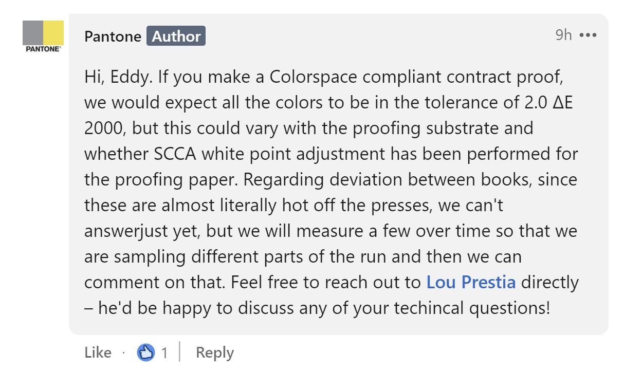
UPDATE 01/09/2021: On LinkedIn I got the following response from a Pantone specialist:
“HI Eddy. We don’t know yet since we have only measured one guide. We’ll work on measuring another one so that we can tell you what we find, but our standard procedure is to pull a sheet about every 200 during the run and check them against the ok sheet. We do this visually since we can’t measure all the colors fast enough during the run, but the visual match from approval sheet (that we did already measure) and the sample pulls appeared to be very consistent.”
My reply:
“Thx for your answer.
I assume the CMYK guide is printed on a 4 color offset press? It was mentioned that the guides complies to G7. Doesn’t G7 require to add a control element (press bar) to the print form? To be able to perform real-time control of the basics? So, I assume you should be able to give the deviations of the basic test targets during that press run…
Or did you really only do a visual check?
BTW: companies like e.g. X-Rite have excellent software to provide nice reports, with the basic stats of a G7 print run: https://idealliance.org/wp-content/uploads/2021/03/G7_PressControl_ADS_ITX2Pro_eXactAutoScanPro.pdf This is the kind of reports that your principal customers, demanding designers and print buyers, want from their printers.”
UPDATE 08/09/2021: I might be asking difficult questions: almost a week after the last question and remark, still no answer from the Pantone specialist…


Interesting and depressing
Nice and important job Eddy
Pantone apparently lives in a parallel world
Thanks Michael! Appreciate it!
And looking forward to your study on the Pantone Extended Gamut system!!!
Thank you for the mentioning of SMS while I feel sorry for PANTONE. Perhaps they should just stick to what they know best – spot colours and communication of spot colours and leave the CMYK colours to me 😉
Good piece again Eddy. Using the Fogra 53 CMYKOGV exchange profile and a nice tool within Alwan ColorHub and a older Pantone solid coated v2 cxf file I get 84% of colour within 2 De2000. Guess that may be a lower figure with the later Pantone solid range.
Thanks Paul!
I’ve shared your findings about CMYKOGV with Michael Abildgaard, he might get in touch!
Hi Eddy
I will send you the full report vie email
Great! Thanks Paul!
As always a very interesting article. Lovely approach Eddy.
Thanks Steve!
Is that SMS website dead? I see many dead linsk amd design looks from the 90s. I see this article is quite new, but cant really find info about libraries on their site
I am sorry. I just saw this comment. The SMS website is alive. I would check out http://www.spotmatchingsystem.com/gettingstarted. This page focuses on SMS for designers primarily.
Hi Eddy, I think that Pantone was the worst thing that ever happened to four-colour printing. All of these lovely colours that you could call up on your Mac that were more or less unachievable with CMYK, just because there was no agreed “colour book” for CMYK printing (the publication gravure printers each had their own colour book, and would be proud of e.g. their blue skies and seas if they printed travel agent brochures, etc.). Crosfield tried to push a colour swatch system called FoColTone (presumably for “four-colour-tone”) for a while, but I don’t think anything came of it. The Pantone colour swatches were intended for selling Pantone inks to make spot colours. There’s a similar thing in Germany called HKS, where HKS is the abbreviation of three German ink manufacturers: Hostmann-Steinberg Druckfarben, Kast + Ehinger Druckfarben, and H. Schmincke & Co.
Thx George!
And Pantone was not only the worst thing for four-color printing, also for spot color printing, once they started to change libraries, create more and more colors (which means: colors closer and closer together).
I know Focoltone (by name), but didn’t know it was from Crosfield and certainly didn’t know the (presumed) origin of the name. Interesting!
I don’t believe Focoltone was a Crosfield product, I understood we were just pushing it because it was compatible with CMYK and so the colours were printable with our separations. If you worked in a centrally planned economy, there were other solutions: in the DDR, commercial artists had to use crayons etc that had the same pigments as the gravure inks — problem solved.
Ah, ok! Thanks for the clarification!