

Printing in color, when looking at commercial printing, is these days highly standardized in CMYK, worldwide. And even packaging and labels are moving towards a fixed color set. However, there was a time when printing in color was most of the time equal to using spot color inks: a specific ink for every color. A time when printing in CMYK was an exception, a luxury product. And that time is not that long ago, I can still remember it. In those days, ‘color guides’ like the Pantone Matching System originated. But times have changed. Printing in CMYK is the de facto standard for commercial printing, spot colors are the – expensive – exception. And with that in mind, it might be time to rethink color guides. Swatchos is a recent initiative that deserves your attention. SMS goes one step further: an ‘integrated’ system, with ‘qualified printers’.
CONTENTS: History | Swatchos | SMS (Spot Matching System) | But I want more colors! | Why is this important?
IMPORTANT UPDATE (03/11/2022): if you care about brand colors, check the new Project BBCG – a Better Brand Color Guide!
When Lawrence Herbert launched the Pantone Matching System in 1963, it absolutely made sense, it was a big step forward. Those were the days when printing was not standardized at all (the first Euroscale standard dates from 1971, the work on SWOP started in 1975), and color measurement devices were inexistent in printing companies. Color inks were often mixed by the printers themselves, purely based on vision. So how could you communicate that you wanted a specific red? That’s the issue Lawrence Herbert solved with his ‘Pantone Matching System’, a ‘color communication system’ with 500 colors. A guide produced on a unique offset printing press, specifically built for this purpose, with special inks on special paper.
Over the years (or better: decades), printing has changed significantly. All printers now have (or should have) color measurement devices. And, except for packaging and labels, almost all printing is standardized to CMYK. And to worldwide accepted standards. As a side note: that wasn’t the case when I started in the printing industry in 1988: every region had its standard… In Europe, e.g., that used to be Euroscale.
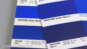
Thanks to fully digital prepress, standardization, automation, and in-line color control, we now can reproduce color much more faithfully than in 1963. And with those color measurement devices, we can now describe colors in a scientific way, not just by a name or a number in a proprietary system. A name of which the actual color can change over time, look at the Reflex Blue in the two examples below.
Over the decades, the number of Pantone colors has grown significantly. Currently, the Pantone Formula Guide (spot colors) has 2.161 colors. The in 2021 ‘refreshed’ CMYK Color Guide contains 2.868 colors. It’s that refreshed CMYK guide that I wrote this article about.
Given the worldwide standardization of print and the ever-growing number of Pantone colors, which become closer and closer to each other (see below), it’s time to look at alternatives.
Swatchos
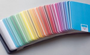
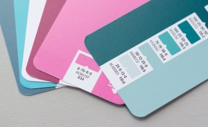
Recently I found out about Swatchos, thanks to one of the readers of my blog. It’s a simple alternative to Pantone. It is a card deck of 129 cards, all with a basic color and six variations of that color on the back, totaling 903 colors. What is nice about this system, from the point of view of a designer, is that it comes as a deck of cards, which makes it much easier to check combinations than with a Pantone guide, where everything is joined in one guide.
And what is even nicer: it is printed in CMYK, according to ISO 12647-2, the FOGRA39 profile. It’s not a ‘special print job’ like the Pantone solid colors. It’s ordinary, everyday, affordable printing.
On the website, you can check the complete list of colors, you can even download all the colors as an ASE file, for free! So it is very easy to use them in Adobe CC applications.
And then there is the price… It’s about 45 euros for one deck… That’s very affordable.
Just one remark: you must dig down into the documentation to know which RGB is used… It’s sRGB. It would be better if this were mentioned everywhere they use RGB values, to avoid confusion (AdobeRGB is often used in prepress), to prevent mistakes.
SMS (Spot Matching System)
A system that I’ve already mentioned before, is SMS, the Spot Matching System by Spot Nordic. This system is also based on industry standards and their implementations (PSO, G7, …). It has a palette of 869 colors, which come in three versions: standard, ECO (eco papers), and MAX (coated papers), The reason to have three versions, is the difference in white point of these paper types. A digital version of SMS (sRGB) is EUR 60 per palette.
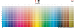
What makes SMS unique, is that it claims visual color consistency across ALL channels, not just print, but also web design, TV sets, and even AR… Also, the on-demand generated colors are without a noticeable difference in color when printed on coated and uncoated paper… The colors are tweaked in such a way that color consistency can be guaranteed. And SMS even offers a service to convert old logos to the ‘closest likeness’ SMS colors. Next to a CMYK bitmap file, these colors are also delivered as ASE files. This article shows you why that’s a big deal.
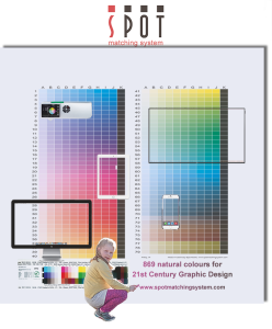
And what is also unique, is that SMS works with ‘certified printers’, in three levels (gold, silver, and bronze). If you, as a brand owner, define your brand colors with SMS and get your products printed by a certified printer, you are sure you will get the closest match possible. Becoming a certified print shop involves, among other things, an SMS crash course.
For more information, check the website! Or take a look at these two video interviews on Inkish.tv: first and second.
But I want more colors!
I hear you, dear designer, you love the fact that the Pantone guides have much more color patches. But beware: more colors isn’t a positive thing, on the contrary!
As I’ve explained in previous articles, there are issues with Pantone guides. With that many colors, some colors can be very close. How to pick and define that valuable brand color: a fundamental issue – insights4print.ceo So, you could end up with a fierce discussion about whether it should be 2747 C or 2748 C, which are 0,6 dE00 apart, a difference which you can’t hold in print.

As a consequence, you could end up in a situation where the printer did a perfect job (having smaller variations in print than the applicable standard for printing requires), but a difference that is higher than 2747 C and 2748 C are apart… Which could lead to (again fierce) discussions with your customer… And that’s something you want to avoid. That’s why you need to manage the expectations!
So, please, set the expectations right and don’t use guides with too many choices!
BTW: these differences don’t matter. It just adds complexity, confusion, and discussion. In case you haven’t read it yet, I recently published the results of my test with six Coca-Cola red variations. The main conclusions: 1) there is no agreement on what is the ‘right’ Coca-Cola red, and 2) the most popular choice is 4 dE00 apart from the color specified by Coca-Cola…
And if you want to mention often quoted studies about the importance of color, you might want to check this article. The claim that color enhances brand recognition is from the days when most advertising in newspapers was black/white; in that case, the use of color indeed enhanced brand recognition. And that often mentioned Loyola study? That’s about using color in Excel-like graphs, which makes interpretation of graphs easier. It’s not about minor color differences. It’s not about Pantone 2747 C vs. 2748 C.
And since we are on the topic of Pantone guides: the tolerances they use are 2 dE00 for 90% of the colors. Which colors are outside that 2 dE00, nobody knows… And a survey I did, with over 19 companies measuring four patches in their guides, showed higher deviations…
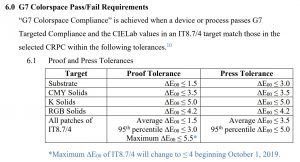
Also, their latest addition, the refreshed CMYK guide: the patches are ‘even closer’ than the standard Pantone spot colors. But it’s printed according to G7, which allows higher deviations, as shown in the table below.
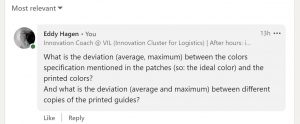
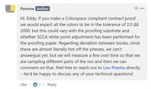
And when I asked the – yes, I know, rather nasty, but very justified – question what the deviation (average, maximum) between the ideal values and the printed values were, plus the deviations (average, maximum) between different copies of the printed guides, they replied that they didn’t know! So, Pantone couldn’t say how far your guide, dear designer or brand owner, can be apart from the one from your printer. Please reread that sentence, and think of the consequences in real life.
Why is this important?
Context matters. Also the context of why certain products were invented. When the Pantone Matching System was launched, it absolutely made sense: before the launch, there was no d/ecent way to specify a color. In the current conditions (a worldwide standardized printing industry), and with the current implementation of Pantone (many more colors, which are often too close together), it’s time to challenge the use of this kind of color guide. In that worldwide standardized printing industry, the context that led to the Pantone Matching System, doesn’t exist anymore. That’s why we should look at alternatives that work better in the current context. Especially now that the romance between Adobe and Pantone is over… Check out Swatchos and SMS!
IMPORTANT UPDATE (03/11/2022): and also check the new Project BBCG – a Better Brand Color Guide! A free framework for rock-solid brand color definitions, more print-safe CMYK conversions and easy brand color exchange: using .ASE files.
PS: A long time ago, I heard the following joke, which fits the situation I described above.
A mom was cooking sausages, and her daughter asked why she cut the two ends from each sausage.
“Ah! Good question, my darling. That’s a trick I learned from my mother, your grandmother!”
The daughter insisted: “But why mommy?
“We’ll ask her the next time we go visit her…”
So the next time they visited the grandmother, the bright young kid asked why she cut the sausages’ two ends.
“Ah! Good question, you are a bright kid! That’s a trick I learned from my mother, your great-grandmother.”
So, with again no decent answer, mother and daughter visited the great-grandmother. And the bright kid said that she saw her mother cut off the two ends of the sausages and had learned that it was a trick that originated with the great grandmother. So she asked again: “why?”
“What??? Are you still using a pan that’s too small???”
This is, of course, a joke, but it also happens in real life. I know a printing company where they used the CYK inks from brand A, but Magenta was from brand B. They had done that for a long time, it just was their habit. Until someone started asking questions (related to a standardization project). And only the person who was the longest with the company could vaguely remember they once (over two decades ago!) had an issue with a print job, with delicate skin tones, where they had a better result with the magenta ink from brand B. So they kept using it that way… Over those two decades, the primary ink colors have changed. They went from Euroscale to ISO 12647. The Magenta inks, e.g., are nearly 2 dE00 apart…
Very interesting article Eddy as always. Times they are a changing and Graphic Designers and actually all Designers need to go with the times if they want to develop. It is never to late to learn new things. We are at the dawn of the Metaverse so I would say that now is a good time to update your playbook and start using colours that fit in there, – as well as in the real world.
Interesting article. I assume that the SMS-system is more up to date and is very smart in providing the possibility to match color on coated and uncoated stock. Their services for logo conversion looks great.
What happened with the Belgian color system invented by Luc van Renterghem? It was introduced some 7 years ago as mycolorpassport and was used by some large printers of paper based packaging material. Did you ever look in that system from Antwerp?
Thanks Henk!
The Swatchos system was launched in 2021, so I guess this is still up to date. Why do you assume SMS is more up to date?
On the system by Luc van Renterghem. The company has been renamed to iVisual. Recently prepress house Athena Graphics took a participation in iVisual: https://grafisch-nieuws.knack.be/grafisch-nieuws/athena-graphics-stapt-in-kapitaal-ivisual/article-normal-1867529.html
I don’t know the details about their system, but the fact that it has 10.000 colors, doesn’t give me a lot of faith that this is a solution that is beneficial to printers… Already with the recent Pantone guides, the colors are too close to eachother, given the acceptable tolerances in print, one color could become another in print… And the iVisual system has about 3 times more colors…
I checked a few references, one of them is Bebat. This is how their brand colors are defined (scroll to the bottom): https://bebat.brandplatform.be/en/brand/primaire-kleuren Just the very basic fact that they don’t specify which RGB the numbers represent (sRGB or AdobeRGB), makes me wonder…
BTW: with this article I wanted to focus on CMYK-based color reproduction, not on spot colors. Except for packaging and labels, probably all other colors are reproduced in CMYK.
Hey guys. If I may jump in. Each colour matching system / colour palette has it’s advantages. I actually quite like the simple layout of the Swatchos system – and designers can actually hold the colours in their hands, which is cool.
Even if I am the creator of the Spot Matching System (SMS), I welcome all competition.
I think in the end it will be the users (not the printers but the designers) that will decide which system is best for design and print. I am betting all my chips on SMS but if I am wrong, that wouldn’t be the first time.
Perhaps you can find a neutral designer to test all systems, side by side, for a new brand that could give other designers an idea on which system to use. Of course we will also include the Pantone Matching System to keep this fair.
Lets say it’s for a brand that is paying millions of dollers or Euros so this time around the designer wants to find colours that should be visually consistent for all his chosen media on behalf of the customer. He or she should pick out paper to be used for printing marketing material and office material, build a nice homepage for the customer and then (depending on the size of the customer/brand) decide whether the brand needs to be presented in Newspapers, Magazines on Billboards and perhaps even on TV – and if employee uniforms and flags need to be made using the brand colours.
In the case of SMS colours, the customer would need to subscribe to SMS, which costs EUR 500 pr. year and all colour variations will be delivered to the designer on request plus technical assistance and communications with his manufacturers is included to ensure correct output of colours.
Thank you for revealing the unrealistic expectations created by the Pantone matching system. It always felt like a monopolistic color system created to be as expensive and exclusive as possible. For example, each year a new color swatch book would be released with new colors that were identical to older swatches, but renamed with new numbers. This simplified system offered by Swatchos using CMYK values and on an expandable card display keeps it all accessible.
Thanks for your comment Benjamin!