

When looking at packaging printing, ECG (expanded or extended gamut printing) is hot. Many people are talking about it, and the promises seem convincing: you can simulate much more brand colors with a set of up to 7 standard inks, with less waste and less downtime. However, ECG has not taken the flight predicted many years ago. Why? Let’s take a look and learn from lessons of the past.
CONTENTS: Some history | Limitations in the past | Current limitations | A way forward | Why is this important? | Updates
First, just in case you’re not around as long as I am, a bit of history. ECG is printing with more than the regular 4 inks (cyan, magenta, yellow and black), making the color gamut of the print larger. It is nothing new, we’ve known this for several decades already.
The first standardized ECG system that I saw was Hexachrome. This six-color system by Pantone was launched in 1995, almost 30 years ago… Next to the standard CMYK process inks, Pantone added Orange and Green. To be honest, I have no idea how successful it was. I did not see it that much in real life. I did see some pretty promotional prints, with colorful birds and oranges, but I think they never found the ‘sweet spot’ for Hexachrome. I think it was mainly promoted towards commercial printers, e.g., high-quality books. But not for the market where ECG makes more sense: packaging, where it could replace spot colors. This shows the difficult position of Hexachrome within the Pantone offering: it could cannibalize the spot color business of Pantone… Eventually, Pantone retired Hexachrome in 2008. According to Wikipedia (also) because Adobe no longer supported the HexWare plugin. Here is an archived Hexachrome product page.
![]()
But, the story from Pantone and ECG got a reboot in 2015, when Pantone launched Pantone ECG, which uses CMYKOGV, so CMYK plus Orange, Green, and Violet. Could that renewed attention to ECG be related to the acquisition of both Esko and X-Rite/Pantone by Danaher?
Another system from the past, with a slightly different approach, is Opaltone. This system uses CMY+RGB, with K being optional. They had a very strong emphasis on spot color simulation, their booths at print shows were full of packaging samples, with Pepsi (blue and red) as one of the prominent examples. But it didn’t last. Currently, the Opaltone website is offline, and finding any information about it is very difficult. Here is an old archived page.

There have also been other systems, like FM6, or you could even create your own ECG system: regular CMYK plus any one, or multiple, spot color.
If you want a more in-depth history, check out what John ‘the Math Guy’ Seymour has written about this topic. In his first article, he pointed to a patent dating from 1968 as the origin of ECG. But he was corrected by several of his readers, making him publish an update, and even a second update. Knowing how seriously John approaches his writings, this must have been a first. 😉
One argument always stood out: more efficient print production thanks to a standardized and larger gamut. But even with that promise, it’s still not taking off as fast as it should…


Limitations in the past
So, why didn’t we see the expected, the promised growth? In the past, maybe due to technical reasons. A lot of packaging is printed in flexo. Two decades ago, in the early days of Hexachrome and Opaltone, the geared flexo presses were not of the highest quality, and that’s an understatement. Also, the production of flexo plates, anilox rollers and inks were not yet entirely up to the quality needed for ECG: small dots (small percentages) were almost impossible when using film-based workflows, coarser anilox rollers and too fast drying inks. Especially when copying the information from the films to the flexo plate, information could get lost, typically in these low percentages. Additionally, the development of multicolor separation was not yet as advanced as today. The simulation can have low percentages for some primary inks when simulating a spot color with ECG. Kind of like when using GCR.
BTW, it was not an exclusive flexo problem, also offset printing had a similar issue when using a computer-to-film workflow, where first a film was imaged, which was then copied to the printing plate. Enabling small dots was less of an issue in offset than in flexo, but I witnessed that small percentages were not copied from the film to the plate, resulting in a bad print.
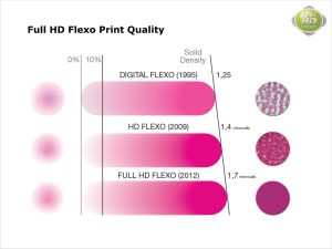
But, over the years, flexo presses, aniloxes, inks, software and flexo plate technology have significantly evolved, and that’s also an understatement. The tools and printing forms are now excellent, thanks to the introduction of digital plates and new screening technology. And the flexo printing presses, aniloxes, inks and software have also evolved and are now up to the task! Just look at a bag of potato chips these days: perfect quality. This looks nothing like flexo printing from the late ‘90s…
And to give you an idea, according to vendor information, digital flexo plates now can hold dots between 0,4% and 99,6%…

Current limitations
With the limitations of presses and printing plates solved, what is still limiting the use of ECG? In my opinion, there are two significant hurdles: design and standardization.
How do you design for ECG? And as an extension: do designers know about ECG? As long as there is no support by default in design applications, like Adobe Illustrator, it will stay a niche. Even though repro houses should be able to make multicolor separations to ECG when they have modern software.
And then there is standardization… This is something that surprised me a bit, but dr. Kai Lankinen told me that the extra inks (OGV or others) have not been standardized (until recently)… So, the typical procedure is that one printer prints certain OGV inks, while another prints a slightly different set of OGV. That isn’t helpful…
If we want ECG to become a success, it needs to be standardized and these standards must be implemented. If you disagree, feel free to comment! But it reminds me a bit of standardization in commercial printing (mainly offset). I still remember the days when CMYK ink sets depended on your region (Europe, North America, and Japan were different). They could even differ depending on the ink manufacturer… Even the print sequence was not standardized, and in case you don’t know: you will get a different color if you switch the print order, e.g., cyan and magenta. 100% C + 100% M in KCMY will look different from the same percentages printing in KMCY. This is, BTW, also a big challenge when using overprinting with spot colors… a different printing order will give a different color.
An interesting anecdote about that standardization, which is also a lesson about innovation, is from a printer I knew pretty well. He specialized in high-quality jobs, like art books. He was often ahead of the time and one of the first to implement ISO 12647. At that moment, they noticed three of the process inks were from vendor A, but the fourth (magenta, if I recall correctly) was from a different vendor… Why? The owner didn’t know anymore, so he asked his press operators. One of them, who had been with the company for several decades, vaguely remembered something: a print job a long time ago, with lots of skin tones and the ‘regular’ ink set didn’t give the right results, so they used the magenta ink from another vendor, with good results. As a result, they kept using that combination, even decades later… With the move towards ISO 12647, they switched to a complete ink set from one vendor.
This lack of standardization in ECG brings us back to the first hurdle: design for ECG… When you design for a commercial print job, it’s easy: you pick the relevant ICC profile, most are included in your design application. And that way, you can perfectly design a print document, even with brand colors that will look as intended (in case you haven’t checked it yet, do look at Project BBCG – A Better Brand Color Guide). But have you already tried to find an ICC profile for ECG? I tried really hard, the only one I could find, which was also shared with me by dr. Kai Lankinen, is the FOGRA55 profile for ‘color communication in multi-primary printing’ (Don’t you love the sexy name? 😉 ), which is the result of one of their research projects. It’s based on FOGRA51 for the CMYK part, plus specific values for Orange, Green, and Violet. You can find all the information about FOGRA55, including a test form and the ICC profile, on this page.

However, what I also recently learned from dr. Lankinen, there is also an ISO standard published in August 2022, but no publicly known implementation cases exist. It’s called ISO/TS 21328:2022 : Standard, Graphic Technology — Guidelines and recommendations for multicolour (CMYKOGV) print characterization.
Additionally, there have been initiatives since 2019, e.g., by Idealliance which published a ECG characterization target. And also vendors are organizing: Bobst has gathered a consortium of 11 vendors and organizations under the umbrella of oneECG.
And then there is also a lack of experience and know-how. Before 2020, printers argued that the brand owners who must pay the bill would not accept the spot color simulations. Designers and others who could influence those brand owners, didn’t know the concept of ECG, or didn’t know how to promote it. Fortunately, times have changed, and brands have become interested in new technologies.
A way forward
How should we move forward to make ECG more common? Here are my ideas, if you would suggest a different path, please leave a comment!
First, ECG should become a default option in design applications, especially those focusing on packaging and label design (yes, Adobe Illustrator, I’m looking at you… 😉 ). A consequence is that, at least in those design applications, the ECG ink set should be standardized. That could be the FOGRA55 set. FOGRA is widely accepted as a reference, and they did decent research on this, so why not use it as the standard set?
And to answer my own question: because some people want to use a different ink set… for whatever reason. It was probably a historic one, where the brand color of an important customer was easier to print with a slightly different ECG ink set. But, here’s where clever software developers should come in: they should design software applications, and color algorithms that transform one ECG ink set into another one. Just like we now do color transformations from one CMYK to another CMYK… Could this be the missing link? In case this already exists, please leave a comment with more information! (Yes, you could even do a sales pitch for such a product).
It will be interesting to see where this will lead us, and when. But with the right partners, you can do this. And don’t give up the first time something goes wrong. Even learning how to walk and talk took you some time…
Why is this important?
Expanded or extended gamut printing has been a promising technology for a long time, but it still hasn’t reached the expected level of adoption. This might however change in the near future, for several reasons. The technology is up to the task. Recently, even an ECG standard has been published… It would cut costs and strengthen the profitability of packaging and label printing companies.
We might see a Perfect Storm coming up for ECG. It’s a hot topic in seminars and shows, e.g., at LabelExpo Europe in a few weeks. ECG enables further automation in packaging and label printing, and it’s also the perfect link between conventional and digital printing.
But there is one aspect I haven’t covered yet: sustainability in general and ESG reporting… Brand owners are taking this seriously, check out my previous article. They want to limit their Scope 3 greenhouse gas emissions (GHG), which includes their packaging printers… Adopting ECG could significantly impact GHG emissions, energy usage, and waste. And that could be an essential part of your sales pitch, dear printer: “We can help you, my dear customer, achieve your ESG goals by switching from spot colors to ECG printing.” And if the print buyer isn’t convinced, involve the ESG team. They might become your best advocate.
PS: If you want more in-depth knowledge about ECG, check out the PhD thesis of dr. Kai Lankinen! Or visit his website. He has also been very helpful in writing this article.
PS2: As Paul Sherfield mentioned on LinkedIn, there is also XCMYK, which is an expanded gamut but only with four colors: CMYK. I’ve written three articles about it in the past: first a theoretical one, than one on a possible business case (being: photobooks) and then one on my persional experiences with a photobook with lots of deep blues that was printed with XCMYK. And it looked great! I still wonder why not more people have been looking into XCMYK… BTW: here you can follow the discussion on LinkedIn.
UPDATE 03/09/2023: check out this LinkedIn post by dr. Kai Lankinen! He makes several excellent points, based on real-life experience:
- spot colors also have deviations (average: 4,96 dE00, max: 7,07 dE00!)
- colors in color guides are not the same as in the digital library (check out Project BBCG!)
- ECG printing can result in tighter tolerances than spot color printing (< 0,86 dE00)
- not all design colors need tight tolerances (<2,5 dE00)
- brand owners can accept large color devations, up to 14,30 dE00!
Also check the discussion!
UPDATE 22/09/2023: very often when talking about ECG, people think about flexo and digital printing. But also in gravure printing this makes sense. Check out this article! In the project,moving to ECG reduced ink consumption by 30% (!) and setup waste by 50%! If that’s not convincing enough…
UPDATE 03/03/2024: dr. Kai Lankinen just shared some interesting information. There is a university project called ‘Optimal Method’ that now also supports PDF/X-5 and ECG (n-color)… Here is the flow (version in PDF format):

UPDATE 01/10/2024: this is some important practical information about ECG and screen angles, shared by Stefano d’Andrea in a comment to a LinkedIn post: “When considering ECG, in theory, no color should have both O&C, or M&G or Y&V in the same point. Therefore OGV can take the same angles of CMY respectively. Careful because Violet falls 15° from M and C, so possible risk of moirée (same as Yellow with M or C and sometimes we shift Y+15% screencount), that’s why it is often printed with FM (digitally modulated) screen.
Another option is to opt for 2 axis screens (elliptical) spanning over 180° but in general it is probably easier to run everything in FM/stochastic/DMS.”
I agree. In order for Extended Gamut Printing to become a global thing, we need standard ink sets (similar to ISO 2846 for CMYK inks) and we need all major software manufacturers to include 7c where you simply convert your RGB to 7c, using for instance the Fogra 55 icc profile. Then of course it must be developed also for more than just coated substrate. It must be made available for printing on uncoated substrates as well for starters – in general the same substrates that are available for CMYK printing according to ISO 12647. In short, we need ISO standards for 7c. There is another bump on the road, which is the fact that while we still have analog presses – offset, flexo etc. – those are typically 4 colour – or 8 colour presses, while 7c printing needs 7 colour units to make sense from a commercial perspective. Digital printers and presses however – at least some should be able to cover the 7c gamut (although I have heard that the colour gamut of many digital presses, – even if they have 11 colorants often doesn’t even reach standard CMYK – say Fogra 51).
Thx for your comment Ingi!
Don’t forget that ECG does not cover everything: in flexible packaging and on brown corrugated, you will often need an opaque base layer. And metallic inks are also not covered by ECG, thus: 8 color presses still make sense, even with ECG.
Some packaging printers use ECG for tints, logo’s and background colors but use regular CMYK-separations for the halftone images. The screen ruling for these images is standard CMYK and the screen ruling for de other parts of the packaging can be identical. If you extend the color range of the images the screen ruling of the additional colors have to be different.
Thanks for you comment Henk! And that’s indeed an aspect I didn’t touch: the screening…
One possibility I also found, is a combination of AM (for the CMYK) and FM (the other colors).
For us is beter when the pictures also converted in 7 colors. There are more shiny and briliant colors. We use the CI8 COMEXI for flexible packaging for 6-7 years.
Thanks Norbert! And indeed, it can also enhance colors of pictures. Great addition!
Excellent summary, Eddy. You mentioned a potential missing link for converting from one ECG into another one with a different ink set. ColorLogic products can do that for several years but it is seldom requested. With CoPrA you can build 7C printer profiles and with the DeviceLink capabilities in CoPrA you can build a 7C to 7C DeviceLink. Applying those DeviceLinks requires a color server that can do so on PDF files – that would be the ColorLogic ZePrA color server.
Aha, thanks for mentioning those capabilities Dietmar! 🙂