

Just before Project BBCG – A Better Brand Color Guide was launched, there were some interesting discussions on LinkedIn, with some people relying 100% on ICC color management, having absolute faith in ICC based color conversions. This is, however, NOT a good idea for brand colors. I’ll show you why, with visual examples…
CONTENTS: Tone Value Increase | Pantone Color Bridge | Automatic color management can do better: go GCR! | Why is this important?
One of those discussions also mentioned a practical thing that happens on a printing press, which is also part of the ISO standards: TVI, tone value increase. Which is often referred to as ‘dot gain’. The dots printed on a substrate are not 100% exactly the same as in the digital file, in the ICC based color transformation. In ISO 12647-2 (sheetfed offset printing), the TVI tolerances are +/- 4%. So, a dot can be 4 points smaller or bigger than in the digital file, that’s the reality of print. That +/- 4% is what the experts considered as reasonable, so just acceptable.

The simplest example of the consequences of this is a brand color conversion to CMYK with a 4% in, e.g., magenta, which could be either 0% or 8% in print. And in both cases it would be within those tolerances. That’s real life in print… That’s what some people seem to forget, especially those who are only looking at color as numbers in a digital file.
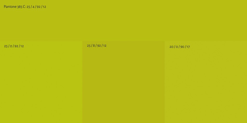
The picture below shows what kind of visual effect that a 0% or 8% can have. I started with Pantone 385 C, document profile: PSO coated v3. In the top row, you can see the ‘standard’ conversion to CMYK, which has a 4% M in it, next to values in all other colors (25 / 4 / 92 / 12). At the bottom right, you see what that would look like with 0% M, in the middle with 8% M. The one on the right, is a custom tweak of that color: 20 / 0 / 90 / 17. I played a bit in Adobe Photoshop and found a color that is almost identical, but it has only three of the four process colors. So, one less color to keep under control, which means: fewer chances for deviations.
Below are two more practical examples, two colors I also discussed in the Project BBCG tutorial: insights4print Dark Grey and Pantone 161 C. Both images show a number of squares, in two rows. The top row shows the ‘normal’ conversion and variations on that, the bottom row ‘my’ conversion, with a manual tweaking and variations on that (see the Project BBCG tutorial for all information about the tweaking, chapter 3.1). From left to right, you first see the original definition (either sRGB or Pantone number). Next to that, there is the basic CMYK combination (PSO coated v3). The following squares show deviations on that basic combination. Which deviations there are, is shown in the squares.
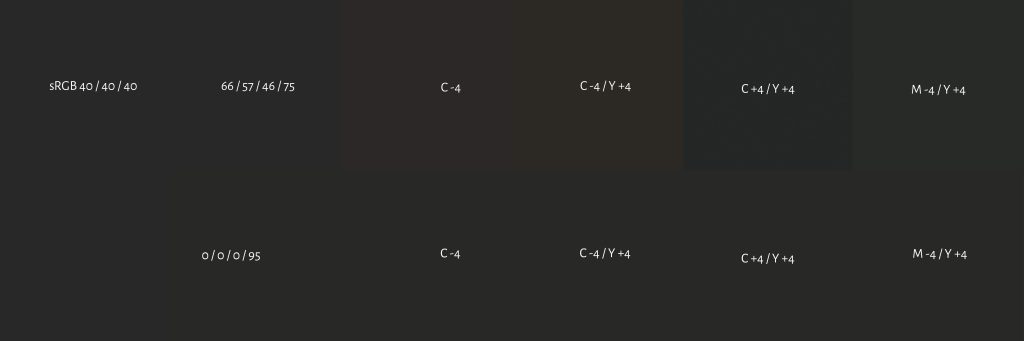
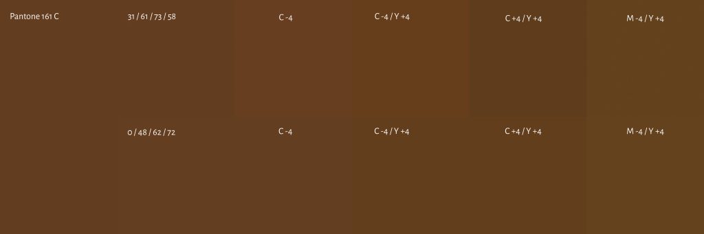
As you can see in these two examples, tweaking your color to have as few process inks as possible, and by extension: to eliminate low percentages, offers a more stable result in print. That’s why you need to make that small investment to do some tweaking, to get a more stable CMYK combination.
Pantone Color Bridge: G7, CRPC6 and 3
A feedback I got from one of the readers of the Project BBCG tutorial, is that the conversions to CMYK in Pantone’s Color Bridge are based on G7 and the CRPC6 (coated) and CRPC3 (uncoated) reference spaces (see page 3 in this document). These are slightly different from the reference spaces used in Europe (PSO coated v3 and PSO uncoated v3, e.g.).
Below you can see what this means for Pantone 151 C. I created two documents in Adobe Photoshop, one with PSO Coated v3 as the document profile, and the other with CRPC6. I colored both documents with Pantone 151 C, the sliders show the conversion into CMYK for both documents…
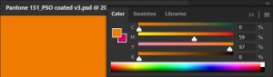
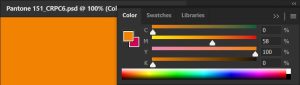
I only checked one color, but you can see that there is a slight difference.
Automatic color management can do better: go GCR!
In an ideal world, I shouldn’t be writing this article. If the color transformation algorithms would not only look at the delta E between input and output, but would also consider how dot gain/TVI influences color, there would not be any transformation with up to, e.g., 4% of a dot in one of the process colors. If color transformations into CMYK would by default apply GCR (Gray Component Replacement) to the maximum (eliminating if possible at least one process color and adjust the others accordingly) and eliminate the small percentages, brand colors would probably look better in CMYK.
But that seems to be a leap of faith for some, or many, color scientists… Choosing a conversion with a higher theoretical delta E, that’s a hard one. Unless you start doing real-life tests, with ink on paper… Then you might notice that eliminating the small percentages is a wise choice. These real-life tests don’t have to cost you a lot of money: order flyers or postcards at an online printer. That’s what I did for the tests I showed in the Better Brand Color Guide tutorial.
And it’s not a fantasy: eliminitating small dots is common practice in packaging and labels! For decades already. But I’m not sure it’s used in commercial printing (yet), it’s certainly not the case in Adobe Photoshop. If you are a vendor, and your DFE or RIP already offers this kind of conversion, please leave a comment! Brag about it!
(BTW: here are some more ideas how vendors can integrate Project BBCG, and GCR is not only interesting for brand colors, it would also be interesting for other artwork)
Why is this important?
If you want your brand or corporate identity colors to be produced within narrow margins and always look ‘good’, you need to put extra effort into the CMYK conversions for different groups of substrates. You will need to test how different CMYK combinations perform on different types of substrates, with different printing technologies. So you can pick the best-performing CMYK combination for that type of substrate, that kind of technology.
If you don’t and you just rely on fully automatic conversions to CMYK, in my opinion you lose the right to complain about deviations in the reproduction of your precious brand colors. Period.


Be the first to comment