

Brand owners demand lower color deviations, with myths and unproven claims being their main argument. Recently I heard that 1,5 dE00 should be the norm, which is not necessary, in my opinion. A box of breakfast cereals I had accidentally put on its head clearly showed that… Welcome to color in real life!
CONTENTS: Cross-sheet deviation | Does it matter? | Why is this important?
A few weeks ago, I bought two new boxes of breakfast cereals (the one I discussed already in this article). And for some reason, I had put one of the boxes on its head. The next time I opened the closet door, I noticed something peculiar: a cross-sheet deviation! Which only became apparent when putting the one box on its head.
One of the sides has that orange tint from top to bottom; looking at one package, you will not notice that the color shifts slightly. It’s only when putting one upside down you will notice.

So, I grabbed a spectrophotometer and measured the deviation between the top and the bottom lid: 2,74 dE00… (D50, 2°, M1). And to be complete: it’s printed in CMYK, it’s not a spot color.

The probable cause is cross-sheet variation (sometimes called in-sheet variation). Which is a reality, especially in offset printing. And I guess in every printing process where pressure is applied when transferring ink or toner. In case my guess is wrong, please leave a comment!
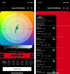
I did contact my friend dr. Kai Lankinen. He checked a spot color reverse flexographic printed film and measured the area of width 73 cm and repeat length of 46 cm from 18 different points across the print. The average dE00 was 0,17, the maximum was 0,47 dE00. So that one was within very tight tolerances.

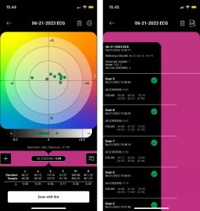
As a comparison, he also measured the ECG (Expanded Color Gamut) surface flexographic printed film, printed with three process primaries. The measured area had a width of 69 cm and a repeat length of 28 cm, and it was measured over 9 different points across the print. The average dE00 was 0,60, and the maximum was 0,90 dE00. So that even that one (ECG printed with three primary colors) showed little variation, all below 1,0 dE00.
Dr. Lankinen considers a 2,5 dE00 tolerance of printed (important) colors acceptable. This flexo ECG printed color is well within that tolerance, which shows the quality improvement of flexographic printing over the past two decades. Digital plates and better presses facilitated this significant jump in quality.

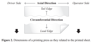
In offset, deviations in the circumferential direction are extremely difficult to control. You can get the axial variation within specific tolerances, by adjusting the ink keys, but there is no control of the circumferential variation (at least as far as I know, please correct me if I’m wrong, by leaving a comment below).
In 2014, Saleh A. Abdel Motaal, a master student at RIT, dedicated his thesis work to this topic.
So, you might get a small deviation compared to the ideal value when you check the control bar, but that doesn’t necessarily mean that that color is within the same tolerance everywhere on the sheet, across the web.
Does it matter?
And it doesn’t matter if there are regions that are a bit off. As I’ve shown in the past, consumers are very tolerant when it comes to color deviations, just check the study with over 100 consumers on buying behavior. Also, our color memory is very flawed, even when comparing two colors a few cm apart! The most picked color in the Coca-Cola Red memory test was NOT the right one, it was 4 dE00 off. Plus: the world isn’t flat, influencing color perception. And please remember that seeing a color is different from measuring a color. E.g., visual appearance and color perception can be influenced by surrounding colors. Just look at the two yellow circles in the image below. They are the same color. But your brain tells you to believe otherwise… That’s why we need measurements to check print quality.

BTW, here is a slide from a presentation by Don Hutcheson on ‘perfect color’, claiming tolerances <2.0 dE00 are unrealistic. I fully agree with that, In 2018 I already discussed what he calls ‘the real-world variables’ in my ‘Chain of Tool Tolerances’.

Over the years, I’ve seen famous brand colors shift significantly, without hurting their sales. E.g., Kellogg’s red has been both vibrant red and magenta, many dE00 apart, without consumers noticing or objecting.

Even Coca-Cola red had many variations over the years, just look at a few examples from my collection of cans.

Why is this important?
Printing is not a perfect process. It’s a pretty complex process, with many variables. Deviations are part of the game. The demand for tiny tolerances, every year a little bit lower, has nothing to do with brand perception. It’s often more about the power to reject a job than actual quality expectations or customer demands.
The applicable ISO standards are just fine, they have good tolerances, let’s stick to those.
Oh, and in case you now want to quote that (in)famous study that “color enhances brand recognition by 80%”: that was on the use of color compared to just black/white in newspaper advertising… It’s not about tiny color differences. That quote has been taken out of context and been abused by many people to sell their consulting services… Here’s more on that.
And this one: “People make up their minds within 90 seconds of their initial interactions with either people or products. About 62-90 percent of the assessment is based on colors alone.” It’s quoted many times, also in scientific papers, but how was this tested? From which study do these numbers come? I tried really, really hard, but I couldn’t find any study showing how and by whom this was tested.
What I did find is the ‘Total Fixation Duration’ of consumers during shopping, measured with eye-tracking and in a shop-like environment. Guess how long does a consumer look at a package? On average less than a second. Coca-Cola? One-tenth of a second… More on that, including those studies, in this article.
Full disclosure: the NIX Spectro 2 that I used for my measurements, was kindly provided by NIX Sensor, for testing purposes.


Hello Eddy.
about your quote “but there is no control of the circumferential variation “, you might be interesting with this thread because circumferential variation is well documented (like in the Heidelberg handbook of print media) and has a long history to avoid misregistration and color difference AFAIK: https://printplanet.com/threads/ink-density-uniformity-on-circumferential-direction.284497/ and this older one: http://print-media-technology.blogspot.com/2012/12/plate-cylinder.html
Best.
Thx for pointing this out Axel!
Will take a look at those!