

Last year, I got a new monitor at work, a 4K monitor, nice! My regular job (the one that pays the bills) is not in the printing industry, so ‘color’ is not at the top of mind when our IT guy buys new equipment. But when I accidentally hit the configuration button, I noticed something interesting: the configuration showed ‘DCI-P3’! My office computer is one with a wide gamut! And this is a feature that my boss will not pay extra for… So, I wondered: is sRGB still standard for monitors? Let’s dive in!
CONTENTS: sRGB | Current offerings | What are the consequences? | Why is this important?
The gamut of a monitor or a screen is important: it shows the capabilities of that device when it comes to color reproduction. A monitor with a large gamut can show more colors than a smaller one. For a very long time, sRGB has been the most common gamut. Microsoft and HP started developing that color gamut in 1996, it was first published as an IEC standard in 1999. Its intended use was (desktop) printers, monitors, and the World Wide Web.
It wasn’t much later that Adobe started developing their own RGB ‘standard’, to make use of ICC profiles and more geared towards printing in CMYK. The initial works started in 1997, AdobeRGB was launched in 1998.

In those days, most monitors wouldn’t even cover the sRGB gamut. Monitors with an Adobe RGB gamut were specialized – read: expensive – equipment. But times have changed… Especially the last few years. But even before that, you could, e.g., get laptops with an AdobeRGB capable screen… My first private laptop was a Sony Vaio (I forget which type), which had such a screen, for a price less than a high-end AdobeRGB monitor… And I’m writing this article on a nearly 8-year-old Acer Nitro, with a 4K AdobeRGB display…
Over the years, I’ve followed the ‘mobile display shootouts’ from Display Mate. And it’s impressive to see what the latest – and greatest – mobile displays can achieve!
And when looking at these capabilities, you might notice another standard: DCI-P3. This comes from the movie (and TV) industry (DCI: Digital Cinema Initiative), and Apple started adopting it several years ago (as ‘display P3’). When looking at the current offerings in both monitors and laptops, you will very often see DCI-P3, even more than AdobeRGB.
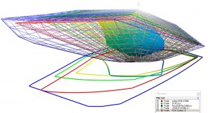
But it doesn’t stop there: some displays and TV sets have a color gamut that’s larger than AdobeRGB and DCI-P3. That’s why new standards have been developed: Rec.2020, and its high dynamic range sibling: Rec.2100.
Current offerings
Now let’s do a reality check: what are the current offerings in the market? To get an idea, I looked at the website of B&H, a large shop in New York, with an extensive offering when it comes to photography and everything related to that, including laptops and monitors. BTW: if you ever visit New York, do visit their physical store. If you are a photographer, it feels like you’re in heaven… Or a candy shop.
Let’s first look at laptops. They offer 1413 different types of laptops. One of the features you can filter on is ‘Color Gamut’. Below is a screenshot of the different options, plus the number of laptops offered in each option.
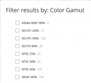
Now you might notice something we didn’t cover yet: NTSC, that’s ‘National Television Standards Committee’, the American standard for analog television, first published in 1941 (in Europe, where there was another standard, this was also called: ‘Never The Same Color’). Sometimes sRGB is compared to 72% NTSC, but this is not entirely true, as BenQ explains in this article.
Please note that the total doesn’t add up to 1413, probably the laptops that are missing don’t have that gamut specified.
If I apply a filter on resolution first (2560 x 1440 pixels and above), the picture looks a bit different: almost 2 out of 3 have a gamut larger than sRGB. And also something interesting: it’s not necessarily the cheaper ones that have sRGB or smaller… It’s a mixed bag.
When looking at computer monitors, there are 1057 items. But here, it’s a bit more challenging to make a statistic due to the vast amount of different options… But a quick look shows that a lot of them have a gamut larger than sRGB.
I also intended to check TV sets, but unfortunately, they don’t show the gamut… But in the features, there is something that is of interest: HDR, high dynamic range. And 214 of the 231 TV sets do offer that high dynamic range. And HDR uses wide color gamut technology.
What are the consequences?
All of this might seem like a theoretical discussion, but it isn’t. It relates to how brand colors are reproduced and what matters when reproducing them. If color accuracy is of the utmost importance, which some – to many – in the printing industry believe, we have a problem. Nearly half of the laptops (NTSC 50% and NTSC 45%) had a screen incapable of reproducing all colors in the sRGB gamut. Meaning: they might not be able to reproduce many brand colors accurately (especially since they are often vibrant, saturated colors).
On the other hand, with many displays having a larger than sRGB gamut (both in the ‘better’ segment of laptops and certainly in monitors), limiting the brand color reproduction to sRGB, might limit the opportunity to really stand out. The brand color could be much more vibrant.
And that’s a discussion we should start: what do you prefer? What do brand owners and designers prefer? An accurate reproduction, which will limit itself due to the lowest common denominator? Or a reproduction that always stands out, taking the possibilities of the medium to the maximum? I’m inclined to think that brand owners, designers, and maybe even more: consumers, might opt for the latter: let those brand colors stand out! Let them pop!
Why is this important?
Many decisions are based on the capabilities of technology at a given time, e.g., the adoption of sRGB. But technology evolves. And offers new opportunities, like (much) larger color gamuts, which could make brand colors stand out and make them pop on a screen. But if we limit ourselves to defining brand colors in sRGB, that’s impossible, by definition. Plus, on the other hand, an accurate reproduction of brand colors on all displays is physically impossible: half of the laptops cannot reproduce the whole sRGB gamut, meaning that some brand colors will not be shown accurately.
But maybe the need for ‘accurate’ reproduction should be revisited. Maybe only the hue, and, to a lesser extent, the lightness matter? While the chroma could be looked at relative to the rest of what is shown on the display? Food for thought…
PS: I only discussed the capabilities of displays. I real life it’s even more complex: not every screen is calibrated… As I mentioned in a blog post on Project BBCG: you can control the input, but not the output.


I do look forward to the day when REC 2020 is the standard for all displays, from mobile phones to Television sets.
I am surprised how few displays are sRGB capable. I thought all newer displays covered sRGB.
Most monitors cover much more than sRGB… Only in laptops about half of them don’t cover sRGB. And I don’t know the age of those monitors/laptops, so it might be that those who are not capable of showing full sRGB, are older ones.
Well, at least it looks like the fancy MacBook laptops cover P3, so easily sRGB – see https://www.apple.com/macbook-air/specs/
Same goes for the iPhone displays and as far as I know most Android displays, both mobile phones and tablets cover sRGB at least.
But you are right of course. To view sRGB colour correctly on your display, you need to calibrate the display and make sure that it is set to display sRGB colours. This is feasible since basically all images that you view online are adjusted to sRGB – and many have the sRGB icc profile embedded to them to make sure they are correctly displayed.
If colour actually matters to you, you will most likely have either a recent display that is still stable or a screen calibrator to make sure what you see is correct.
This is actually important even for normal people that are not colour nerds, that order a lot of products online from webshops where products are normally displayed in sRGB format.
The investment is only around 200-300 Euros or so for a simple calibrator + software. So NOT using sRGB colours – or defining them as your brand colours, because not all people have the good sense of adjusting their display to standard sRGB is basically like saying that there is no reason to use icc colour management when printing in CMYK because anyway not all people will view the printed item in D50 light.
A better understanding computer displays is only possible with knowing the observer metameric mismatch index. This is an issue identified in the early 1950s. Colors on a display with narrowband RGB primaries may appear differently to multiple observers who may happen to be viewing the display side-by-side. This phenomenon limits the capability of such displays to be used in collaborative color critical work.
A thorough understanding of “observer metamerism” (also referred to as observer variability) is needed.
Hey Refik.
Do you mean basically that not all people “see” the same colour identically for various reasons – different cones in the eyes etc.?
The bigger question is (imo): If you have a certain colour, lets say a certain red colour (since I am partial to red) and it has a certain LAB value. Lets say that this colour fits within both the sRGB and the Fogra 39 gamut.
Now lets say we pick a random person and ask them to look at a monitor/display, that is set up to display the sRGB gamut, – and you look at the sRGB version of the colour.
We also have a printed proof of the same red colour, printed perfectly in accordance with Fogra 39 on a proofing media that is correct according to Fogra 39. The lighting in the room is set to D50.
Will the red colour on the monitor and the red colour on the paper, when the observer (person) looks at it from a 2° angle look identical to this person – and every person for that matter, – or not?
Even if the red colour may look slightly maroon red to some people and more bright red to others, – if the colour on the monitor and the colour on the proof look identical to each person, then from a brand owners perspective that doesn’t matter, since a brand owner simply wants their colour to look identical in the various media.
If for some people there is a difference in the monitor colour and the proof colour to some people, we do have a problem that I suspect can never be solved with generic equipment that “normal” people use in their everyday lives.
Simply put, observer metameric mismatch happens when the primaries of a computer display interact differently with the naturally different color matching functions of different observers.
“Setting up a display to simulate sRGB” does not help. This phenomenon is directly related with the way the RGB primaries are designed. The problem originates from the gaps between the neighboring slopes of Blue-Green and Green-Red primaries. When these gaps are present at HM (half maximum) you start to see the problem. These gaps can either be formed by narrowing the primaries at fixed wavelengths or by moving the peak wavelengths of primaries apart with broadband primaries. Literature almost unanimously refers to the narrow bandwidth case. But I have also witnessed the mismatch problem on wide color gamut displays with broadband primaries where the peak wavelengths are positioned at longer wavelengths.
Hence, tuning/tweaking/simulating a smaller gamut does not help. Observer metamerism is a built-in problem. It can only be cured by designing the primaries differently.
Before going into how saturated colors are rendered on a proofing setup that includes a desktop viewer and a calibrated/profiled display, we should take a look at the how the base color white is formed by the two devices. The unprinted paper reflects the ISO 3664:2009-compliant light within the confines defined by the pigments and OBAs. A typical coated paper will send your eyes a full spectrum of white light at about 5150ºK. The additional 150ºK comes from the secondary emission of the OBAs. In the case of an uncoated paper with high OBA, the CCT of the reflected light becomos 5350ºK. But the CRI of the reflected light stays almost the same. Hence almost all observers experience the same whiteness when they view the paper in the desktop viewer. However, various displays create the white very differently. The white created by a narrowband WCG display is akin to what a backlit box with R+G+B LEDs creates. When viewed and measured as a light source in a darkroom, this type of display may report a CRI value as low as 40. Or you may think that you are viewing an unprinted sheet of paper under a first generation 3-phosphor fluorescent tube with a typical CRI of 60.
So before moving into all sorts of illuminant metamerism problems related with the spectral structures of the inkjet contract proof and the printed image, we have to understand the basic difference between what we see in the desktop viewer and what the computer is displaying. Due to this gappy structure of the spectrum of the display, different observers establish a visual match between the desktop viewer and the computer display at different CCTs. In a particular test, 5 prepress operators were asked to freely pick the CCT to match a WCG display to the desktop viewer. They all picked a different CCT between 5400 to 6000ºK.
The visual continuity between the desktop viewer and the display is only valid for a particular observer. While one observer sees the “same” red on both, the others see a “different” red on the display. In summary, the proofing setup only works for one observer.
I would like to add a clarification on a confusing point.
sRGB is defined as a color space. One could write down a set of equations that would precisely convert from sRGB into L*a*b* and back again.
sRGB is often used in digital cameras. By default, many cameras will “tag” images with sRGB. This means that they have used proprietary algorithms to convert the RGB from their sensor into an approximation of sRGB. It is only an approximation of sRGB, since (as far as I am aware) there are no cameras that have the same spectral sensitivity as the human eye. The “sRGB” tag gets stored in the header of the image file so that other applications know how to interpret the otherwise ambiguous RGB values.
As this blog post makes clear, storing an image as sRGB will limit the gamut. The file itself cannot store colors outside the cube of RGB going from 0 to 255, and the eight vertices of this cube have rigidly defined locations in CIELAB space. To get colors outside of the sRGB region, you would need to have some negative values for R, G, and/or B.
So, the image format itself limits the gamut, irrespective of what the monitor can display. If you want colors outside the sRGB gamut, you must store images in one of the other formats.
(Part 1) I will add some further information on the gamut of monitors.
The “ideal” monitor in terms of gamut size would have red pixels that are monochromatic (only one wavelength) and they would be right at the edge of visible light- somewhere above 700 nm. The blue pixels would actually be violet, and would be right at the edge of the other end of the range of visible light – somewhere below 400 nm.
Then you have green. If I chose a wavelength that is on the yellow-green side (maybe 530 nm) I will only miss a few of the very rich yellow and orange colors. I will unfortunately miss out on a whole lot of seafoam greens and cyans. I could choose a wavelength more on the bluish green side (maybe 510 nm), but Clemson fans would be up in arms about not being able to show a rich orange.
So, to begin with, you can’t make a monitor that has only three primaries,
(Part 2) You could make the pixels be close to monochromatic, but there are some engineering difficulties.
One approach would be to use lasers, which emit monochromatic light. But lasers are very directional and you want to be able to view the monitor from different angles. So, you shine the lasers through some diffusing membrane. I don’t know if you have ever tried this, but this leads to very distracting sparkle. I’m gonna go out on a limb and say that it is impractical.
A second approach is to start with LEDs for the light sources. These emit a somewhat narrow range of wavelengths, so they are not so bad and are used in many displays. But they still aren’t perfect. Adding a bandpass filter to the LEDs can narrow the wavelengths that are emitted by blocking light at wavelengths other than the one you want.
One problem with this is the fact that you have wasted light, which mean wasted energy. On a cell phone, where long battery life is a big deal, wasting light is not a good thing. Adding filters will increase the gamut, but at the expense of cutting down battery life to get the same brightness.
A third option is to use this magical little thing call quantum dots. These are tiny spheres that absorb light in a range of wavelengths and then emit that light in a vary narrow range. (Yes, this is a special type of fluorescence.) The wavelength they emit depends on the size of the sphere. In effect, they do the same thing that a bandpass filter does, but with minimal wasted light.
The limitation to this technology is the ability to manufacture quantum dots that are all exactly the same size. But there are monitors on the market today that use this technology, and they do have a wider gamut than standard LED versions.
(Part 3) I will now expand on what Refik has astutely said with a very practical example.
Consider the “ideal” violet primary. It is sitting at the edge of the violet part of the rainbow. But where is it? Maybe 400 nm is close enough to the edge, but maybe you want 380 nm? Or 360 nm? The trouble is, the sensitivity of the human eye drops off quickly as you approach the ultraviolet, so you need more power to make it visible.
That itself is an issue that would lead to engineering tradeoffs. How much gamut are will willing to trade for power efficiency?
But there is a bigger problem that is made apparent when I bring a 405 nm laser pointer to class. If I point this at a non-fluorescing white surface, it makes a violet dot that I can just barely see. But for my students, the violet dot is bright. The thing is, the lenses in my eye have a manufacturing date that is way further in the past than my students. My lenses have yellowed, which is to say, the transmittance at the blue end of the spectrum has been cut down, and for violet, the transmittance is way down.
To tie this back to Refik’s comment, if we built a monitor with a 400 nm primary in order to give young people a really wide gamut, then geriatrics like me would have to adjust the color temperature through the roof in order to see white.
Wow! Thanks for your additions John!
Hi John,
The needle-like spiky structure of the laser projection systems make them the worst performing device in terms of observer metameric mismatch. A leading digital projection system manufacturer, Christie Digital Systems (https://www.christiedigital.com/) , is still making systems with all three major projection techniques: “RGB Pure Laser”, “Blue Only Laser + Phosphor”, and “Xenon”.
https://www.lamptolaser.com/fact1.html – At the end of this page, the interactive graph will show you the spectrum for each system. Only the RGB Pure Laser system can achieve Rec. 2020. It is easier to maintain. It does generate much less heat. But Xenon is still there to provide a “common” appearance to many spectators.
https://www.mdpi.com/2313-433X/9/10/227
The above link will take you to a very recent (open access) study on the issue: “Mapping Quantitative Observer Metamerism of Displays” by Giorgio Trumpy, Casper Find Andersen, Ivar Farup, and Omar Elezabi
Refik,
I am familiar with the RGB lasers – I have one! It’s a cool trick that you can combine a red, a green, and a blue laser into one beam by using the appropriate dichroic filters. I knew that these were sold for use in laser light shows, and that there is a digital input so you can pulse-width modulate the intensity at a pretty high rate. I was not aware that anyone was rastering one of these to make a display. Thanks for sharing!
As I ponder this, I realize that the fact that the laser is constantly moving across the screen would reduce the sparkle effect.
John,
Today’s laser projectors first diffuse the monochromatic light coming from the LED lasers before they hit the micro mirror array of the DLPs. So what is coming out of the lens in no more dangerous than what is coming out of a xenon lamp projection system.
https://www.christieavenue.com/en/issue/22/laser-safety/
https://www.christieavenue.com/en/issue/22/laser-facts/
https://www.christieavenue.com/en/issue/22/xenon/
https://www.sharpnecdisplays.eu/p/laser/en/technologies.xhtml
These web pages may provide the explanation on how laser power is put into good use. As said in Christie’s page on laser safety “It probably poses less of a real-world hazard than a ten-dollar laser pointer.”
As these RGB pure (diffused) laser projectors can achieve 120 Hz frame rate at 4K and 480 Hz at 2K, the intensity is probably not controlled by pulse-width modulation.