

“Color increases brand recognition by 80%”, it’s a quote that is often used in the printing industry, e.g. to demand super tight tolerances in print production. I went on a search to find the original study, to know what was tested and how. It was a long search. Eventually, I found the study that is supposed to be the origin of the quote. But it doesn’t mention that 80% increase at all… And even if it would mention it, it would have been taken completely out of context. Join me in the search for the origin of this quote and what it really means!
CONTENTS: The search | The context | The other Loyola study | The rant | Why is this important? | Updates
The search
I have to admit, I have been searching a long time for the origins of this quote. John – the math guy – Seymour also did a search, without success. Even though there are a few million web pages that reference this quote…
Often Jill Morton from ColorMatters.com and ColorCom.com gets attributed this quote. But that is incorrect: she mentions the quote on her website, but attributes it to Loyola University in Maryland. Unfortunately, without researcher, nor paper title. I contacted Jill Morton to find out more, but she didn’t reply. So, I had to dig deeper.
In case you didn’t know, Google makes it possible to limit your query to a certain time period. And that’s what I did: dig deeper and deeper in history to find the first mention of this quote. Which probably was a marketing leaflet from Xerox, from 2005 (correction 28/02/2019: the copy I received, see below, is from 2005, but Google says it is from 1/2/2001). Fortunately, this one did include the names of the researchers, with dr. Ellen Hoadley (now prof. em.) being the lead researcher. With that information, I could focus my search a bit better.
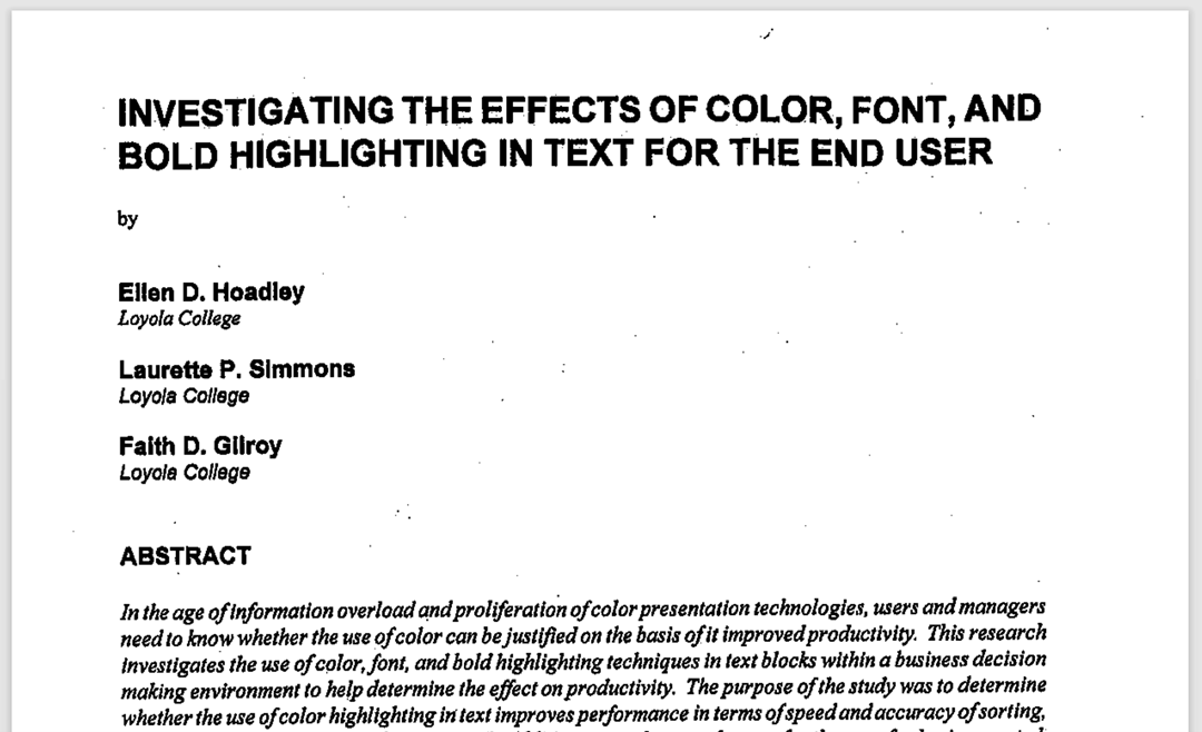
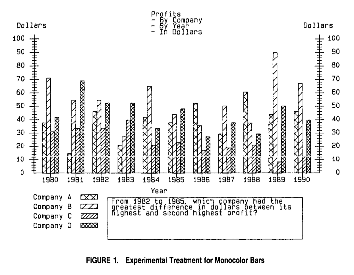
Which didn’t mean it would become easier: Google couldn’t find any paper by dr. Hoadley that had that quote in it. The next logical step was to approach her. And she seems a nice person: she sent me one research paper (‘Investigating the effects of color, font, and bold highlighting in text for the end user’, 2000) and pointed me to another one (‘Investigating the effects of color’, 1990). The first being a follow up to the second. Which made me very happy! I finally had the famous Loyola paper in my hands!!!
Alas, neither of the two papers contained that famous quote…
The context
When reading both studies from dr. Hoadley, it became very clear that the quote is – these days – completely taken out of context. The studies are on how the use of color in graphs, texts, … enhances the processing of the information. And you should try to imagine what the average office looked like in 1990, when she did her first study: computer screens that were monochrome, printers that were black and white only. The use of color in office environments was still very expensive. Even in 2005 printing color was still rather expensive, compared to black and white. So, you needed a rationale to invest in that kind of equipment. No wonder that it was a Xerox marketing leaflet called ‘20 Ways to Share the Color Knowledge‘ that is the oldest claim I found of the 80% increase in brand recognition. Dr. Hoadley included a copy of that leaflet in her e-mail.
There was also another reference in the Xerox leaflet: ‘Bureau of Advertising, Color in Newspaper Advertising’. With this input, I was able to locate several other studies. But again, these studies on the effect of the use of color in advertising should be read in context: they are from a time when most print was monochrome, especially newspaper printing. When newspapers first got the capabilities to print full color (or before that: two colors), you needed hard proof that the use of color would increase sales, could increase brand recognition. That’s what you can find in those old studies. E.g. in this one: ‘The Effects on Sales of Color in Newspaper Advertisements’, Richard Sparkman Jr. and Larry M. Austin, 1980.
And other studies that show the effect of color on sales, show that the color of a product makes a difference, e.g. when choosing a refrigerator, when choosing a sweater. E.g. this one: “The role of individual colour preferences in consumer purchase decisions”, Luwen Yu, Stephen Westland, Zhenhong Li, Qianqian Pan, Meong-Jin Shin1 and Seahwa Won, 2018.
Studies related to color and brand identity, focus on the importance of picking the ‘right’ color for your brand. When the associations made with a certain color conflict with your brand identity, it will have a negative effect on brand recognition.
So, all these studies on the importance of color have a very different context than print quality. I found no study that relates brand recognition to print quality, to deviations in color quality in print. The famous quote is about the choice to use color or monochrome. And when it’s related to product choices, it’s about personal color preferences. Again, not about color quality in print.
The other Loyola University
During my search, I found an interesting study on the use of color, from Loyola University. But something didn’t fit: it was published in 2011, which is more recent than the oldest quote I found. So, it wasn’t the ‘real deal’. And even more: it seems there are at least two Loyola Universities: the one in Maryland, and one in Chicago.
The color study from Loyola University in Chicago is called ‘Exciting red and competent blue: The importance of color in marketing’. It examines how color affects consumer perceptions. One of the conclusions is: “By itself, color improves particular personality ratings when it creates a match between the brand logo color and the personality dimensions (i.e., excitement and red, competence and blue, sophistication and black).”
But, again, it doesn’t study color quality in print.
The rant
You can skip this part if you like, it’s a rant. A rant about the sloppiness of writers when it comes to claims and references. Especially when it comes to reports written by (future) academics. I found numerous references to the infamous quote. Often with wrong sources (e.g. Jill Morton), wrong dates (e.g. 2007). Which means that those researchers did not even try to consult the original paper.
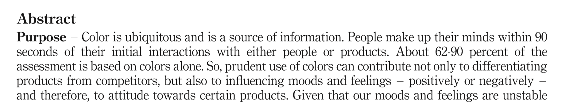
I also found rather strong claims in papers that had no reference at all. Take e.g. this one: “People make up their minds within 90 seconds of their initial interactions with either people or products. About 62-90 percent of the assessment is based on colors alone.” This is the opening of a research paper on the impact of color on marketing, one that is often quoted by other research papers. But without any reference, without any proof. I contacted the person who wrote that paper, to ask some more information, but didn’t get a reply. So, for me, this is just fiction, wishful thinking. Until I get proof of this claim. And that assessment on color: that’s probably about blue sweaters versus red sweaters, not about a deviation in color of a few delta E.
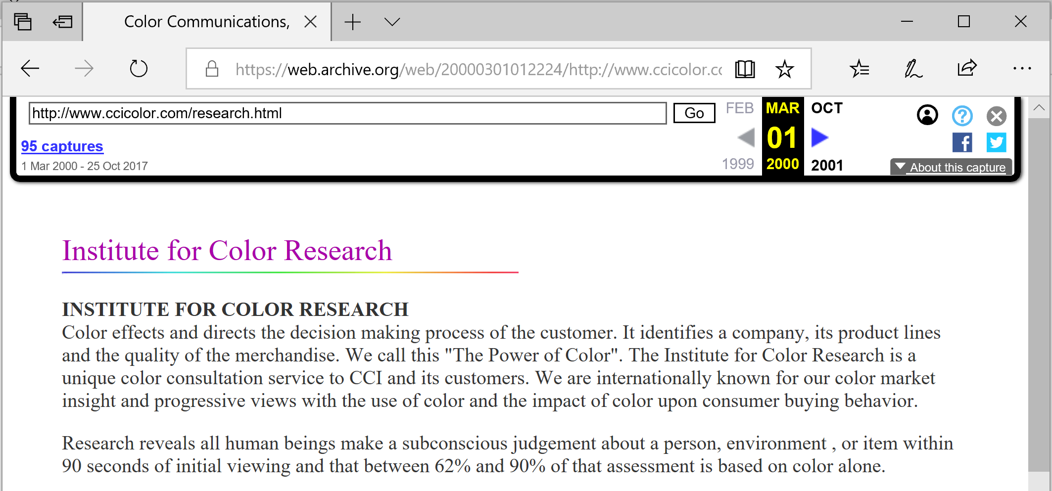
Sometimes that quote is also attributed to a color consulting company. On their current website, the quote isn’t there anymore. But thanks to the Internet Archive Wayback Machine, I found out that it probably first appeared on their website in 2000 (seen screenshot below). Without any reference, just “Research reveals (…)”. Not ‘our research reveals’, just a general ‘research reveals’, without any reference. I contacted them, but didn’t get a reply.
UPDATE 02/03/2019: I got an e-mail from this color consulting company. The original research seems to be from Carlton Wagner, director of Wagner Institute for Color Research and it dates from before 1990. They are still looking if they can find the original study, but based upon articles I found about him and his research, it’s about getting the right color category, the one that fits your products. It is not about print quality. BTW: do you remember print quality at that time? Well, all print these days is (close to) excellent compared to the print quality at that time.
UPDATE 02/04/2020: I got a comment from Karen (see below). She attended a presentation of the Color Response Report, in 1988. And she still has the documentation! “He gave me a portfolio which includes The Wagner Color Response Report, ‘Let Your Colors Do The Talking’ by Carlton Wagner, and a swatch deck called ‘The Color Response Dictionary’. I briefly looked for the quote you spoke about without success. (…) On page 9, the report reads, “In fact when it comes to merchandise, sixty percent of a customer’s decision to purchase an item is based on color alone!”.
The night of the event my manager had on a bright yellow blazer and a black skirt. During his talk he said something to the effect that no one should ever wear the colors of a bumblebee. He was a very interesting guest.”
UPDATE 19/03/2023: You might want to check this article, which shows actual research, of consumers in a shop-like environment. Research with eye-tracking tools… Guess what: the average ‘Total Fixation Duration’ is less than a second… Meaning: a consumer looks on average less than a second to a package. Can you judge a color in less than a second? And the most extreme example: Coca-Cola. There the Total Fixation Duration was 0,1 second. One-tenth of a second…
I also found someone, who seems to be one of the top influencers on the web, to quote a certain source for an important research finding, but when checking that source, it references… yes… the first one. Circular references. Great. That’s how you become a top influencer on the web… BTW: neither of the two sites provide proof for that claim.
And rather often tiny adjustments are made, with important consequences. Take e.g. the difference between “Color increases brand recognition by 80%” and “Color increases brand recognition by up to 80%”. The ‘up to’ is important: it was demonstrated in at least one case to have this effect, while the other claims that it will always be 80%. I also found one blog making the jump from ‘color increases memory by 80%’ to the fact that color would improve brand recognition.
Why is this important?
When using a quote from a study in a discussion, in a report, you need to be sure that the quote and the foundation of that quote are correct. You need to check references. And you need to check the context of quotes. A better version of the famous quote would be: “Color increases brand recognition by up to 80%, compared to monochrome”.
Dear printer, if a brand owner, or anybody else, is using the quote “Color increases brand recognition by 80%” in a color quality discussion, you need to inform that person about the context of that quote: it’s about monochrome versus color. Not about small color deviations. Don’t let people use this quote to make your life harder than it needs to be!
Added 01/03/2019: For the record: I’m not advocating bad print quality. Printers should take pride in their jobs and deliver good to excellent print quality. But print quality is more than a small color deviation. And when it comes to color: ISO 12647, PSO, G7 provide a good framework. And they are achievable for all printing companies that have decent (recent) equipment and skilled operators. These standards are what printers and their customers should stick to. With the exception of a few, very specialized niches like wall and floor coverings. But for marketing material, for packaging and labels, ISO 12647, PSO, G7 are fine. But cutting the tolerances in e.g. ISO 12647 in half, because your brand color is special, doesn’t make any sense. I found no experiments, no studies that justify such a demand (see also the articles I mention below, in the PS). BTW: I’ve defended and promoted standardization in print, including ISO 12647, already long time before it became popular. They are a significant upgrade for print quality, for print quality control. They offer a solid framework for reliable and repeatable color reproduction in print.
Added 09/07/2022: you might also want to check this article, with the results of a test where participants (399!) were asked to pick the ‘right’ Coca-Cola red from six variations. Spoiler alert: there was no agreement. The most popular one was 4 dE00 away from the correct one. Even the one with a 9 dE00 deviation was quite popular…
PS: you might also want to check the following other articles I wrote: CONFIRMED: our color memory is seriously flawed (and what this means for brand colors); Brand color quality in print: the chain of tool tolerances; Groundbreaking color study: 2 out of 3 see differences between identical packages, dE 6 won’t influence buying and The uncertainty principle of visual color evaluations.
UPDATE 28/02/2019: I found another study that covers the advantages of using color, called The Power Of Color and written in 2003, but again this is when compared to monochrome printing.
UPDATE 21/05/2020: here is an interesting study, on ‘Understanding consumers’ in-store visual perception: The influence of package design on visual attention‘. What makes it interesting is that it is based on in-store research, with eye-tracking devices: it’s based on real world experiences. “We conclude that consumers’ first eye contact depends on simple physical design features, meaning features with little semantic content facilitates initial attention. (…) The regression analysis did not find a significant relation for design features like size, typography, brand letters, brand pictures, and color.”
UPDATE 09/12/2022: I just came across this study, of which the final conclusion could be misused to demand small tolerances in print: “As a result, colors create certain emotions in people, which directly affects people’s purchasing behavior.” You see! Color directly affects people’s purchasign behavior! But when you look at the tests: it’s about color categories: yellow, blue, black, … these influence purchasing behavior. The color category has to ‘fit’ the product. But it’s not about color nuances and certainly not about tiny tolerances like 2 dE00. So always be careful when you hear claims about the importance of color: check the references, check the original paper and the research setup!
UPDATE 13/01/2022: I just published a new article, which includes results from eye-tracking studies, showing how much time shoppers put their attention on a package. And it’s probably a lot less than you might think… The article also covers the two different approaches our brain has: System 1 (fast, but inaccurate) vs System 2 (slow, but accurate), This is a concept from ‘behavioral economics’, and it’s very relevant to how we look at color…
Eddy, I’m so glad I came across this article. It confirms exactly what I was thinking. How frustrating it’s been to discover that the ‘ideal’ quote for my dissertation had no reference…anywhere! As a conscientious student, I didn’t use the quote.
Fantastic research, thanks for taking the time.
Thanks Nikki! Glad you like it.
PS. I’ve shared on LinkedIn because the message needs to get out there. Who will commission a new study?
I was Mr. Carlton Wagner’s host in 1988 when the Chicago Steelcase office sponsored his presentation of the Color Response Report at Unity Temple in Oak Park, Illinois. The event was for designers in Chicago and it was a great experience to listen to Mr. Wagner’s presentation in a wonderful building designed by Frank Lloyd Wright.
Interesting Karen!
You don’t happen to have copy of his report in your archive?
He gave me a portfolio which includes The Wagner Color Response Report, “Let Your Colors Do The Talking” by Carlton Wagner, and a swatch deck called “The Color Response Dictionary”.
I briefly looked for the quote you spoke about without success.
On page 9, the report reads, “In fact when it comes to merchandise, sixty percent of a customer’s decision to purchase an item is based on color alone!”.
The night of the event my manager had on a bright yellow blazer and a black skirt. During his talk he said something to the effect that no one should ever wear the colors of a bumblebee. He was a very interesting guest.
Thanks Karen! I really appreciate your effort diving in to your archive!
Stay safe!
Dear Eddy,
Thanks for your exhaustive research! I just did a quick one, and found this paper, which may be of interest to you. It’s called: “Real-world visual search is dominated by top-down guidance”.
Xin Chen, Gregory J. Zelinsky ¤
Department of Psychology, Stony Brook University, Stony Brook, NY 11794-2500, USA
Received 3 May 2006; received in revised form 8 August 2006
And it’s available online at: http://www.sciendirect.com
http://www.elsevier.com/locate/visres
I’ll appreciate very much your comments on it so as to help us all color lovers and accurate students find the right statement.
Thx Gema!
I briefly looked at the paper, it again highlights the difference between color and b/w. And comparing those, color certainly has an effect.
But it does not address the tiny color variations that people in the printing industry like to believe to make a difference.
Thanks for your investigative journalism. It’s well appreciated.
Thanks Jackson! 🙂
Grazie Eddy, ho cercato a lungo anchio di capire da quali fonti fossero citate le percentuali. Era abbastanza logico che ci trovassimo di fronte al caso delle percentuali di Merabian. il contesto e il tempo della ricerca svuotano di significato il risultato di qualsiasi percentuale
Your thorough investigation is much appreciated! I took a brief look and stumbled upon a paper that might catch your attention. It’s titled: “Top-Down Influence Prevails in Real-World Visual Search.”
Thank you.
Thx!
And here’s the link to that study: https://www.sciencedirect.com/science/article/pii/S0042698906003476#