Last week John Seymour (aka ‘John The Math Guy’) published a very technical, but very good article on color differences and more precisely on 1,0 delta E and a ‘just noticeable difference’. An important topic in the printing industry. As usual, John’s article is very well documented. But when talking about a ‘just noticeable difference,’ there is a hardly known aspect of human observations: the uncertainty principle of visual color evaluations. Which means: you can not be (completely) objective in visual color evaluations if you know that you are evaluating colors.
CONTENTS: Printing vs IRL | Framing | An Experiment | Behavioral Economics | Now What? | Why is this important? | Updates
Color evaluation in printing vs IRL
Especially in the packaging world color deviations are considered critical. In a printing company color deviations will be evaluated under a bright light (ISO 3664:2009, ‘critical comparison’: 2000 lux; office lights are usually around 500 lux), to make sure that even the smallest deviations will be visible to the press operator. It is also part of the job description of both the press operator and the print buyer that they can and will detect the smallest color differences. They are paid to find color differences, so they will search for them, until they find them.
However, in real life, things are different. In supermarkets the amount of light is (much) less than the 2000 lux in the ’critical comparison’ evaluation conditions, making it (much) harder to see color differences. And in real life people are looking for their favorite product or bargains, they are not looking for color differences. The mindset of consumers is therefore very different.
‘Framing’
In psychology there is a concept called ‘framing’: when you are directing people – unconsciously – in a certain direction. Just the fact that you tell people, the press operator and the print buyer, that you are looking at color quality, they will be more critical about that color quality. And this should be taken into account, also when doing studies on color.
I’m aware of a study on the perception of color quality that shows this. It was a large scale study: over 100 participants with a nice mix of gender, age and background. And it was done under standardized conditions (i.e. a light booth). The participants were shown eight pairs with varying colors (offset printed samples, one reference and eight variations), but one of those variations was identical to the reference… Which revealed something extraordinary: 25% of the participants noticed a difference between those two identical samples… When looking at the participants with a background in printing (i.e. ‘the professionals’), it was even higher: almost one out of three (30%) saw a difference where there was none… (Added 28/05/2018: I’ve published the results of this study in a new article)
Just the fact that those people participated in a color test and were asked if they could see a difference, directed them towards seeing color differences, even if they weren’t there. And since they saw differences between identical samples, the chances are that also the evaluation of other color differences was overrated.
An experiment
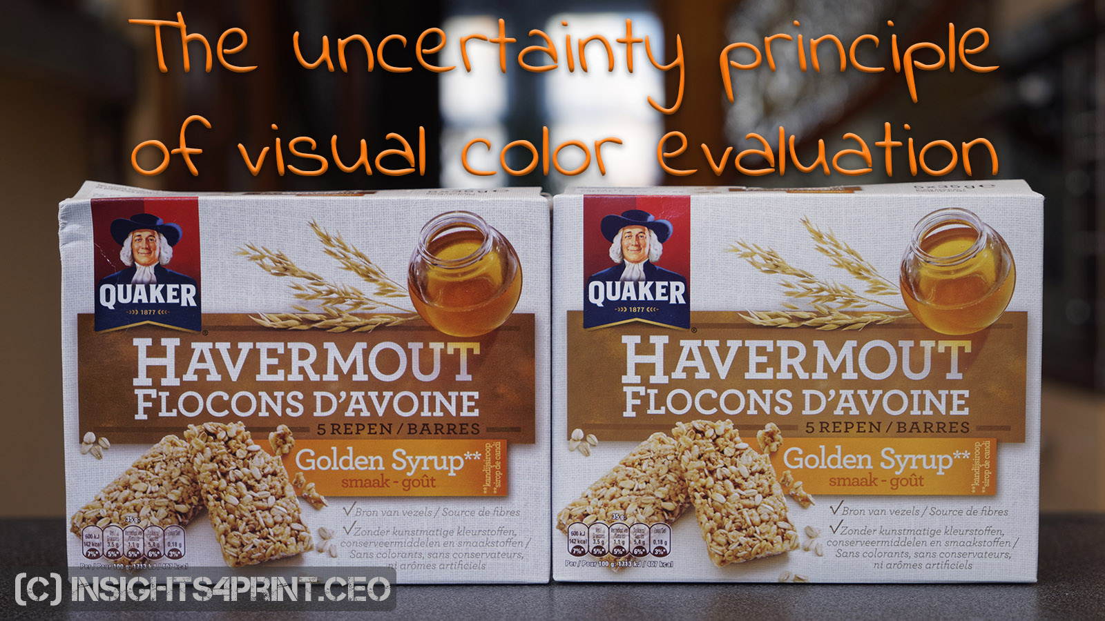
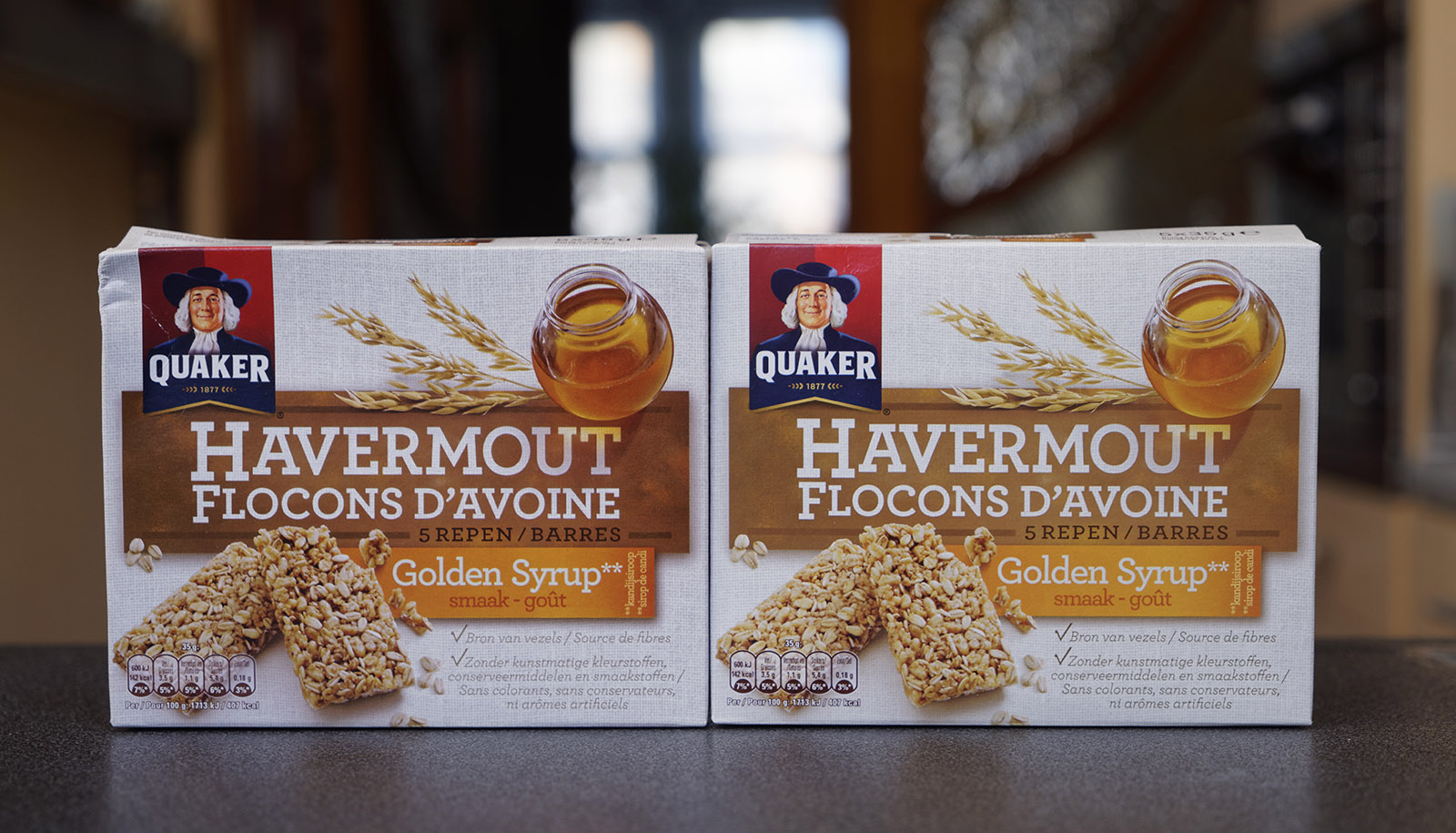
With this knowledge in mind, I did a little experiment with my girlfriend. When I went shopping, I noticed two packages of granola bars which to me – being a color nerd – showed a huge color difference. So I bought the two packages. Back home I put the two packages next to each other on the table and I asked her the following questions, in this order:
- Me: Do you notice anything?
- She: Euh… you bought two packages of granola bars… Are you hungry?
- Me: No, that’s not it. Do you notice anything about those two packages?
- She: Euh…
- Me: Do you notice a difference between those two packages?
- She: That one has a dent in it, it is damaged.
- Me: No, that’s not it. Do you notice anything about the “Golden Syrup” text?
- She: Euh… not really…
- Me: Do you notice anything about the color of the background behind the “Golden Syrup” text?
- She: It’s a nice yellow…
- Me: No, that’s not it. Do you notice a color difference between that background on the two packages?
- She: Euh… well, yes, now that you point my attention to it, there seems to be a slight color difference.

In case you think my girlfriend is either stupid or blind, she is neither. She has a university degree and teaches music and esthetics to 16- to 18-year-olds. But she is more or less an average consumer. One that will first see the damage on a package before noticing a color difference… And one that will only focus on color if you ask her to.
And this story shows what I like to call ‘the uncertainty principle of visual color evaluations’: just the fact that you indicate that you are going to evaluate color differences will influence the outcome. Meaning: people will look for color differences. And will see differences that they otherwise (i.e. while shopping) wouldn’t notice. Or even see differences that are not there…
Behavioral economics
The claim this uncertainty principle of visual color evaluation makes, is backed by scientific research. Over the past few years, I read a number of books on psychology and ‘behavioral economics’. I found cases in these books that are very similar. There are two titles about psychology and behavioral economics I can really recommend: Daniel Kahneman – Thinking, Fast and Slow; Dan Ariely – Predictably Irrational.
Now what?
I hope I’ve made it clear that it’s hard or even impossible to have a really objective visual assessment of color.
For quality control, the solution is to measure colors, with a decent and well-maintained device and according to the right procedures. There can be some drawbacks, but it’s at least more consistent and more objective than a visual assessment.
For all the color studies that have been executed in the past, it might be wise to check them if they could have been influenced by this uncertainty principle of visual color evaluations.
For future studies, a solution might be to observe people, subjects that don’t know that they are part of a color study. This could e.g. be done by putting different packages with slightly different colors on a shelf in a supermarket and see if one color is more frequently picked up by regular customers than another. Or tell participants that they are participating in a different kind of study: e.g. the general design of packages, with design variations which also include slightly different colors. The fact that the topic is ‘design’ might prevent the ‘framing’ on colors.
And one more thing: the time available for a visual evaluation should be limited. The longer you look, the higher the chances your brain will tell you there is a difference. The time to detect a color difference might even be a measure of color differences: the longer it takes to detect it, the smaller the difference. But once again the uncertainty principle of visual color evaluations applies: if the subject knows that the measurement is time-based, he/she will ‘see’ color differences faster, making it inaccurate. Let’s think about that.
Why is this important?
When doing surveys and studies, it is of the utmost importance that the question doesn’t direct the participants into one or another direction. But when evaluating print quality, that’s just what we are doing: we are telling people (e.g. print buyers), that we expect them to search for color differences. Some might stay objective, but (many) others might be triggered to see things that are not there, or overrate them and turn a small, acceptable color difference into a huge issue.
And the uncertainty principle should also be taken into account when doing scientific studies… E.g. by adding that extra check to evaluate the objectivity of the participant: evaluating two identical colors. Or telling the participants a different story, that the study is on a different topic.
PS: you might also want to check my color memory test.
PPS: here is a full paper on the uncertainty principle of visual color evaluations
UPDATE 14/08/1017: this morning I received a mailing with a link to an article titled: “This illusion proves that your brain ignores most of what you show it“. That article shows colors dissappearing from your sight, within 5 to 10 seconds! The proces behind this is called ‘filling-in’. The Wikipedia-page on this subject also shows a nice example…
UPDATE 28/01/2022: here is an interesting new research that clearly shows the effect of ‘framing’, how easy observations can be influenced. It’s a research on cookies… (the ones you can eat). And guess what they found: if you put a label on it that says ‘New and Improved’, people will actually find it tastes better… even if it’s the same cookies as one with a neutral or negative label…
UPDATE 09/07/2022: you might also want to check this article, with the results of a test where participants (399!) were asked to pick the ‘right’ Coca-Cola red from six variations. Spoiler alert: there was no agreement. The most popular one was 4 dE00 away from the correct one. Even the one with a 9 dE00 deviation was quite popular…


Interesting article, and good to bear in mind when conducting visual tests and evaluation. It reminds me of the old trick press operators did to customers coming in to approve the first OK sheet in a press run. Instead of doing any changes on the press (because they knew it was inked up and adjusted as good as it could get), they told the print buyer that they would make some minor fine tunings to get to the result the person wanted – a bit “warmer” look, and to hold back the cyan a little, for example. After some ten minutes they asked the person to come back, and showed the old samples again, just placed in a slightly different place in the viewing booth. More or less every person fell fro this trick, and now gladly accepted the sheet, and said it now looked perfect. (But it was really the same sheet they had looked at some 10 minutes earlier!)
Thanks Paul! Another old trick is to first show ‘bad’ sheets, so that the print buyer can make some remarks and after a few bad copies, show a ‘good’ copy, from the pile of sheets that have already been printed. A good press operator/account manager also knows the taste of the print buyer, ‘tweaking’ the print (and the press check process) according to his/her taste.
Another anecdote to show that it’s more about psychology than real color control: I know from a large magazine printer that when they stopped accepting physical proofs for the advertisements in the magazines, the number of complaints dropped to almost zero… Before they had one person working full time on handling color complaints…