

The best book I’ve ever read, which I recommend to everybody, is ‘Thinking, Fast and Slow’. A book on behavioral economics, by professor and Nobel prize winner Daniel Kahneman. And contrary to what you might think after this description: it reads like a thriller! It’s amazing how people react and behave. We are not the rational beings we like to think we are. And that’s also when it comes to color vision: depending on the situation, either ‘System 1’ or ‘System 2’ will be active. With different results. Let me introduce you to the wonderful world of the human brain! Plus: I’ll show the results from eye-tracking studies, revealing how much attention packages get during shopping… (spoiler alert: probably much less time than you might think)
CONTENTS: System 1 vs. System 2 | Press checks: System 2 takes over! | “This will ruin our sales!” | Read outside the box | Why is this important?
For those who think economics is boring, you need to check out ‘behavioral economics’. It’s fascinating. Over the years, I’ve read several books about it, with ‘Thinking, Fast and Slow’ being the number one. It’s an overview of many decades of research, with many exciting experiments, revealing numerous biases.
What is fundamental to this is the difference between the two parts of our brain. There is the ‘old’ part, which is very fast but inaccurate. It’s that part where our reflexes reside. It’s also often referred to as our ‘lizard brain’. The other part is much slower, but more accurate. It’s our conscious mind. Kahneman introduced the concept of System 1 (the fast, not-so-accurate one) and System 2 (the slow, accurate one) to describe these. This is often referred to as ‘Dual Process Theory’.
Here are some more properties of both:
- System 1: Fast, automatic, low effort, frequent, emotional, stereotypic, unconscious
- System 2: Slow, effortful, infrequent, logical, calculating, conscious.
System 1 vs. System 2
Recently, it occurred to me that System 1 and System 2 is the difference at play when looking at the color of packages.
(as a side note: I had that small ‘eureka’ moment while reading a book on behavioral economics and innovation, in my bath…)
When shopping in a supermarket, we are driven by System 1: we take certain cues (including brand name, form, graphics, and color category) to identify the product we want to buy, within a few seconds. System 1 does not have/take the time to check if that brand color is within a few delta E compared to the ideal color, or if two adjacent packages are identical.
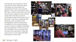
And that interaction time with a specific package is very short: one, maybe two seconds per package. This is not just a guess or assumption, this is shown by tests with ‘eye tracking’ devices. If you are in packaging, you should check out the Package Insight website. Package Insight is a division of Quad, the printing company. They test how people interact with packages on shelves in a real-world environment to find out which designs work the best. And they use, among other techniques, eye tracking.
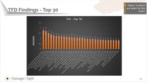
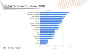
E.g., this study of craft beers shows that the Total Fixation Duration (TFD) was less than 2 seconds per package. For 13 of the 30 packages, it was even less than 1 second! So, that’s the time a consumer takes to evaluate a package: 2 seconds, or less. Think about that.
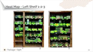
BTW, an interesting feature of that eye tracking is the creation of heat maps, which show where our eyes are fixated on, even for a fraction of a second.
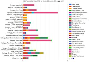
Another study from Packaging Insight is on breakfast cereals. During that test, they also checked what element of a packaging got the attention and for how long. The graph looks a bit complicated, but look at the length of the bars, and then check the amount of time these bars cover, the axis on the bottom. And do check again: the one that got the most attention, was only looked at for 0,8 seconds… Less than a second, that’s all the attention a Kellogg’s breakfast cereal box gets during shopping.
And a last one, canned soda. And specifically look at the most iconic brand, brand color: Coca-Cola… It’s the last but one: 0,1 second. Only one-tenth of a second Total Fixation Duration, that’s all. But even with only one-tenth of a second attention, it was the second most sold product…
According this blog post research has proven, via fMRI technology, that it’s effectively System 1 that’s at play during shopping, not System 2: “Up until very recently, every economic behavioral model assumed all purchase decisions were System 2 driven. Thanks to fMRI technology we know the truth, which is that economists were wrong. System 1 plays an influencing role behind nearly all purchase decisions. The degree might vary.” I’m still looking for the exact study, but I can already tell that there has indeed been many studies using fMRI on how our brain makes decisions, here is a good overview. And while checking scientific papers, I came across this one: “This case study showed that self-report based methods cannot accurately foretell success, while using brain data the prediction accuracy reached 80 per cent”.
Press checks: System 2 takes over!
When doing a press check, or another color evaluation, System 2 takes over: we will take the time to look for (minor) differences, to find (minor) differences, which is a very different setting. Try to do a press check or a color evaluation within that 2-second timeframe… It won’t be easy to make a decent comparison between proof and print, to identify color differences within 2 seconds.
From a print production point of view, it’s a good idea that System 2 takes over. It will make it possible to correct errors, to adjust quality if necessary. But you can’t compare that System 2 evaluation with the System 1 view that a consumer will have in the supermarket. They are very different.
Dear printer, here’s some advice: if you have a difficult, hypercritical print buyer, or brand owner, let him/her do the press check within that 2-second timeframe. Show the eye-tracking statistics and explain that the product will not be viewed for more than 2 seconds. So, a print check that resembles the buying experience should not take longer than 2 seconds. And make sure the press check is done with P2 lighting (500 lux), not the P1 at the press console (2000 lux). The lower the amount of light, the harder it is to spot color differences. This will be an interesting experience…
BTW: it’s also System 2 that is activated when color scientists, color consultants, and color geeks look at color. It’s conscious, it’s slow and high effort. They should be aware of this, they should not generalize what they notice, what they find to situations with System 1 viewing.
Copycats
It’s the difference between System 1 and System 2 evaluation that house brands exploit when designing the packages of their alternatives to famous brands: they will, e.g., design a red cola can that is so close to Coca-Cola that it will trick System 1 into confirming that’s the product we need, but just different enough not to get sued by Coca-Cola, different enough when System 2 takes a closer look at it…
You may have witnessed that yourself, I admit that I did. I have bought the wrong products in the past because my System 1 was fooled. Here’s an actual example of this.
“This will ruin our sales!”
An often-heard argument for setting tiny tolerances is that it will ruin sales if the color deviates too much. But there is no proof for that claim (remember the significant changes in Coca-Cola red a few years ago LINK). On the contrary… A few weeks ago, I had a meeting with someone from the packaging industry, glass packaging to be specific. His company has a system to reuse glass bottles, mainly for (craft) beers. There are a few standard-sized bottles, but one of their customers had a very different one, which makes the collection/return process a bit more challenging. The packaging company had already suggested this company to switch to one of the standard bottles, but they refused. “That special bottle is our brand! That’s what makes our customers buy our beer! Changing the type of bottle will ruin our sales!”, claimed the marketing department. A similar claim is often heard in packaging printing.
And then something happened… the war in Ukraine. It turned out that the particular type of bottle was only available from one manufacturing plant located in Ukraine, which had to shut down due to the war. And guess what happened to their sales… nothing significant. Even with the standard bottles, sales figures were as before. It did not make a difference.
And here is something people often seem to forget: the difference between initial sales and return sales. Yes, that particular bottle might have grabbed the attention the first time, but for repeat sales, when you like the beer, you look for the product by brand name. If the bottle looks a bit different, you might be a bit surprised, but you buy it for the contents, not for that particular bottle.
If changing the design of a package would matter that much, would any brand risk doing a rebranding? I guess not… (although I do admit there have been cases of rebranding going wrong, but in those cases, they changed way too much at once, it was not gradually)
Read outside the box
All of this behavioral economics stuff, System 1 and System 2 might be entirely new for a print specialist, a color specialist. But it is real. And it influences us, all of us, all the time. And it also shows why every specialist should read outside the box. Read (or listen to) information that is NOT your core competence. Be interested in the world outside your expertise. Why? Because it’s there where breakthroughs come to life…
The book I’m reading now is ‘Evolutionary Ideas’ by Sam Tatam. The basic idea from the book is that we keep re-inventing what has already been proven in the past. Not necessarily by humans, but also by evolution in nature…
One of the examples in the book is the development of the high-speed train in Japan. They had a specific target to meet: from Tokyo to Osaka (515 km) in two and a half hours or less. The speed was less of an issue, they got there quite fast. But with speed came problems: noise, a lot of noise… And especially when entering a tunnel: which resulted in a significant boom. Reducing noise became the real challenge.
And a challenge it was… The development team couldn’t find a way to reduce the noise levels to the required level… Until one of the engineers, who was also interested in birds, remembered a lecture he had once attended. And this inspired him to study why the owl makes no sound at all when flying and why the kingfisher only makes a small splash when entering the water at a very high speed. And that would be the breakthrough, it was these birds that provided the answers they needed. Evolution had already solved their problems…
Another example is Innocentive, which originated from the pharmaceutical company Eli Lily. Like most (or all) pharmaceutical companies, Eli Lily was research-heavy. And they had several issues they had spent large amounts of money on that were still not solved. So they tried a different approach: open innovation. They made their ‘challenges’ public and put a reward on them. Guess what: within a year, one-third of their challenges (which they had worked on for years!) were solved… “We quickly found out that people who solved the problems had some type of lateral expertise.”
And this relates to one breakthrough I’ve seen unfold right in front of me: at the end of the last century, P&G was working on washing powder in the form of a tablet. But they couldn’t get it right, the tablets weren’t firm enough, kept falling apart… At that time, I was on vacation with a friend of mine, who was pursuing a doctoral degree in pharmacy. And the person responsible for that R&D project was also in our group. She mentioned her problem to my friend, who said there were a few techniques to solve this. Back home, my friend gave a classic schoolbook about pill making to the P&G person, eventually delivering a breakthrough in their project…
For color scientist, color experts, color geeks, an interesting, ‘out of the box’, field to read about is color perception and recent research in that field. Here is a good starter, the article I already mentioned in my previous article, which discusses some color perception topics. And of course ‘Thinking, Fast and Slow’, the best book I have ever read.
Why is this important?
There are two important lessons in this article. The first is that, even as an expert, you need to show interest in other fields, it’s rewarding! You might get inspired in a way you will never get when staying in your typical echo room.
Second lesson: our brain is something weird. And the way we look at color during a press check, is very different from how we look at color in the supermarket. In the first, we invest a lot of time, we want it to be accurate. We activate System 2, a conscious decision, making it possible to detect even the slightest differences. In the supermarket, however, it’s System 1. And this is not that accurate, it will never have the same level of critical color vision as System 2, at the press check. System 1, in the supermarket, will never notice those slight deviations that print buyers and brand owners are making so much fuzz about… It only invests 2 seconds, at the most, to evaluate a package. (*) This should be taken into account when setting tolerances for packaging, labels, and general commercial printing. Let’s stick to the ISO standards and best practices like PSO/PSD, G7. These have good tolerances.
PS: in a LinkedIn post, I asked my network how this short fixation duration relates to the time needed for press checks… And more thoughts on press checks in this article.
(*) The Package Insight website has some 30 projects on specific products listed. In only very few occasions, the top brand(s) got just a over 2 seconds attention. With one exception: tooth paste. For some reason we look much longer at tooth paste packages than all other kinds of FMCG packages… If you have an explanation for that, please leave a comment! I have no clue…
Goede middag Eddy. Ik heb het boek: ‘Thinking, Fast and Slow’. A book on behavioral economics, by professor and Nobel prize winner Daniel Kahneman, inmiddels aangeschaft. Erg interessant. Dank voor de tip. Met vriendelijke groet, Hans Baljet / Printmedianieuws.
Fijn! Echt een boeiend boek…