

Since the launch of Project BBCG, only three weeks ago, several vendors contacted me with the same question: “Can we integrate Project BBCG into our software products?” My standard answer used to be: “You already have!”, since it’s based on CIELab values as the primary color definition. But a question last week triggered something. We can do a lot more! Here are some ideas, since I want everything related to Project BBCG to be non-proprietary, I’m sharing it here so that every vendor who wants to jump on the wagon has the same information.
CONTENTS: The world is your color guide | From Adobe CC to measurement device | Automatic color conversions for artwork: full GCR | Dear Adobe: embrace CxF for color libraries! | Why is this important?
An important aspect I overlooked, is the user-friendliness for the designer, the brand owner, the print buyer. Although everything about Project BBCG is based on tools and knowledge they have, except for using CxF, we can still improve this. It was a question from Norm Uress (Measurecolor), who asked if there was a fit with the ultra-portable spectrophotometers. And yes, of course! These ultra-portable and very affordable spectrophotometers could be valuable tools for designers, brand owners and print buyers. So, if these could be used in a way that makes it easy for this target group, that would be awesome!
(as a side note: ‘awesome’ is an often mentioned word in the feedback I received about Project BBCG)
(from now on, when I write designer, this probably also applies to brand owners and print buyers)
The world is your color guide: importing a measured color
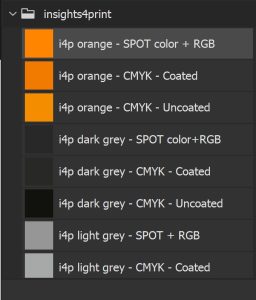
What is needed to make that connection user-friendly is relatively simple: it should be easy for a designer to 1) measure any color and be able to import this into Adobe CC applications, or any other relevant application (but let’s be honest: the market share of Adobe CC is gigantic). And 2) import their brand color specifications from Adobe CC into the measurement device, so that he/she can just select the brand color that needs to be inspected (e.g., i4p – Orange – SPOT color + RGB) from a database in the device/app, and compare the measured value with the basic brand color definition, the Lab values.
That first scenario doesn’t seem that difficult to me (but, I do admit: I do not write software code). What you need, is to be able to translate a measured color into an ASE file. Which then can be somehow shared/exported so that the designer can import it into Adobe CC. How should that sharing be done? Just look at how you can share pictures from your smartphone. I always sent pictures from my smartphone to my laptop via e-mail. It might seem silly, but it’s very efficient.
For developers: in case you need more information about the contents of the ASE files, here are two good articles: article 1 and article 2. So, translating the measured data into an ASE file should be feasible. But I should mention one more thing, in case color translations are needed: Adobe Photoshop and, I assume also the other Adobe CC applications, use D50, 2° observer. The values in the Pantone libraries in Adobe CC are M2 (measurement method). If one of these is incorrect, please let me know, and I will update the article!
From Adobe CC to measurement device, color quality management, …
That was the easy part: importing a measurement into Adobe CC. Now let’s do it the other way around. Conceptually, you could reverse the flow I described above: export the brand color files as one ASE file and import that into the measurement application.
But maybe designers would like a flow that is even less hassle. So, here is a suggestion: import the brand color(s) via a QR code.
I guess a clever plugin developer can create a plugin that would read the name and Lab values of a brand color swatch and translate that into a QR code on the screen, which then can be scanned by the measurement app on the smartphone.
But we need to agree on what is in that QR code. I suggest taking part of CxF, the Color eXchange Format, to do this. CxF has some elements that would perfect this exchange. Look at this section of a CxF file below.
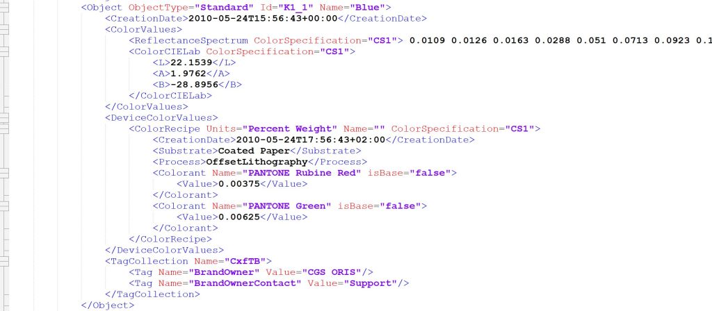
In a minimal exchange, having the name and the three ColorCIELab elements would be sufficient. For my insights4print Orange, that could look like this:
<Object Name=”i4p – Orange – SPOT color + RGB”>
   <ColorValues>
      <ColorCIELab>
         <L>70</L>
         <A>47</A>
         <B>79</B>
      </ColorCIELab>
    </ColorValues>
</Object>
A QR code based on that code could look like this.

FYI: there is a cheap plugin to create QR codes in Adobe Photoshop CC.
Combining multiple color swatches in one QR code might not be a good idea: the QR code has a limited number of characters. In that way, some export/import workflow should be chosen.
Note for the designers: to make this work seamlessly, it is advisable to order your brand colors in Adobe CC logically. They will be represented in the measurement application in the same way, in the same order.
Some of the vendors that contacted me, have systems to follow up on print quality, on brand color reproduction. A similar flow would apply to them, they need to be able to import the brand color specifications in an easy way, and show the brand colors in a similar way as they are shown in Adobe CC (read: same order).
Automatic color conversions for artwork: full GCR
As I explained in the Project BBCG tutorial: standard automatic color conversions aren’t nice with brand colors. But this is not limited to brand colors, the same accounts for all artwork. What would be nice, is if color conversions of artwork would be converted with maximum GCR (Grey Component Replacement: the fewer inks, the better), and with a safety zone on the low and high end (eliminating e.g. everything below 5%, turning 97% into 100%). In packaging, these principles have already been used for a very long time, that’s where I got the idea. But I’m not sure if and how many vendors in commercial printing apply these. In packaging software, you can also set the maximum delta E when calculating alternative ink combinations with fewer inks, plus the lower and higher end thresholds.
What might be challenging, is how to deal with this when gradients are used… so if you would like to explore this route, definitely look into this. And you might also want to check if there is an IP on this…
(I’m not saying there is, but I’m not sure there isn’t)
On the design side, it would be mandatory to design in spot colors or CMYK (when only printing in CMYK) and keep the CMYK numbers unchanged when exporting to PDF.
Dear Adobe: embrace CxF for color libraries!
And the last is a plea to Adobe: embrace CxF for color swatch information in your Creative Cloud applications! The PDF file format supports spectral color definitions, the latest version of the APPE introduced spectral color definitions, so it would only be logical to include spectral color definitions in Adobe Illustrator, Photoshop, and InDesign.
Next to having an easy import of measured colors as input for a color swatch, there is one significant reason: halftones of a spot color, e.g., for gradients. When you can import a full CxF, including either calculated or measured halftones of a spot color, the preview in Illustrator would probably improve and be more consistent with the final result.
But even implementing a partial adaptation of CxF, the ‘mini CxF’ I showed you above, for the definition of a swatch, would already be excellent! Being able to import and export color swatch definitions in that mini CxF format, would be a significant step forward to becoming completely independent of Pantone colors, of Pantone color guides. Go for it, Adobe!
Why is this important?
When I launched Project BBCG, I was convinced that everything was in place to implement the suggested workflow immediately. And it is, you can easily replace your Pantone-based workflow with a Project BBCG flow. But, when getting questions from different vendors, it became clear we could do more. We can get to a workflow where a designer measures a color in real life he likes and imports it into Adobe CC as the brand color for brand ABC. We can get a workflow where a brand owner exports his brand colors from Adobe CC to the measurement application of his ultra-portable spectrophotometer. When checking a print job, he can look up the color from his dedicated color library and check the print job.
With a few clever tricks, with a few clever people, this could be a reality quite soon. If Adobe fully commits to CxF support in Adobe CC, it could become a reality for everyone. And that way, we would never have to talk about Pantone color libraries and the issues associated with them again. Except maybe on a Friday evening, after work, in the pub, when recounting old, scary stories from the past…
PS: consider this as a working document. These are my ideas of what we need and what might be a way to get it. There might still be other requirements, ideas, or practical challenges, maybe I just missed something important. Please do contribute to the discussion! If we cooperate on this, we could get a much better flow than we have today.
PPS: if you use or integrate Project BBCG, there’s also something else you need to do: brag about it! Say that you support it! And share the information about Project BBCG, share the tutorial file (yes, you can publish it on your website, on condition that you don’t alter it and include the credits, a link to insights4print.ceo). To get the Project BBCG movement growing, we need ambassadors and advocates. That’s not something I can do. My full time job (the one that pays the bills) is outside the printing industry. Everything I do for insights4print.ceo and Project BBCG is in my free time. There is also no financial backing behind insights4print.ceo and Project BBCG (except an occasional paid presentation). I’m just doing this because I love the printing industry and want it to move forward. The appreciation and gratitude in the feedback I get, is what drives me.
Be the first to comment