Best Practices
Monitors: is sRGB still standard?
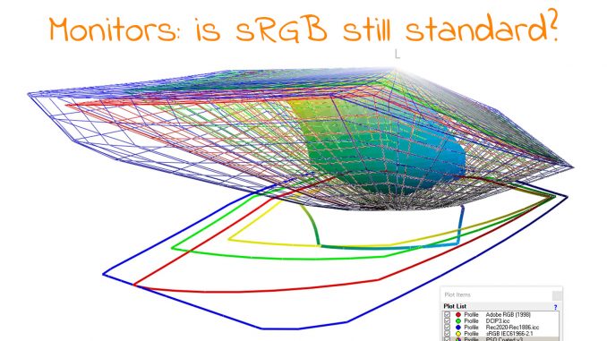
Last year, I got a new monitor at work, a 4K monitor, nice! My regular job (the one that pays the bills) is not in the printing industry, so ‘color’ is not at the top […]

Last year, I got a new monitor at work, a 4K monitor, nice! My regular job (the one that pays the bills) is not in the printing industry, so ‘color’ is not at the top […]
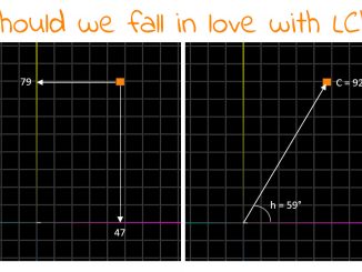
For as long as I can remember, the primary unambiguous, device-independent way to describe, define colors is in Lab (CIELAB, L*a*b*). But even after so many decades, I still struggle to ‘feel’ the a- and […]
Earlier this week, I posted on LinkedIn why, according to me, designers might not be familiar with color spaces and document profiles. It generated a lot of discussion… Going from “designers should not be bothered […]
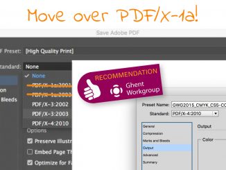
It was a surprise when I read the recent message from the GWG: ‘Stop using a 20-year-old standard’! My first reaction was: what??? The GWG promotes standards! But then I noticed the ‘20’, and it […]
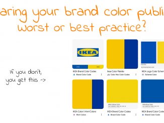
Brands are proud of their brand logo and their brand colors. They spend a lot of time and money to get that perfect logo. And a lot of time is spent on creating a brand […]
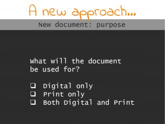
Initially, I had planned to write an article about two issues I spotted in Black Friday publicity folders I received last week. Two issues that could have easily been prevented with a little bit of […]
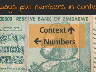
Here’s an important lesson for life: always put numbers in context. E.g., the fact that I own 20 billion dollars. Unfortunately, it’s Zimbabwean dollar, which is worthless. (*) And with that in mind: what’s up […]
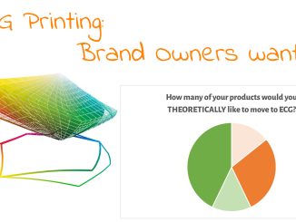
As I showed in the previous article, ECG printing (expanded or extended color gamut) is feasible from a technological point of view. Even more: it has lots of benefits. And guess what: most brand […]
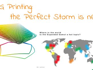
When looking at packaging printing, ECG (expanded or extended gamut printing) is hot. Many people are talking about it, and the promises seem convincing: you can simulate much more brand colors with a set of […]
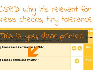
With the vacation approaching, here’s something to think about: CSRD, the ‘corporate sustainability reporting directive’ and how this will affect print, and more specifically: press checks and tiny tolerances… Your first response might be that […]
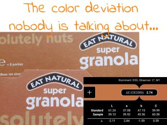
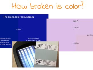
Brand owners demand lower color deviations, with myths and unproven claims being their main argument. Recently I heard that 1,5 dE00 should be the norm, which is not necessary, in my opinion. A box of […]
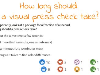
Earlier this year, I published an article with studies showing how long consumers interact with a package while shopping. On average, the ‘Total Fixation Duration’ was less than a second. Coca-Cola cans? One-tenth of a […]
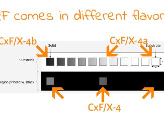
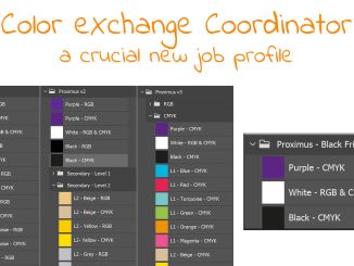
When talking about brand colors, and brand color reproduction, many people are looking at CxF as the way to go. It is also one of the directions Project BBCG shows for sharing brand color specifications. […]
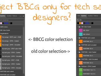
In a recent discussion on LinkedIn, someone said that Project BBCG is a good system, but only for tech-savvy designers. While I agree with the first part, I strongly disagree with the second: it’s even […]
You may have seen some posts on LinkedIn about the latest Pantone guides, about issues with those guides. Many people shared pictures of differences between old and new guides, we discovered homeopathic-level ink formulations (which […]
(c) insights4print.ceo - 2016-2024