

Did I already mention that I love LinkedIn? Not just to keep in touch with people I know, but also to find and share interesting information. Plus, it’s also an excellent place for me to run small experiments. And every time with some unexpected results… Let’s see what results another ‘Is there a color difference?’ test on LinkedIn delivered!
CONTENTS: Bahlsen Blue | The LinkedIn test and results |That other number | Some comments |Extra measurements |The small red tag | Redesign failures | Why is this important?
Last week, when passing through the aisle with cookies, I noticed this new type of Bahlsen cookie, with a pink/lilac background. I wondered how the logo’s blue would compare to the ‘regular’ cookie standing next to it. So I bought both of them (yes, I know, the efforts I need to do to keep this blog interesting…).
When I returned home, I immediately took out my Nix Spectro 2 and measured the logo’s blue (the lower part of the N; M1, D50, 2°, 3 measurements averaged), which was interesting: 2,13 dE00! So, outside the 2 dE00 tolerance, people selling color-related tools and services are pushing… And I can assure you: both are excellent print jobs. As was the case with the previous test I did with Bahlsen blue.

(For the record: I do not have the reference for Bahlsen blue, couldn’t find it online, so in case the reference is ‘in the middle’ of the two measurements, both would be within that 2 dE00, if one of them were spot on, the other would be just outside, but: please read on and stay focused… there’s a little surprise coming!)
The LinkedIn test and results
Knowing they are very close, but not identical, I took a picture of the two packages. I posted them on LinkedIn, asking what viewers think of that blue logo, stating that it was two different varieties of cookies.
I offered the following options:

And here are the results, with exactly half of the viewers stating it’s less than 2 dE00. But also two LinkedIn users stating it was over 2 dE00 and NOT acceptable…


Given the very different background, which will influence color perception, I included the option that it was not a fair question. And almost one in four picked that option, nice!
BTW: I already discussed how the background will influence color perception in the previous article about Bahlsen blue, which also had two packages with a different background, that time it was white vs light blue. And putting a brand color on different (colored) backgrounds is kind of a catch 22: either the brand color is a perfect match with the brand color specifications (CIELab or spectral values) and then it will look different, due to the influence of the background. Or, it will look as intended, but that won’t be a spectral match. You choose.

That other number
If you have read my previous article on Bahlsen blue, you might remember that there is another number we have to look at: the number of people who saw the post on LinkedIn, but decided not to interact, not to react. And, once again, that’s a significant number of people! Nearly 99% didn’t feel the need to react to this color related question. And that’s not different in a shopping environment: as soon as our brain has received enough information to conclude with a reasonable – but not absolute! – certainty that the color of the package is the one you were looking for, you will grab it. Predictive processing this is called, I already mentioned it in this article, about adjacent packages with a 11 dE00 difference. When shopping, we are not evaluating color, it’s just a rough trigger to find what we are looking for. In case you don’t believe me, check out what happened to me when shopping for breakfast cereals a few years ago…

And taking into account the members that decided not to respond, the results look like this…

Some comments
Obviously, there were a lot of comments, which are often quite revealing. For example, the one who said this was a terrible print job! No color control! I guess (or hope) that person didn’t read the instructions – being: look at the blue logo of these two varieties – and thought they were two samples of the same cookies. If that person did read the instructions and thought the blues were way out of control, that would be something significant. But: it’s not the first time I’ve encountered this! When the first results came in from a test I designed a long time ago, where participants had to compare a reference with several flat samples, including one identical (< 0,3 dE00), one person claimed to see a big difference between the identical samples… Why? Psychology! He is a professional and was asked if he noticed a color difference, so he had to see one! Nearly one out of three print professionals who participated in that test claimed to see a difference… Although there was none…
Always keep in mind: if you are looking for color differences, e.g. while judging print quality, chances are that eventually your brain will ‘see’ color differences, even if there are none. It’s psychology. It’s the ‘uncertainty principle of visual color evaluations‘.
Another comment detailed why there was a difference between the upper and bottom part of one of the packages: “obviously the form was not quite in balance since the upper part of the blue logo is lighter than the bottom part”. With that comment in mind, I did some more measurements, and now it gets really interesting…
Extra measurements
Do you remember that my first assessment was that the blue in the two packages was just outside 2 dE00? Well, when measuring them again, they were just below 2 dE00: 1,92… So, if you had used 2 dE00 as the threshold to accept/reject that print job, on the first measurement, you would have rejected it, and the printer probably would be forced to do a reprint, but the second would have approved it. Did I already mention that print quality control can be like Russian roulette? (Yes, I did, in this article.)
And imagine the cost of that first scenario! Not just the financial cost that the printer would have to absorb (please remember that their margins are really low and packaging material is a large part of the total cost), but also an environmental cost: these packages would have done a perfect job, but when rejected, they are wasted.
I measured multiple spots this time, but there was no significant difference between the top and bottom parts! Meaning: no inking problem…
So, why did that person think he noticed such a deviation? To find out, I also did ‘digital measurements’: I checked different parts of the picture I shared with the color picker in Adobe Photoshop, after averaging a 25 x 25 pixels area, and calculated the delta E with the ColorTools add-in for Microsoft Excel. And that immediately showed what happened: the top box is slightly curved, which influences the way the light falls onto it and therefore the reflected light, resulting in the color that my camera registered. Which will not happen on the press control table, where the sheets are always flat. But this will happen very often – if not all the time – in real life, especially with a folding carton, due to the tension of the folding. The world outside the print bubble isn’t flat, as I explained in detail in this article.

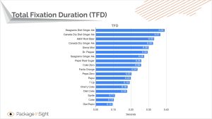
Your first response might be that you have never noticed such a thing in real life! Yes, and there is a good reason for that: our brain corrects for that. Our brain only notices such minor deviations if we are actively looking for them. And that’s NOT what you do in a regular situation, like shopping. BTW: do you know how long you are looking at an individual package while shopping, what the ‘total fixation duration’ is? Well, I found tests with eye-tracking tools, by Package Insights, and the results are pretty revealing: on average, less than a second. A can of Coca-Cola? One-tenth of a second… Try judging a color in that amount of time… Or to notice that curvature and slightly different lighting I just talked about. This is also related to how our brain processes information, which I explained in detail in this article.
As an analogy, I love taking pictures of reflections in windows; you can sometimes get fascinating scenes. But most people don’t even notice those reflections; they literally look right through them. And I also have to force myself to spot them.
The small red tag
Another person made a remark that the small red tag was different. And that must have been because it is CMYK (which is correct), and the magenta was in the top package stronger to make the cranberries more satuated. Which is not correct. I made a new picture, with the red labels touching. And guess what: once again there was curvature… When pushing it down a little, they are very close to identical.

Now, the print quality of this tiny red tag touches another important point, which my friend, Dr. Kai Lankinen has raised a few times on LinkedIn: shouldn’t we use different tolerances for primary brand colors (the Bahlsen blue in this package) and secondary or supporting colors (like the red tag)? I agree with him. This would, by the way, be a great research project or subject for a thesis if you are a student.
Redesign failures
Last year, right after my previous article on Bahlsen blue, I published an article on the new logo for Oreo cookies (yes, you can detect a pattern in my research). As a reminder, there is a color difference of over 10 dE00 between the old and new logos. According to ‘common wisdom’, spread by people selling color-related tools and services, this should have ruined the sales! Especially when both old and new packages are used next to eachother (which was the case).
But I didn’t see any articles on an ‘Oreo redesign failure’… I checked the investor relations information on their website, and there was no mention of any redesign failure, nor a sudden decline in sales. But there is more: when I checked several websites where you can download brand logos, I found that these still show the old logo, over half a year after I spotted the new logo in real life! So: a 10 dE00 redesign went unnoticed! Please, read that again… And think about it. How this relates to tiny tolerances in print.
What I did see recently was – again – a redesign failure by Tropicana… It was a post on LinkedIn by Fernando Arendar, who introduced me to the predictive processing theory and is known for his expertise in ‘neuropackaging’. He made an interesting analysis of why the recent redesign of the Tropicana packages resulted in a sales decline. And guess what: it had nothing to do with color. There are many things involved in shopping/sales, color is just a minor part. The purpose of color is to provide a visual clue to find the preferred brand/product, within a tiny time frame (usually less than a second, as I showed above).

A few years ago, when I asked a group of over 100 average consumers when they would buy another brand than their favorite brand, two reasons stood out: promotions and being out of stock. When I repeated that question in a FOGRA Colour Management Café two years ago, so with print professionals as an audience and including a few people from X-Rite/Pantone, not one picked the option ‘looking a bit different’. Just by rephrasing ‘color difference’ to a more neutral ‘looking a bit different’ showed their real feelings: minor color differences really don’t matter.

Why is this important?
There are multiple conclusions we can draw from this test. First: never do a complete ‘print quality assessment’ based on a picture. Second: the real world is NOT flat, the curvature of boxes will influence light and therefore color. While in an ordinary setting, your brain will correct for that. However, a camera will not and show it as it is on your screen.
Design influences color perception: if you have a brand color surrounded by another color, the perception will be different, even if the ink has a perfect spectral match.
Although color is an essential quality aspect in printing, it’s only one of the many elements in shopping. It serves a goal: being able to find your favorite product in the chaos of a shop. And this only takes minimal time, one-tenth of a second for Coca-Cola cans. That’s just enough to see it’s red, not if that red is within a tiny tolerance.
Redesigns can lead to failure, but it’s not due to the color being slightly different; many more, and more important, factors come into play. A 10 dE00 redesign of the Oreo logo even went unnoticed…
And as I already mentioned in my previous article, the myth that tiny color deviations would hurt brands was invented by color consultants who wanted to make money. And it’s based on a wrong interpretation of studies from the newspaper industry, showing that the use of color, compared to not using color at all, enhances brand recognition. Even after a decade of asking people who defend tiny tolerances in print to show me the proof, I still didn’t see ANY study that would confirm this. But I do have studies showing the opposite… And not just tests I designed myself. Also, tests by others. The myth is busted, let’s end the 2dE00 madness. Let’s just stick to the tolerances specified in the applicable ISO standards.
And dear FMCG brand owners, if you still think your brand is so special that it needs tiny tolerances in print, accept the conditions and pay a premium price for it. A 2 dE00 tolerance is NOT the default for packaging & labels and commercial printing. It’s a premium. You have to put your money where your mouth is.
PS: Three decades ago, tolerances were broader because of the limitations of the technology used. So, if a 3 or 4 dE00 didn’t hurt sales then, why would it hurt sales now? Please, enlighten me…


Be the first to comment