

It might sound like blasphemy: swapping brand colors. And some people might accuse me of heresy by just thinking about that possibility. But hear me out: there is an experiment that supports this these, that – contradicting ‘common knowledge’ – brand colors are not that unique, and you could swap them without common people noticing… The proof? An experiment designed to pick the ‘right’ Coca-Cola red from six variations, with the real Coca-Cola red next to five other famous red brand colors. And guess what: the most popular one, with 29% of the votes, was not the right one.
CONTENTS: Picking the best fitting brand color | 495 tests, and counting | Famous red brand colors | Why is this important? | Updates
Originally published: 26/09/2026 – Last update: 02/10/2026
Before digging into that experiment, let’s think about how brand colors are picked, how that special color is selected from numerous possibilities. I’ve never witnessed how this happens at a big brand, but I like to imagine it goes something like this.
- Agency gets a briefing from Big Brand on their products, their values, their customers
- Based on that briefing, the agency does background research on what brand color would be the best fit. It checks competitors and all kinds of studies on color psychology (whether or not they are based on scientific research)
- The agency comes back with a proposal to the Big Brand. In a meeting with all the important people, the agency gives an elaborate presentation on their research, to finally reveal their proposal for the new, special brand color.
- Because a presentation on a screen is not reliable for accurate color reproduction, the agency also pulls out their good old, trusted Pantone Color Guide and – with a lot of pride – shows the new, special brand color: Pantone 109C. The agency passes the color guide around so everyone can take a good look at the new, special brand color.
- And then the discussion begins: the head of the Big Brand – obviously – wants his say in the discussion and loudly claims that 116C would be a better fit. “That one comes closer to the core values of our company! It should be 116C!”
- A long, intense discussion starts about the very essence of the company: which color nuance represents it the best: 109C or 116C.
- Some follow the agency, because they are the branding experts, the color experts. Others follow the head, because he ‘feels’ the company, because he is the head.
- Eventually, it is settled: the head has the last word, and 116C will be the new, special color. Because he ‘feels’ that it’s the better choice.
And this is a unique color: Pantone has a specific name for it, so it must be unique. And – especially after the fierce discussion – it must be guarded by all means possible, with the utmost diligence, because if, in real life, the new, special brand color were to look more like 109C, customers would not recognize it as the company’s core values and would no longer trust them, that’s what they are told.
FYI: 109C and 116C are less than 2 dE00 apart, the image below gives you an idea.

An even more interesting example is 2747 C and 2748 C, these are less than 1 dE00 apart… Imagine a discussion whether it should be 2747 C or 2748 C… [sigh]

Both images were created in Affinity, which still has the Pantone libraries included, and which is free after Canva acquired it. I’ve used the PANTONE Formula Guide Solid Coated v5, for the blue one, I included the sRGB values, since the difference is invisible to me. The setup of both images is the same: 2 triangles with the mentioned Pantone colors.
Well, the story above is just my imagination; I’m probably wrong on this one.
BTW, on that last sentence of the story: even after a decade of searching, I’ve found no studies, no proof showing small color differences would negatively impact sales. If you have any, please send me the paper describing the study and its conclusions.
But what I do know is how Esko (Graphics) picked its new brand color after Barco Graphics and Purup-Eskofot merged in 2001. One of the VP’s involved shared the story with me a long time ago.
The agency they hired had done thorough research on brand colors. And they concluded: a certain kind of green was unique! No other company had this kind of brand color! Woohoo! Really proud they found that unique color, they made a presentation with their proposal for the new brand identity and the new brand color. And they were in for a surprise: the moment they showed the green, everyone around the table strongly opposed it. Why? The agency showed them a really unique color, one that would stand out against all other companies, and they were not happy???
Well, their client, Esko, wasn’t just an ordinary company: they had excellent knowledge of printing and color. And they immediately noticed why no other brand used that really unique color: it was impossible to reproduce with standard CMYK inks… And remember: at that time, there were still lots of printing magazines, where Esko advertised. They needed a brand color that was easily reproducible in CMYK… So, eventually they settled on a different shade of green, the one they are still using.
Whatever the process to find that new brand color, the impression is always the same: this is the one that best represents our values, our products. And it is a unique color: Pantone has a specific name for it! Which makes it uniquely definable, it could never be confused with another one. (sic)
495 tests, and counting
With that uniqueness of each and every brand color in mind, I wanted to do a reality check. So, nine years ago, in 2017, I put together a test and published it online. At the moment of writing, 495 people participated in that test, which is a far larger number of participants than most other color-related experiments.
The setup was the following: I took the Coca-Cola logo, white text on a red background. I created six variations: one with the ‘right’ Coca-Cola red, and in the other five, I swapped that red with the red of other famous brands: Adobe, KitKat, Netflix, Target, and Vodafone. During the test, the different versions were shown in sequence (not side by side), and participants had to pick the right one. Participation was done via a web form, where I asked not only which version was correct, but also whether a calibrated monitor was used, whether participants were involved in printing, and a few other things. A more in-depth version of the setup is in this article.
To make a long story short: the most often picked color was not the right one. The most often picked color, with 28,7% of the votes, is just over 4 dE00 from the real one. And even the one that is just over 9 dE00 apart from the real one was picked about as often as the real one… (19,2% vs 19,4%)
Below is a graph showing the results. For the first time, I’ve included not only the color deviations, but also the name of the brand color… As you can see, the most popular one is Netflix red, and Target red is as popular as Coca-Cola red.

Now, some people might argue that this is an online test and you shouldn’t do color-critical tests online, you can’t trust a monitor. Point taken, and that’s the reason why I included that important check: whether they used a calibrated monitor. Which was the case for 22% of the participants. Interesting side note with this: only 70 out of 306 of the people involved in printing – the ones that should know you need to do critical color work on a calibrated monitor – did this test on a calibrated monitor. Only 23%… Read that again. And ask yourself: why?
Did that make a difference? Not if you look at the most often-picked color, that’s again Netflix red, which even rose from 29% to 34%. But there is a shift between the second and third place: while that was a tie in the total results, in this subset, the real one came in second (25%), and Target red came in third (16%).

If this test didn’t convince you, and you still believe that – as Coca-Cola states – in real life everyone will immediately recognize Coca-Cola red, check out the image below. These are all regular cans of Coca-Cola, bought in a regular supermarket chain, within a few weeks’ timeframe…
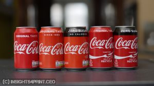
From a consumer point of view, Coca-Cola red is a vibrant red. It’s not a Pantone number, a CIELab value, or a spectral value. If it’s vibrant red, and the shop is a trusted place, consumers will buy it if they intend to purchase Coca-Cola. Even if it’s – when measured – more like Netflix red or Target red.
Famous red brand colors
To put the uniqueness of brand colors in perspective, I did the following exercise: I asked my little assistant, Google Gemini, to give me a list of 20 famous brands that use red as their brand color and asked for the values in sRGB (which are probably the easiest to find). This is the list: Adobe, Budweiser, Canon, CNN, Coca-Cola, Ferrari, H&M, KFC, LEGO, Levis, Marlboro, Marvel, McDonald’s, Netflix, Nintendo, Pinterest, Puma, Red Bull, Target, YouTube.
I recalculated the sRGB values Gemini provided me to Lab values. Then, thanks to the excellent ColorTools Excel add-in, I created a matrix and calculated the delta E 2000 difference between all 20 of them, all combinations. To make it easier to evaluate, I included ‘conditional formatting’ in the Excel sheet: red (<1 dE00), orange (>=1 to <4), and green (>= 4). And that looks like this.

To give some statistics:
- The maximum difference was 20,9 dE00
- The median was 7,9 dE00
- The minimum… Well, that was 0,0 dE00. Yes, some brands share the same brand color, based on the list Google Gemini generated. E.g., Adobe and YouTube. And also Canon, CNN, and Target.
- 10 combinations had a difference below 1 dE00…
- 31 combinations between 1 dE00 and 4 dE00
- 149 combinations had a difference of 4 dE00 or higher.
You get the picture: many companies have more or less the same brand color.
It’s possible that not all sRGB codes were correct: if you look at five different websites that publish the color codes of brand colors, chances are that you will get at least three different combinations… E.g., let’s check those three companies that have, according to the list generated by Google Gemini, the same sRGB values: Canon, CNN and Target. First the values according to Brandpalettes.com, next according to Brandcolorcode.com.
 µ

As you can see, according to Brandpalettes.com, CNN and Target have the same RGB values. According to Brandcolorcode.com, it’s Canon and Target that have the same RGB values and same Pantone number, which is different from the Pantone numbers provided by Brandpalettes.com. [sigh]
If you really want your brand color to be reproduced correctly, every time, you should seriously consider making your brand color guide public, as I discussed in this article.
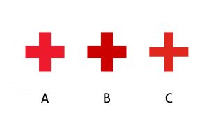
Now add to these quite close red brand colors the unavoidable variations in print (and don’t forget: variations in monitor setup for websites, TV ads, …), and the reproduced red brand colors will look quite similar. Which shouldn’t be an issue: the logo’s form is a higher-order point of recognition than the brand color. E.g., which one of these three logos is the right one? And which one is certainly NOT the right one?
BTW: if consumers would identify all these reds as different brand colors, why would Mondelez sue Aldi for deliberately using packaging that is very similar to their own? Check out the yellow of Nilla Wafers and Vanilla Wafers below. From a printing standpoint, that’s quite a different color. But not for Mondelez, from the filed complaint: “73. Like the NILLA WAFERS Trade Dress, the Infringing Wafer Cookie Packaging features predominantly yellow background with an ombre effect producing a lighter shade.”

It will be interesting to see how this lawsuit turns out. As this article explains: “To prove infringement, Mondelēz will then have to demonstrate that Aldi’s packaging is so similar to Mondelēz’s that consumers who buy Aldi’s products are likely to be confused or misled into believing they have purchased the name-brand version.” Will the court decide that, e.g., these yellows are totally different and not confusing, or the opposite: too similar and hurting Mondelēz sales?
Why is this important?
Every brand owner likes to think that their brand color is really unique. They will guard its integrity with their lives, fueled by the – unproven – myth some people are spreading that even a tiny deviation would ruin their sales.
But real life is different. Our color memory is poor, as several studies have shown. And even the most iconic brand color, Coca-Cola red, seems very difficult to pick from a series of six red brand colors. When another brand color is picked more often, this suggests that the claimed uniqueness of a brand color is a myth.
Print products like packaging should look good, but brand color reproduction doesn’t have to be within tiny tolerances. As long as it can be recognized as the brand, that’s sufficient. And as the test I did showed: even the Target red was recognized as Coca-Cola red by almost one in five, even though these are 9 dE00 apart. And for a reality check, look at these recent pictures I took in a supermarket nearby, right after the launch of the Coca-Cola redesign (August 2026).


And that’s the reason why we need that new metric: the Smallest Actionable Difference (SAD). The Just Noticeable Difference (JND) and the Just Acceptable Difference (JAD) don’t relate to consumer behavior in real life: JND and JAD were determined in a controlled, flat and evenly lit environment (contrary to the real world, which isn’t flat), and participants are explicitly asked to give their opinion and take sufficient time (activating System 2, contrary to using System 1 during shopping). Quality assessment in print production should not be based on JND and JAD, this leads to perfectly usable jobs being rejected and turned into waste.
If you still don’t believe me that a small color deviation won’t hurt sales, check out this 2-year-long, real-life experiment with packages that were 10+ dE00 apart. An experiment conducted by Oreo… Probably without realizing it.
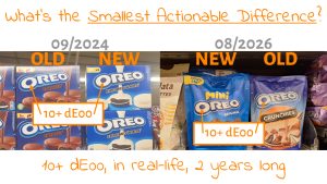
UPDATE 02/10/2026: During a dicussion on LinkedIn, a senior color scientists, with even more decades of experience than me, had to admit he never saw any studies on the effect of small color differences in packaging after I explicitely asked him about that. He had been involved in a project to establish procedures to keep the brand colors in high quality packaging consistent (please note that high quality, not just everyday FMCG packaging!). And he assumed that there probably have been internal studies about this. There must have been studies on that!
And here is the thing, think about this for just two seconds: if there have been internal studies, what could have been the reasons for NOT making the results public? If these internal studies had confirmed the myth that small color differences influence trust and sales, brand owners would use those studies on a daily basis, to hit printers with the results and pressure them even more. But that’s not the case. So, my guess is that there are either no studies, OR… those studies rejected that myth and showed that small color differences in FMCG packaging don’t make any difference in real life, no loss of trust, no loss of sales… That would be an important reason to keep them secret – if any exist: they take away the primary reason to pressure printing companies.
Related posts:
 The Impact of Color on Brand Recognition:
Re-evaluating the 80% Claim
A guest post, by Google Gemini Deep Research AI
 New survey: the influence of color deviations, damaged packages on shopping behavior and brand loyalty
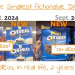 Did a two-year-long, real-life experiment reveal the magnitude of the Smallest Actionable Difference?

This was very interesting. Thank you for this topic. I frequently need to match colours for decorative architectural glass. When the colour we achieve is close but not perfect, I say to the sales guys “Does it need to exactly match the sample or does it need to look good doing the job?” They never take this question to the client.